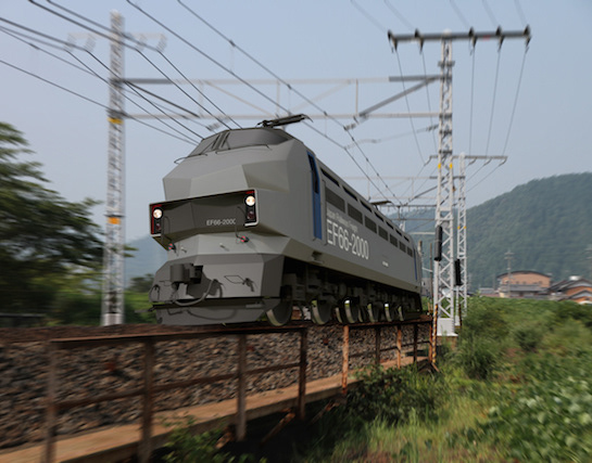
You may also like

WATAYO
和た与のCI と包装紙のリニューアルデザインです。竹の皮に包まれた羊羹を開いた瞬間の形をグラフィックパターンとして包装紙に散りばめました。複数のサイズを作ることになっていた包装紙はサイズによって柄のパターンを変えて楽しいものにしています。This is a renewal design of Wata-yo's CI and wrapping paper. The graphic pattern of the shape of a yokan wrapped in a bamboo skin at the moment it is opened is scattered on the wrapping paper. The wrapping paper, which was to be made in multiple sizes, has a different pattern for each size to make it fun.
2020
BRANCH
「枝」を意味する店名のロゴデザイン。花屋さんでありますので「枝、森、花」そのどれもを感じさせる明るいデザインとしました。 Logo design for a store name meaning “branch. As a florist, the logo is bright and evocative of “branches, forests, and flowers. 为一个意为 “枝条 ”的店名设计徽标。 作为一家花店,徽标色彩明亮,令人联想到 “树枝、森林和鲜花”。
2024
RENOVATION EXPO
リノベーションエキスポ大阪の公式ポスターのデザインです。建築空間で文字を形成したデザインとしました。This is the design for the official poster of Renovation Expo Osaka. The design was made to form letters in architectural space.
2019
KIMIIRO SIGN
近江八幡市で、社会福祉法人 おうみ福祉会の新しい建物が5月に開所しました。 その建物は「きみいろ」と言います。きみいろは日本語であなたの色という意味です。 作業所に訪れる人、それぞれの個性が彩る家族のような場所。そんなイメージかもしれません。今回、内部のサインを担当させていただきました。その「きみいろ」=「君色」というネーミングから、キャンバスに絵の具で描いたような、にじみと温かみのあるサインとすることを思いつきました。ここでは「せんべい」も作っており、せんべいルームのサインも作りました。A new building of Ohmi Fukushi Kai social welfare corporation opened in May in Ohmi-Hachiman City.The building is called "Kimiiro. Kimiiro means "your color" in Japanese.It is a family-like place where the individuality of each person who visits the workshop adds color to the place. That may be the image of this building.This time, I was in charge of the interior signage.From the name "Kimiiro" = "Kimiiro," we came up with the idea of making the signage blotchy and warm, as if painted on a canvas. We also make "senbei" here, so we created a sign for the senbei room.
2023
GOENMAN
ご縁まんは、菓匠禄兵衛の商品でおめでたい縁起の良いイメージでパッケージを依頼されました。紅白と金色を用いて「円」と「縁」を掛け合わせて縁起の良いデザインを目指しました。e were asked to create a package for Gohan Man, a product of the confectioner Rokubei, with a festive and auspicious image. We aimed to create an auspicious design by using red, white, and gold colors to cross the words "yen" and "en" together.
2020
1/6 fabric
滋賀の繊維を使ったファブリックブランドです。湖東地域の麻織物と高島ちぢみを使って小物を作りました。柄になっているのは滋賀にゆかりあるモチーフのデザインです。使うほどに良さがわかる気持ち良い生地と評判です。These are fabric brands using fibers from Shiga. Hemp fabrics from the Koto region and Takashima chijimi are used to make these small items. The patterns are designed with motifs associated with Shiga. The fabrics have a reputation for being pleasant to the touch, and the more you use them, the more you appreciate their quality.
2018
TOYAMA FESTIVAL
第62回富山まつりの公式ポスターを担当しました。青空の下、市内のメイン道路で日中にダイナミックな踊りが行われるこのお祭りを象徴的に踊り子の姿でデザインしました。We were in charge of the official poster for the 62nd Toyama Festival. We designed the dancers to symbolize this festival, in which dynamic dancing takes place during the day on the city's main roads under a blue sky.
2022
ONDA
ONDAはイタリア語で波を意味します。これはチェストですが表面が波のようにカーブしています。ウォルナットとヨーロッパビーチに2種類の木のコントラストがあるデザインです。ONDA means wave in Italian. This is a chest, but its surface is curved like a wave. The design has a contrast between two types of wood in walnut and European beach.
2009
YUTANPO
磁器の湯たんぽのデザインです。布団の中へ入れて使用する湯たんぽですが、多くの湯たんぽは、蓋の部分が突起として出ています。その出っ張りをなくし、人が触れる形状としてもっともあってほしかった形態を目指しました。This is a porcelain hot water bottle design. Most hot-water bottles are placed in a futon and the lid of the bottle protrudes from the futon. We eliminated the protrusion and aimed to create a shape that people can touch.
2012
3 Glass Base Award Gift
2014
Back to Top