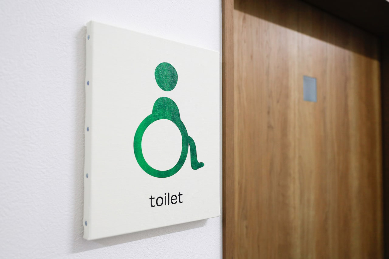
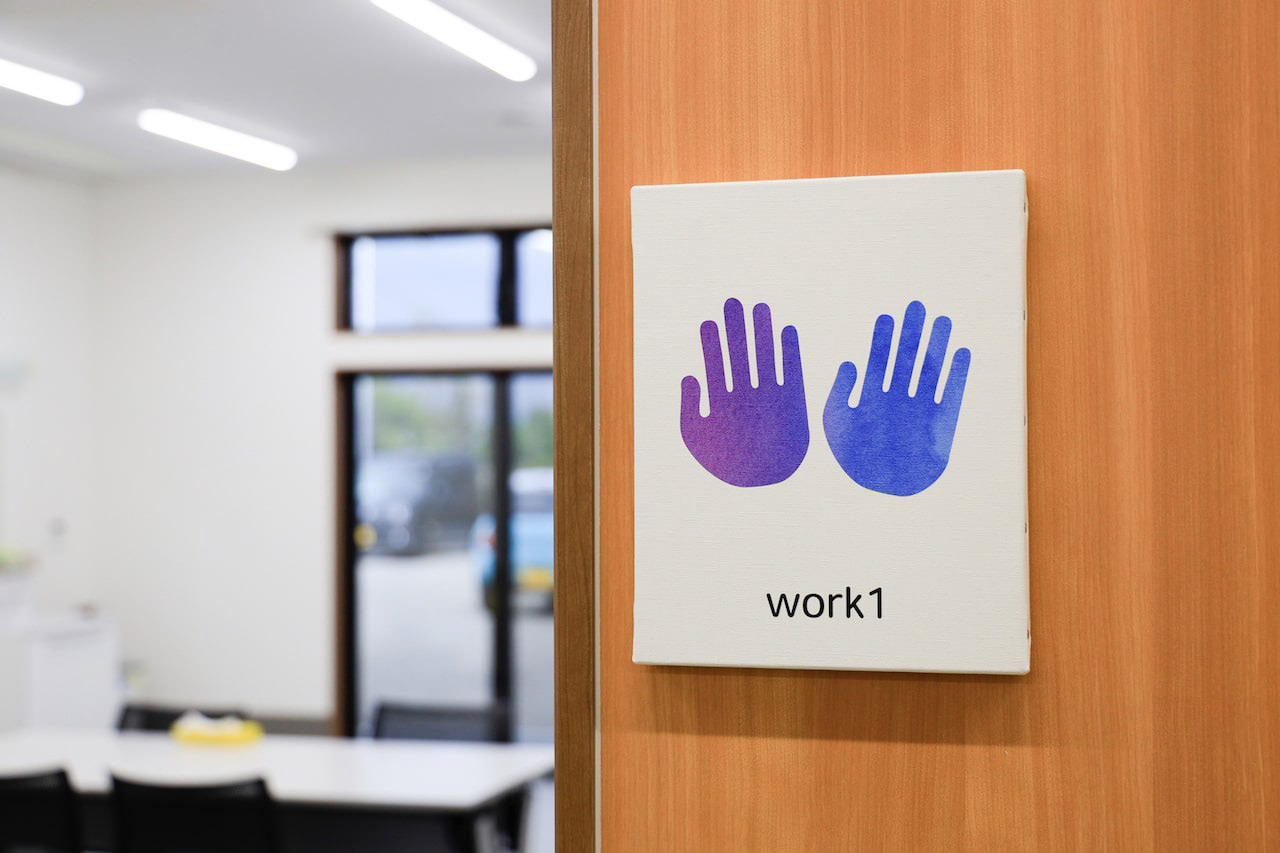
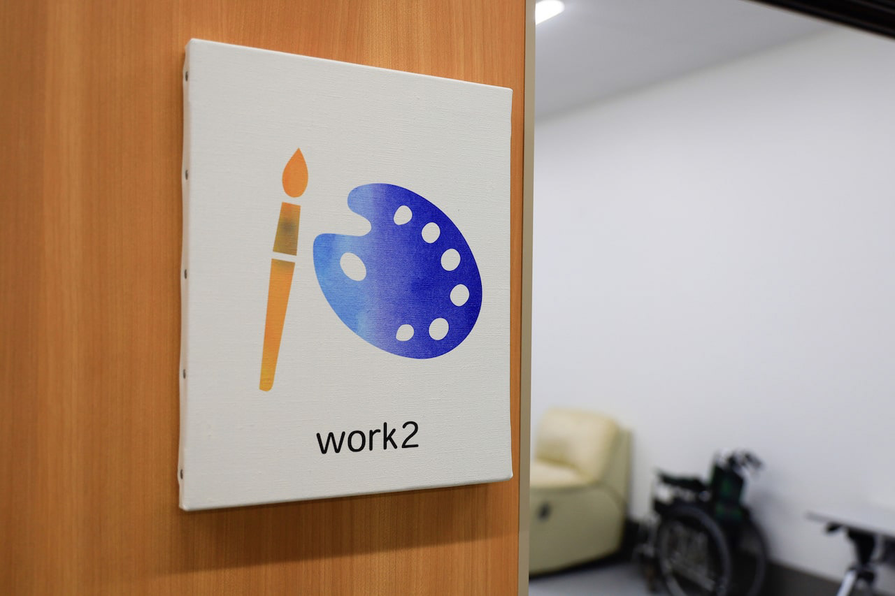
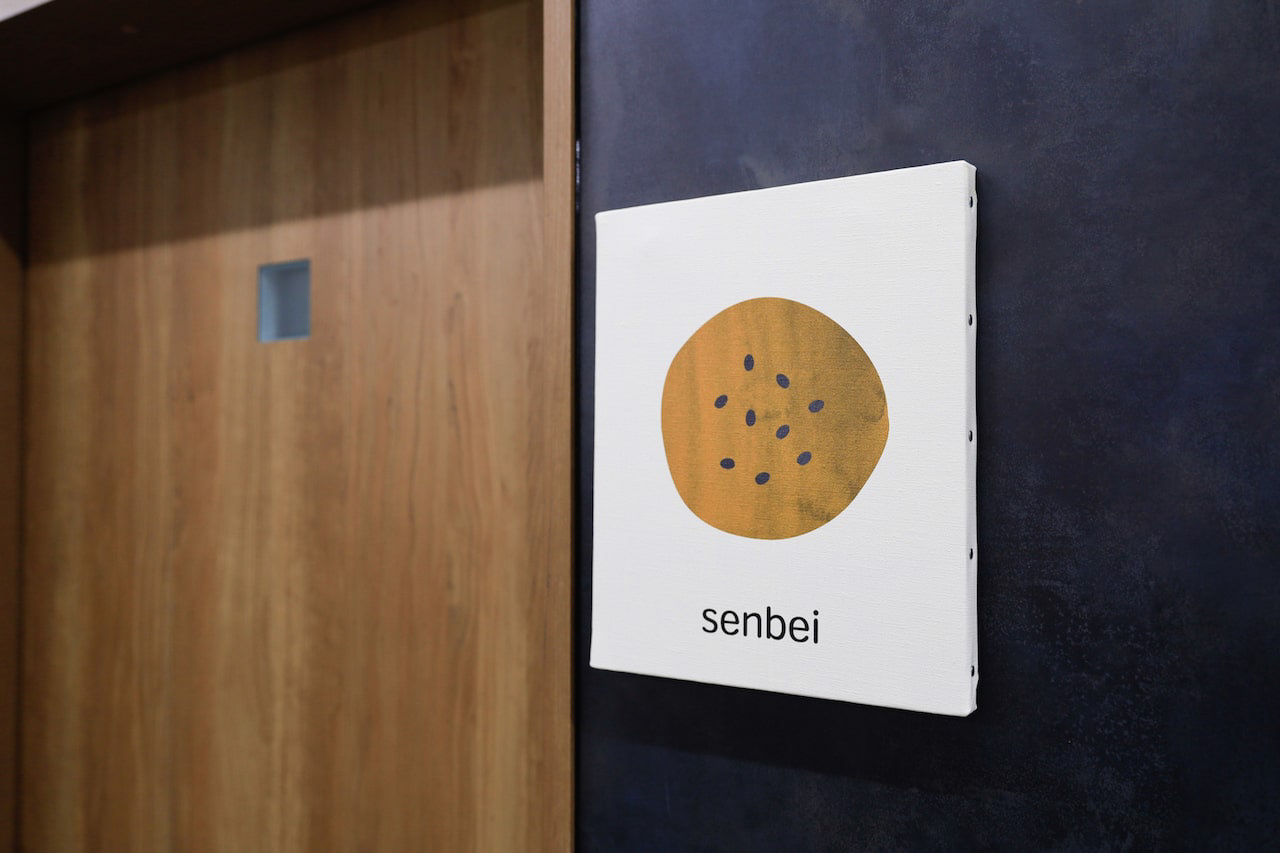
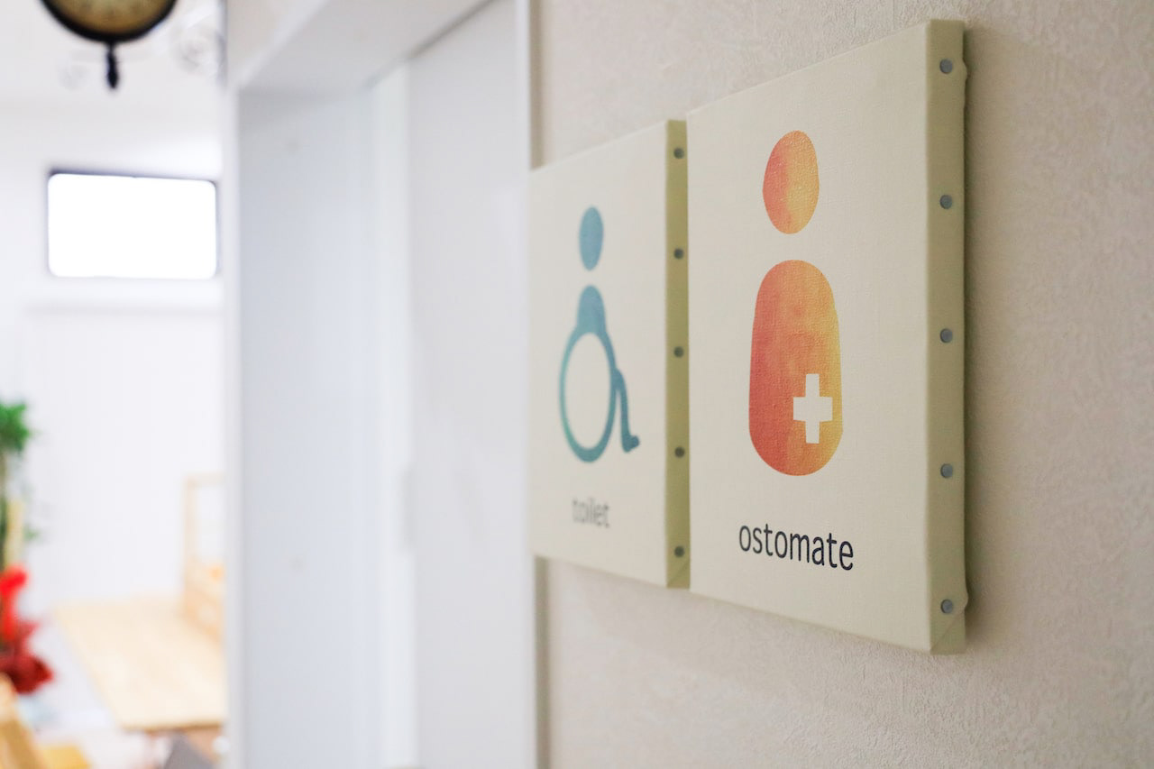
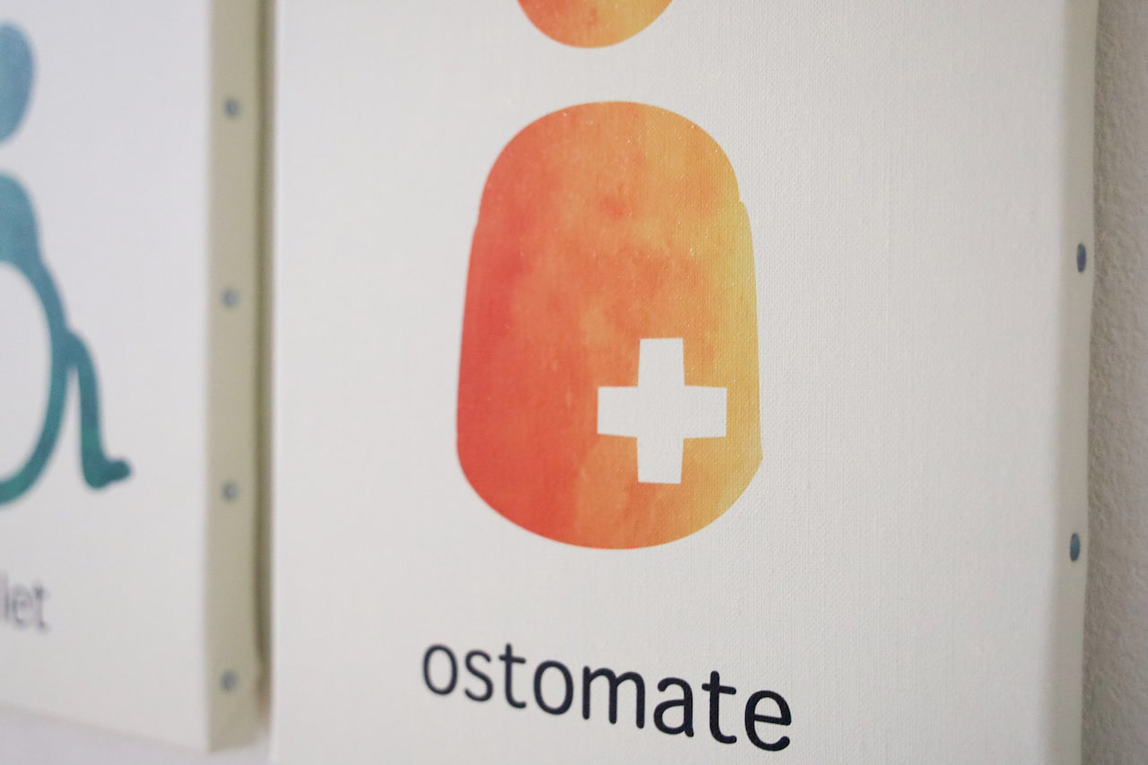
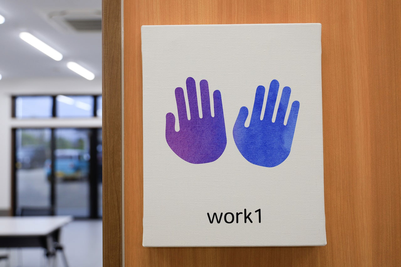
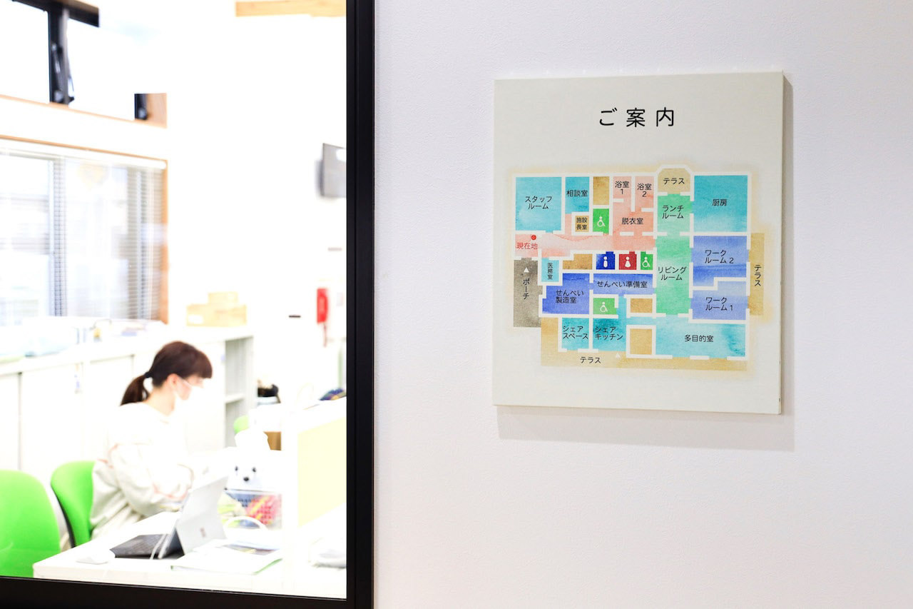
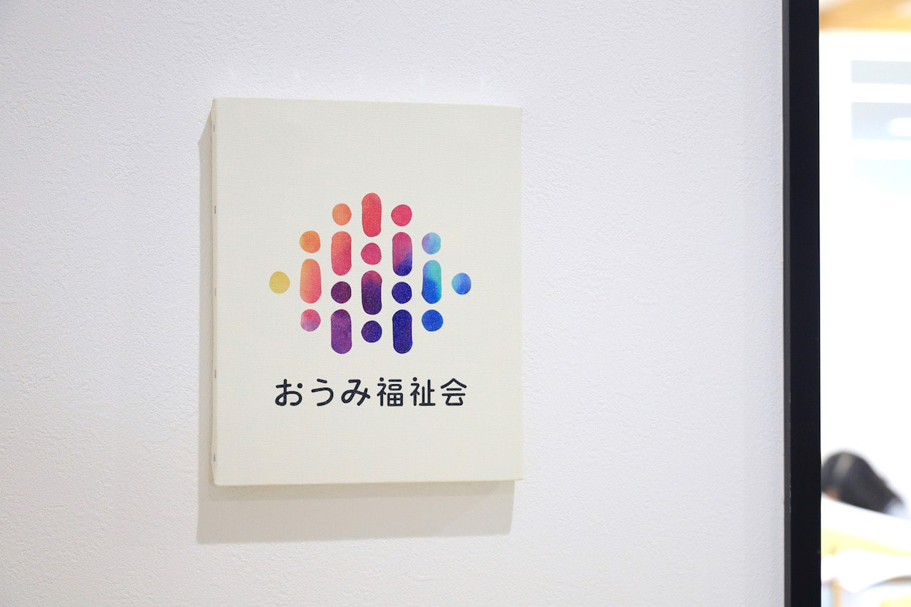
You may also like

SUPER DRY ART 2004
表参道旧同潤会青山アパート仮囲いに掲出されるという立地条件から、道路を挟んだ手前側の歩道と向こう側の歩道からとでは見え方が異なるようなデザインを意図しました。近くで見ると細かく印刷された[DRY]の文字ばかりが目立ち、遠くからでは[DRY]の文字は見えず、ビールの缶の姿がはっきり見えるというものです。 Given its location on the temporary fence surrounding the former Dojunkai Aoyama Apartments in Omotesando, the design was intended to look different depending on whether you were viewing it from the sidewalk on the near side of the road or the sidewalk on the far side. When viewed up close, the finely printed word "DRY" is the most prominent feature, while from a distance, the word "DRY" is not visible, and the image of the beer can is clearly seen.
2004
BIWAKO HOMARE
近江茶 琵琶湖ほまれのパッケージデザインです。茶の栽培地である、三重県境から琵琶湖まで繋がっているというイメージを水彩画で表現しました。This is the package design for Omi Tea Biwako Homare. The image of the connection from the border of Mie Prefecture to Lake Biwa, where the tea is grown, is expressed in watercolor.
2021
TOYAMA FESTIVAL
第62回富山まつりの公式ポスターを担当しました。青空の下、市内のメイン道路で日中にダイナミックな踊りが行われるこのお祭りを象徴的に踊り子の姿でデザインしました。We were in charge of the official poster for the 62nd Toyama Festival. We designed the dancers to symbolize this festival, in which dynamic dancing takes place during the day on the city's main roads under a blue sky.
2022
SAKAEYA
肉サカエヤのCIデザインを担当しました。牛という文字を使いながら和にならない洋のイメージを感じさせるデザインとし、ナイフで切ったような手作り感、クラフト感のあるロゴデザインとしています。We designed the CI for Sakaeya Meat shop. The logo design uses the character for "beef" but gives a Western image that is not Japanese, and has a handmade, crafty feel as if it were cut with a knife.
2019
MOTONOKI MOCHI
本之木餅は菓匠禄兵衛における長年ベストセラー商品です。 そのリニューアルデザインを担当しました。 今までの商品同様赤をベースに金との組み合わせは変えませんが、箱の型に抜きを使うことで立体感ある仕上がりに、印刷にもツヤニスを多様することで光の当たり方で浮かび上がる深みのある演出としました。 今までの印象を損なわず、さらに表現を進化させたデザインとしています。 お菓子は、ふっくらと炊き上げた粒あんを、餅粉入りのもっちり生地で包み、焼き上げたものです。8個入りと5個入りがあります。 Motonoki Mochi has been a best-selling product of Kasho Rokubei for many years. We were in charge of its renewal design. The red base color is the same as the previous products, and the combination of gold and gold is the same, but the box is die-cut to give it a three-dimensional finish, and a variety of glossy varnishes are used in the printing to create a deep effect that comes to life when the light hits it. The design has evolved further in expression without losing the impression of the past. The confectionery is made by wrapping softly cooked sweet bean paste in mochi dough and baking it. 8 pieces and 5 pieces are available.
 Motonoki mochi (红豆沙馅麻糬)多年来一直是 Kasho Rokubei 的畅销产品。 我们负责其更新设计。 与以前的产品一样,金色和红色底色的组合保持不变,但在包装盒上使用了模切模具,使其具有立体感,印刷时使用了亮光漆,产生了深邃的效果,在光线照射下栩栩如生。 设计在表现形式上有了进一步的发展,但又不失过去的印象。 这种点心是用煮软的甜豆沙,裹上麻糬粉烘烤而成。
2025
Otsu North Edges
琵琶湖のほとり、大津北には多彩なクラフターが集っています。 帽子、鉄溶接、樹脂加工、木彫仏像、湖から集めたガラス 異なる素材と技が出会い、 ここでしか生まれない新しい価値を形にしました。 大津北から発信する、唯一無二のクラフトコレクションです。 大津北商工会と一緒に企業の支援をしています。 BtoBばかりで商品開発をしたことがない企業や、事業で出る廃棄物をどうにかしたい。今までのスタイルに行き詰まりを感じている企業、これからの後継者のために新しく事業を立ち上げたい。 様々なお悩みを商品開発という軸で解決してゆくプロジェクトを2025年4月より行なってきました。 私がいなくなった後も、事業者が自律的に商品を開発して行けることを目指しながら、伴走をしますが、自走を促すためにやっています。 2026年2月のギフトショーで発表しました。 Otsu Kita, on the shores of Lake Biwa, is home to a diverse range of crafters. Hats, iron welding, resin processing, wooden Buddha statues, and glass collected from the lake Different materials and techniques come together to create new value that can only be found here. This is a one-of-a-kind craft collection from Otsu Kita. 位于琵琶湖畔的大津北,是众多手工艺人的聚集地。 帽子、铁艺焊接、树脂加工、木制佛像、以及从湖中采集的玻璃制品…… 不同的材料和技艺在此交融,创造出独一无二的价值。 这是来自大津北的独一无二的手工艺品系列。
2025
AYU PORRIDGE
あゆ雑炊のパッケージデザインです。あゆのひらきを使い、レンジアップご飯で手間要らずで簡単に雑炊が作れるように開発されました。鉄鍋に木の蓋をデザインモチーフとし、レトルトご飯と、だし汁を隙間なくホールド可能なパッケージに逆台形型の箱としました。一枚のシートから立体になるデザインです。青い紙に金印刷でローコストに制作しました。 This is the package design of Ayu Porridge. It was developed to make Zosui (rice porridge) easily and hassle-free with microwaved rice using Ayu flounder. The design motif is an iron pot with a wooden lid, and the package is an inverted trapezoid-shaped box that can hold retort rice and the broth without gaps. The design is three-dimensional from a single sheet. Gold printing on blue paper was used for low-cost production. 鲶鱼粥包装设计。 它的开发目的是让人们能够使用鲶鱼比目鱼用微波炉简单方便地煮粥。 设计图案是铁锅上的木盖、甑饭和一个倒梯形盒子,用于盛放无缝隙肉汤的包装。 该设计是由单张板材制作而成的三维作品。 它是用蓝色纸张上的金色印刷以低成本制作的。
2024
TOYAMA MATSURI 2025
青空の下、元気よく、威勢よく踊り子たちが繰り広げる富山まつり。みんなが一つになって大きな輪を作り、富山まつりを支えているように感じました。このポスターでは、色鮮やかな衣装の色紙を丸めたような輪がたくさんつながって「祭」の文字となって元気よくジャンプして踊っている姿をデザインしました。 Under the blue sky, dancers perform with vigor and spirit at the Toyama Festival. It felt as though everyone came together to form a large circle, supporting the Toyama Festival. For this poster, I designed a scene where numerous circles, resembling rolled-up sheets of colorful costume paper, connect to form the character for “festival” (“祭”), leaping and dancing energetically. 在蓝天之下,舞者们活力四射、气势磅礴地演绎着富山祭典。众人齐心协力编织出巨大的圆环,仿佛正是这般团结支撑着整个祭典。本海报设计中,众多色彩绚丽的服饰色纸被卷成圆环相互连接,构成“祭”字的造型,生动展现了舞者们欢快跳跃、翩然起舞的姿态。
2025
SHIGA BANK DAVID CARD
滋賀銀行のデビットカードのプロポーザルデザイン案です。琵琶湖の上と琵琶湖の下をテーマに2種類デザインしました。上は夕日、下は水中をイメージしたシンプルながら目を引くデザインです。This is a proposal design proposal for a debit card for Shiga Bank. Two designs were created based on the theme of above Lake Biwa and below Lake Biwa. The upper design is a simple but eye-catching image of a sunset, while the lower design is an underwater image.
2020
AYU, SALT-GRILLED FLAKES
あゆの塩焼きをほぐした瓶詰めです。高級感を大切に、塩焼きであったことを引用し、竹串で封印をしています。紙も四角い金のマスがキラキラ見えるものを選択しています。This is a jar of ayu fish unglazed with salt. To emphasize the importance of luxury, it is sealed with a bamboo skewer, citing that it was grilled with salt. The paper is also selected to show a square gold square with glittering gold squares.
2021
Back to Top