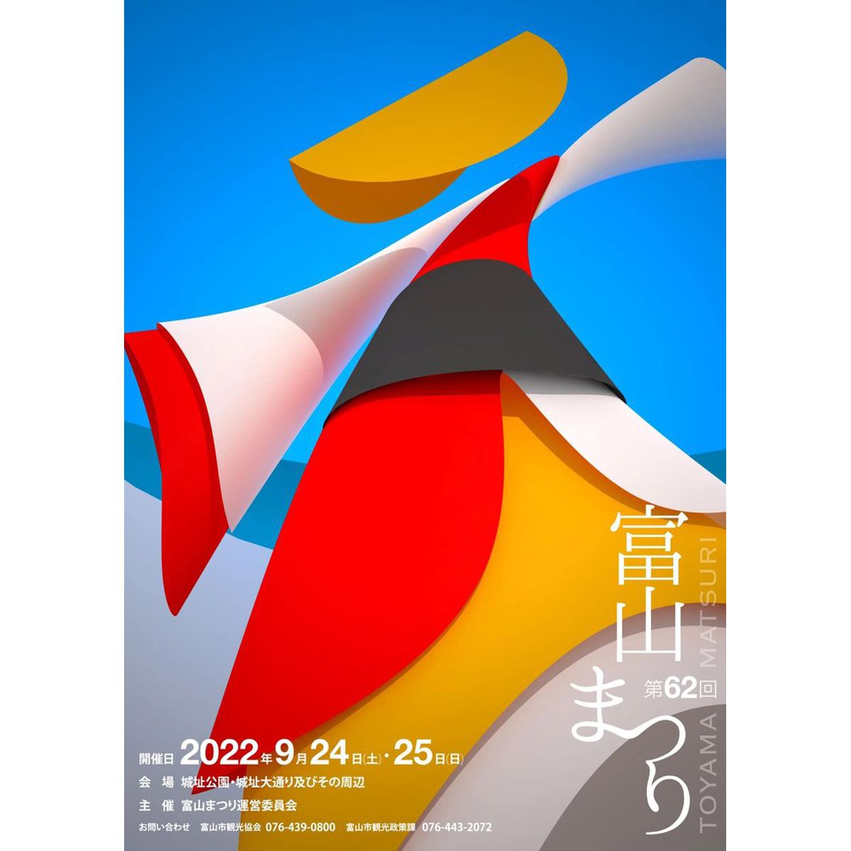
TOYAMA FESTIVAL
第62回富山まつりの公式ポスターを担当しました。青空の下、市内のメイン道路で日中にダイナミックな踊りが行われるこのお祭りを象徴的に踊り子の姿でデザインしました。We were in charge of the official poster for the 62nd Toyama Festival. We designed the dancers to symbolize this festival, in which dynamic dancing takes place during the day on the city's main roads under a blue sky.
You may also like
AYU BOILED in SOY SOURCE
あゆの醤油煮の缶詰です。高級感があり、美味しそうに見えるように、醤油が染み込んでいくようなイメージでデザインしました。Canned ayu fish simmered in soy sauce. We designed it to look luxurious and delicious, with the image of soy sauce soaking into the product.
2021
IKA'S MONO
旧伊香郡4町のアンテナショップIKA'S MONO STOREのブランディング、パッケージデザインなどです。四つの町が一つになって高みを目指す。というイメージでロゴデザインをしました。イカのイメージでパッケージにもヘッダーを作って様々な業者の商品に統一感を持たせて販売しました。This includes branding and package design for IKA'S MONO STORE, an antenna store for four former Ika-gun towns. The four towns are united as one and aim high. We designed the logo with this image. We also created a header on the package with the image of squid to give a sense of unity to the products of various vendors and sell them.
2019
MASU of Shiga
滋賀県産のびわ湖材を用いたノベルティ用のひのき枡のデザインです。
枡で日本酒を飲む機会も減りましたが、日本酒を木の枡で飲むと木の香りがお酒に移り一味違った楽しみ方ができます。この巻き紙にはその楽しみ方を前面に出して記述しています。
巻き紙を取るとシールが貼られています。
そのシールを剥がすと、枡にレーザー刻印された滋賀のモチーフが現れます。モチーフは4種類ありますが何種類あるかは記されていません。何が出るかはお楽しみということにしました。SNSなどで調べると何種類あるのかもわかったり、調べたくなる、シェアしたくなる仕組みとしました。単なる押しつけのノベルティにならないよう、日本酒を楽しんでもらう、心に残る体験デザインとして考えたものです。
Hinoki Masu is a novelty item designed using Biwako wood from Shiga Prefecture. Masu is a vessel for drinking sake.
Although the number of occasions to drink sake with wooden Masu has decreased, drinking sake with wooden sake cups offers a different way to enjoy the sake, as the aroma of the wood is transferred to the sake. This paper roll describes how to enjoy sake in a different way.
When you take off the paper roll, you will find a sticker attached to it.
When the sticker is removed, the Shiga motif laser-engraved on the Masu is revealed. There are four different motifs, but the number of motifs is not indicated. The idea was to make people want to check and share the information by checking on social networking sites. We did not want this to be a mere novelty item, but rather a memorable experience designed to encourage people to enjoy sake.
新颖的桧木 Masu 设计采用滋贺县的琵琶湖木材。 Masu 是喝清酒的容器。
虽然用木制 Masu 喝清酒的机会较少,但用木制 Masu 喝清酒时,木头的香气会传递到清酒中,给人一种与众不同的享受。 这个纸卷描述的就是这种品酒方式。
取下纸卷后,会贴上一张贴纸。
撕下贴纸后,马苏上激光雕刻的滋贺图案就会显现出来。 共有四个不同的图案,但没有说明有多少个。 我们的想法是让人们可以通过社交网站轻松查找到有哪些图案,并让人们愿意查找这些图案并与他人分享。 设计的初衷是让人们享受清酒带来的难忘体验,而不仅仅是一种勉强的新奇感。
2025
Renovation EXPO OSAKA 2018
リノベーションエキスポ2018大阪のポスターデザイン。
「食」をテーマにリノベーションの展示会を大阪南港ATCで開催します。
リノベーションを略して「リノベ」の文字を家具や建築として表現しました。
製図で描くような幾何学的書体を上にかぶせ、リノベーションの設計感を出しました。
2018
KIMIIRO SIGN
近江八幡市で、社会福祉法人 おうみ福祉会の新しい建物が5月に開所しました。
その建物は「きみいろ」と言います。きみいろは日本語であなたの色という意味です。
作業所に訪れる人、それぞれの個性が彩る家族のような場所。そんなイメージかもしれません。今回、内部のサインを担当させていただきました。その「きみいろ」=「君色」というネーミングから、キャンバスに絵の具で描いたような、にじみと温かみのあるサインとすることを思いつきました。ここでは「せんべい」も作っており、せんべいルームのサインも作りました。A new building of Ohmi Fukushi Kai social welfare corporation opened in May in Ohmi-Hachiman City.The building is called "Kimiiro. Kimiiro means "your color" in Japanese.It is a family-like place where the individuality of each person who visits the workshop adds color to the place. That may be the image of this building.This time, I was in charge of the interior signage.From the name "Kimiiro" = "Kimiiro," we came up with the idea of making the signage blotchy and warm, as if painted on a canvas. We also make "senbei" here, so we created a sign for the senbei room.
2023
IZUMI YAMASAKI
2017
AYU in Olive Oil
鮎のオリーブオイル漬けのパッケージデザインです。メタリックの紙にオリーブの果実とオリーブグリーンの印刷でシンプルにデザインしました。他のシリーズと同様に缶の上面に中身の写真を表現し、中身のわかりやすい美味しそうなデザインとしています。
Package design for ayu fish marinated in olive oil. The design is simple with olive fruit and olive green printing on metallic paper. As with the other products in the series, a picture of the contents is expressed on the top of the can, making it easy to understand the contents of the tasty design.
橄榄油鲶鱼的包装设计。 设计简洁,在金属纸上印有橄榄果和橄榄绿。 与该系列的其他产品一样,罐头顶部印有内容物的图片,使人一目了然,看起来美味可口。
2025
minami design school
2025年6月〜2026年2月まで、大津北商工会にて、全10回のスクール形式で新商品開発、既存商品ブラッシュアップの講師を勤めることになりました。
事業者における新商品開発の際も、全てが決まってから「最後に外注するものが デザイン」ではなく、
リサーチから、今企業内にあるリソースを最大限に活かしながら、誰に向けて何を作るのか、サービスを考えることから、商品開発、売り場のデザインまで、その全てが「デザイン」であります。
ものづくりの事業者にとって、デザインは遠いものではなく、
それらの仕事の多くは実は「デザイン」です。
このスクールでは、事業者自身が自律的に考え、商品開発し、デザインができるように、私の力でどこまでできるかわかりませんがやることになりました。
I will be teaching a 10-session school-style course on new product development and product refining for existing products.
When developing a new product for a business, it is not a case of “the last thing to be outsourced is the design” after everything has been decided,
Design” is everything from research, to thinking about what to make and for whom, to product development, to designing the sales floor, all while making the most of the resources currently available within the company.
For manufacturing businesses, design is not something far away,
Many of those jobs are actually “design”.
In this school, I don't know how far I can go, but I will do it so that the businesses themselves can think, develop products, and design autonomously.
我将以 10 期学校的形式教授新产品开发和现有产品的更新。
在为企业开发新产品时,并不是在确定了一切之后 “最后外包的是设计”、
设计 "是指从研究、思考制造什么和为谁制造、服务、产品开发到销售空间设计的所有工作,同时还要充分利用公司内部现有的资源。
对于制造企业来说,设计并不遥远、
很多工作其实就是 “设计”。
在这所学校里,我不知道自己能走多远,但我会做到让企业自己能够自主思考、自主开发产品、自主设计。
2025
GINDAWARA
釜炊き近江米 銀俵のロゴをデザインしました。シンボルマークは米俵を横から見た姿。銀俵の文字は古い文字から引用しました。We designed a logo for GINDAWARA. This restaurant cooks rice in a Shigaraki earthenware pot. The symbol mark is a side view of a rice bale. The letters of "Ginbawara" are taken from old characters.
2019
AYU KIMURA SHOPPING BAG
あゆの店きむらのショッピングバッグをデザインしました。マチ部分の柄とシームレスにつながるでざいんです。8角形の形は生け簀の形を図案化したものです。We designed a shopping bag for Ayu Kimura. The octagonal shape is based on the shape of a fish tank.
2019