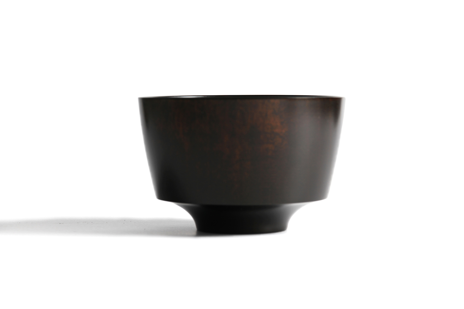
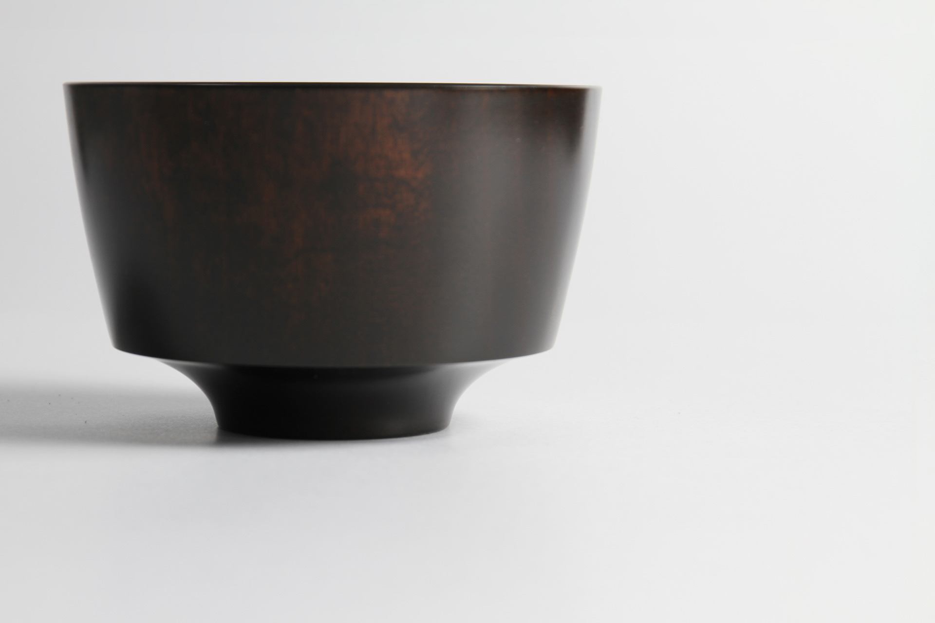
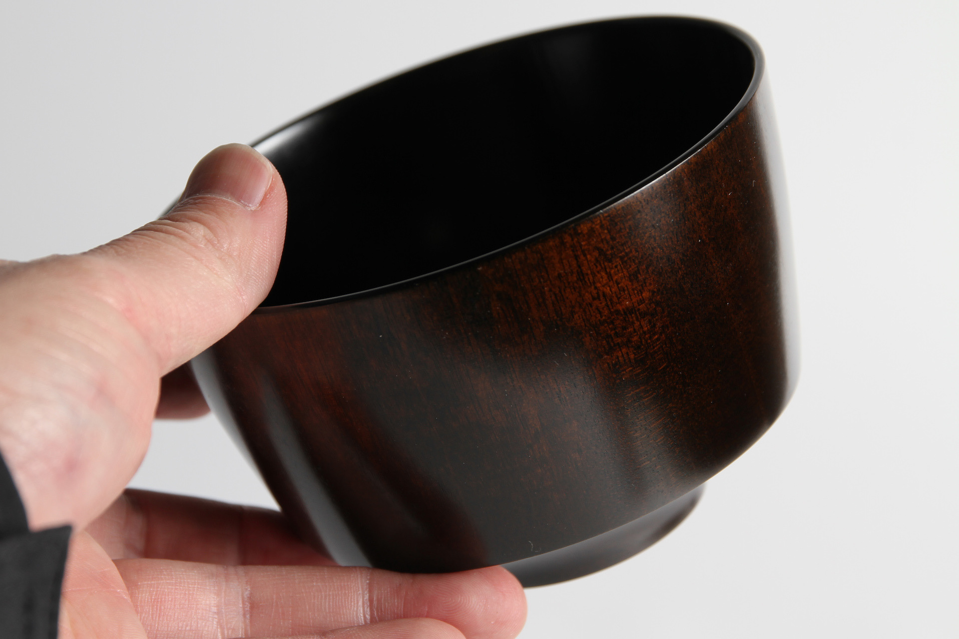
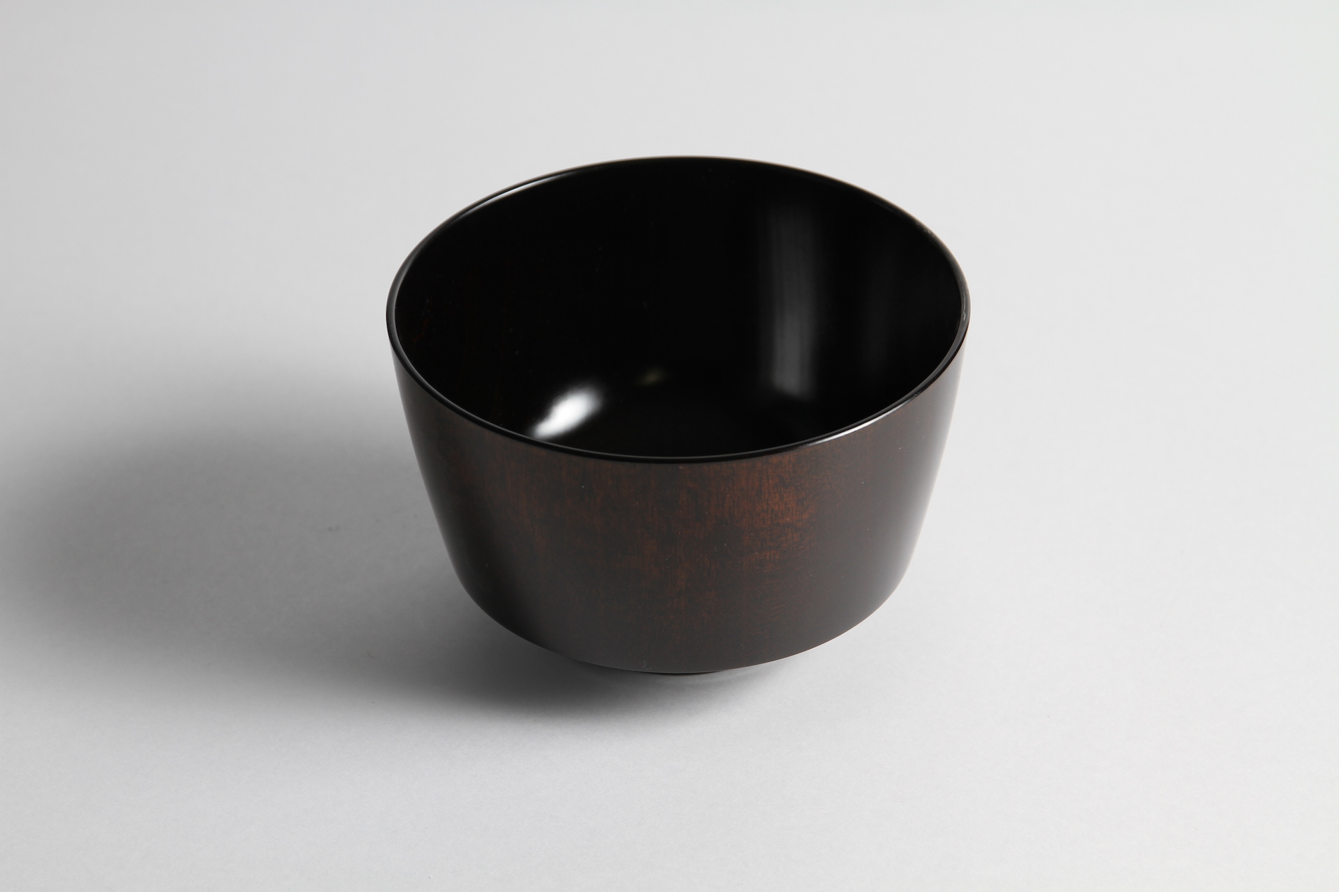
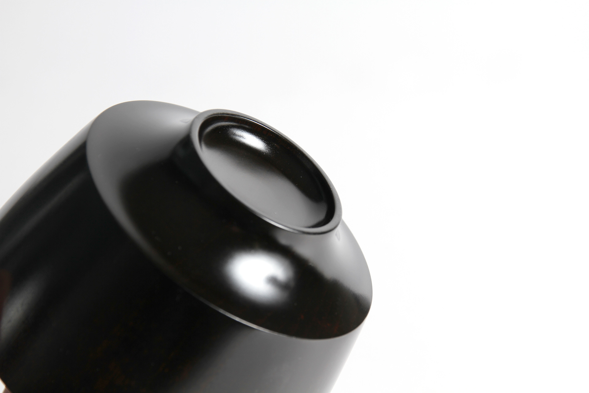
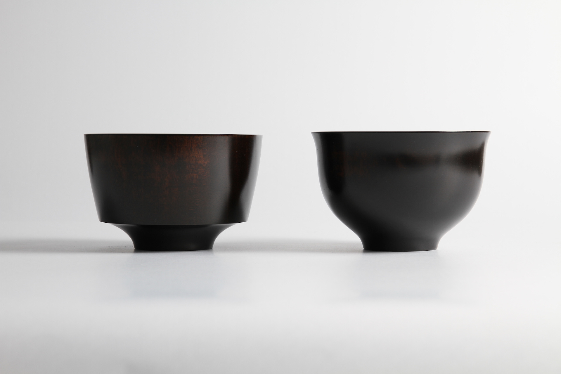
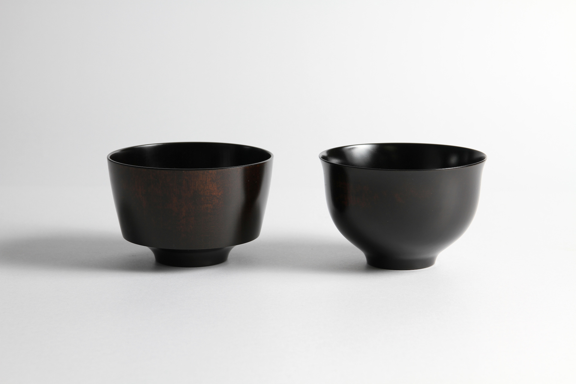
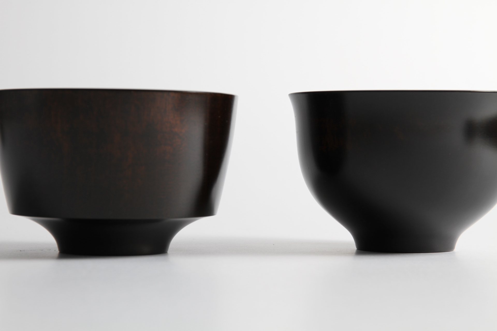
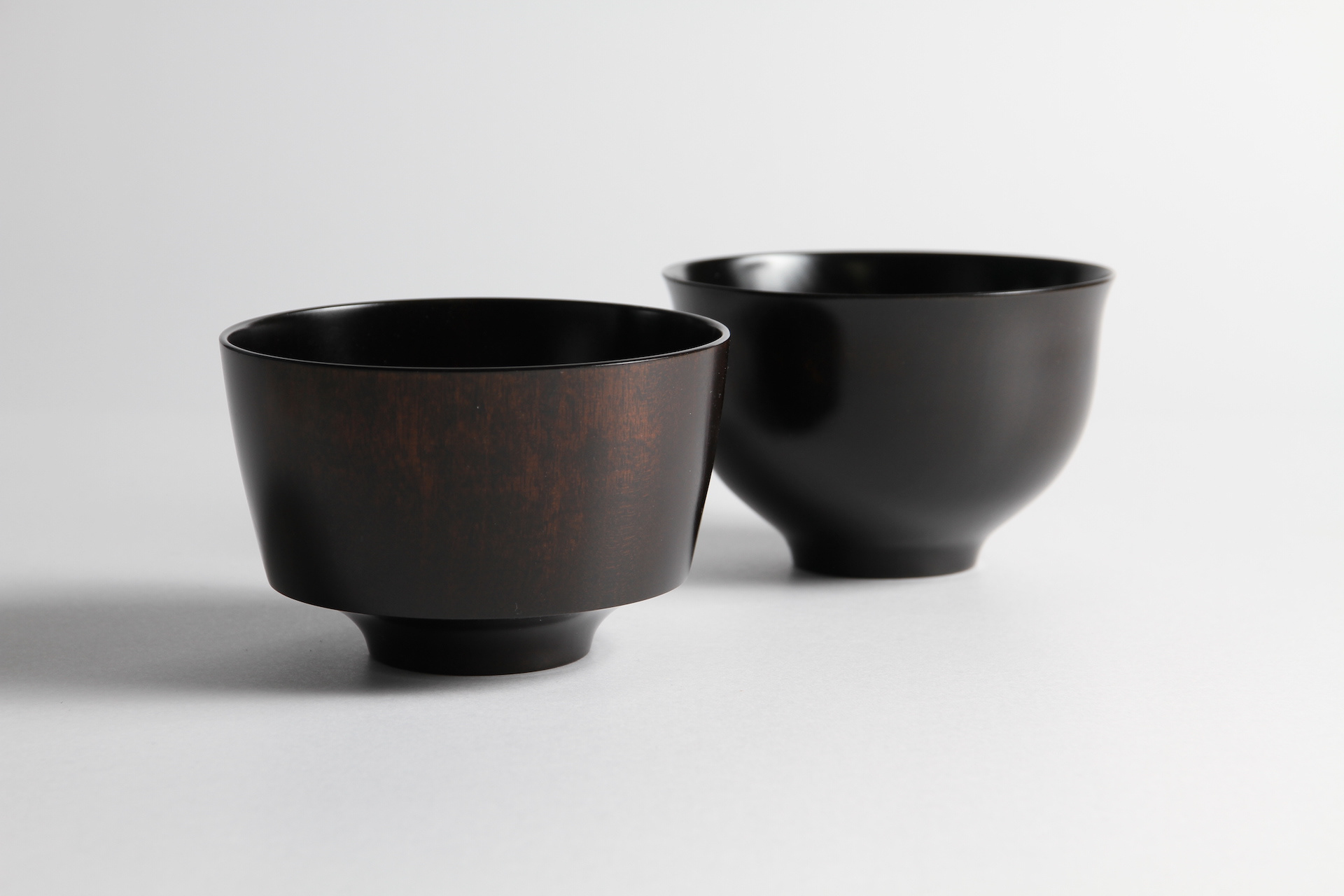
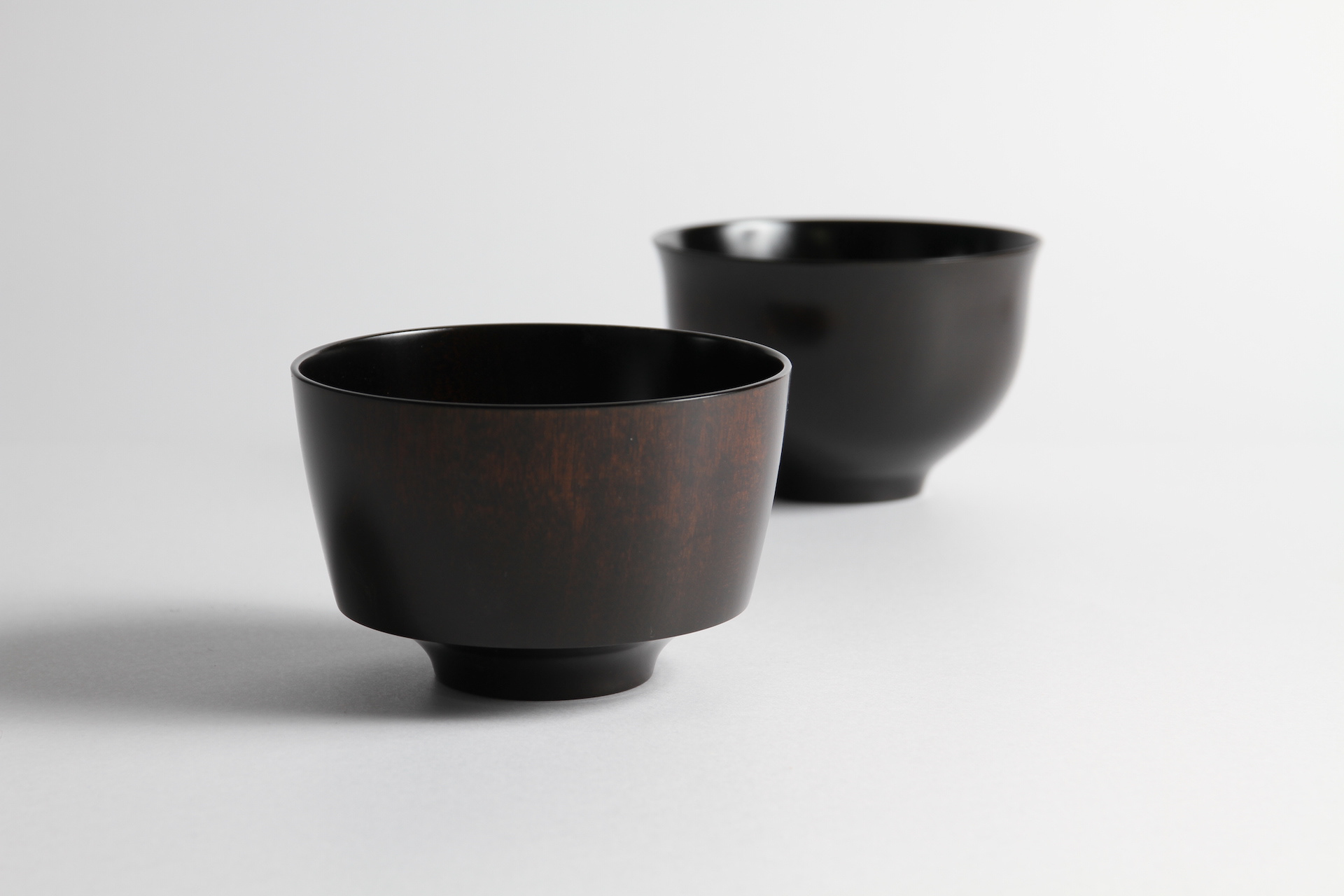
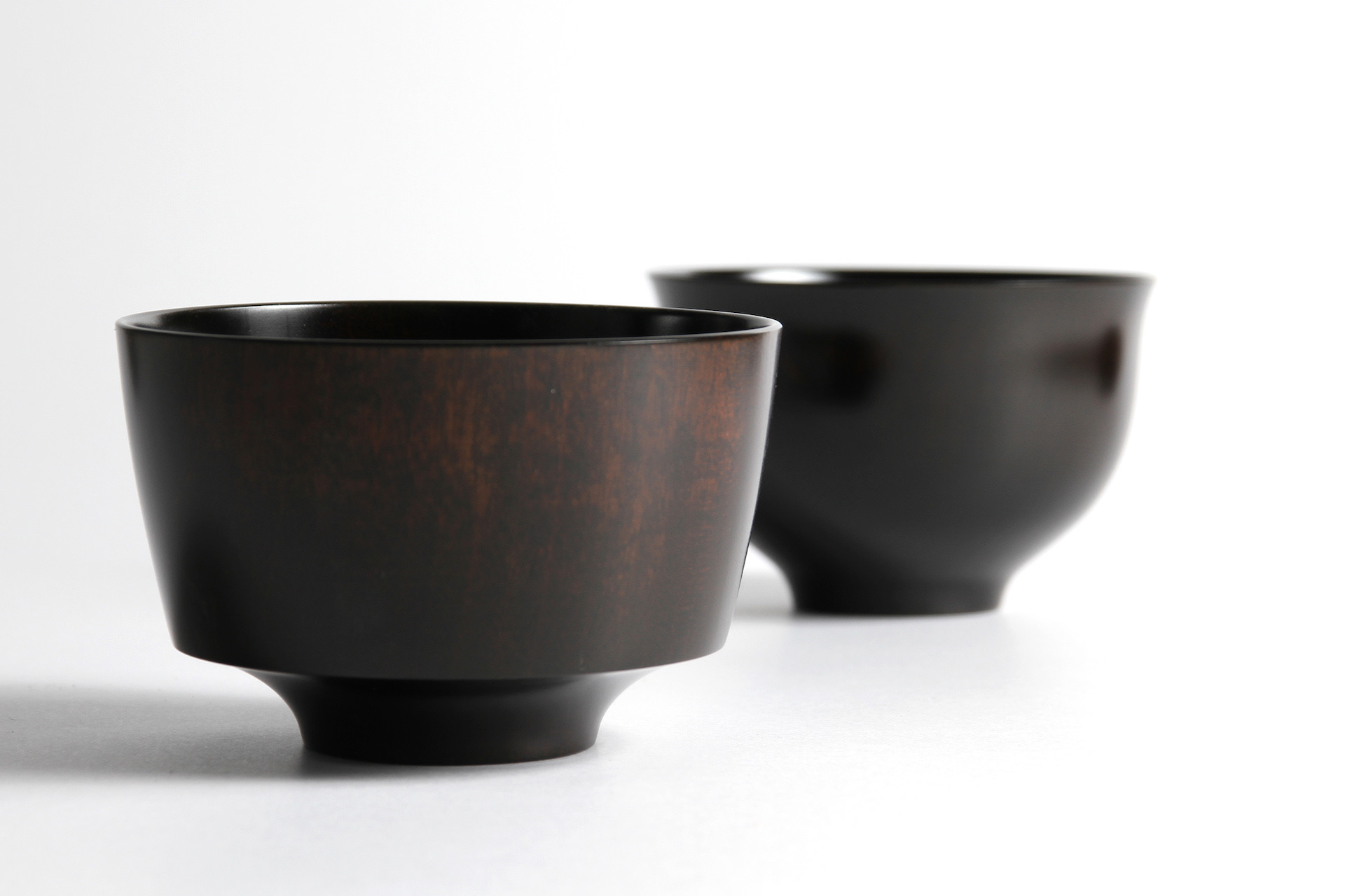
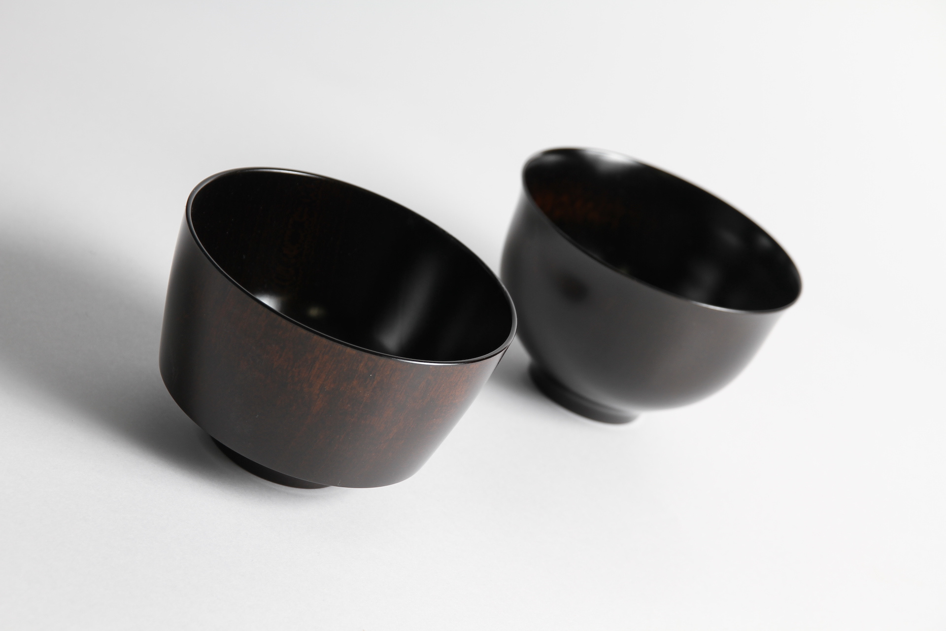
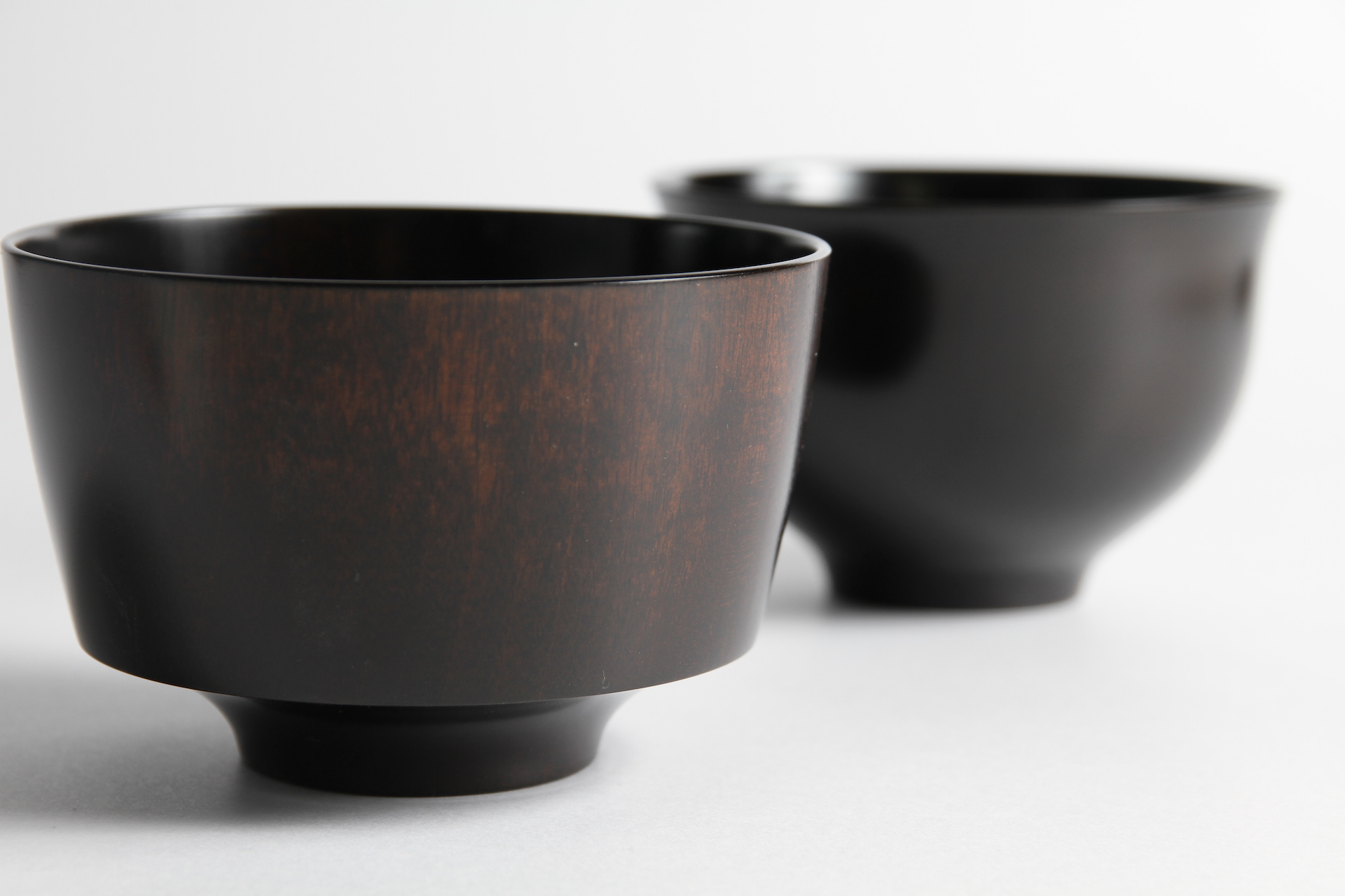
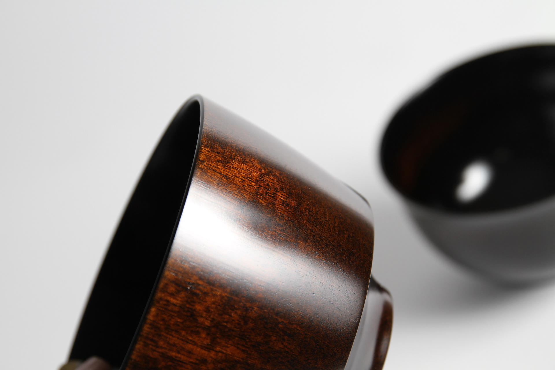
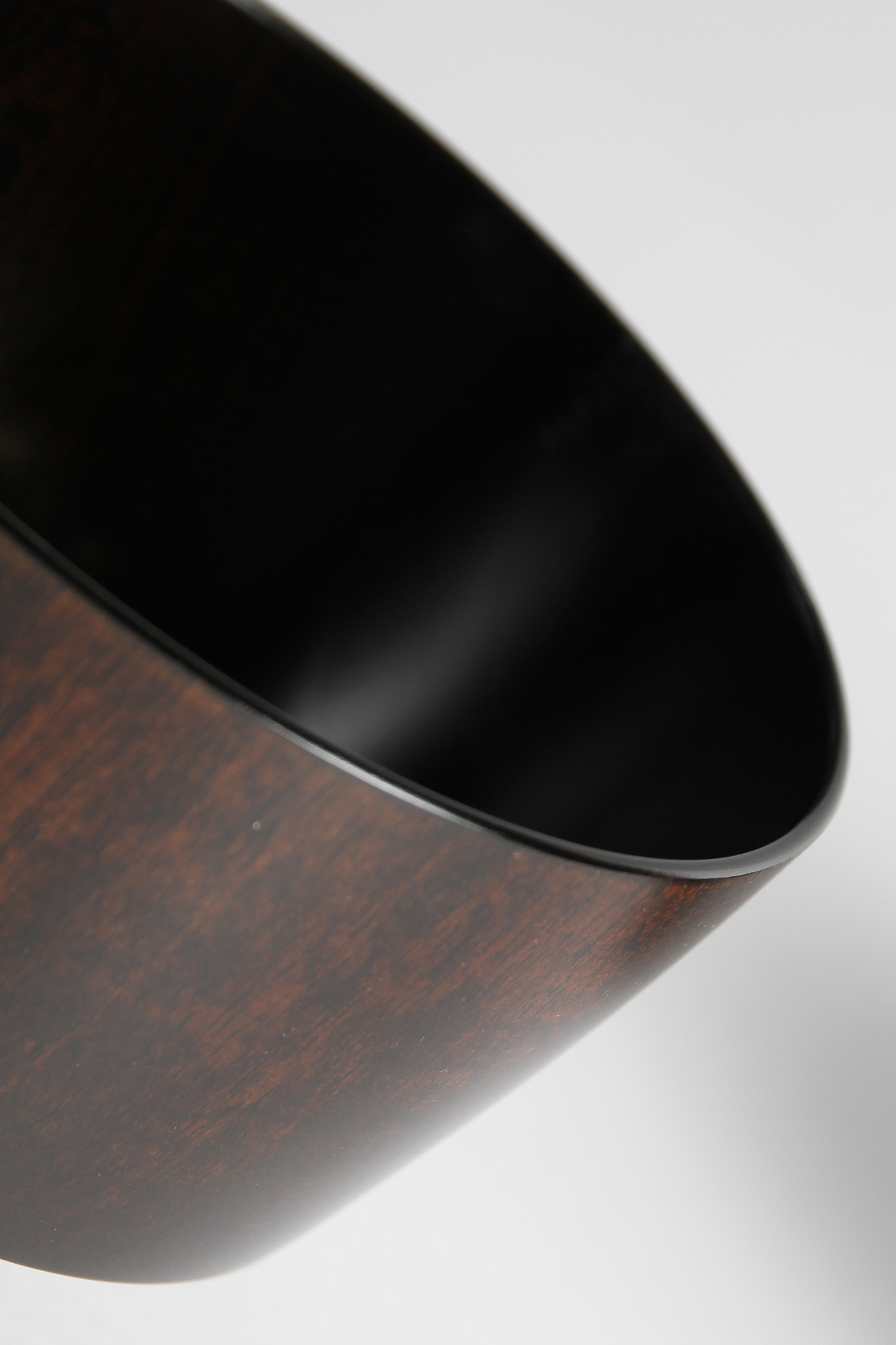
You may also like

KIRAMIZUKI OMI RICE
近江米の新品種「きらみずき」のパッケージデザインおよびブランディングプロポーザル応募案。パッケージの絵は、きらきらと輝く琵琶湖を中心に、豊かな生物、山林、気候、田畑のイラストをちりばめ、それらの恩恵を受けたみずみずしい米粒を描きました。全体的に金色でデザインを、下地は旨味を感じさせる淡いベージュ色で高級感とシズル感(美味しそうに見える感覚)を演出しました。のぼりや法被、コンセプトブック、ポスターなど販促品も合わせてデザインしました。Proposal entry proposal for a new variety of Omi rice. The package picture depicts a sparkling Lake Biwa, interspersed with illustrations of rich living creatures, mountains, forests, climate, and fields, and the lush rice grains that benefit from them. The overall design is in gold, while the base color is a light beige that evokes a sense of deliciousness and a sense of luxury. The base color is a light beige color that evokes a sense of deliciousness, creating a sense of luxury and sizzle (a sense of looking delicious).
2023
ACRYLIC TOILET SIGN
LEDを内臓したアクリルのトイレサインです。サインのベースは木製でLEDが内臓されています。アクリル部分に切削加工が施されてあり、光を拡散し発光します。Acrylic restroom sign with built-in LEDs. The base of the sign is made of wood and contains LEDs. The acrylic part is machined to diffuse light and emit light.
2020
KIMIIRO SIGN
近江八幡市で、社会福祉法人 おうみ福祉会の新しい建物が5月に開所しました。 その建物は「きみいろ」と言います。きみいろは日本語であなたの色という意味です。 作業所に訪れる人、それぞれの個性が彩る家族のような場所。そんなイメージかもしれません。今回、内部のサインを担当させていただきました。その「きみいろ」=「君色」というネーミングから、キャンバスに絵の具で描いたような、にじみと温かみのあるサインとすることを思いつきました。ここでは「せんべい」も作っており、せんべいルームのサインも作りました。A new building of Ohmi Fukushi Kai social welfare corporation opened in May in Ohmi-Hachiman City.The building is called "Kimiiro. Kimiiro means "your color" in Japanese.It is a family-like place where the individuality of each person who visits the workshop adds color to the place. That may be the image of this building.This time, I was in charge of the interior signage.From the name "Kimiiro" = "Kimiiro," we came up with the idea of making the signage blotchy and warm, as if painted on a canvas. We also make "senbei" here, so we created a sign for the senbei room.
2023
EF66-2000
高速貨物列車専用の機関車として誕生し、国鉄最強の電気機関車と呼ばれたEF66。 量産車は1968年より製造開始され、独特のフロントデザインにより、当時話題になりました。 寝台列車牽引の花形にもなり、電気機関車の黄金期を作りました。   その後、JR貨物が製作した、EF66-100番台やEF200,EF210へ主役の座を譲りました。   今回、EF66のDNAを引き継ぎ、強力な出力を搭載し、インテリジェントな最新型電気機関車の試作機として、誕生したのが、EF66-2000です。   JRの電化区間には、直流と交流があります。その直流用に製造された機関車が直流電気機関車です。 直流機は一部分を除いて基本的に青色ですが、これは実験型のための灰色となっています。 The EF66 was born as a locomotive exclusively for high-speed freight trains and was called Japan National Railways' strongest electric locomotive. Production of the mass-produced car began in 1968, and it became a hot topic at the time due to its unique front design. It also became the star of sleeper train traction, ushering in the golden age of electric locomotives. ​ After that, the leading role was given to the EF66-100 series, EF200, and EF210 manufactured by JR Freight. ​ This time, the EF66-2000 was born as a prototype of an intelligent, cutting-edge electric locomotive that inherits the DNA of the EF66 and is equipped with powerful output. It has an output of 3,900 kW, the same as the EF66, and is equipped with a VVVF inverter. ​ JR's electrified sections have direct current and alternating current. A locomotive manufactured for direct current is a direct current electric locomotive. The DC machine is basically blue except for one part, but this is gray for the experimental type.
2014
RYO
この仏壇は部屋の隅に置く事ができます。 そのことによって、部屋のどこにいても仏様の姿が見え、仏様も部屋を常に見渡せます。 コンパクトでありながら深い奥行きを持たせ、素材を活かすことで上質感を与えています。 Wise prayer design competition 2005:1st.prize
2005
OIDEN FESTIVAL
豊田おいでんまつりは、おいでん総踊りと花火大会の構成で始まりました。おいでんの曲にあわせて工夫をこらした衣装で踊ります。初めての人でも参加可能な踊りでオープンな雰囲気が特徴です。 踊りと同時に開催される花火大会は東海地区最大の花火です。踊りと花火が一緒になっている祭りは国内でも珍しく、そのダイナミックで躍動的な姿をイメージし、踊りの舞を残光として表現し、美しい花火の光も重ね合わせたポスターとしてデザインしました。日本の美しい夜の祭を描きました。 The Toyota Oiden Festival began with the Oiden So Odori dance and a fireworks display. The dancers wear ingenious costumes and dance to the music of Oiden. The dance is open to even first-time dancers and is characterized by its open atmosphere. The fireworks display held at the same time as the dance is the largest fireworks display in the Tokai area. It is rare in Japan to have a festival that combines dancing and fireworks, and we designed this poster to express the dynamic and dynamic image of the dancing as afterglow, superimposed on the beautiful light of the fireworks as well. We depicted a beautiful night festival in Japan.
2023
CUBRIC TEAK HOOK
CUBRICはシンプルなデザインの木製の壁掛けフックです。 幻の銘木「ユーラシアン チーク材」で製作しました。 濃い色は塗装の色ではございません。木質は重硬でとても高級感があります。 高価な材料ですが、もう一種類のCUBRICとあまり変わらないようにお値段は頑張っています。2つの立方体形状の組み合わせで構成されています。 どのような空間にもよく合う、なんでもないシンプルな形です。CUBRIC is a wooden wall hook with a simple design.It is made of Eurasian teak, a fantastic wood.The dark color is not the color of the paint.The wood is heavy, hard, and very luxurious.It is an expensive material, but we are trying our best to keep the price not much different from the other type of CUBRIC.It is composed of a combination of two cube shapes.It is a simple, nondescript shape that fits well in any space.
2017
TOYAMA DESIGN FAIR 2024 GRAND PRIX AWARD
富山デザインフェア2024のポスターデザインコンペにおいて大賞を受賞しました。 コンセプトは「富山デザインふんばり!」 能登の震災で被害を受けた富山でもありますが、ここがふんばり所だと思います。 踏ん張ってバーベルを持ち上げる、その姿は富山の「富」の姿であります。 富の背景は立山連山の山を模し、紅潮して顔を赤く染め頑張っている姿を表現しています。 強靭そうな富山ブラックの踏ん張りに期待します。 Toyama Design Fair 2024 Poster Design Competition Grand Prize Winner The concept was “Toyama Design Fumbari! Toyama was damaged by the Noto earthquake, but I think this is the place to be. The figure of a man standing on his feet and lifting a barbell is the image of Toyama's “wealth”. The background of the “Tomi” is a mountain range in the Tateyama Mountain Range, and the image of a man working hard with his face reddening in the face of the earthquake is represented. We look forward to seeing the strong-looking Toyama Black stand firm in the face of the mountains. 2024 年富山设计展海报设计竞赛中获得了大奖。 设计概念是 “富山设计丰收!”。 富山虽然在能登地震中受到了破坏,但我认为这里是值得一去的地方。 双脚站立、举起杠铃的男子形象代表了富山的 “财富”。 财富 "的背景是立山山脉,人物形象表现的是一个正在努力工作、面色红润的男子形象。 我们期待着看到外表强壮的富山黑子挺身而出。
2024
FRAME STOOL
frameはスツールであり、3つの構成要素がわずかな隙間を保ちながら一つに統合されています。サイドフレームにより持ち上げられた座面は、軽やかでエッジの利いた印象を与えるデザインです。 Horie Stool:Silver Award
2013
NAGAHAMA GENPACHI RUSK
長浜市にあるパン屋ポムドテールの源八ラスクのデザインです。パン職人こだわりの生地から作るラスク。種類も多いですが最小限の資材で対応できるシステムを作りました。ギフトボックスはパンの形をしています。This is a design of Genpachi rusk from bakery Pomme de Terre in Nagahama, Shiga Prefecture. These rusks are made from dough with the baker's special care. There are many different flavors, but we have created a system that can handle a minimum amount of packaging materials. The gift box is in the shape of a loaf of bread.
2020
Back to Top