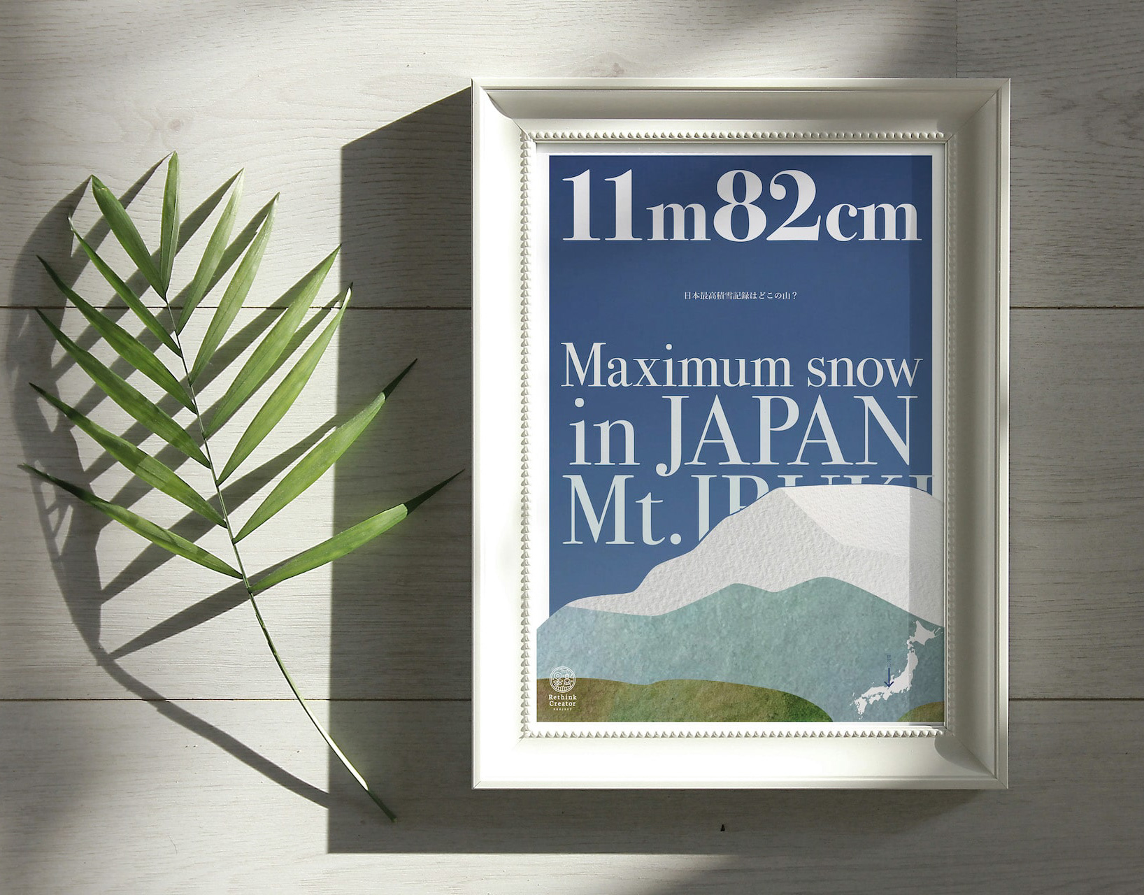
220
220は特殊な触媒を用いて飲料の味を変化させる魔法のマドラーです。数秒かき混ぜるだけでワインが熟成されたような味になります。プロダクトデザインは秋田道夫氏、ブランディングを弊社が担当しました。220 is a magic muddler that uses a special catalyst to change the taste of beverages. Just a few seconds of stirring is all it takes to make wine taste like it has been aged. Product design was done by Michio Akita and branding by our company.
You may also like
LAKE GLASS MUSEUM
琵琶湖のレイクグラスを展示するミュージアムとして、米原駅の構内にあるびわこ一周レンタサイクルに設置しました。自転車でビワイチをしながら琵琶湖に立ち寄ってもらいレイクグラスを探してほしい。そして持ち帰ってきたものを展示できるスペースです。This museum displays Lake Biwa lake glass and is located on the Biwako round-the-bike rental bicycle located in the premises of Maibara Station. We want people to stop by Lake Biwa while doing the Biwaichi by bicycle and look for lake glass. This is a space where they can then display the items they bring back.
2022
Cosmopolitan Tourism R&D
国際観光政策研究所のロゴデザインです。CとTを組み合わせて地球のように見せています。Logo design for the Institute for Cosmopolitan Tourism R&D, combining the C and the T to look like the earth.
2015
CORTE HOME
コルテホームは、自分らしいライフスタイルを提案する住宅のブランドです。
ブランドロゴをはじめとする、ブランド構築を担当しました。
2017
SAKAEYA
肉サカエヤのCIデザインを担当しました。牛という文字を使いながら和にならない洋のイメージを感じさせるデザインとし、ナイフで切ったような手作り感、クラフト感のあるロゴデザインとしています。We designed the CI for Sakaeya Meat shop. The logo design uses the character for "beef" but gives a Western image that is not Japanese, and has a handmade, crafty feel as if it were cut with a knife.
2019
Golden Sesami AYU
金ごまあゆは、琵琶湖産の小鮎の佃煮に、ごまをまぶした商品です。ご飯にのせたりして食べると美味しいのでその姿をパッケージデザインとしました。Golden Sesami Ayu is a tsukudani, a small sweetfish from Lake Biwa, sprinkled with sesame seeds. It is delicious when eaten over rice, so we designed the package to look like that.
2021
3 Glass Base Award Gift
2014
AYU KIMURA SHOPPING BAG
あゆの店きむらのショッピングバッグをデザインしました。マチ部分の柄とシームレスにつながるでざいんです。8角形の形は生け簀の形を図案化したものです。We designed a shopping bag for Ayu Kimura. The octagonal shape is based on the shape of a fish tank.
2019
YASHIMA BRANDING
屋島山頂の各店舗に統一的な暖簾、日除け幕を設置し、販売用の手ぬぐい、バッジも制作しました。それらは伝統工芸「讃岐のり染め」の大川原染色本舗さんに制作いただいたものです。
屋島のノスタルジックで少し寂れたイメージに合いつつも、モダンと和を併せ持ったイメージです。青色階調の差を生かした背景色と、 台形のシンボル形体の組み合わせで考えたものです。
メインモチーフの台形は屋島をシンボリックに力強く表現したもので、伝統建築の反り屋根のようでもあります。カーブをつける
ことで和の印象を強めています。単体でも反復の繰り返しでも、様々な媒体などに展開されてゆくイメージで、強く柔軟に様々な
ものに展開できるデザインとなっています。
背景は、「屋島をひらく」のブランドステートメントに呼応する舞台幕が開かれるようなイメージです。
この10年にわたる高松市の尽力により高松市屋島地区が、全国の優れた都市景観の事例を表彰する「都市景観大賞」で、大賞の国土交通大臣賞に選ばれました。香川県内では初の大賞受賞だそうです。
We set up a unified curtain and sunshade at each store on the top of Mt. Yashima, and also produced tenugui hand towels and badges for sales.
These were produced by Okawahara Dyeing Honpo, a traditional craftsman of "Sanuki Nori Dyeing".
The image of Yashima is nostalgic and a little desolate, yet modern and Japanese at the same time.
The background color is a combination of different shades of blue and the trapezoidal shape of the symbol.
The Yashima district of Takamatsu City was selected for the Minister of Land, Infrastructure, Transport and Tourism Award, the grand prize of the Urban Landscape Awards, which recognize outstanding examples of urban landscapes from across Japan. This is the first time that an area in Kagawa Prefecture has won the grand prize.
2023
KAITSUBURI
滋賀県の県鳥「カイツブリ」のペーパーウェイトです。彦根市のバルブ産業のメーカーで鉛フリー合金の銅ビワライトを用いて制作しました。使うほどにエイジングして味わい深い表情になります。
This is a paperweight of "Kaituburi", the prefectural bird of Shiga Prefecture. It was produced by a manufacturer of valve industry in Hikone City using copper biwaite, a lead-free alloy. The more you use it, the more it will age and take on a tasteful look.
ご購入はこちら
To purchase, please visit
https://www.creema.jp/item/3607196/detail
2014
uluru
真っ赤なブビンガのカタマリを見て、エアーズロックに見えました。
世界最大級の一枚岩が夕焼けに染まるこんな写真が浮かんだのです。
ブビンガはエアーズロックになりたがっていた。と私は思いました。
そんな思いつきから生まれた素材を活かしたペーパーウェイトです。
I saw the bright red Bubinga Katamari and it looked like Ayers Rock.
This photo of one of the world's largest monoliths colored by the setting sun came to mind.
Bubinga wanted to be Ayers Rock. I thought.
This is a paperweight that makes use of materials born from such an idea.
2008