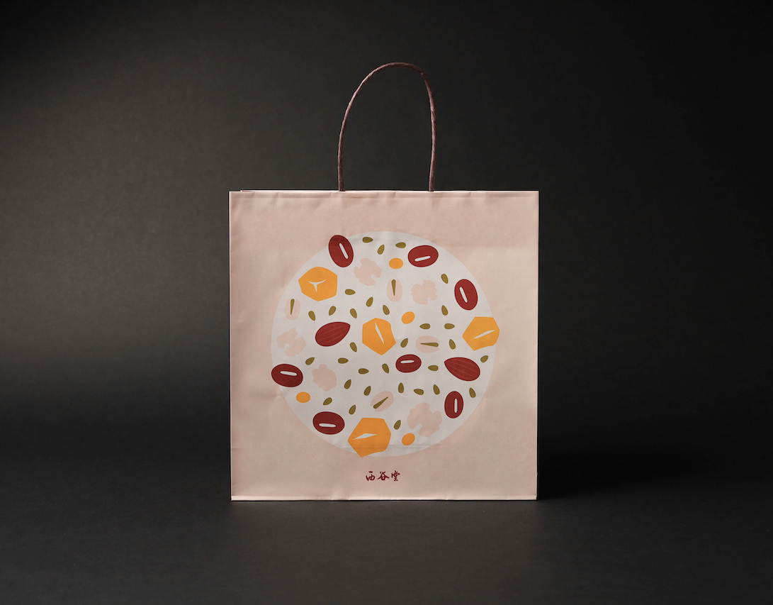
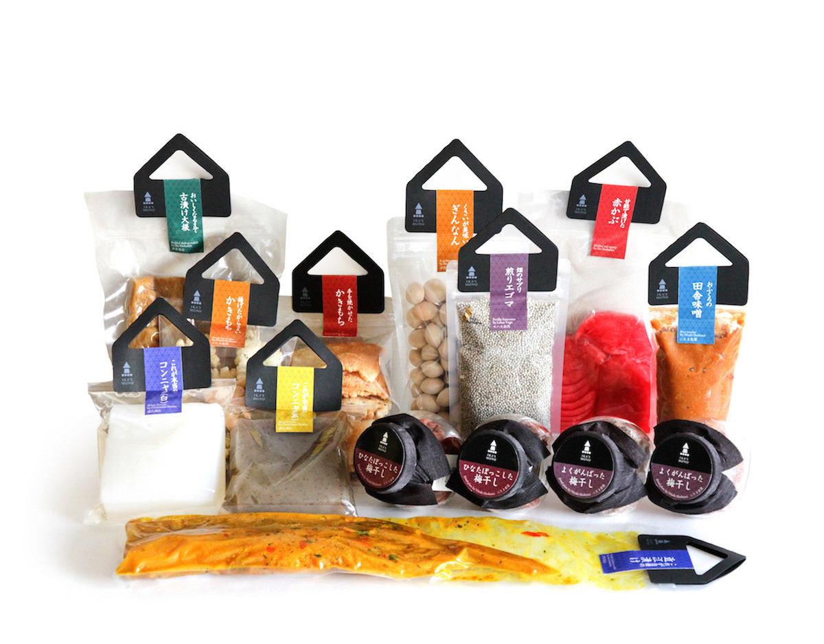
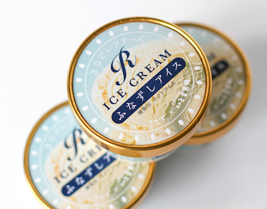
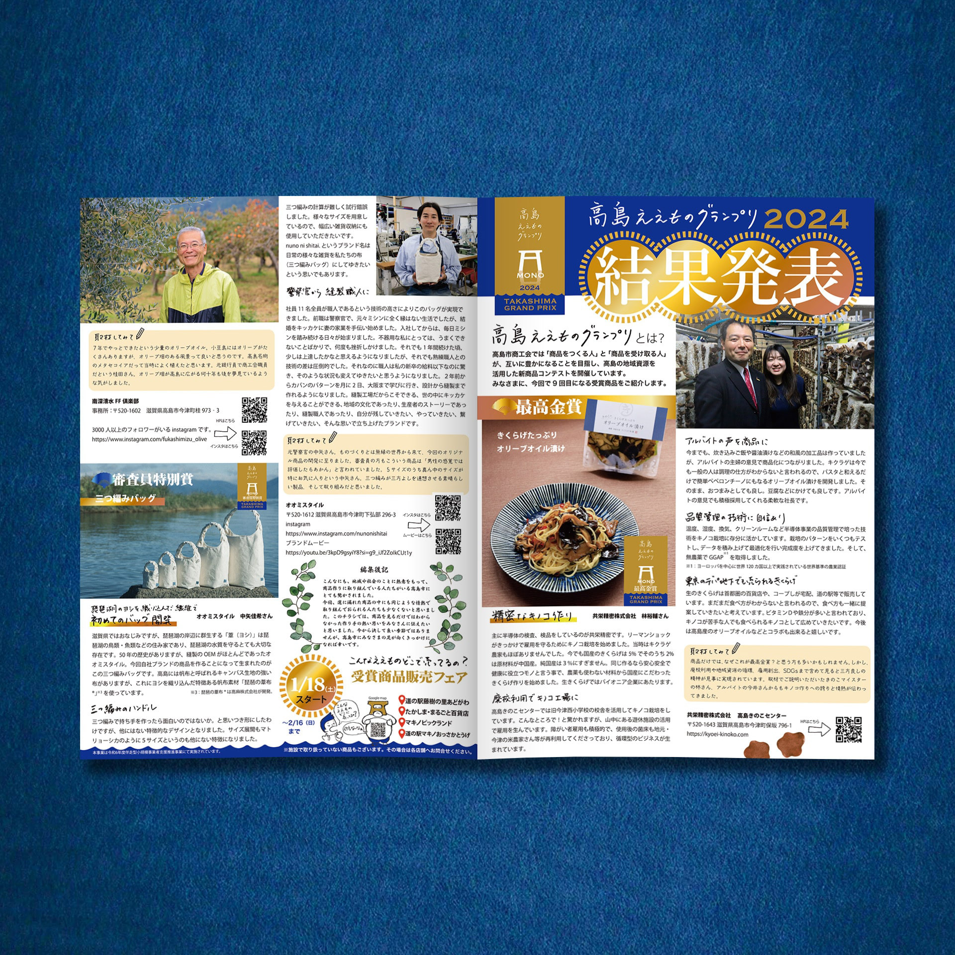
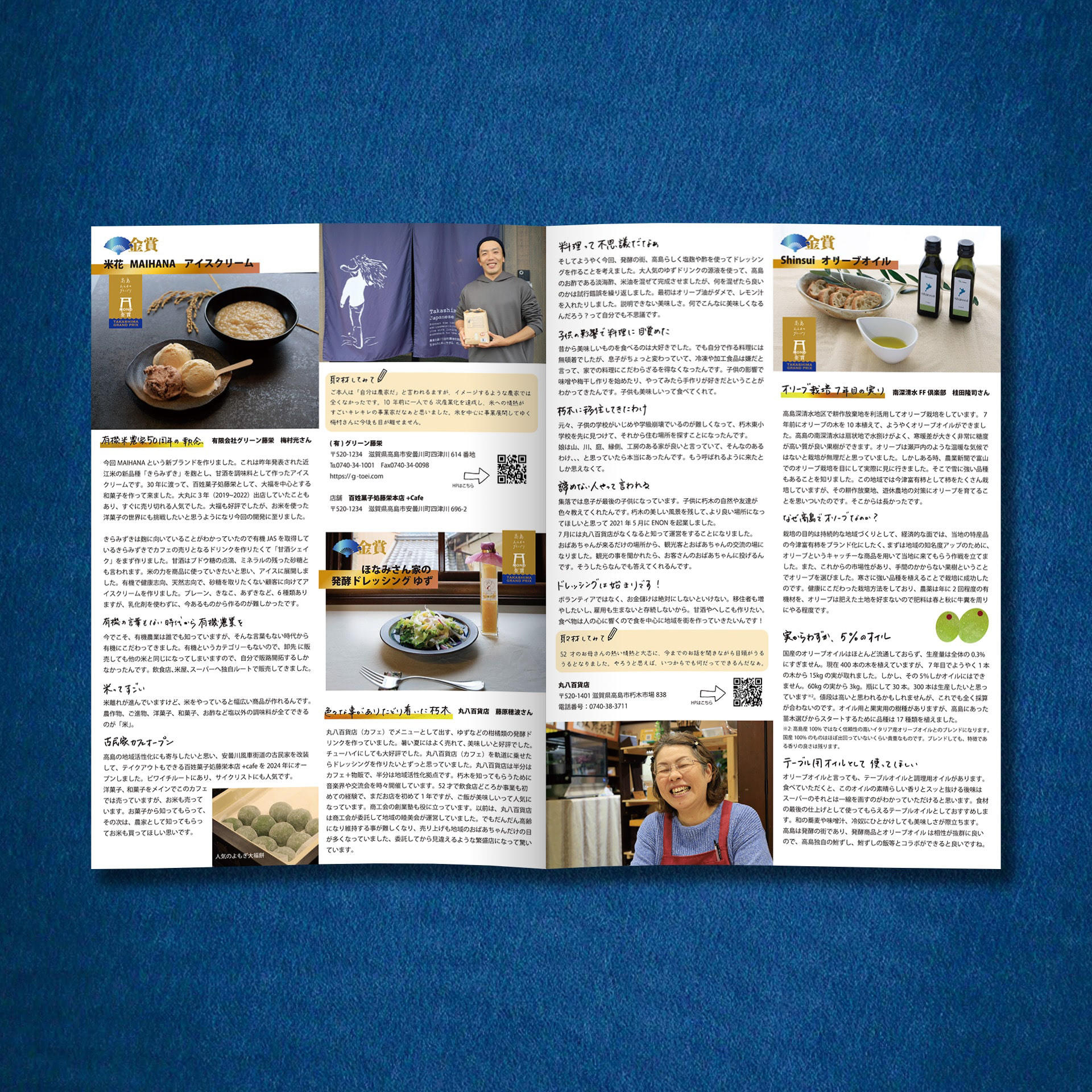
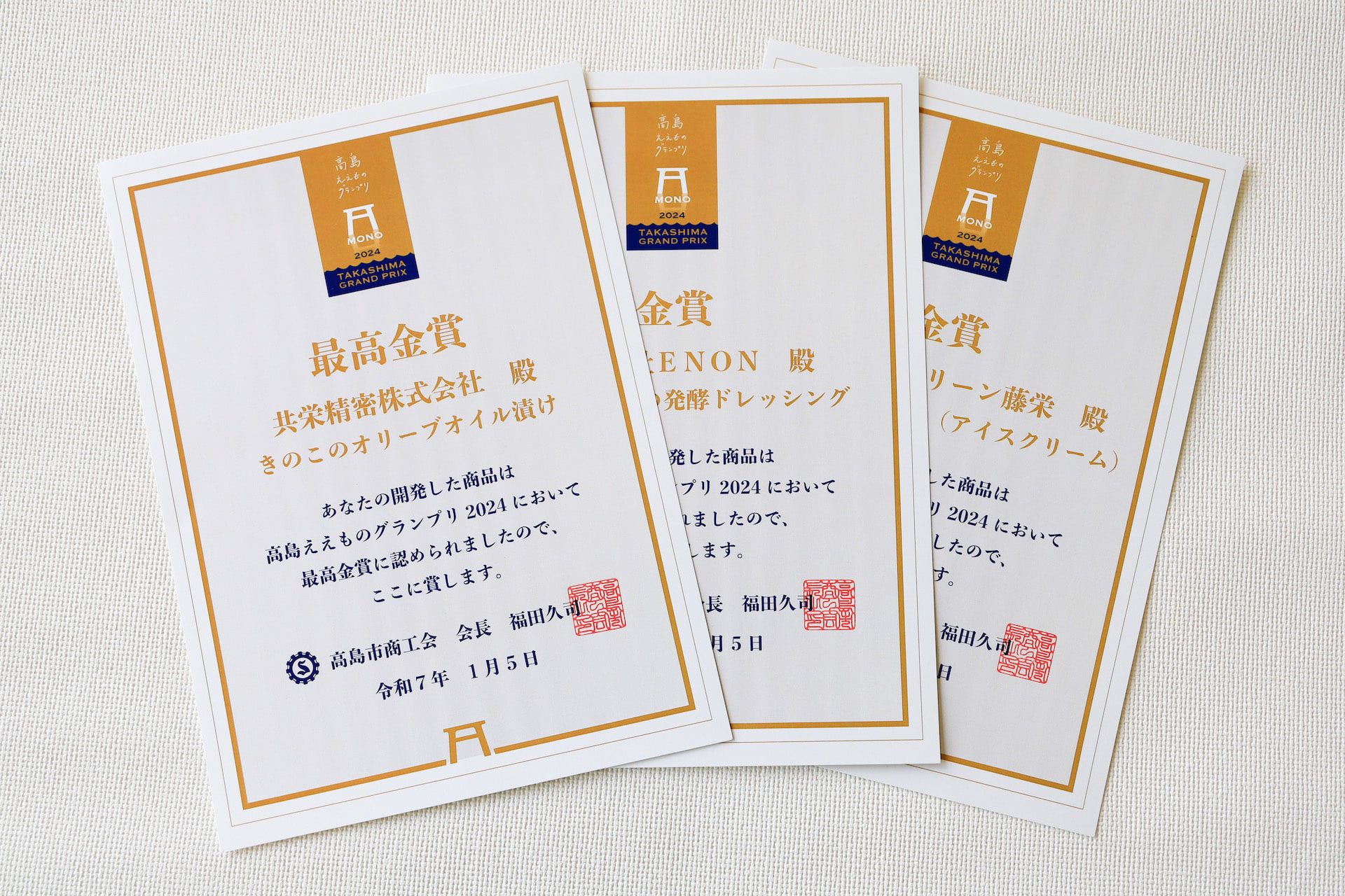
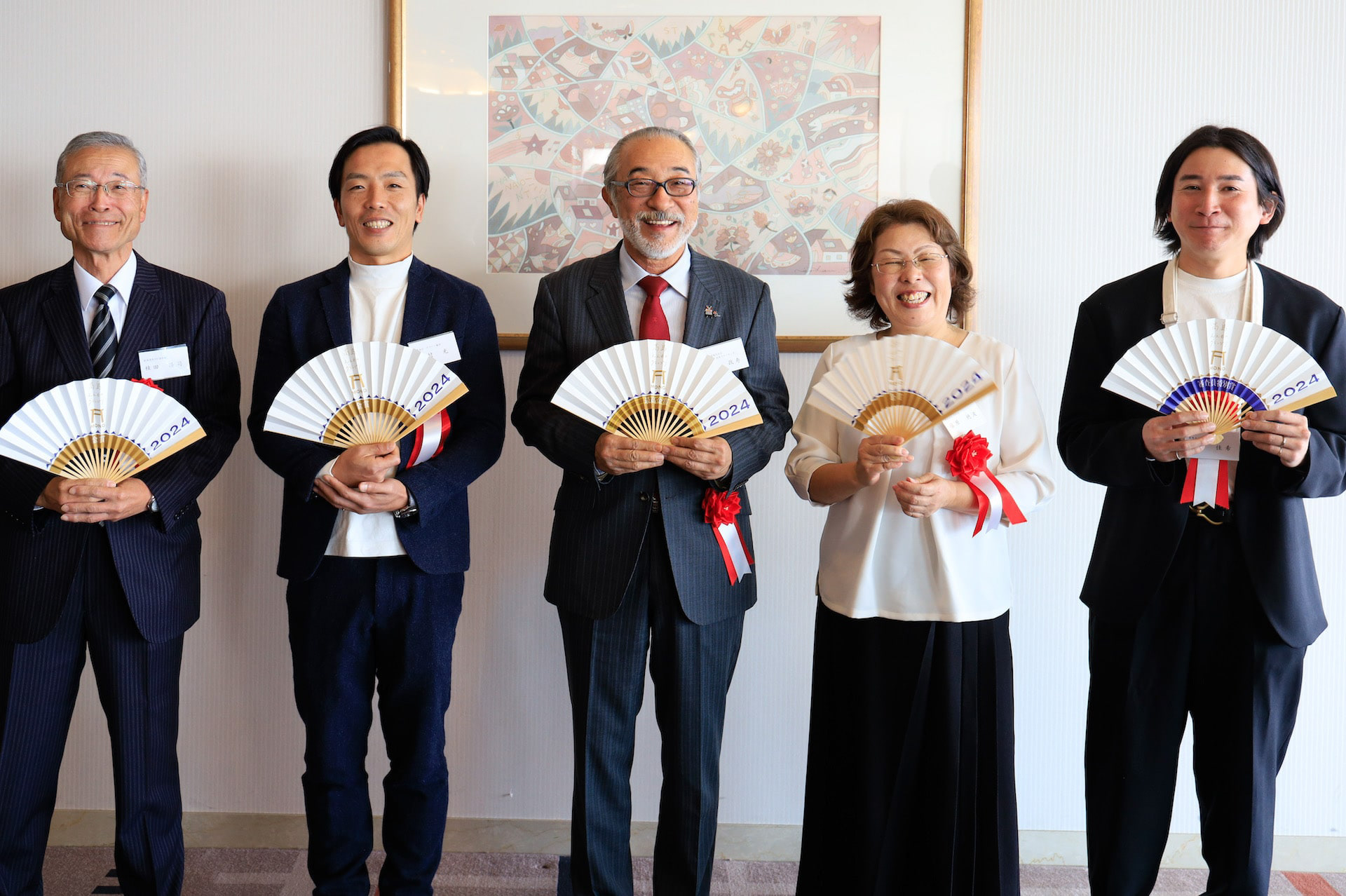
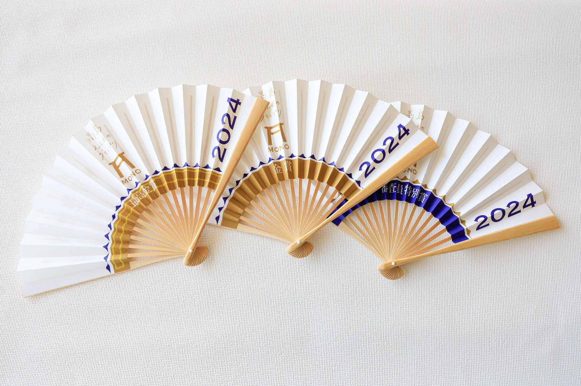
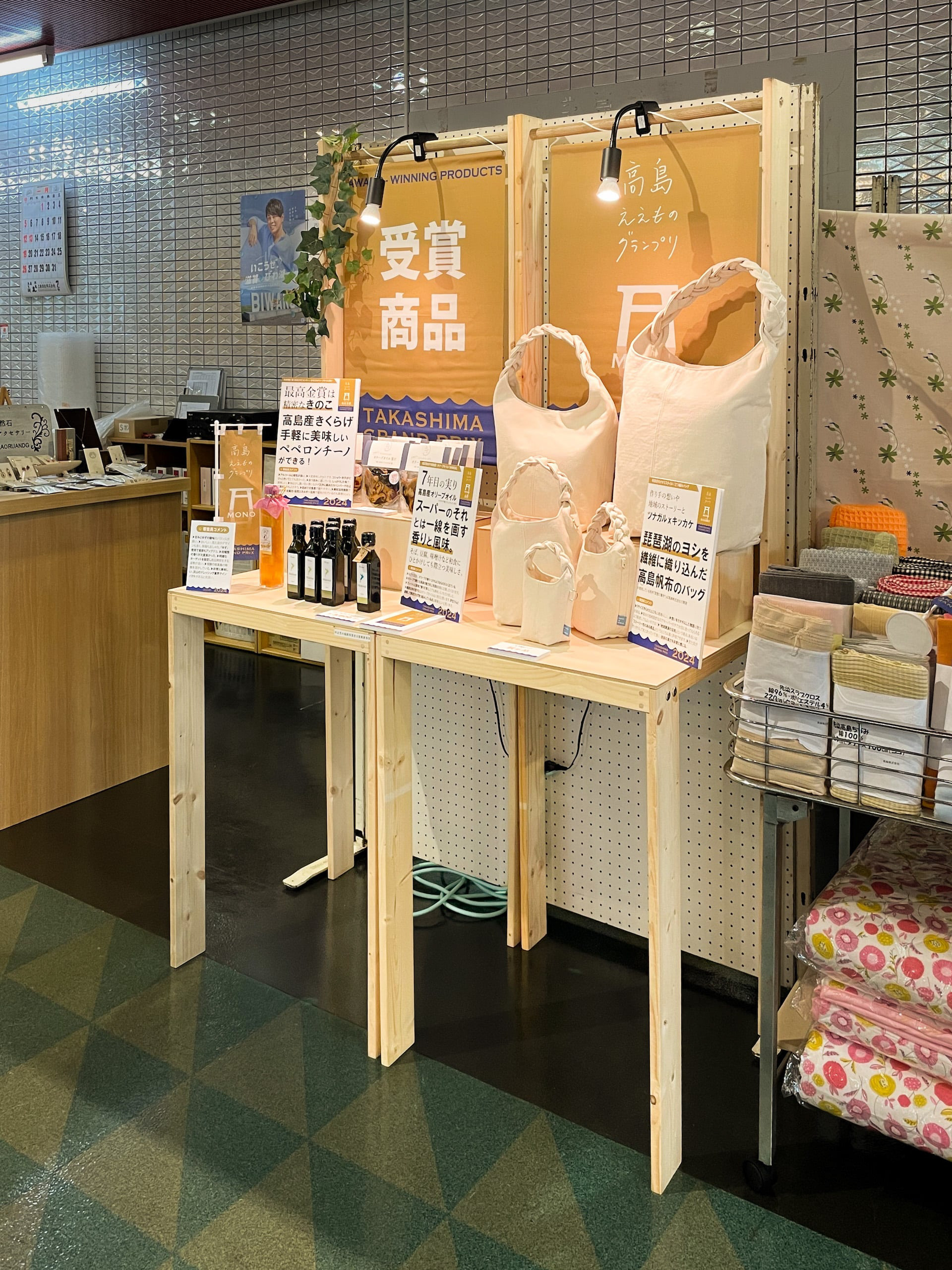
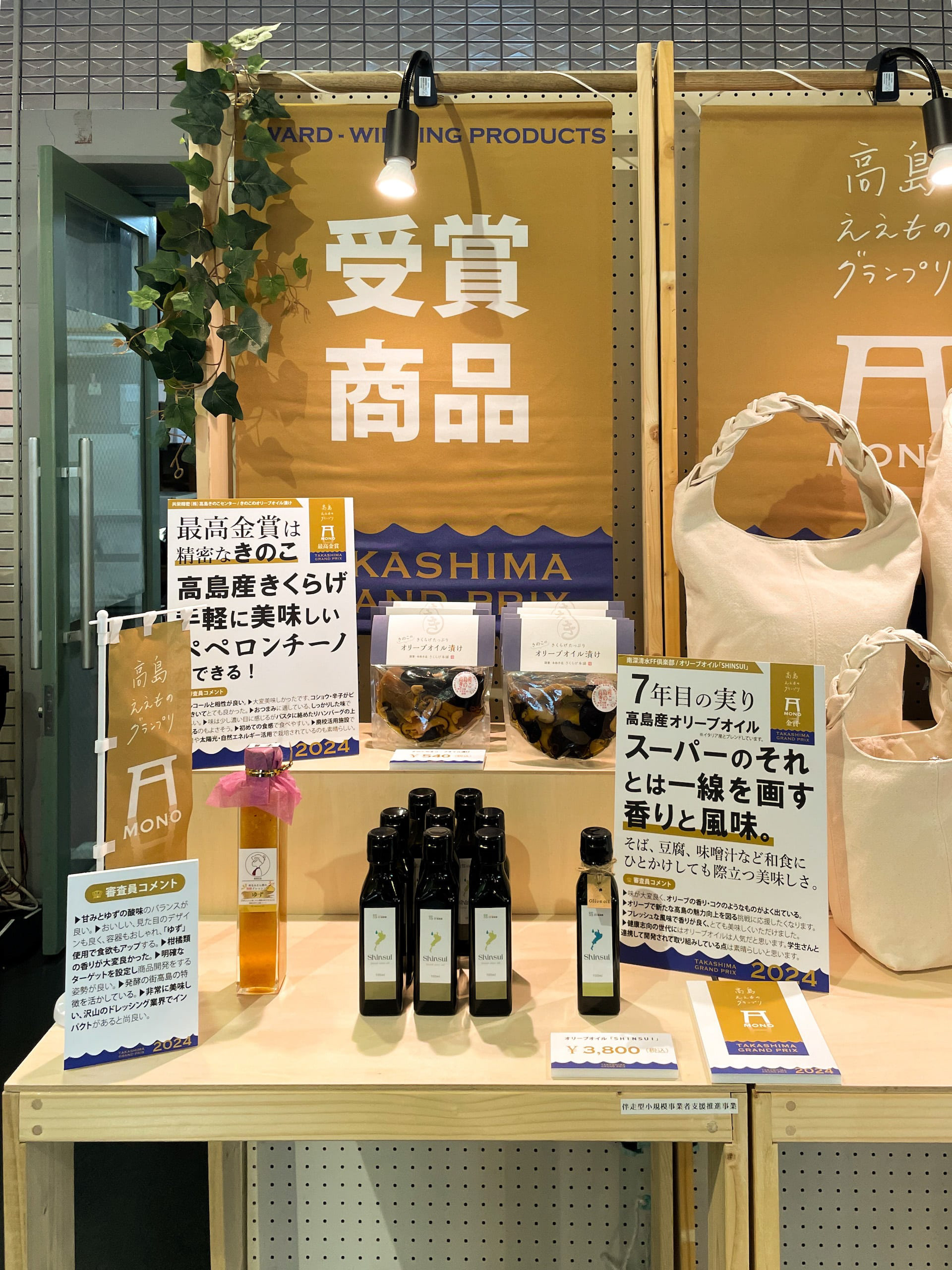
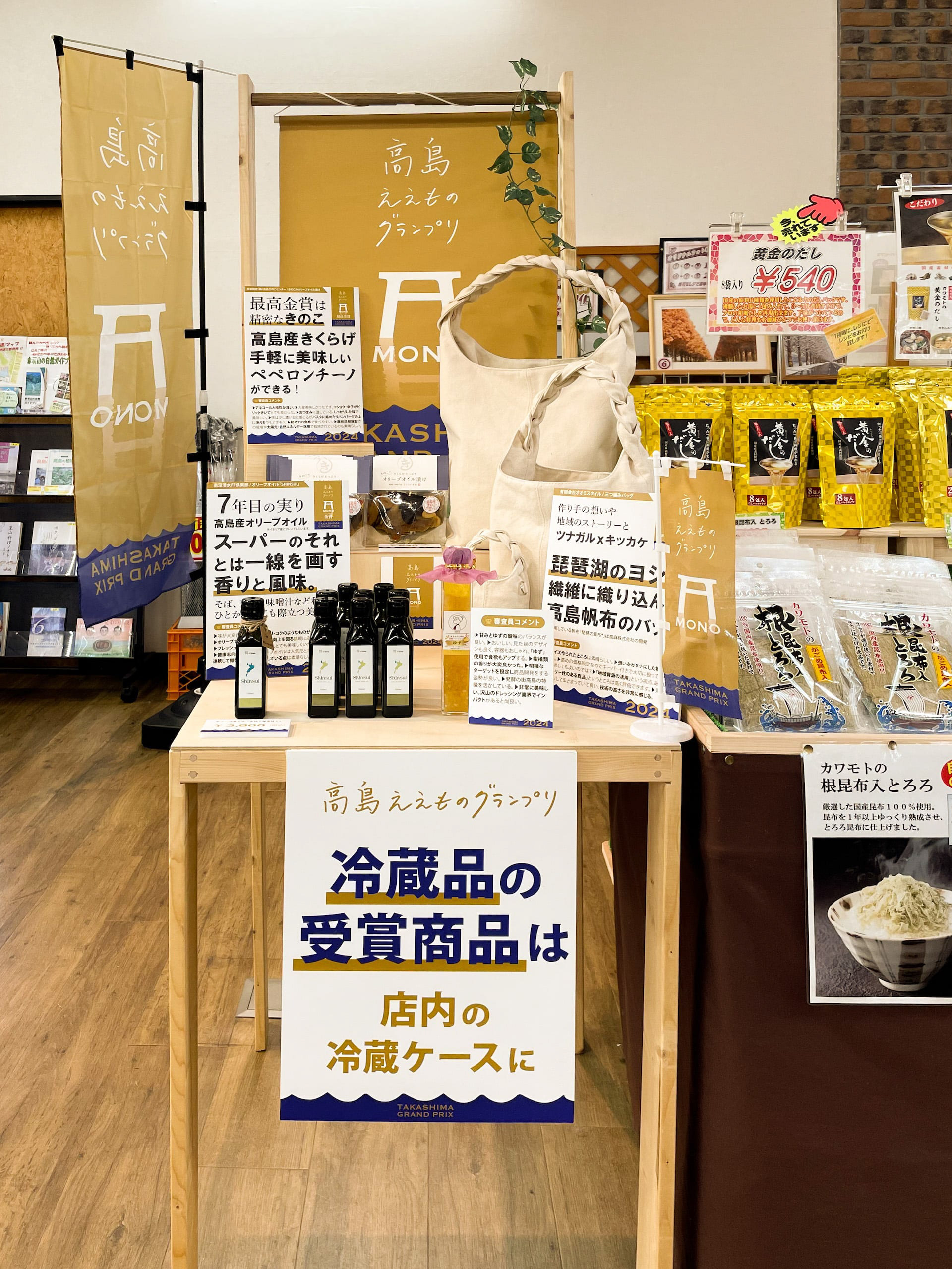
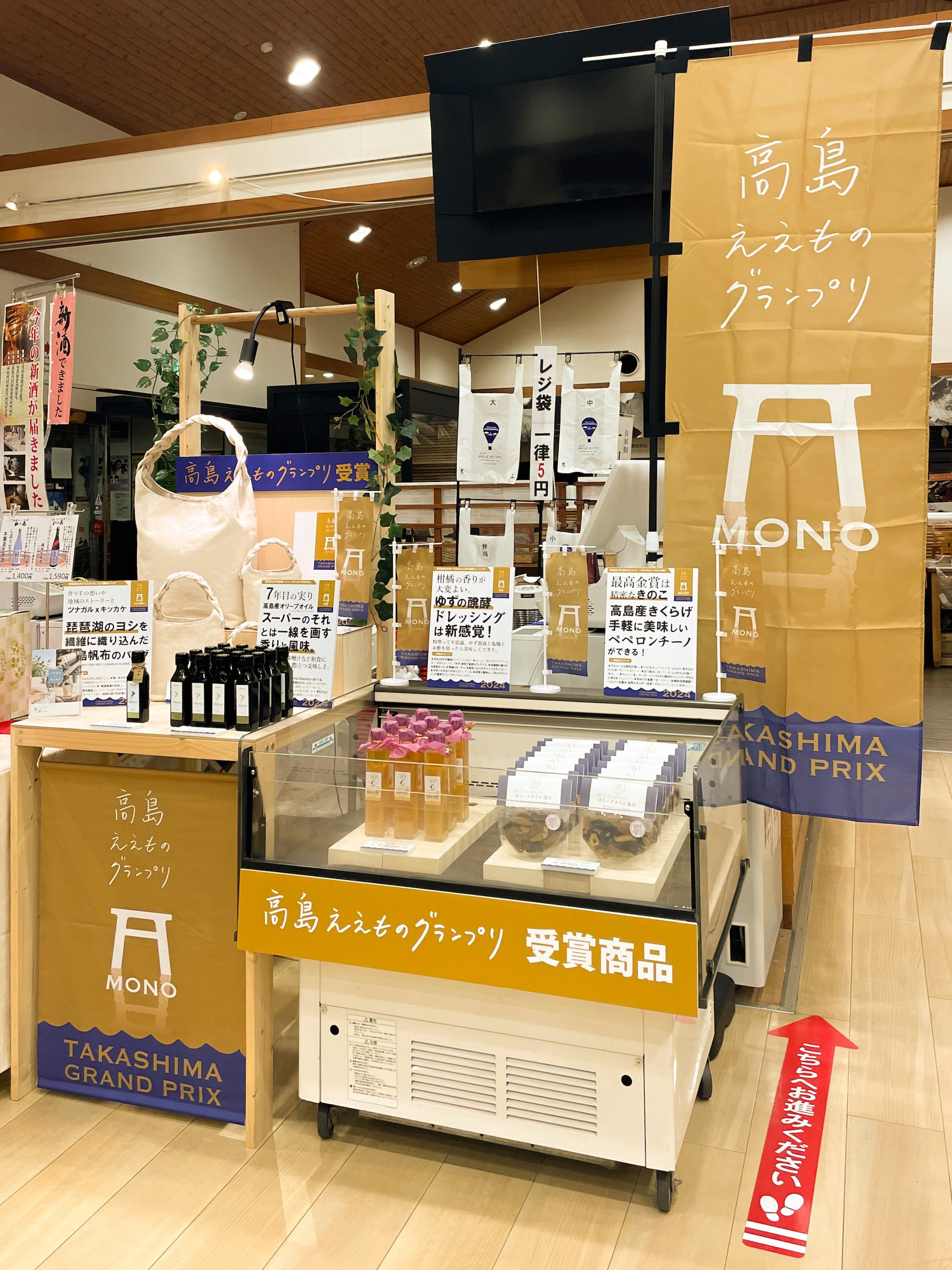
You may also like

Miso soup with Seta shijimi
琵琶湖のセタシジミを使ったインスタントの味噌汁です。しじみの殻をデザインとして使いました。高級なしじみなので金色にしています。This instant miso soup is made with Lake Biwa's seta shijimi clam. We used the shells of shijimi clam as a design. The color is gold because of the high quality shijimi clam.
2020
HOP VISA
これはHOP VISAカードリニューアル指名コンペでの案です。滋賀の美しい緑、田園風景を水彩画を用いて表現したものです。手描きの四角い不均一なマス目が重なったりにじんだりして、一つの自然を形成しているようなイメージです。このようなおおらかさこそが滋賀のイメージであり、今までの緑のvisaカードのイメージも踏襲しながら、若々しく優しい、滋賀と、平和堂の空気感を表現できていると思います。This is a watercolor rendering of the beautiful green, rural landscape of Shiga. The image is of hand-painted squares of uneven squares overlapping and blurring to form a single natural feature. This kind of generosity is the image of Shiga, and I think it expresses the youthful and gentle atmosphere of Shiga and Heiwado, while also following the image of the existing green visa cards.
2023
VEHICLEN
室内用子供乗用玩具です。 中は収納で引出しになっていてお尻のほうから引き出せます。 オモチャなどを楽しく片付けながら遊べる乗り物です。 つののように張り出した部分は把手になっており、つかんで走ります。 子供の乗り物を考えるにあたって、子供の乗り物は暮らしの中で邪魔なものである。 あるいはいつか邪魔になる。と思っていました。 ですので、有用な引出し型の収納が走れば良いなと思っていたのです。 そして、子供は引出しが大好きなのです。 出来るだけコストを抑えるためにシンプルな板のみで作ろうと思いました。 でも、考えていくうち、少しずつ、箱が斜めになったのでした。 その方が、角がなく乗り心地も良いのです。
2007
BIWAKO HOMARE
近江茶 琵琶湖ほまれのパッケージデザインです。茶の栽培地である、三重県境から琵琶湖まで繋がっているというイメージを水彩画で表現しました。This is the package design for Omi Tea Biwako Homare. The image of the connection from the border of Mie Prefecture to Lake Biwa, where the tea is grown, is expressed in watercolor.
2021
Root Cowaorking
2017
OMI MAIKO
近江米粉は滋賀県の近江米を使った米粉です。ロゴデザインやパッケージデザインを担当しました。Omi Rice Flour is a rice flour made from Omi rice in Shiga Prefecture. We were in charge of logo design and package design.
2015
JAPAN-FRANCE 150th
2008年日仏交流150周年記念ロゴマークの応募案です。日本国旗とフランス国旗の融合をデザインしました。This is a proposal for a logo mark to commemorate the 150th anniversary of Japan-France relations in 2008. The design is a fusion of the Japanese and French flags.
2008
BRANCH
「枝」を意味する店名のロゴデザイン。花屋さんでありますので「枝、森、花」そのどれもを感じさせる明るいデザインとしました。 Logo design for a store name meaning “branch. As a florist, the logo is bright and evocative of “branches, forests, and flowers. 为一个意为 “枝条 ”的店名设计徽标。 作为一家花店,徽标色彩明亮,令人联想到 “树枝、森林和鲜花”。
2024
Adam&Eve Bottle
2008
KUROBUTA
段ボール箱のベロを差し込む部分を豚の鼻に見立てて、黒豚を立体的にパッケージ全体に描くデザインとしました。 既存のロゴに使われている豚の鼻、目、放射状の装飾をパッケージにあしらうことで、ロゴとパッケージがつながる統一的ブランディングとしています。お尻の側に社名と、尻尾を描いています。箱を開けるときに鼻を引き出すと「THNAK YOU」の文字が見えるようにしています。 お店にパッケージが並んでいる際も、豚がたくさん並んでいるように見え、可愛く、遠目にも目を引くデザインとなっています。 もらったあとも取っておきたいパッケージということで、極力商品名や社名は前面に出さないことを意図しており、段ボール製の収納用品として販売していそうなものを目指し、シンプルで抽象的なデザインとしています。それゆえ、ギフトボックス以外の、壁面デザインやのぼりなど、様々な媒体に展開しやすいものになっています。 段ボールのクラフトの地色を活かしたナチュラル感のあるデザインにしており、素材の良さを感じさせるものです。 The design depicts a black pig three-dimensionally on the entire package, using the part of the cardboard box where the tongue is inserted as a pig's nose. The pig's nose, eyes, and radial decorations used in the existing logo are used on the package to create a unified branding that connects the logo and the package. The company name and tail are drawn on the butt side. When the box is opened, the nose is pulled out to reveal the words "THNAK YOU. When the package is lined up in a store, it looks like a bunch of pigs, which is cute and eye-catching from a distance. The design is simple and abstract, aiming for something that would be sold as a cardboard storage product. Therefore, the design can be easily applied to a variety of media other than gift boxes, such as wall designs and banners. The design has a natural feel, taking advantage of the ground color of the corrugated kraft, and gives a sense of the quality of the material.
2023
Back to Top