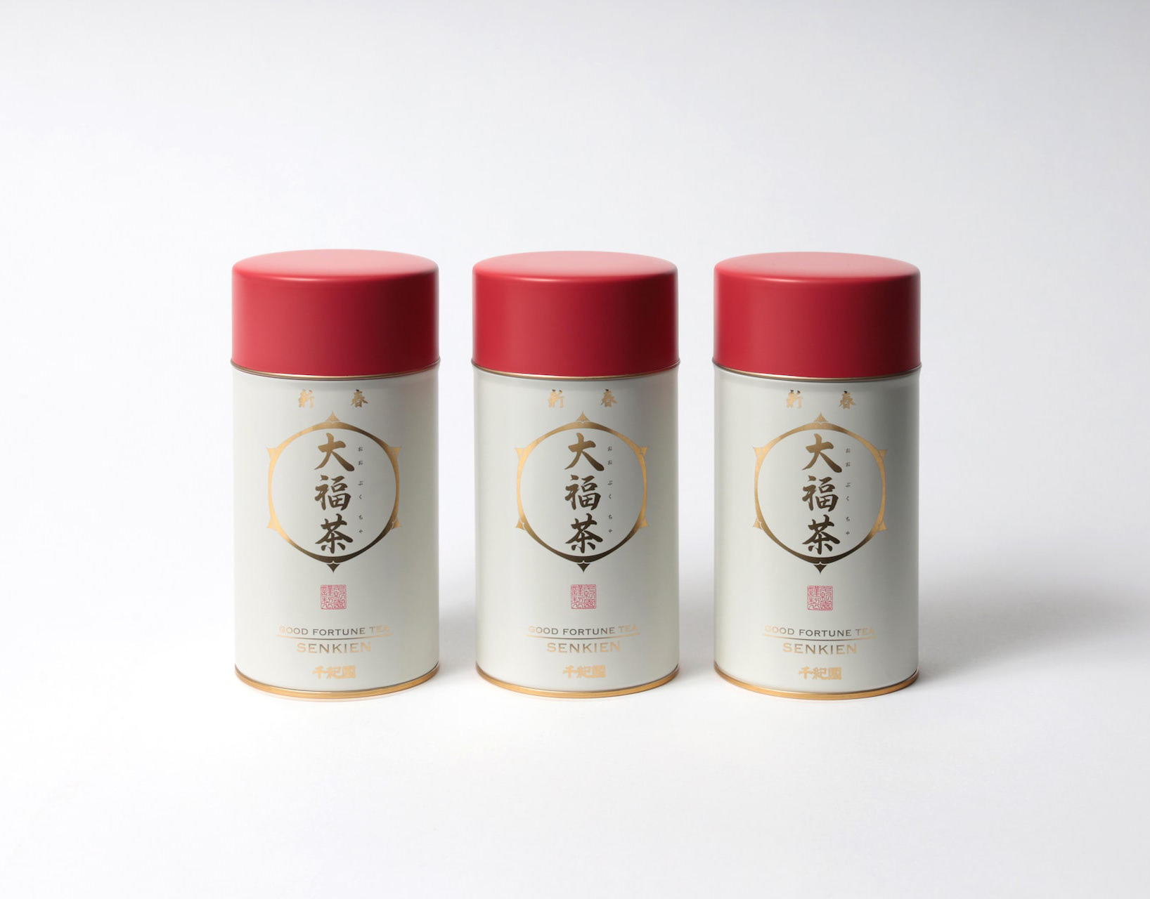
You may also like

DEN-EN KITCHEN
den-en kitchen ロゴデザイン。おうみ福祉会の新施設、きみいろ内に併設されたden-en kitchen(田園キッチン)のロゴデザインを担当しました。田んぼの田を両手で抱き抱えるような暖かさを感じさせるデザインです。のどかな田園風景に溶け込むカフェは、どなたでもご利用頂けます。Logo design for den-en kitchen.We designed the logo for den-en kitchen (Den-en kitchen), which is located in Kimiiro, a new facility of Ohmi Fukushi Kai.The design evokes a warm feeling of embracing the rice paddies with both hands. The café blends into the peaceful countryside and is open to everyone.
2023
TOKAN
これは、信楽焼の陶器で出来た厨子(仏壇)です。 陶器の気品と重厚感が仏壇に存在感を与えています。 現在の住宅事情にあっても、置き場所をとらず、みんなの集まるリビングにおいても違和感がなく、 小さくとも確かな気品と存在感は陶器ならではのものです。
2007
AYU KIMURA SHOPPING BAG
あゆの店きむらのショッピングバッグをデザインしました。マチ部分の柄とシームレスにつながるでざいんです。8角形の形は生け簀の形を図案化したものです。We designed a shopping bag for Ayu Kimura. The octagonal shape is based on the shape of a fish tank.
2019
GINDAWARA
釜炊き近江米 銀俵のロゴをデザインしました。シンボルマークは米俵を横から見た姿。銀俵の文字は古い文字から引用しました。We designed a logo for GINDAWARA. This restaurant cooks rice in a Shigaraki earthenware pot. The symbol mark is a side view of a rice bale. The letters of "Ginbawara" are taken from old characters.
2019
YUTANPO
磁器の湯たんぽのデザインです。布団の中へ入れて使用する湯たんぽですが、多くの湯たんぽは、蓋の部分が突起として出ています。その出っ張りをなくし、人が触れる形状としてもっともあってほしかった形態を目指しました。This is a porcelain hot water bottle design. Most hot-water bottles are placed in a futon and the lid of the bottle protrudes from the futon. We eliminated the protrusion and aimed to create a shape that people can touch.
2012
LAKE BIWA TROUT
琵琶湖の宝石と言われるビワマスを使った缶詰です。サーモンのようなピンク色に白い筋の入った身をパッケージにもデザインしました。This canned product is made from Biwa trout, the jewel of Lake Biwa. The pink, salmon-like color with white streaked flesh is also designed into the package.
2021
TAKASHIMA A MONO GP 2024
高島ええものグランプリ2024のブランディングを担当しました。 今回は受賞者への取材を記事にし、商品を見るだけではわからない作り手の熱い想いやストーリーを大切に伝えようと考え、高島市内の道の駅への集客に新聞折込のB3チラシをデザインしました。また道の駅の専用什器、POPなど売り場のデザインもしました。 また、受賞者へは、「センスがええ」ということで高島産のセンスと賞状、副賞がプレゼントされました。 We were in charge of branding for the Takashima Eemono Grand Prix 2024. This time, we turned interviews with the winners into articles, with the aim of conveying the passion and stories of the makers that cannot be understood just by looking at the products, and designed a B3 flyer to be inserted into newspapers to attract customers to roadside stations in Takashima City. In addition, the winners were presented with Takashima-made products, a certificate, and a prize in recognition of their "good sense. "我们负责 2024 年高岛艾莫诺大奖赛的品牌推广工作。 这次,我们采访了获奖者并撰写了一篇文章,还设计了一张 B3 传单,刊登在报纸上,以吸引顾客前往高岛市的路边车站。 我们还在路边车站设计了专用固定装置、POP 和其他销售区域。 我们还向获奖者颁发了 “时尚感”、证书和额外奖品,所有这些都是高岛制造,以表彰他们的 “时尚感”!
2025
TOFU ICCHO
和紙でできたノート豆腐一帳のロゴデザイン。 エッジがピンとしつつも、中身はやわらかい、そんな豆腐のような手作り感のあるロゴを目指してデザインしました。
2014
Root Cowaorking
2017
MOTONOKI MOCHI
本之木餅は菓匠禄兵衛における長年ベストセラー商品です。 そのリニューアルデザインを担当しました。 今までの商品同様赤をベースに金との組み合わせは変えませんが、箱の型に抜きを使うことで立体感ある仕上がりに、印刷にもツヤニスを多様することで光の当たり方で浮かび上がる深みのある演出としました。 今までの印象を損なわず、さらに表現を進化させたデザインとしています。 お菓子は、ふっくらと炊き上げた粒あんを、餅粉入りのもっちり生地で包み、焼き上げたものです。8個入りと5個入りがあります。 Motonoki Mochi has been a best-selling product of Kasho Rokubei for many years. We were in charge of its renewal design. The red base color is the same as the previous products, and the combination of gold and gold is the same, but the box is die-cut to give it a three-dimensional finish, and a variety of glossy varnishes are used in the printing to create a deep effect that comes to life when the light hits it. The design has evolved further in expression without losing the impression of the past. The confectionery is made by wrapping softly cooked sweet bean paste in mochi dough and baking it. 8 pieces and 5 pieces are available.
 Motonoki mochi (红豆沙馅麻糬)多年来一直是 Kasho Rokubei 的畅销产品。 我们负责其更新设计。 与以前的产品一样,金色和红色底色的组合保持不变,但在包装盒上使用了模切模具,使其具有立体感,印刷时使用了亮光漆,产生了深邃的效果,在光线照射下栩栩如生。 设计在表现形式上有了进一步的发展,但又不失过去的印象。 这种点心是用煮软的甜豆沙,裹上麻糬粉烘烤而成。
2025
Back to Top