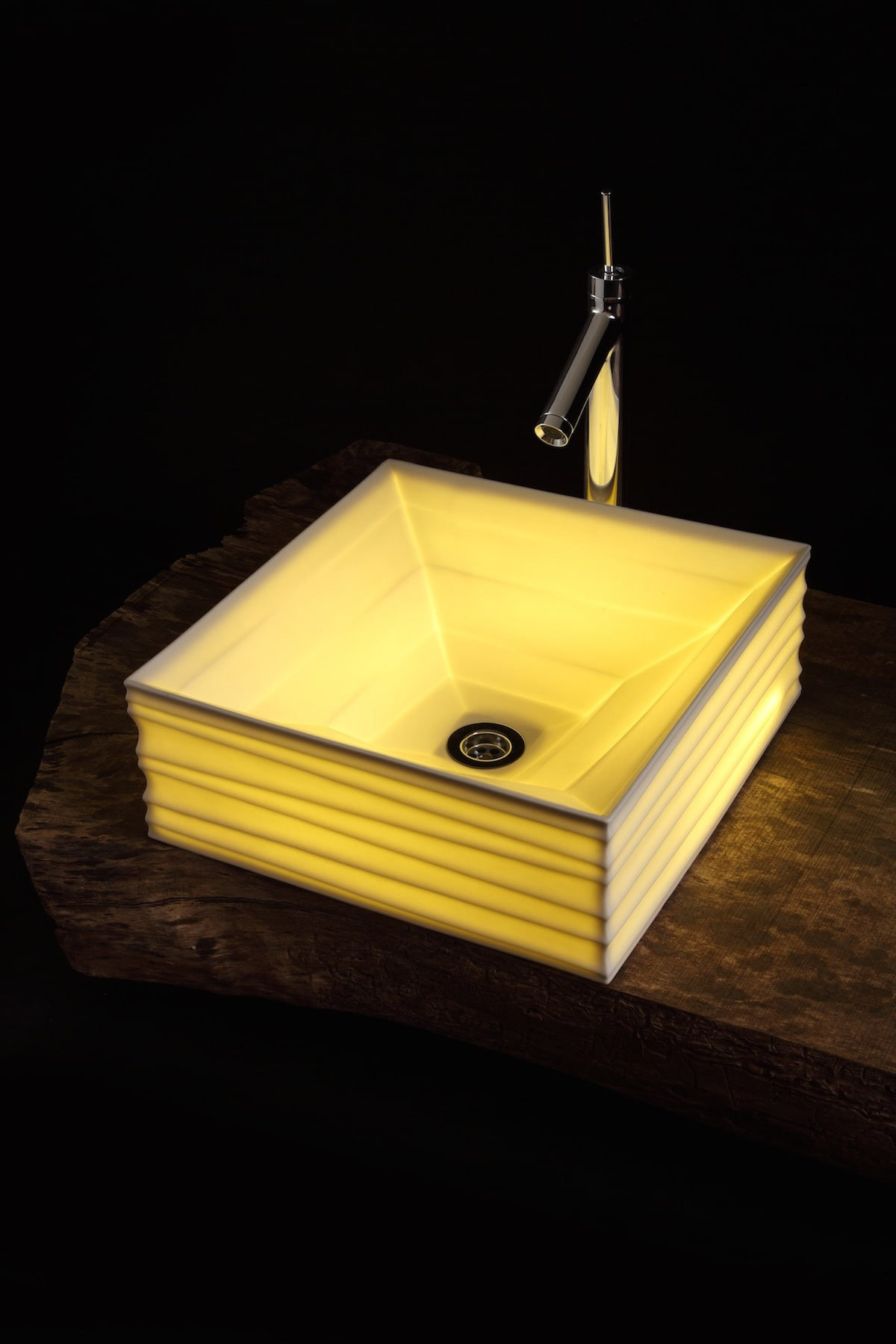
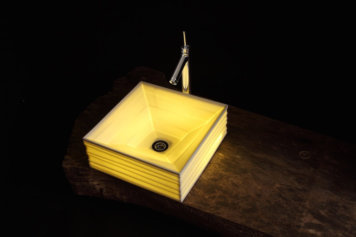
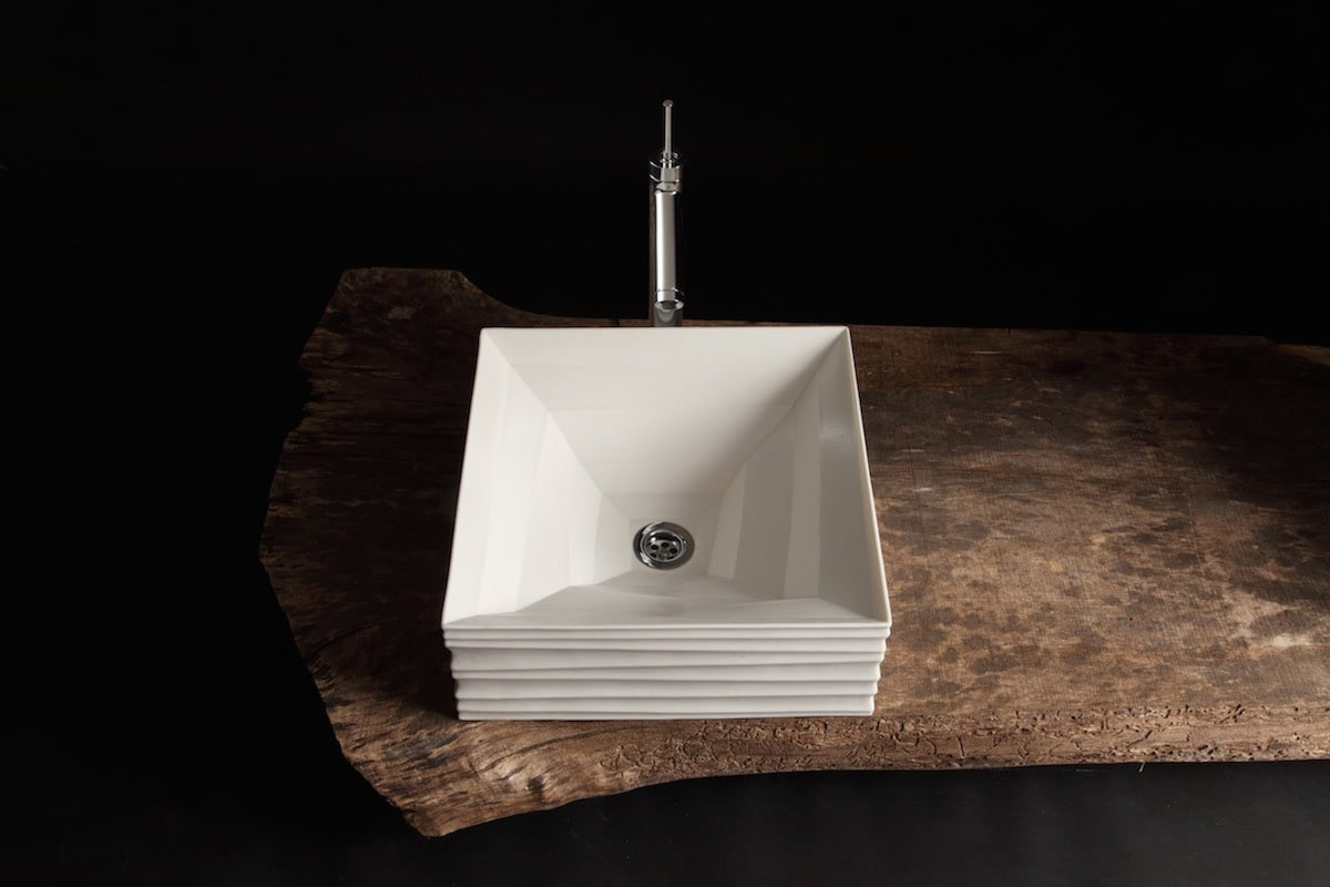
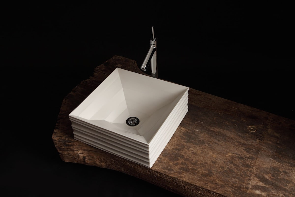
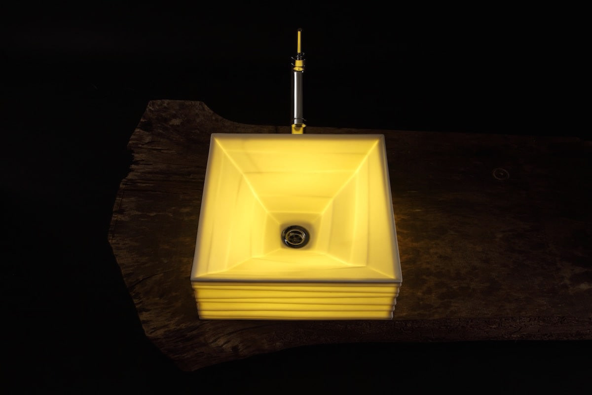
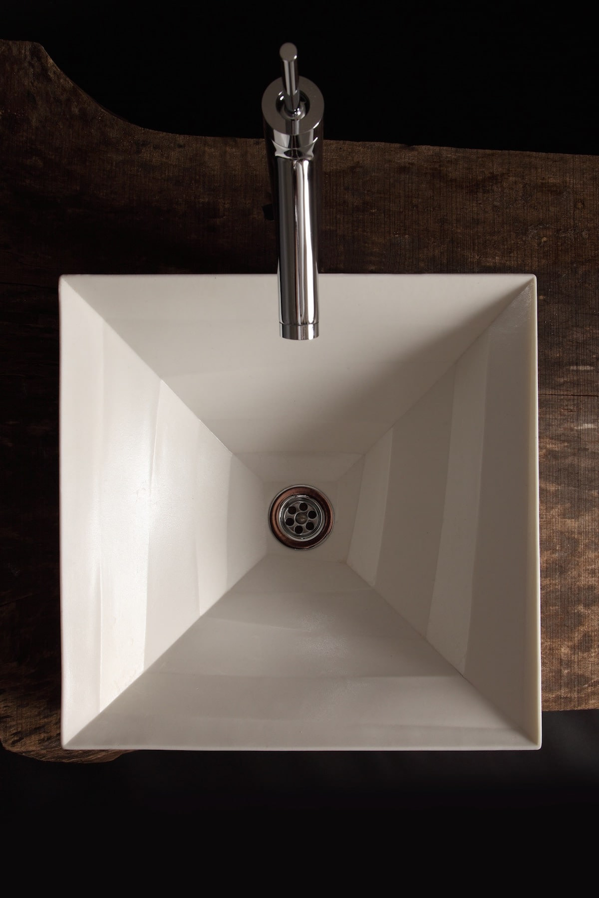
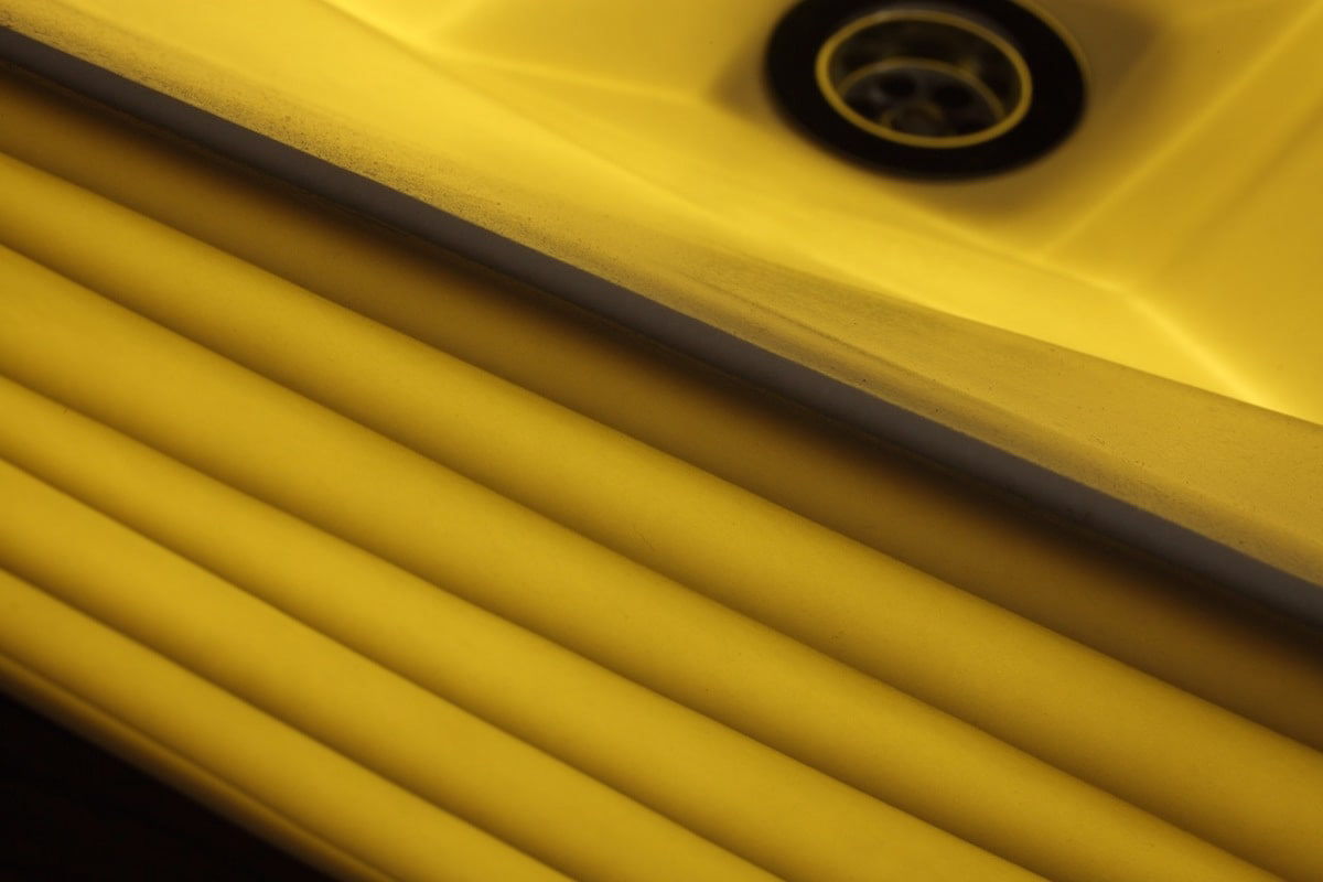
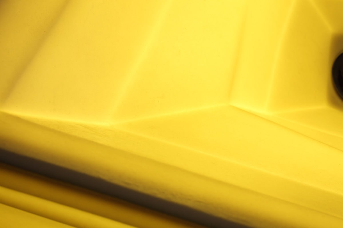
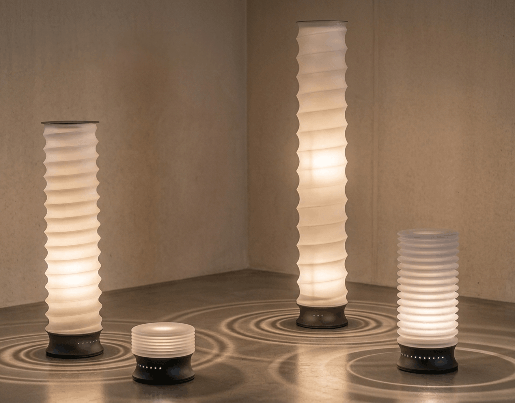
You may also like

CORTE HOME
コルテホームは、自分らしいライフスタイルを提案する住宅のブランドです。 ブランドロゴをはじめとする、ブランド構築を担当しました。
2017
AYU in Olive Oil
鮎のオリーブオイル漬けのパッケージデザインです。メタリックの紙にオリーブの果実とオリーブグリーンの印刷でシンプルにデザインしました。他のシリーズと同様に缶の上面に中身の写真を表現し、中身のわかりやすい美味しそうなデザインとしています。 Package design for ayu fish marinated in olive oil. The design is simple with olive fruit and olive green printing on metallic paper. As with the other products in the series, a picture of the contents is expressed on the top of the can, making it easy to understand the contents of the tasty design. 橄榄油鲶鱼的包装设计。 设计简洁,在金属纸上印有橄榄果和橄榄绿。 与该系列的其他产品一样,罐头顶部印有内容物的图片,使人一目了然,看起来美味可口。
2025
DRWERS OF PAST,PRESENT,FUTURE
引出しにはそれぞれ、過去の引き出し、現在の引き出し、未来の引き出しと名前が付けられています。 それぞれ過去、現在、未来をイメージした特徴の異なった三枚の陶板で前板が作られています。 陶板は信楽焼で手作りによって作られています。 引き出しを開けるとそこには、past, present, futureの文字が刻まれています。 陶板の引き出しは、何か特別な印象を引き出しにもたらします。 この引き出しをどのように使うかは使用者に委ねられていますが、人にはみなそれぞれの、現在、過去、未来があります。 何か大切なものや情報を入れたりする特別な箱になることを願っています。
2024
CUBRIC HOOK
CUBRICはシンプルなデザインの木製の壁掛けフックです。 2つの立方体形状の組み合わせで構成されています。 どのような空間にもよく合う、なんでもないシンプルな形です。主張するわけでもなく、なんとなく壁にあり、玄関で向かえてくれる。 フックはあくまでも脇役。 主役は空間でありインテリアです。こんなシンプルな木製フックが意外と売っていませんでした。CUBRIC is a wooden wall hook with a simple design. It consists of a combination of two cube shapes. It is a simple, nondescript shape that fits well in any space. It does not make a statement, it is somehow on the wall, and it will greet you at the entrance. The hook is only a supporting role. The main role is the space and interior. Surprisingly, such a simple wooden hook was not sold.
2017
RED Animal Crayon
2012
nasow
nasowはnatural soft woodの略でゴム素材と木屑、貝殻、様々な廃材を練りこんだ新素材です。リブランディングとプロダクトデザインを担当しました。独特の弾力のある素材の良さを引き出したデザインです。nasow stands for "natural soft wood," a new material made of rubber, wood chips, seashells, and various scrap wood. We rebranded and designed the product. The design brings out the best of the unique elasticity of the material.
2017
minami design school
2025年6月〜2026年2月まで、大津北商工会にて、全10回のスクール形式で新商品開発、既存商品ブラッシュアップの講師を勤めることになりました。 事業者における新商品開発の際も、全てが決まってから「最後に外注するものが デザイン」ではなく、 リサーチから、今企業内にあるリソースを最大限に活かしながら、誰に向けて何を作るのか、サービスを考えることから、商品開発、売り場のデザインまで、その全てが「デザイン」であります。 ものづくりの事業者にとって、デザインは遠いものではなく、 それらの仕事の多くは実は「デザイン」です。 このスクールでは、事業者自身が自律的に考え、商品開発し、デザインができるように、私の力でどこまでできるかわかりませんがやることになりました。 I will be teaching a 10-session school-style course on new product development and product refining for existing products. When developing a new product for a business, it is not a case of “the last thing to be outsourced is the design” after everything has been decided, Design” is everything from research, to thinking about what to make and for whom, to product development, to designing the sales floor, all while making the most of the resources currently available within the company. For manufacturing businesses, design is not something far away, Many of those jobs are actually “design”. In this school, I don't know how far I can go, but I will do it so that the businesses themselves can think, develop products, and design autonomously. 我将以 10 期学校的形式教授新产品开发和现有产品的更新。 在为企业开发新产品时,并不是在确定了一切之后 “最后外包的是设计”、 设计 "是指从研究、思考制造什么和为谁制造、服务、产品开发到销售空间设计的所有工作,同时还要充分利用公司内部现有的资源。 对于制造企业来说,设计并不遥远、 很多工作其实就是 “设计”。 在这所学校里,我不知道自己能走多远,但我会做到让企业自己能够自主思考、自主开发产品、自主设计。
2025
OIDEN FESTIVAL
豊田おいでんまつりは、おいでん総踊りと花火大会の構成で始まりました。おいでんの曲にあわせて工夫をこらした衣装で踊ります。初めての人でも参加可能な踊りでオープンな雰囲気が特徴です。 踊りと同時に開催される花火大会は東海地区最大の花火です。踊りと花火が一緒になっている祭りは国内でも珍しく、そのダイナミックで躍動的な姿をイメージし、踊りの舞を残光として表現し、美しい花火の光も重ね合わせたポスターとしてデザインしました。日本の美しい夜の祭を描きました。 The Toyota Oiden Festival began with the Oiden So Odori dance and a fireworks display. The dancers wear ingenious costumes and dance to the music of Oiden. The dance is open to even first-time dancers and is characterized by its open atmosphere. The fireworks display held at the same time as the dance is the largest fireworks display in the Tokai area. It is rare in Japan to have a festival that combines dancing and fireworks, and we designed this poster to express the dynamic and dynamic image of the dancing as afterglow, superimposed on the beautiful light of the fireworks as well. We depicted a beautiful night festival in Japan.
2023
CUBRIC TEAK HOOK
CUBRICはシンプルなデザインの木製の壁掛けフックです。 幻の銘木「ユーラシアン チーク材」で製作しました。 濃い色は塗装の色ではございません。木質は重硬でとても高級感があります。 高価な材料ですが、もう一種類のCUBRICとあまり変わらないようにお値段は頑張っています。2つの立方体形状の組み合わせで構成されています。 どのような空間にもよく合う、なんでもないシンプルな形です。CUBRIC is a wooden wall hook with a simple design.It is made of Eurasian teak, a fantastic wood.The dark color is not the color of the paint.The wood is heavy, hard, and very luxurious.It is an expensive material, but we are trying our best to keep the price not much different from the other type of CUBRIC.It is composed of a combination of two cube shapes.It is a simple, nondescript shape that fits well in any space.
2017
SAISIR
SAISIRはサカエヤに併設されたフレンチレストランです。SAISIRは掴むという意味であり、象形文字の牛の文字にヒントを得ながら、ナイフのようなロゴマークのデザインとしました。SAISIR is a French restaurant attached to Sakaeya, and the logo mark was designed to look like a knife, inspired by the hieroglyphic character for cow, SAISIR meaning "to grasp.
2019
Back to Top