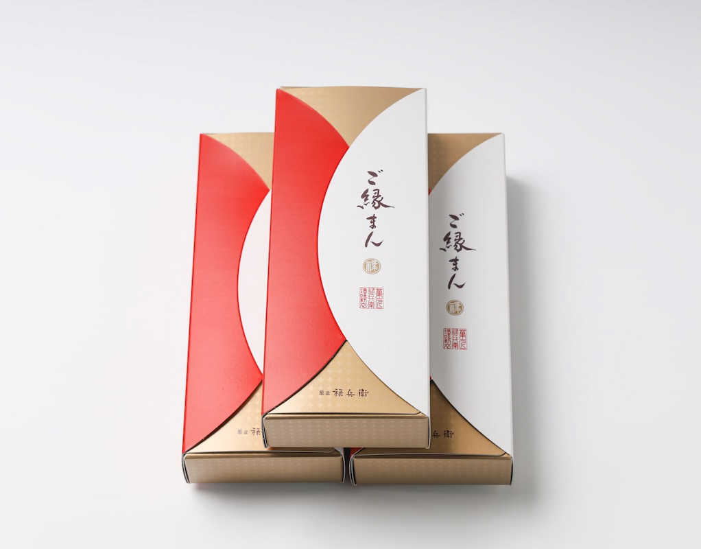
You may also like

SAISIR
SAISIRはサカエヤに併設されたフレンチレストランです。SAISIRは掴むという意味であり、象形文字の牛の文字にヒントを得ながら、ナイフのようなロゴマークのデザインとしました。SAISIR is a French restaurant attached to Sakaeya, and the logo mark was designed to look like a knife, inspired by the hieroglyphic character for cow, SAISIR meaning "to grasp.
2019
LINDO CUP
信楽で開発された世界初の透ける陶土を使ったグラスです。一つ一つロクロによる手作り品で、その土の独特の質感は他の陶器にはないものです。 使っていくうちにエイジングしてよい味わいが出てくると思います。 ワイングラスとしても、あるいは様々な用途でもお使い頂けます。 トールは祝杯のシャンパンにも。 ワイドは、山菜の和え物やアイスクリームなど、小鉢のように使うことも。 小さなキャンドルを入れても素敵です。 TALL 80x80x150mm WIDE 90×90×110mm
2008
Miso soup with Seta shijimi
琵琶湖のセタシジミを使ったインスタントの味噌汁です。しじみの殻をデザインとして使いました。高級なしじみなので金色にしています。This instant miso soup is made with Lake Biwa's seta shijimi clam. We used the shells of shijimi clam as a design. The color is gold because of the high quality shijimi clam.
2020
TOYAMA DESIGN FAIR 2024 GRAND PRIX AWARD
富山デザインフェア2024のポスターデザインコンペにおいて大賞を受賞しました。 コンセプトは「富山デザインふんばり!」 能登の震災で被害を受けた富山でもありますが、ここがふんばり所だと思います。 踏ん張ってバーベルを持ち上げる、その姿は富山の「富」の姿であります。 富の背景は立山連山の山を模し、紅潮して顔を赤く染め頑張っている姿を表現しています。 強靭そうな富山ブラックの踏ん張りに期待します。 Toyama Design Fair 2024 Poster Design Competition Grand Prize Winner The concept was “Toyama Design Fumbari! Toyama was damaged by the Noto earthquake, but I think this is the place to be. The figure of a man standing on his feet and lifting a barbell is the image of Toyama's “wealth”. The background of the “Tomi” is a mountain range in the Tateyama Mountain Range, and the image of a man working hard with his face reddening in the face of the earthquake is represented. We look forward to seeing the strong-looking Toyama Black stand firm in the face of the mountains. 2024 年富山设计展海报设计竞赛中获得了大奖。 设计概念是 “富山设计丰收!”。 富山虽然在能登地震中受到了破坏,但我认为这里是值得一去的地方。 双脚站立、举起杠铃的男子形象代表了富山的 “财富”。 财富 "的背景是立山山脉,人物形象表现的是一个正在努力工作、面色红润的男子形象。 我们期待着看到外表强壮的富山黑子挺身而出。
2024
BIWAICHI
2019
NAGAHAMA GOEN DEAPARTMENT STORE
長浜ごえん百貨店のロゴデザインと企画です。長浜のいいものを集めて日本橋のここしがで催事をしました。5円玉を落として良いことが起きるご縁くださいボックスも作成しました。 Logo design and planning for Nagahama Goen Department Store. We also created a box in which you can drop a 5-yen coin and something good will happen to you. 为 Nagahama Goen 百货公司设计和规划徽标。 我们还制作了一个盒子,投下一枚五元硬币,就会有好事发生。
2020
Oiled EEL
これは、鹿児島県産、宮崎県産、愛知県一色産などの国内産のうなぎを使用したうなぎの蒲焼オイル漬けです。 鮎のオイル漬けの兄弟商品となりますが、より高価であるため高級感を増す装飾を施したデザインとしています。 常温で3年間保存できるため、食べたい時にそのままでも、またはトースターなどで軽く焼くと、さらにおいしく召し上がれます。 This is an oil-pickled eel made from domestically produced eels such as those from Kagoshima, Miyazaki, and Isshiki in Aichi Prefecture. It is a sibling product of oil-pickled ayu fish, but since it is more expensive, it is designed with decorations that add a sense of luxury. It can be stored at room temperature for three years, so it can be enjoyed as is when you want to eat it, or lightly grilled in a toaster for an even better taste. 这是一种油腌鳗鱼,由爱知县鹿儿岛、宫崎和伊势的家养鳗鱼制成。 它是油腌香鱼的同类产品,但由于价格较高,因此在设计上采用了装饰性设计,增加了豪华感。 它可以在室温下保存三年,所以想吃的时候可以直接享用,或者用烤面包机轻轻烤一下,味道会更好。
2025
HALAL MEET ORGANIZATION
ハラール認証の食肉を適正に流通させる日本における団体のロゴマークです。 日本の日の丸と、食卓を示すお皿をモチーフにしています。 This is the logo mark of an organization in Japan that promotes the proper distribution of Halal-certified meat. The motif of the logo is the Japanese flag "Hinomaru" and a plate showing a dining table. 这是日本一个组织的徽标标志,目的是正确销售经清真认证的肉类。 图案由日本国旗日之丸和一个代表餐桌的盘子组成。
2013
SAKAEYA
肉サカエヤのCIデザインを担当しました。牛という文字を使いながら和にならない洋のイメージを感じさせるデザインとし、ナイフで切ったような手作り感、クラフト感のあるロゴデザインとしています。We designed the CI for Sakaeya Meat shop. The logo design uses the character for "beef" but gives a Western image that is not Japanese, and has a handmade, crafty feel as if it were cut with a knife.
2019
MATSUMOTO YUKI FURNITURE
松本雄樹家具製作所のロゴマークをデザインしました。ノミのようで暖かい家のようで、手作り感のあるマークとしています。We designed a logo mark for Yuki Matsumoto Furniture Manufacturing. The mark is designed to look like a chisel and a warm house, with a handmade feel.
2022
Back to Top