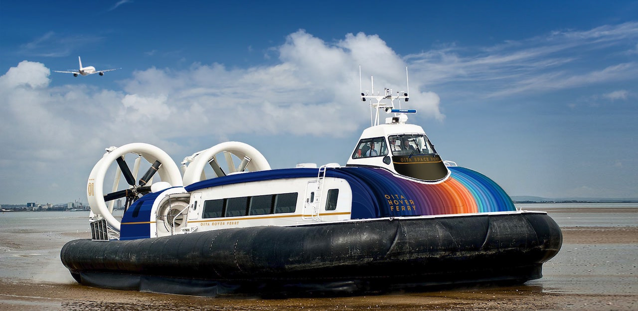
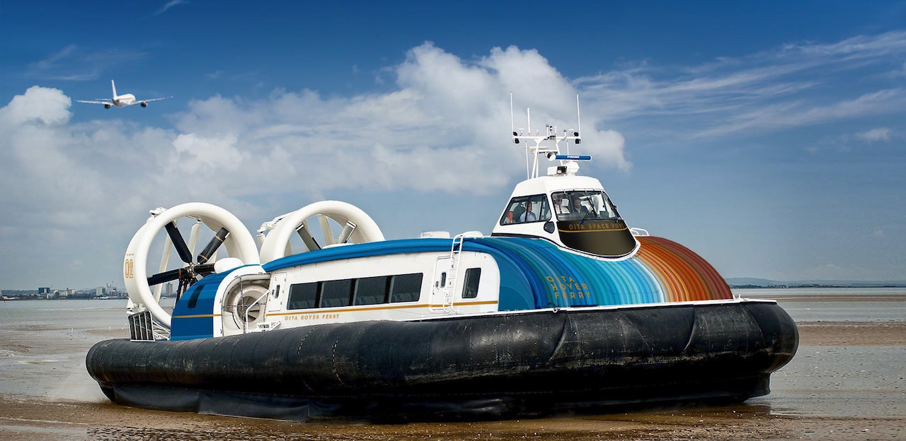
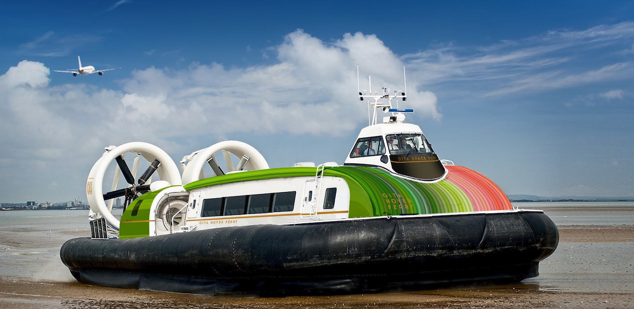
You may also like

LAKEWOOD
2021
RUNO
山中漆器の拭き漆の器です。黒と赤があります。 シンプルでオーソドックスなデザインを心がけてデザインしました。とても軽く、使いやすく、あまり緊張しすぎない、しかしそこまでカジュアルでもない。ふつうな上質さを目指したデザインです。非常に軽く出来ています。山中塗とは、石川県加賀市の山中温泉地区で作られる漆器で、山中漆器と呼ばれます。国産のミズメ桜を轆轤挽きで仕上げ、拭き漆技法で仕上げました。Yamanaka Lacquerware wipe lacquer vessels. Available in black and red.We designed it with a simple and orthodox design in mind. It is very light, easy to use, not too strained, but not that casual either. It is a design that aims for ordinary quality. It is very light. Yamanaka-nuri is a type of lacquerware produced in the Yamanaka Onsen area of Kaga City, Ishikawa Prefecture, and is called Yamanaka lacquerware. Domestically produced mizume-zakura cherry wood is wheel-thrown and finished with a wiping lacquer technique.
2021
RENOVATION EXPO
リノベーションエキスポ大阪の公式ポスターのデザインです。建築空間で文字を形成したデザインとしました。This is the design for the official poster of Renovation Expo Osaka. The design was made to form letters in architectural space.
2019
YASHIMA BRANDING
屋島山頂の各店舗に統一的な暖簾、日除け幕を設置し、販売用の手ぬぐい、バッジも制作しました。それらは伝統工芸「讃岐のり染め」の大川原染色本舗さんに制作いただいたものです。 屋島のノスタルジックで少し寂れたイメージに合いつつも、モダンと和を併せ持ったイメージです。青色階調の差を生かした背景色と、 台形のシンボル形体の組み合わせで考えたものです。 メインモチーフの台形は屋島をシンボリックに力強く表現したもので、伝統建築の反り屋根のようでもあります。カーブをつける ことで和の印象を強めています。単体でも反復の繰り返しでも、様々な媒体などに展開されてゆくイメージで、強く柔軟に様々な ものに展開できるデザインとなっています。 背景は、「屋島をひらく」のブランドステートメントに呼応する舞台幕が開かれるようなイメージです。 この10年にわたる高松市の尽力により高松市屋島地区が、全国の優れた都市景観の事例を表彰する「都市景観大賞」で、大賞の国土交通大臣賞に選ばれました。香川県内では初の大賞受賞だそうです。 We set up a unified curtain and sunshade at each store on the top of Mt. Yashima, and also produced tenugui hand towels and badges for sales. These were produced by Okawahara Dyeing Honpo, a traditional craftsman of "Sanuki Nori Dyeing". The image of Yashima is nostalgic and a little desolate, yet modern and Japanese at the same time. The background color is a combination of different shades of blue and the trapezoidal shape of the symbol. The Yashima district of Takamatsu City was selected for the Minister of Land, Infrastructure, Transport and Tourism Award, the grand prize of the Urban Landscape Awards, which recognize outstanding examples of urban landscapes from across Japan. This is the first time that an area in Kagawa Prefecture has won the grand prize.
2023
KIMIIRO SIGN
近江八幡市で、社会福祉法人 おうみ福祉会の新しい建物が5月に開所しました。 その建物は「きみいろ」と言います。きみいろは日本語であなたの色という意味です。 作業所に訪れる人、それぞれの個性が彩る家族のような場所。そんなイメージかもしれません。今回、内部のサインを担当させていただきました。その「きみいろ」=「君色」というネーミングから、キャンバスに絵の具で描いたような、にじみと温かみのあるサインとすることを思いつきました。ここでは「せんべい」も作っており、せんべいルームのサインも作りました。A new building of Ohmi Fukushi Kai social welfare corporation opened in May in Ohmi-Hachiman City.The building is called "Kimiiro. Kimiiro means "your color" in Japanese.It is a family-like place where the individuality of each person who visits the workshop adds color to the place. That may be the image of this building.This time, I was in charge of the interior signage.From the name "Kimiiro" = "Kimiiro," we came up with the idea of making the signage blotchy and warm, as if painted on a canvas. We also make "senbei" here, so we created a sign for the senbei room.
2023
MASU of Shiga
滋賀県産のびわ湖材を用いたノベルティ用のひのき枡のデザインです。 枡で日本酒を飲む機会も減りましたが、日本酒を木の枡で飲むと木の香りがお酒に移り一味違った楽しみ方ができます。この巻き紙にはその楽しみ方を前面に出して記述しています。 巻き紙を取るとシールが貼られています。 そのシールを剥がすと、枡にレーザー刻印された滋賀のモチーフが現れます。モチーフは4種類ありますが何種類あるかは記されていません。何が出るかはお楽しみということにしました。SNSなどで調べると何種類あるのかもわかったり、調べたくなる、シェアしたくなる仕組みとしました。単なる押しつけのノベルティにならないよう、日本酒を楽しんでもらう、心に残る体験デザインとして考えたものです。 Hinoki Masu is a novelty item designed using Biwako wood from Shiga Prefecture. Masu is a vessel for drinking sake. Although the number of occasions to drink sake with wooden Masu has decreased, drinking sake with wooden sake cups offers a different way to enjoy the sake, as the aroma of the wood is transferred to the sake. This paper roll describes how to enjoy sake in a different way. When you take off the paper roll, you will find a sticker attached to it. When the sticker is removed, the Shiga motif laser-engraved on the Masu is revealed. There are four different motifs, but the number of motifs is not indicated. The idea was to make people want to check and share the information by checking on social networking sites. We did not want this to be a mere novelty item, but rather a memorable experience designed to encourage people to enjoy sake. 新颖的桧木 Masu 设计采用滋贺县的琵琶湖木材。 Masu 是喝清酒的容器。 虽然用木制 Masu 喝清酒的机会较少,但用木制 Masu 喝清酒时,木头的香气会传递到清酒中,给人一种与众不同的享受。 这个纸卷描述的就是这种品酒方式。 取下纸卷后,会贴上一张贴纸。 撕下贴纸后,马苏上激光雕刻的滋贺图案就会显现出来。 共有四个不同的图案,但没有说明有多少个。 我们的想法是让人们可以通过社交网站轻松查找到有哪些图案,并让人们愿意查找这些图案并与他人分享。 设计的初衷是让人们享受清酒带来的难忘体验,而不仅仅是一种勉强的新奇感。
2025
HACHIMANJIKAN
近江八幡の西の湖周辺をビーチクルーザーで自転車ツアーをするツーリズムのブランディング「ハチマンジカン」です。Hachimanjikan" is a branding for a tourism brand that offers bicycle tours by beach cruiser around Lake Nishi in Omi Hachiman.
2019
TACHI
シンプルでオーソドックスなデザインを心がけてデザインしました。 とても軽く、使いやすく、あまり緊張しすぎない、しかしそこまでカジュアルでもない。 runoの丸く柔らかいデザインと対照的に、tachiは、凛とした佇まいを持ったデザインです。(写真の後半はrunoとの比較です) 非常に軽く出来ています。 斜め上からはあまり裏側が見えませんが、裏側の削り込みにより手がすっと入り、大変持ちやすくデザインされています。 山中塗とは、石川県加賀市の山中温泉地区で作られる漆器で、山中漆器と呼ばれます。国産のミズメ桜を轆轤挽きで仕上げ、拭き漆技法で仕上げました。 We designed this product with a simple and orthodox design in mind. It is very light, easy to use, not too strained, but not that casual either. In contrast to the round and soft design of runo, tachi has a dignified appearance. (The second half of the photo is a comparison with runo.) It is made very light. Although you cannot see the back side of the bowl from an angle, the back side has been cut down so that you can easily put your hand into the bowl, making it very easy to hold. Yamanaka-nuri is a type of lacquerware produced in the Yamanaka Onsen area of Kaga City, Ishikawa Prefecture, and is called Yamanaka lacquerware. The potter's wheel is made of domestically produced mizume-zakura (cherry tree) and finished with the wipe lacquer technique.
2024
UDCBK
UDCBK(アーバンデザインセンターびわこ・くさつ)は、草津の未来のまちのデザインを考えるために、 大学(教職員や学生)、企業(経営者や通勤者)、行政(国や県や市の職員)の人々が、 草津に住む市民の方々と気軽に自由に話し合い、交流する場所として南草津駅前に生まれました。 様々な人がここを拠点に交わり、その中から様々な事が発展的に広がっていく。 この場所は言うなれば「未来創造交差点」であると考えました。 様々な道が交差し、つながり、そして広がってゆく様子をロゴマークとしてデザインしました。 UDCBKの文字がそれぞれ道のようになっており、ジャンクションになっています。 グラデーションの色は、様々な考えや、アクション、動きを表現しています。
2017
UIROMOCHI
「和た与」のういろ餅のパッケージリニューアルです。こちらのういろは、米粉を使用していることから米の形をあしらっています。包装紙を開くとわかるようなデザインです。一つは抹茶と白、もう一つは黒糖をあらわし、中身を表現したものです。This is a package renewal of Uiro rice cake of "Wata-yo". This Uiro is decorated with the shape of rice because it is made of rice flour. The design can be recognized by opening the wrapping paper. One is a matcha green tea and white, and the other is brown sugar, representing the contents of the rice cake.
2020
Back to Top