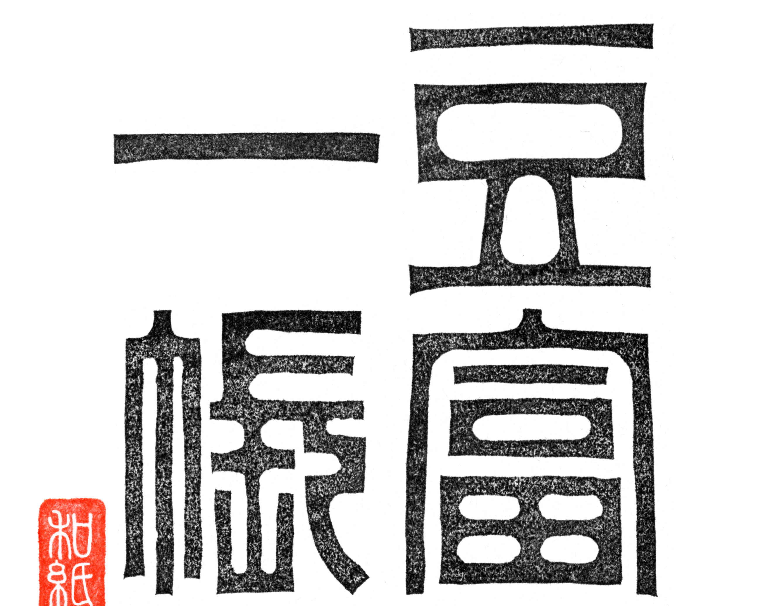
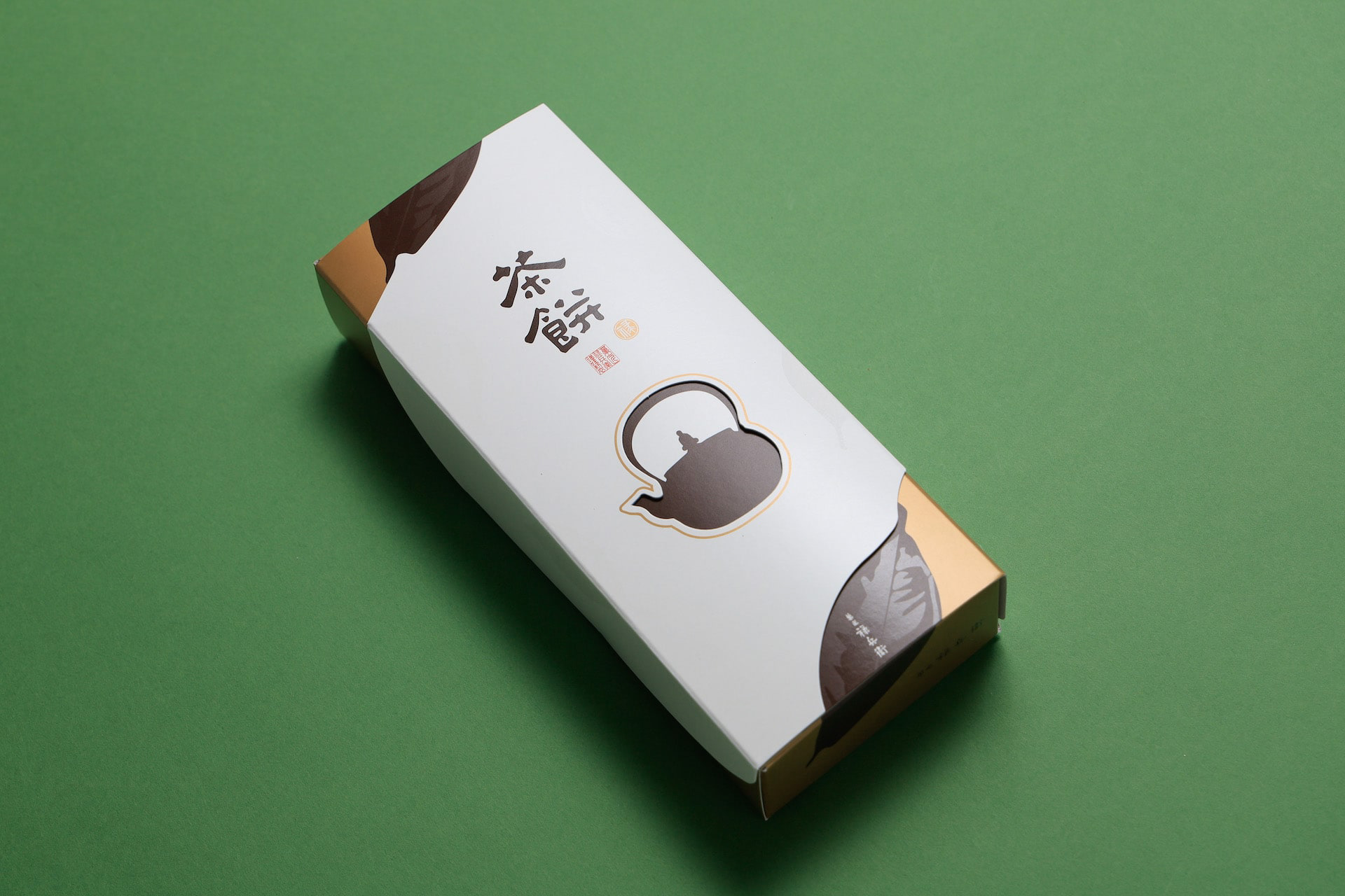
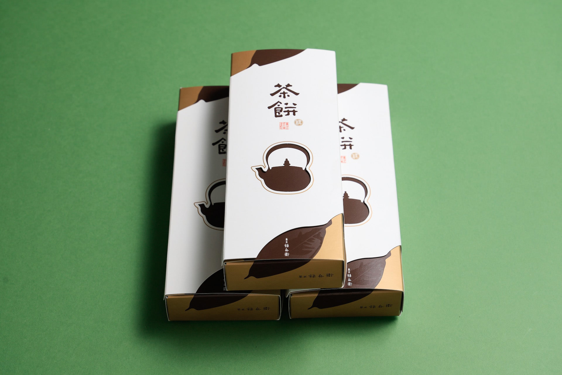
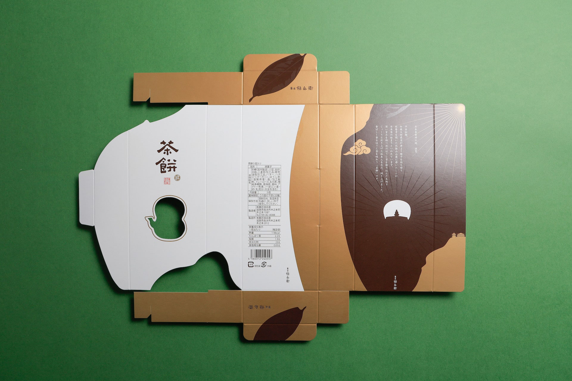
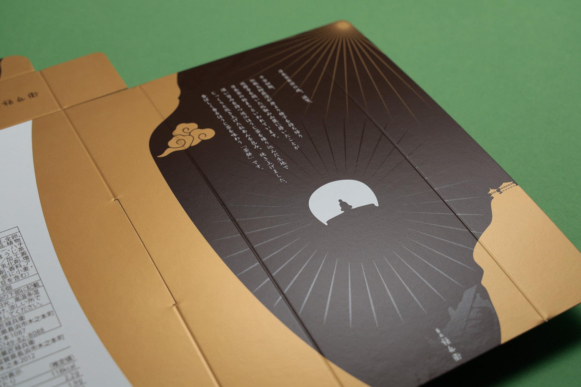
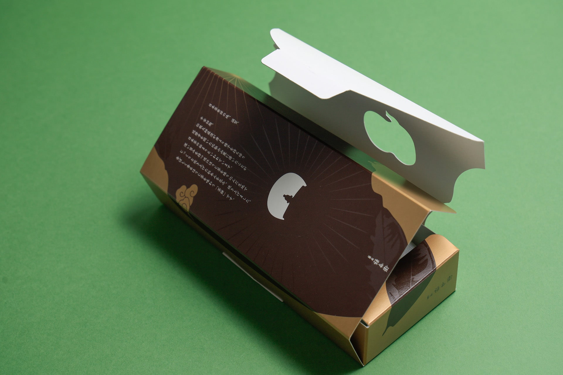
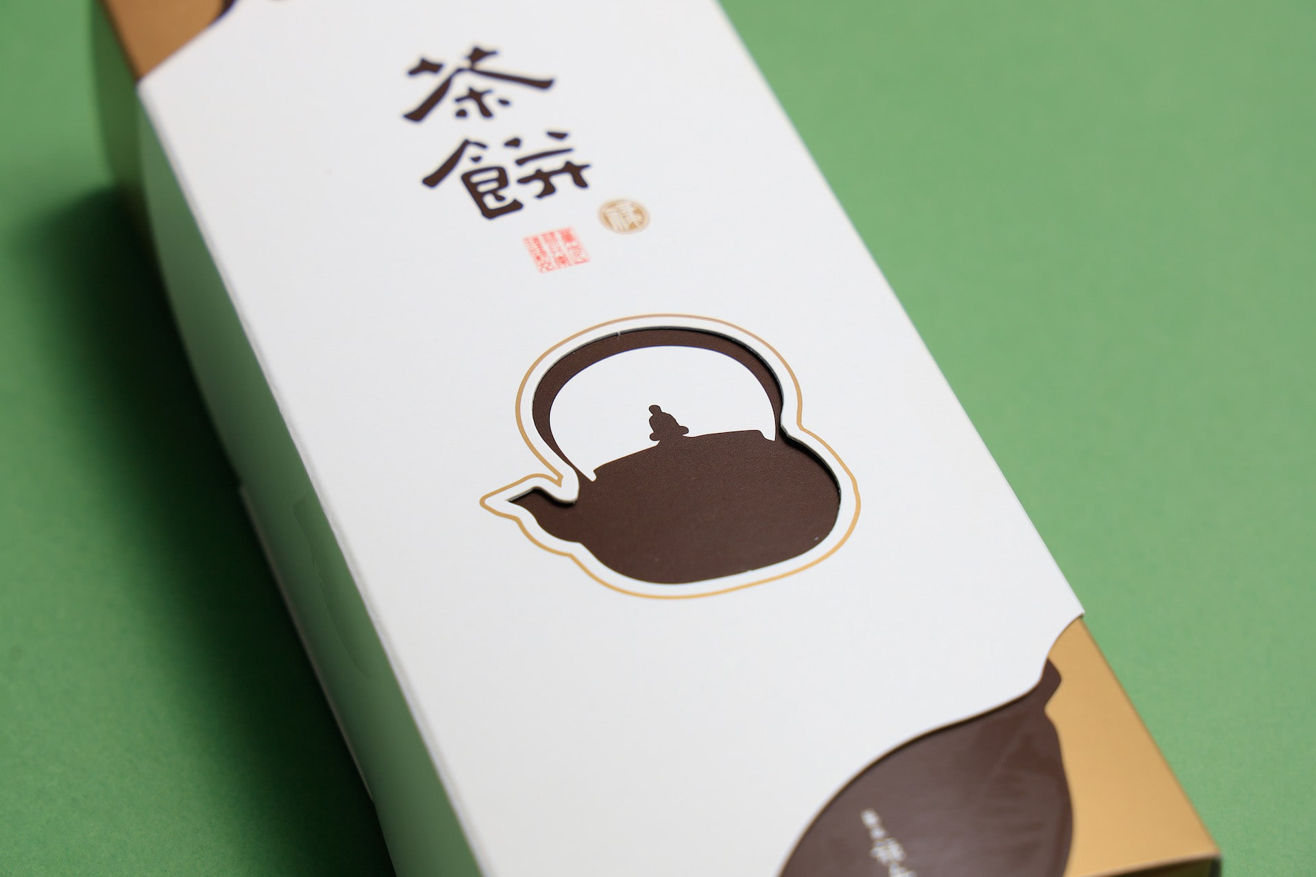
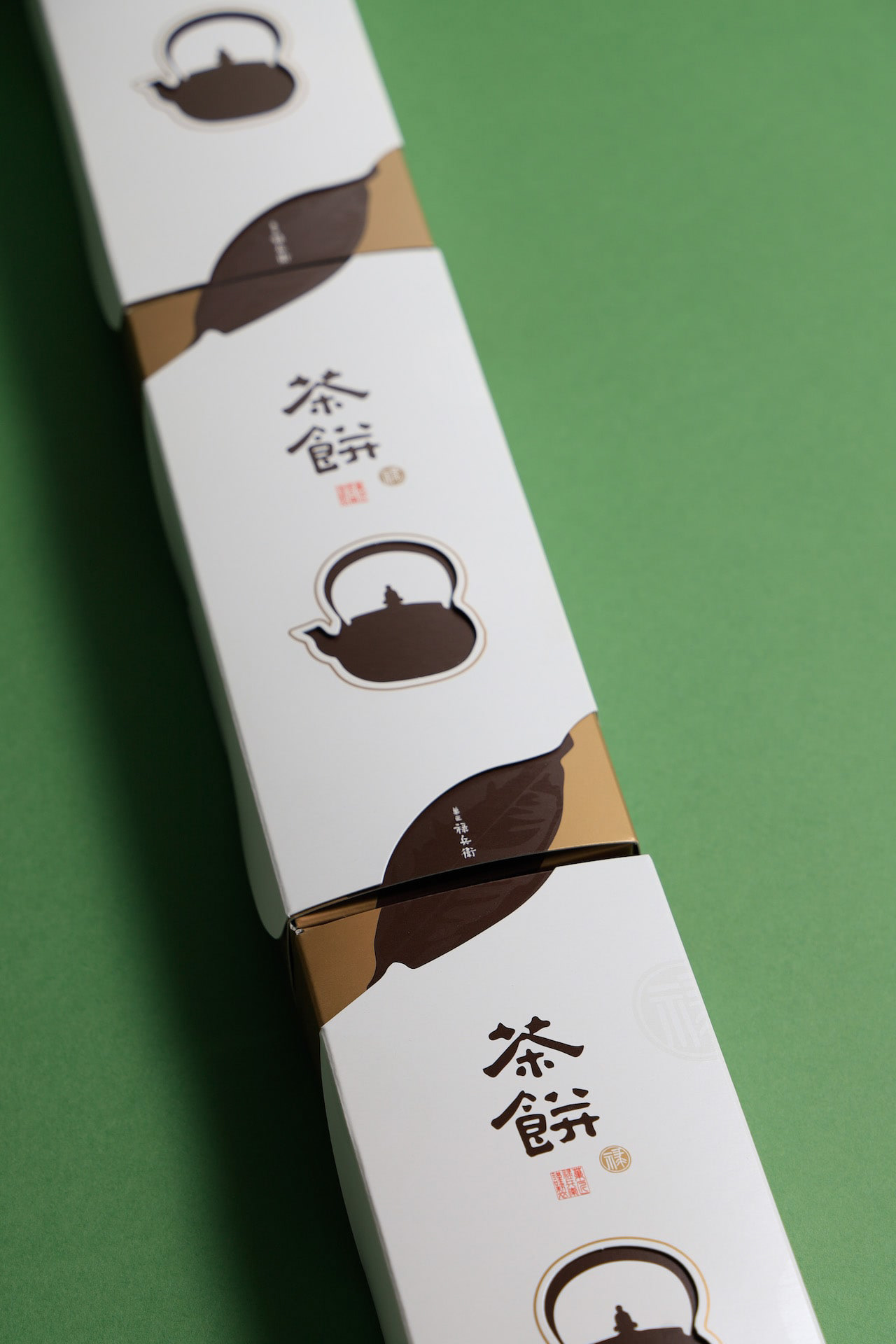
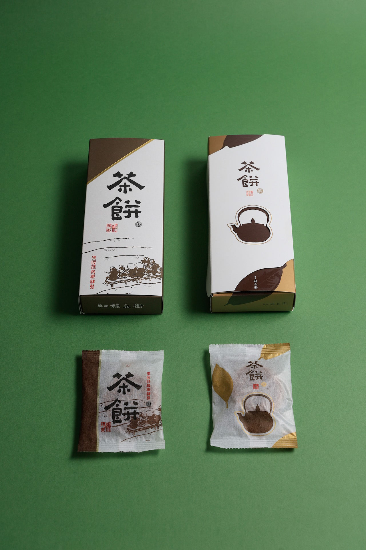
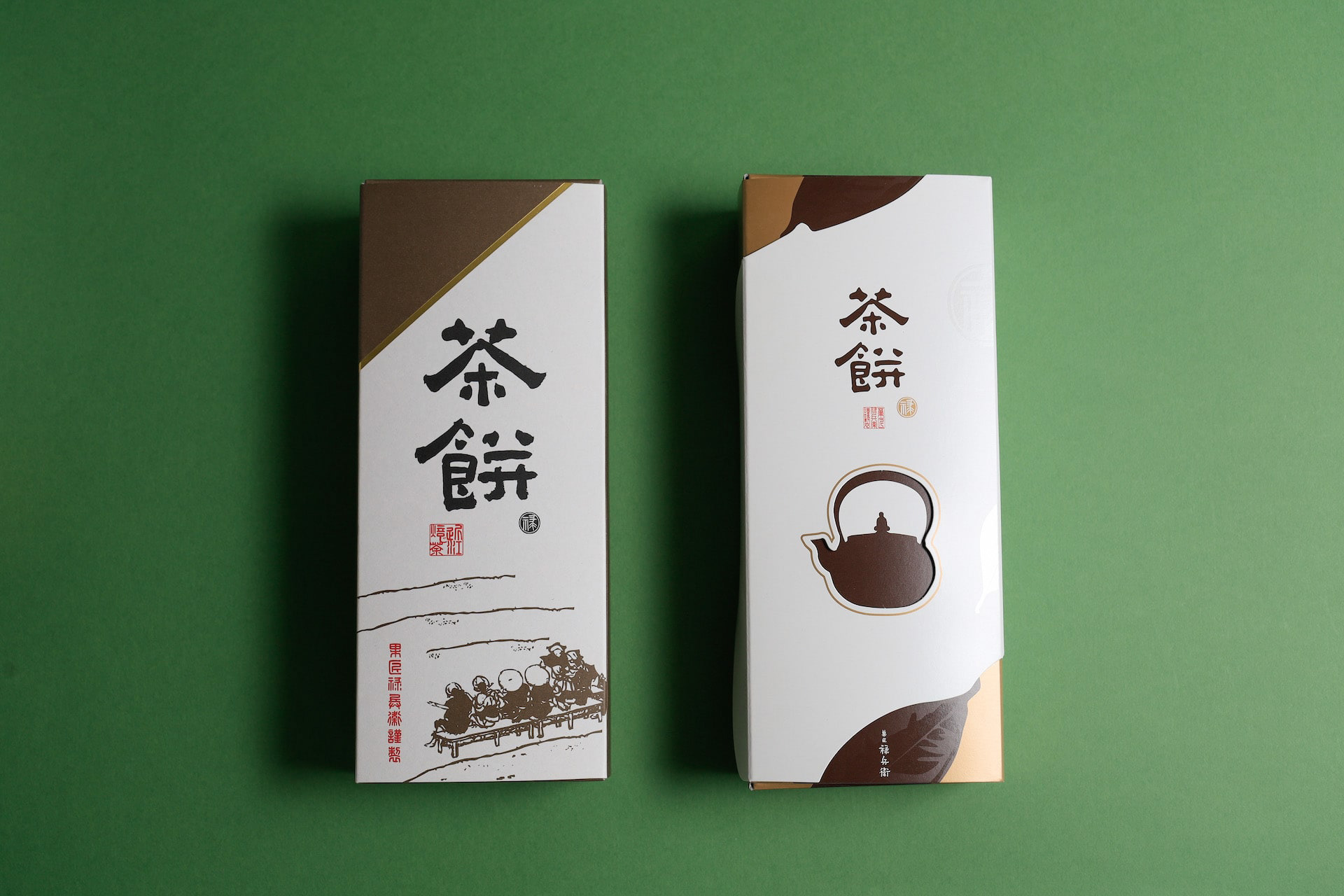
You may also like

OITA ASIAN SCULPTURE EXHIBITION
さまざまな表情をした金属の帯のようなものが右のほうへ伸びて、コンペティションを競いあっている様を表現しました。一つ一つが異なるカラフルな作家の違った個性であり、全体で現代彫刻のような表現としました。遠くからでも目をひくキラリとした表現としています。The work depicts a series of metal strips with various expressions extending toward the right, competing with each other in a competition. Each piece is a different colorful individuality of a different artist, and the overall expression is that of a contemporary sculpture. The overall effect is that of a contemporary sculpture, which is eye-catching even from a distance.
2023
CUBRIC HOOK
CUBRICはシンプルなデザインの木製の壁掛けフックです。 2つの立方体形状の組み合わせで構成されています。 どのような空間にもよく合う、なんでもないシンプルな形です。主張するわけでもなく、なんとなく壁にあり、玄関で向かえてくれる。 フックはあくまでも脇役。 主役は空間でありインテリアです。こんなシンプルな木製フックが意外と売っていませんでした。CUBRIC is a wooden wall hook with a simple design. It consists of a combination of two cube shapes. It is a simple, nondescript shape that fits well in any space. It does not make a statement, it is somehow on the wall, and it will greet you at the entrance. The hook is only a supporting role. The main role is the space and interior. Surprisingly, such a simple wooden hook was not sold.
2017
KIRAMIZUKI OMI RICE
近江米の新品種「きらみずき」のパッケージデザインおよびブランディングプロポーザル応募案。パッケージの絵は、きらきらと輝く琵琶湖を中心に、豊かな生物、山林、気候、田畑のイラストをちりばめ、それらの恩恵を受けたみずみずしい米粒を描きました。全体的に金色でデザインを、下地は旨味を感じさせる淡いベージュ色で高級感とシズル感(美味しそうに見える感覚)を演出しました。のぼりや法被、コンセプトブック、ポスターなど販促品も合わせてデザインしました。Proposal entry proposal for a new variety of Omi rice. The package picture depicts a sparkling Lake Biwa, interspersed with illustrations of rich living creatures, mountains, forests, climate, and fields, and the lush rice grains that benefit from them. The overall design is in gold, while the base color is a light beige that evokes a sense of deliciousness and a sense of luxury. The base color is a light beige color that evokes a sense of deliciousness, creating a sense of luxury and sizzle (a sense of looking delicious).
2023
NORIKAU OGAWA/KENZO OGAWA
陶芸家 小川顕三氏と小川記一氏のブランドディレクションを担当しました。 陶芸家のお二人に対し、まず、作品から印象を得た二色のコンセプトカラーを設定しました。 その二色を、名刺から、リーフレット、ホームページに至るまで、対比的に使用することで、お互いを引き立てあうように計画しました。
2017
TSUCHINOCO CARDBOARD MAZE
ブランディングを担当しました、つちのこブランドからまったく新しいダンボール迷路の登場です! このダンボール迷路の最大の特徴は、宝探しをしながら遊べる迷路です。 入口で宝物カードを受け取り、その宝物を探しながら迷路を探検します。 宝物を見つけたら、カードに穴を空けてゆきます。 全部の宝物を発見するまで出る事はできません。 段ボール迷路をより面白く体験できる「宝探し迷路」です。 25,50,100など自由にマス目をカスタムできます。 納品事例多数です。 We are proud to introduce a brand-new cardboard maze from the Tsuchinoko brand, for which we were in charge of branding! The main feature of this cardboard maze is that it is a maze where visitors can play while searching for treasure. You receive a treasure card at the entrance and explore the maze looking for the treasure. When you find the treasure, you make a hole in the card. You cannot leave the maze until you have found all the treasures. This is a "treasure hunting maze" that makes the cardboard maze experience more interesting. You can customize the number of squares to 25, 50, 100, etc. We have many delivery examples.
2014
TOYAMA MATSURI 2025
青空の下、元気よく、威勢よく踊り子たちが繰り広げる富山まつり。みんなが一つになって大きな輪を作り、富山まつりを支えているように感じました。このポスターでは、色鮮やかな衣装の色紙を丸めたような輪がたくさんつながって「祭」の文字となって元気よくジャンプして踊っている姿をデザインしました。 Under the blue sky, dancers perform with vigor and spirit at the Toyama Festival. It felt as though everyone came together to form a large circle, supporting the Toyama Festival. For this poster, I designed a scene where numerous circles, resembling rolled-up sheets of colorful costume paper, connect to form the character for “festival” (“祭”), leaping and dancing energetically. 在蓝天之下,舞者们活力四射、气势磅礴地演绎着富山祭典。众人齐心协力编织出巨大的圆环,仿佛正是这般团结支撑着整个祭典。本海报设计中,众多色彩绚丽的服饰色纸被卷成圆环相互连接,构成“祭”字的造型,生动展现了舞者们欢快跳跃、翩然起舞的姿态。
2025
78 shochu
78は米焼酎です。78のステンレスコップにデザインを合わせた焼酎です。78 is a rice shochu; the design of this shochu matches the stainless steel cup of 78.
2021
YUTANPO
磁器の湯たんぽのデザインです。布団の中へ入れて使用する湯たんぽですが、多くの湯たんぽは、蓋の部分が突起として出ています。その出っ張りをなくし、人が触れる形状としてもっともあってほしかった形態を目指しました。This is a porcelain hot water bottle design. Most hot-water bottles are placed in a futon and the lid of the bottle protrudes from the futon. We eliminated the protrusion and aimed to create a shape that people can touch.
2012
amana
「あまな」は近江八幡丁稚羊羹の老舗和た与の経営するカフェです。そのインテリアデザインを担当しました。外観は和風であり、テイクアウト導線も設けました。モダンな和、円をテーマにしてデザインしています。Amana" is a café run by the long-established Ohmi-Hachiman Decchiyokan (sweet bean jelly) shop, Wataoyo. We were in charge of the interior design. The exterior is Japanese style, and a take-out line is also provided. The theme of the design is modern harmony and circle.
2020
RENOVATION EXPO
リノベーションエキスポ大阪の公式ポスターのデザインです。建築空間で文字を形成したデザインとしました。This is the design for the official poster of Renovation Expo Osaka. The design was made to form letters in architectural space.
2019
Back to Top