AYU PORRIDGE
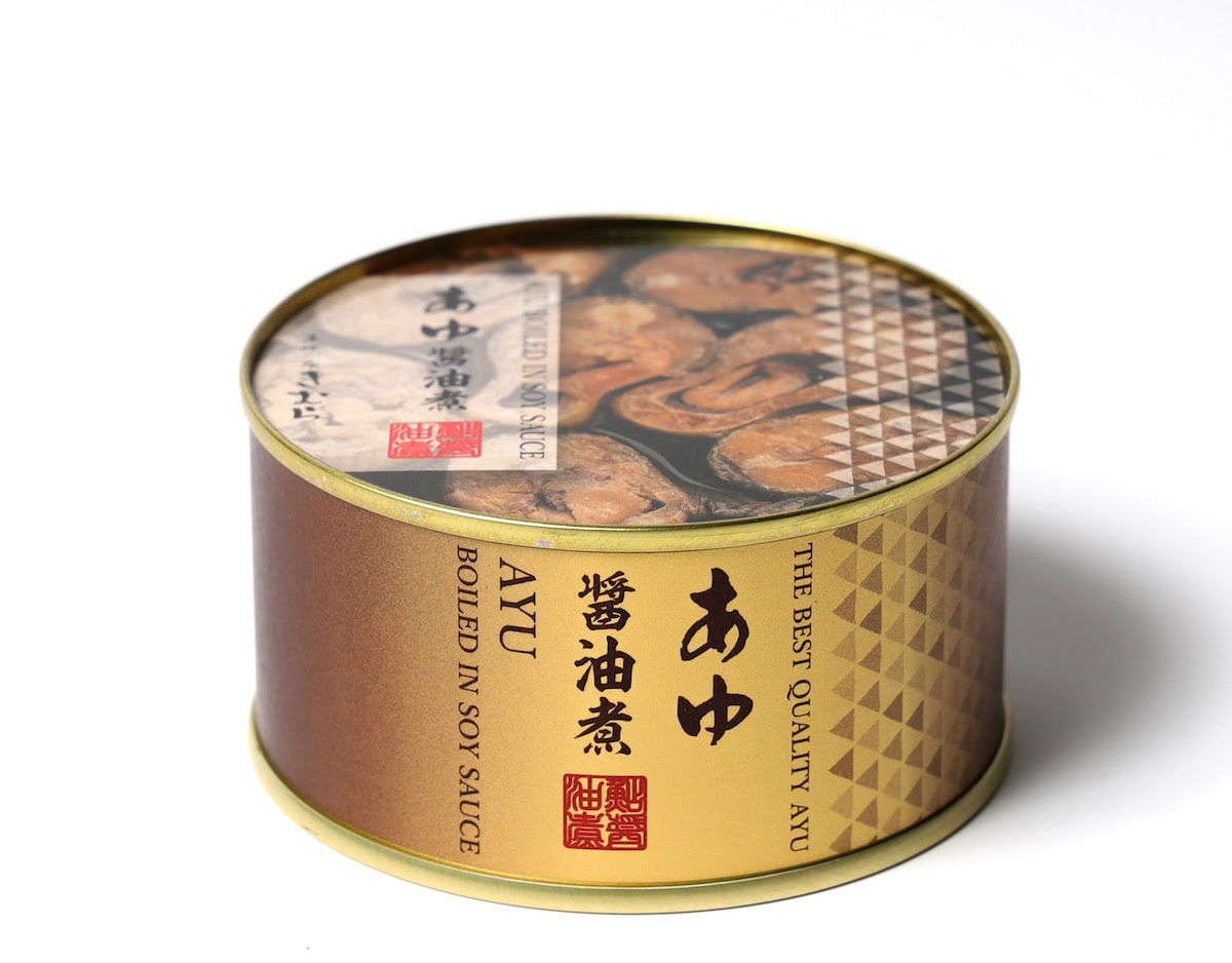
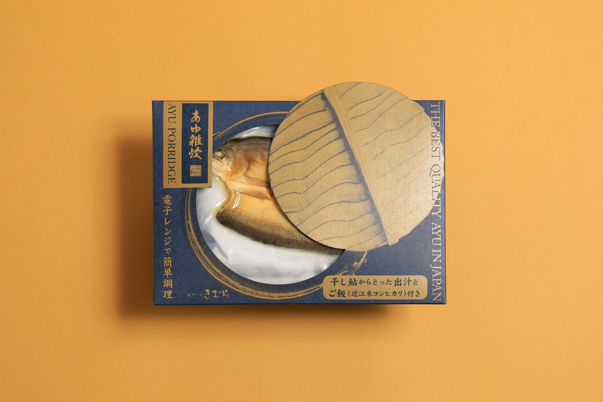
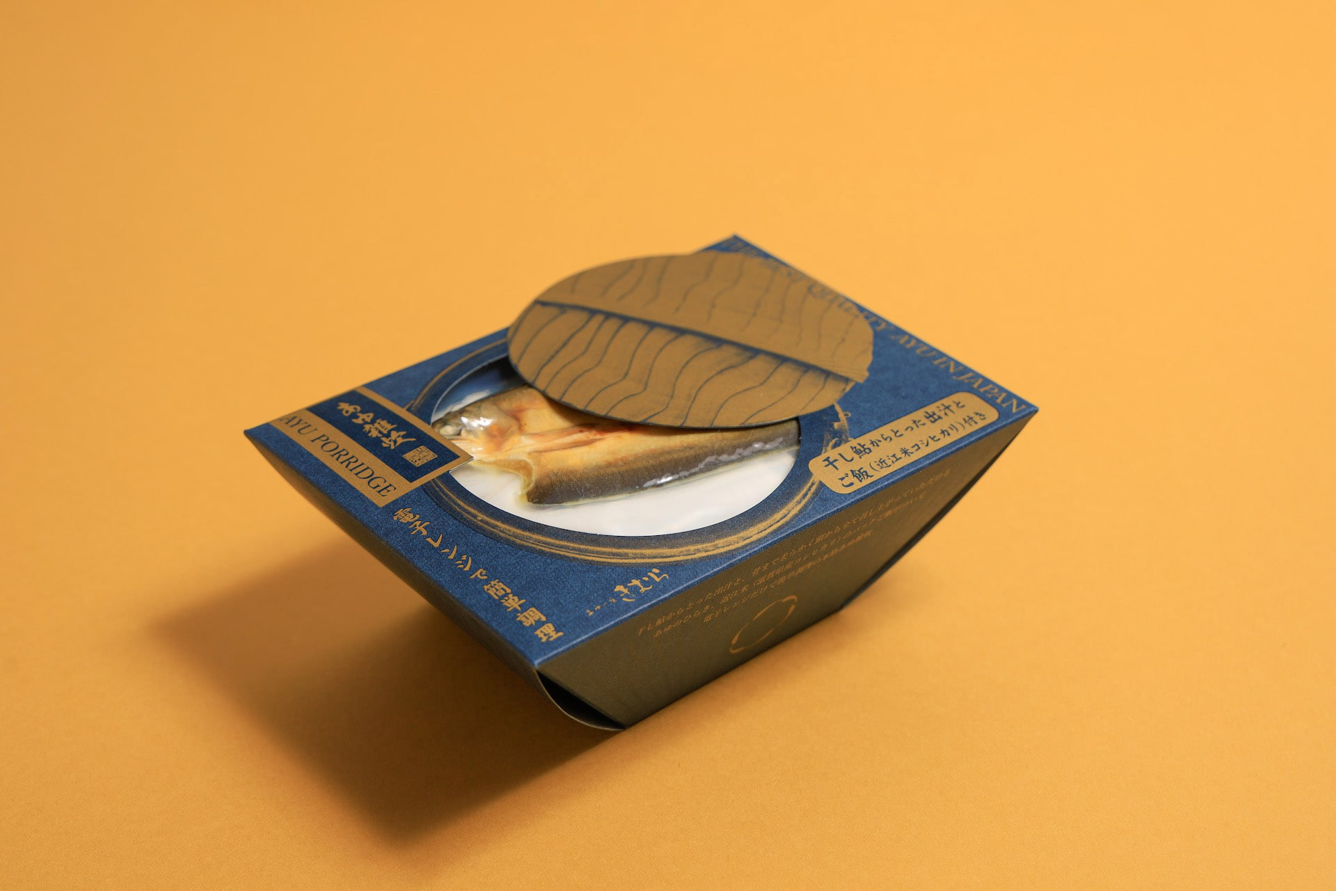
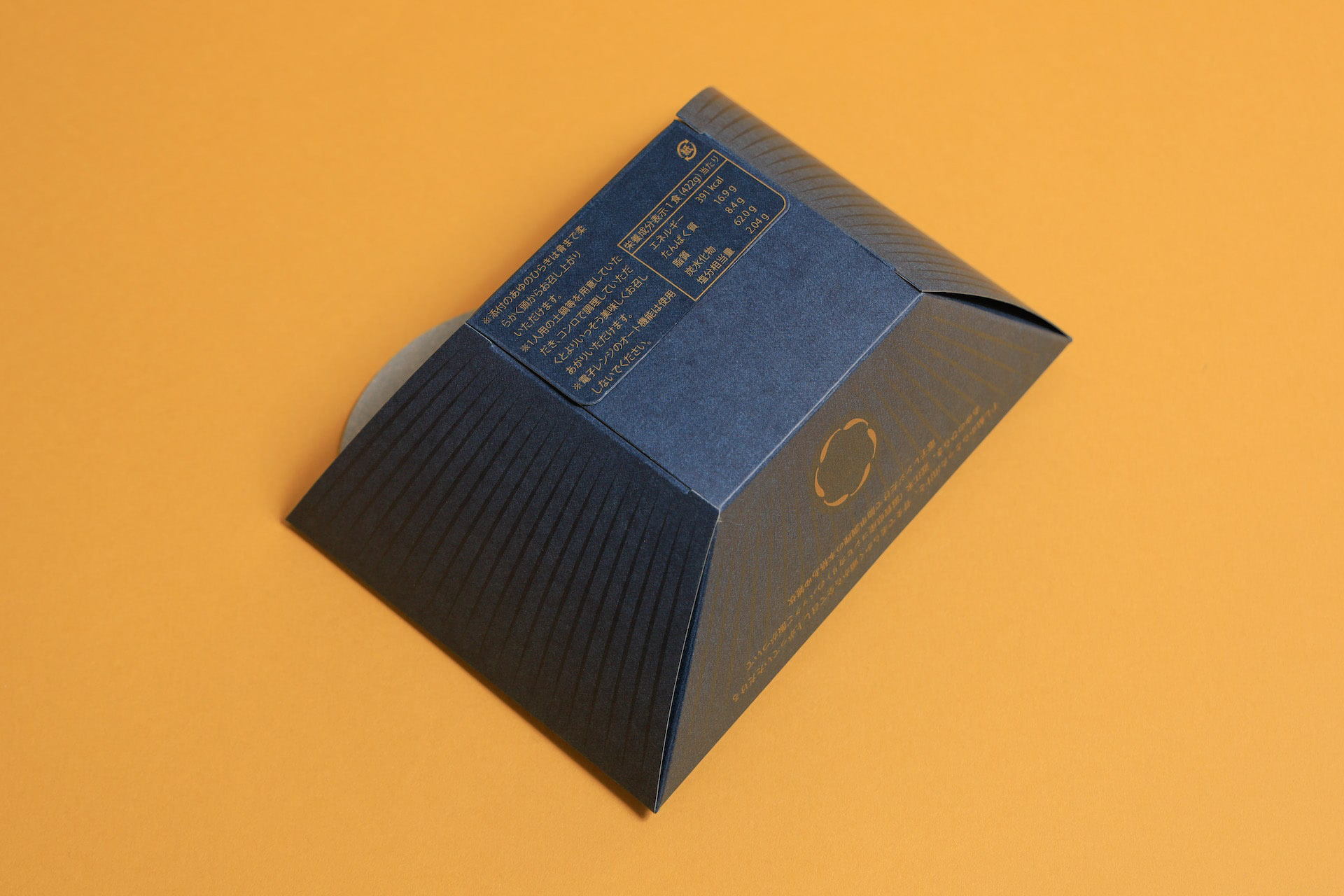
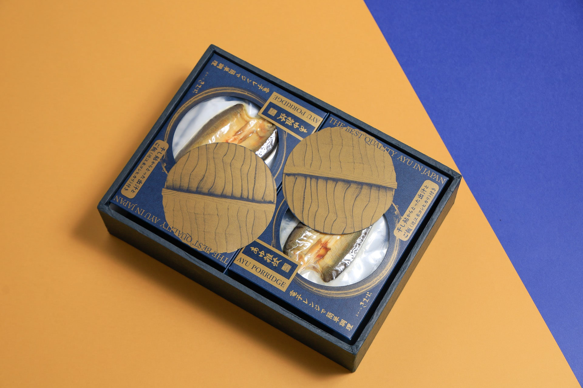
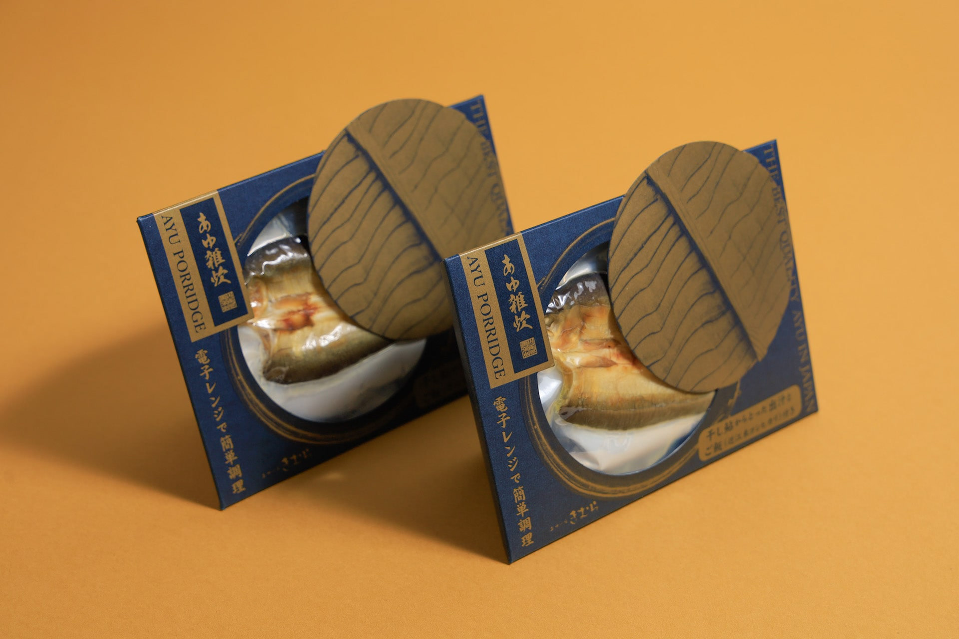
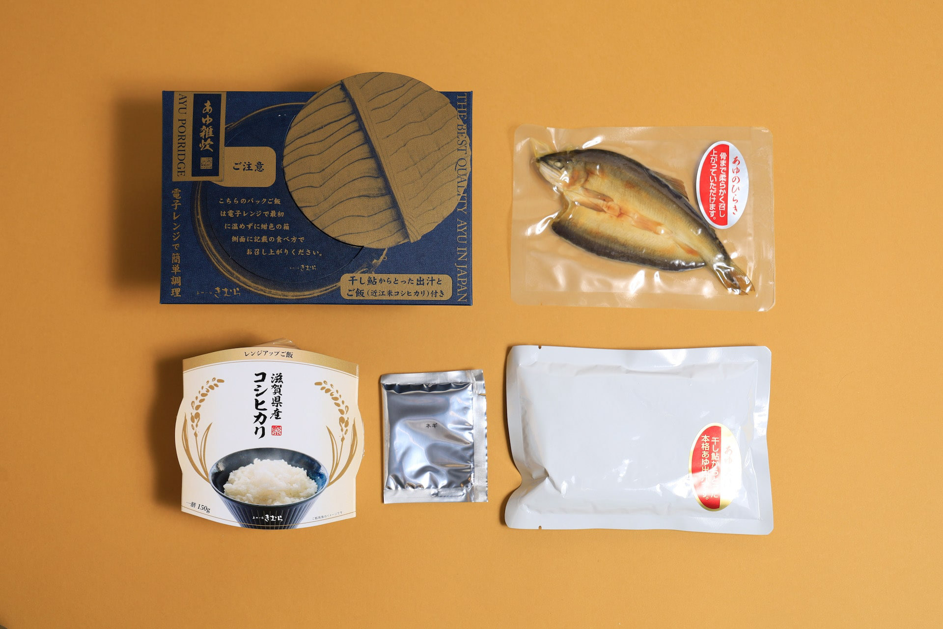
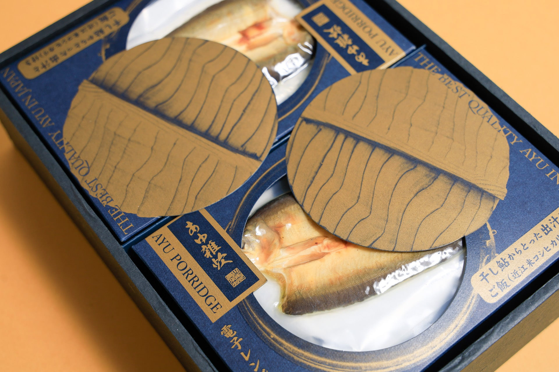
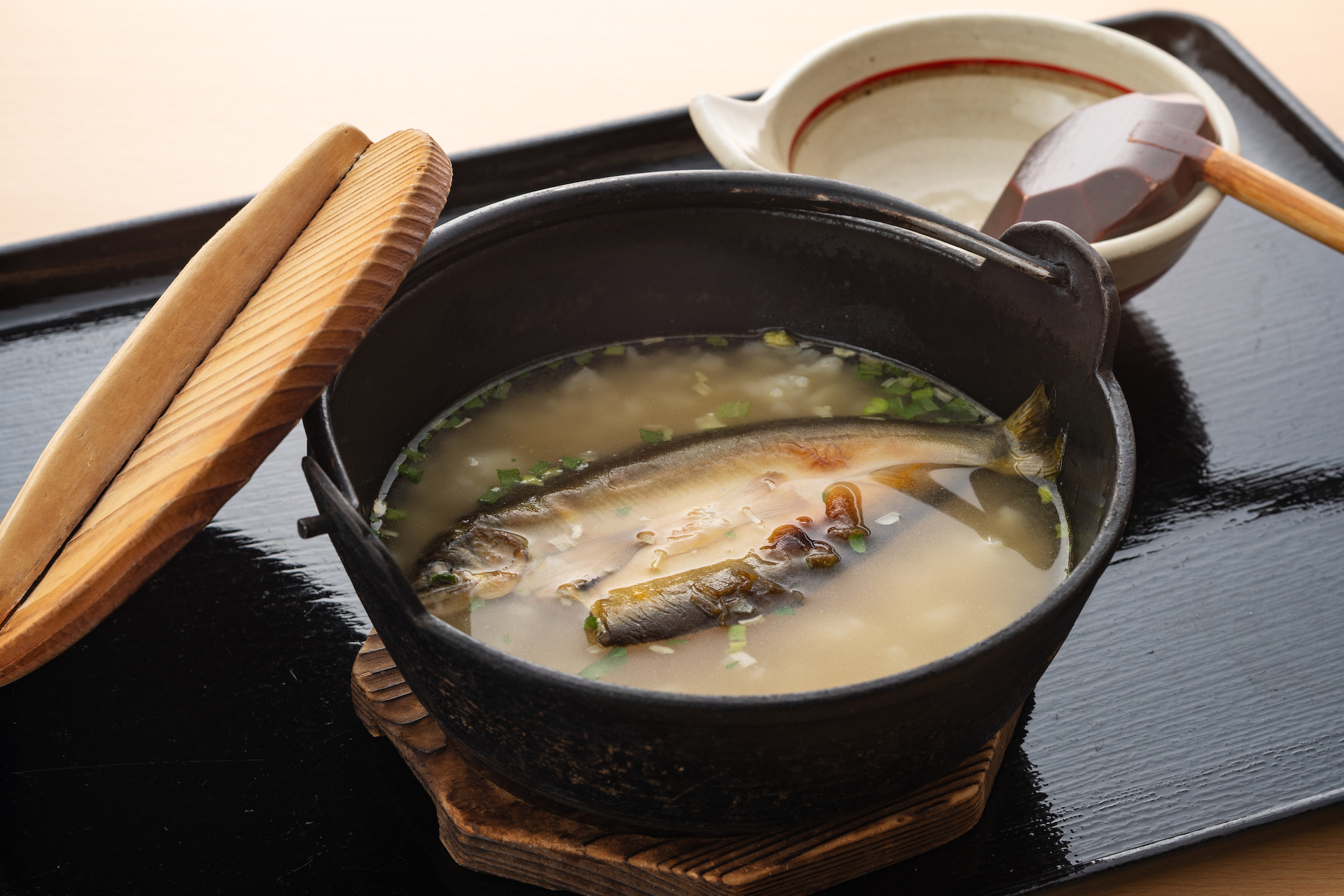
あゆ雑炊のパッケージデザインです。あゆのひらきを使い、レンジアップご飯で手間要らずで簡単に雑炊が作れるように開発されました。鉄鍋に木の蓋をデザインモチーフとし、レトルトご飯と、だし汁を隙間なくホールド可能なパッケージに逆台形型の箱としました。一枚のシートから立体になるデザインです。青い紙に金印刷でローコストに制作しました。 This is the package design of Ayu Porridge. It was developed to make Zosui (rice porridge) easily and hassle-free with microwaved rice using Ayu flounder. The design motif is an iron pot with a wooden lid, and the package is an inverted trapezoid-shaped box that can hold retort rice and the broth without gaps. The design is three-dimensional from a single sheet. Gold printing on blue paper was used for low-cost production. 鲶鱼粥包装设计。 它的开发目的是让人们能够使用鲶鱼比目鱼用微波炉简单方便地煮粥。 设计图案是铁锅上的木盖、甑饭和一个倒梯形盒子,用于盛放无缝隙肉汤的包装。 该设计是由单张板材制作而成的三维作品。 它是用蓝色纸张上的金色印刷以低成本制作的。
You may also like
KOKA Cardboard Box
滋賀県甲賀市の段ボールのデザインです。甲賀市の市章の2色を使用し、忍者テーマで手裏剣のモノグラムを配置し、市章デザインもあしらっています。ふるさと納税返礼品を送るのに使用されたりしています。This is a cardboard design for Koka City, Shiga Prefecture. It uses the two colors of the Koka city emblem, and has a ninja theme with a shuriken monogram and the city emblem design. It is sometimes used to send tax returns from hometowns.
2021
CHINDON FESTIVAL
第67回全日本チンドンコンクールのポスターデザイン案です。賑やかな音が聞こえて来そうな立体的で動きのあるデザインとしました。「ちんどん」の文字が描かれています。This is a poster design for the 67th All Japan Chindon Competition. The design is three-dimensional and full of movement, as if one can hear the lively sound of the chindon. The word "Chindon" is drawn on the poster.
2021
SENKO
2013
THE WORLD SOCIETY FOR EKISTICS
世界駅スティクス学会2005の公式ポスターをデザインしました。ekisticsは人間居住工学の意味です。その文字を居住空間に見立ててデザインしました。We designed the official poster for the World Ekistics Congress 2005. Ekistics means "human habitation engineering. We designed the letters as if they were living spaces.
2005
BRANCH
「枝」を意味する店名のロゴデザイン。花屋さんでありますので「枝、森、花」そのどれもを感じさせる明るいデザインとしました。
Logo design for a store name meaning “branch. As a florist, the logo is bright and evocative of “branches, forests, and flowers.
为一个意为 “枝条 ”的店名设计徽标。 作为一家花店,徽标色彩明亮,令人联想到 “树枝、森林和鲜花”。
2024
minamo
2021
JAPAN-FRANCE 150th
2008年日仏交流150周年記念ロゴマークの応募案です。日本国旗とフランス国旗の融合をデザインしました。This is a proposal for a logo mark to commemorate the 150th anniversary of Japan-France relations in 2008. The design is a fusion of the Japanese and French flags.
2008
among
傘立てのデザインです。一見、傘立てには見えませんが、全ての傘の先端が合うように円と円の隙間を調整しています。どこにはまるのか、最初は悩みますが、慣れるとすぐにわかります。自分で使いこなす美しいプロダクトです。This is the design of an umbrella stand. At first glance, it does not look like an umbrella stand, but the gap between the circles is adjusted so that the tips of all umbrellas fit together. At first you may have trouble figuring out where it fits, but once you get used to it, you will soon find out. It is a beautiful product that you can use yourself.
2015
Oiled AYU
2016
DECCHI YOKAN 3
3本入りの丁稚羊羹のパッケージリニューアルです。以前のパッケージが包装の手間がかかるということで、風呂敷をモチーフにしつつ、ワンタッチでとじることが可能なパッケージを考案しました。This is a renewal of the packaging for 3-packs of Decchi-Yokan. The previous package was time-consuming to wrap, so we devised a package with a furoshiki (wrapping cloth) motif that can be closed with a single touch.
2020