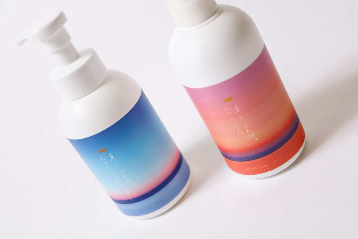
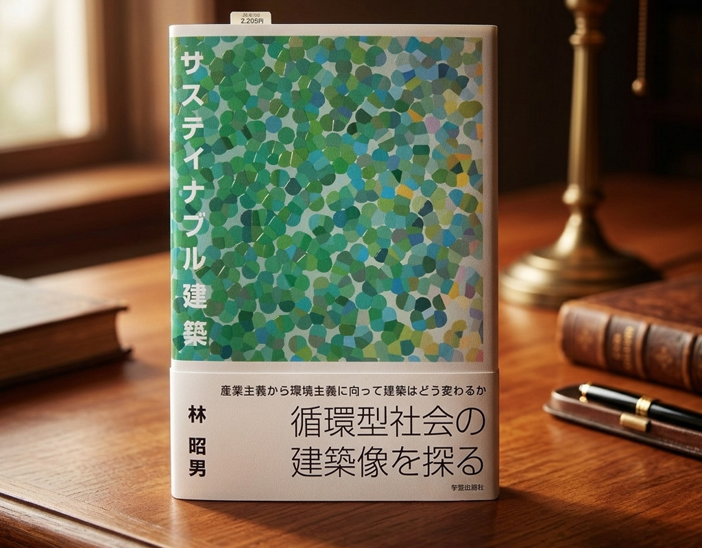
You may also like

あゆ塩焼き
木村水産のあゆ塩焼きのパッケージデザインです。 個包装で国内最高の養殖鮎としてふさわしい高級感を高めるデザインとしました。 冷凍商品のため、外側は銀印刷でシャープにして冷感のあるデザイン、中は一転、赤を施し、冷凍ケースの中にあっても、火入れし、焼きたてのように美味しそうに見えることを狙いました。 This is the package design of Ayu Salt Grilled Ayu. The individually wrapped ayu fish is designed to enhance the sense of quality as the best farmed ayu fish in Japan. Because it is a frozen product, the outside is sharply designed with silver printing to give it a cool feel, while the inside is painted red to make it look as if it has been fire-roasted and freshly grilled, even though it is inside a frozen case. 阿尤盐焗阿尤鱼包装设计。 该设计增强了国内最好的养殖鲶鱼在独立包装中的奢华感。 由于是冷冻产品,外包装采用银色印刷,锋利而冰冷,内包装则采用红色印刷,目的是使产品即使在冷冻箱中,看起来也像经过火烤和新鲜烧烤一样美味。
2025
AYU PORRIDGE
あゆ雑炊のパッケージデザインです。あゆのひらきを使い、レンジアップご飯で手間要らずで簡単に雑炊が作れるように開発されました。鉄鍋に木の蓋をデザインモチーフとし、レトルトご飯と、だし汁を隙間なくホールド可能なパッケージに逆台形型の箱としました。一枚のシートから立体になるデザインです。青い紙に金印刷でローコストに制作しました。 This is the package design of Ayu Porridge. It was developed to make Zosui (rice porridge) easily and hassle-free with microwaved rice using Ayu flounder. The design motif is an iron pot with a wooden lid, and the package is an inverted trapezoid-shaped box that can hold retort rice and the broth without gaps. The design is three-dimensional from a single sheet. Gold printing on blue paper was used for low-cost production. 鲶鱼粥包装设计。 它的开发目的是让人们能够使用鲶鱼比目鱼用微波炉简单方便地煮粥。 设计图案是铁锅上的木盖、甑饭和一个倒梯形盒子,用于盛放无缝隙肉汤的包装。 该设计是由单张板材制作而成的三维作品。 它是用蓝色纸张上的金色印刷以低成本制作的。
2024
TOYAMA DESIGN FAIR 2024 GRAND PRIX AWARD
富山デザインフェア2024のポスターデザインコンペにおいて大賞を受賞しました。 コンセプトは「富山デザインふんばり!」 能登の震災で被害を受けた富山でもありますが、ここがふんばり所だと思います。 踏ん張ってバーベルを持ち上げる、その姿は富山の「富」の姿であります。 富の背景は立山連山の山を模し、紅潮して顔を赤く染め頑張っている姿を表現しています。 強靭そうな富山ブラックの踏ん張りに期待します。 Toyama Design Fair 2024 Poster Design Competition Grand Prize Winner The concept was “Toyama Design Fumbari! Toyama was damaged by the Noto earthquake, but I think this is the place to be. The figure of a man standing on his feet and lifting a barbell is the image of Toyama's “wealth”. The background of the “Tomi” is a mountain range in the Tateyama Mountain Range, and the image of a man working hard with his face reddening in the face of the earthquake is represented. We look forward to seeing the strong-looking Toyama Black stand firm in the face of the mountains. 2024 年富山设计展海报设计竞赛中获得了大奖。 设计概念是 “富山设计丰收!”。 富山虽然在能登地震中受到了破坏,但我认为这里是值得一去的地方。 双脚站立、举起杠铃的男子形象代表了富山的 “财富”。 财富 "的背景是立山山脉,人物形象表现的是一个正在努力工作、面色红润的男子形象。 我们期待着看到外表强壮的富山黑子挺身而出。
2024
FUNAZUSHI ICE
「ふなずしアイス」のパッケージデザインです。 彦根の老舗「いと重菓舗」と「あゆの店きむら」のコラボ商品です。 正確には飯(いい)と呼ばれる、ふなと一緒に漬け込むお米を使っており、ふながこの中に入っているわけではありません。 この飯は、今までは、あまり用途がなく捨てられる事も多かったふなずしの材料です。 ふなずしのイメージを覆し、臭みもなく、レアチーズのようでとても美味しいです。 このデザインを考える上で、まず想像したのは「ふなずし=臭い」という認識が一般にはされやすいことを想像しました。 この中身は決して臭くない、美味しいものですから、このレアチーズのような美味しさをパッケージを通して適切に伝える必要があると思いました。 率直に美味しそうだと感じてもらえるシズル感のあるパッケージを提案しました。
2024
WATAYO
和た与のCI と包装紙のリニューアルデザインです。竹の皮に包まれた羊羹を開いた瞬間の形をグラフィックパターンとして包装紙に散りばめました。複数のサイズを作ることになっていた包装紙はサイズによって柄のパターンを変えて楽しいものにしています。This is a renewal design of Wata-yo's CI and wrapping paper. The graphic pattern of the shape of a yokan wrapped in a bamboo skin at the moment it is opened is scattered on the wrapping paper. The wrapping paper, which was to be made in multiple sizes, has a different pattern for each size to make it fun.
2020
MAEKAKE SHOCHU PACKAGE
鹿児島の焼酎のパッケージデザインです。設計の条件としてアルミパウチを使用すること、銘柄をシールで表示することがありました。 酒屋のイメージと言えば前掛けなので、前掛けと桜島をデザインしたラベルをパウチにぐるっと巻くパッケージとしました。様々な銘柄に対応するため、商品を書いた説明紙をラベルで貼ることができる方法を考えました。立体感があり、見栄えのするデザインです。 パウチの銀色を活かし上部の桜島からは銀の噴煙が上がっているように見せます。無愛想なアルミパウチの良さを引き出すデザインを心がけました。ギフト箱もインディゴのテクスチャーで窓から中身が見えるようにしました。 This is a package design for Kagoshima shochu. The design requirements were to use an aluminum pouch and to display the brand name with a sticker. Since the image of a liquor store is that of a front hanging, we decided to use a package that wraps a label with a design of a front hanging and Sakurajima around the pouch. In order to accommodate a variety of brands, we came up with a method that allows the label to be attached to an explanatory paper with the product written on it. The design has a three-dimensional feel and looks great. The silver color of the pouch makes it look like a silver plume rising from Sakurajima at the top. We tried to create a design that would bring out the best of the bland aluminum pouch. 这是鹿儿岛烧酒的包装设计。 设计条件是使用铝制小袋,并用贴纸标明品牌名称。 酒铺的形象是正面悬挂,因此包装设计的标签上印有正面悬挂和樱岛的图案,并将酒袋包裹起来。 为了适应各种品牌,我们想出了一种方法,可以将标签贴在写有产品说明的纸上。 这种设计具有立体效果,看起来很不错。 包装袋采用银色,看上去就像从樱岛顶部升起的银色翎羽。 我们努力创造一种设计,使不起眼的铝制小袋发挥出最大的作用。

2023
RENOVATION EXPO
リノベーションエキスポ大阪の公式ポスターのデザインです。建築空間で文字を形成したデザインとしました。This is the design for the official poster of Renovation Expo Osaka. The design was made to form letters in architectural space.
2019
TOYAMA FESTIVAL
第62回富山まつりの公式ポスターを担当しました。青空の下、市内のメイン道路で日中にダイナミックな踊りが行われるこのお祭りを象徴的に踊り子の姿でデザインしました。We were in charge of the official poster for the 62nd Toyama Festival. We designed the dancers to symbolize this festival, in which dynamic dancing takes place during the day on the city's main roads under a blue sky.
2022
FLOCK
FLOCKは群を意味します。信楽焼の陶器で作られた箸置きやブローチなどのブランディングデザインとネーミングです。商品数がとても多く、動物や植物など生物が多くを占めているので群と名付けました。FLOCK means flock. It is a branding design and naming of chopstick rests and brooches made of Shigaraki ware pottery. We named it "Flock" because there are so many products and many of them are creatures such as animals and plants.
2018
OITA ASIA SCULPTURE EXHIBITION
大分アジア彫刻展公募の公式ポスターを担当しました。大分の頭文字OとアジアのAをモチーフに、現代彫刻作品を思わせるようなデザインとしました。大分の向こうにアジアを見据えるイメージでAを向こう側に配置し、また、賞の頂点を金色のAで表しています。 I designed the official poster for the Oita Asia Sculpture Exhibition open call. Using the initials O for Oita and A for Asia as motifs, I created a design reminiscent of contemporary sculpture. The letter A is positioned toward the horizon, symbolizing the vision of Asia beyond Oita, while the golden A represents the pinnacle of the awards. 我负责设计了大分亚洲雕塑展公开征集活动的官方海报。以大分首字母O和亚洲首字母A为设计元素,打造出令人联想到现代雕塑作品的视觉效果。将A字母置于远方,象征着从大分眺望亚洲的意境,同时以金色A字母代表奖项的巅峰。
2025
Back to Top