You may also like

among
傘立てのデザインです。一見、傘立てには見えませんが、全ての傘の先端が合うように円と円の隙間を調整しています。どこにはまるのか、最初は悩みますが、慣れるとすぐにわかります。自分で使いこなす美しいプロダクトです。This is the design of an umbrella stand. At first glance, it does not look like an umbrella stand, but the gap between the circles is adjusted so that the tips of all umbrellas fit together. At first you may have trouble figuring out where it fits, but once you get used to it, you will soon find out. It is a beautiful product that you can use yourself.
2015
EF66-2000
高速貨物列車専用の機関車として誕生し、国鉄最強の電気機関車と呼ばれたEF66。 量産車は1968年より製造開始され、独特のフロントデザインにより、当時話題になりました。 寝台列車牽引の花形にもなり、電気機関車の黄金期を作りました。   その後、JR貨物が製作した、EF66-100番台やEF200,EF210へ主役の座を譲りました。   今回、EF66のDNAを引き継ぎ、強力な出力を搭載し、インテリジェントな最新型電気機関車の試作機として、誕生したのが、EF66-2000です。   JRの電化区間には、直流と交流があります。その直流用に製造された機関車が直流電気機関車です。 直流機は一部分を除いて基本的に青色ですが、これは実験型のための灰色となっています。 The EF66 was born as a locomotive exclusively for high-speed freight trains and was called Japan National Railways' strongest electric locomotive. Production of the mass-produced car began in 1968, and it became a hot topic at the time due to its unique front design. It also became the star of sleeper train traction, ushering in the golden age of electric locomotives. ​ After that, the leading role was given to the EF66-100 series, EF200, and EF210 manufactured by JR Freight. ​ This time, the EF66-2000 was born as a prototype of an intelligent, cutting-edge electric locomotive that inherits the DNA of the EF66 and is equipped with powerful output. It has an output of 3,900 kW, the same as the EF66, and is equipped with a VVVF inverter. ​ JR's electrified sections have direct current and alternating current. A locomotive manufactured for direct current is a direct current electric locomotive. The DC machine is basically blue except for one part, but this is gray for the experimental type.
2014
VEHICLEN
室内用子供乗用玩具です。 中は収納で引出しになっていてお尻のほうから引き出せます。 オモチャなどを楽しく片付けながら遊べる乗り物です。 つののように張り出した部分は把手になっており、つかんで走ります。 子供の乗り物を考えるにあたって、子供の乗り物は暮らしの中で邪魔なものである。 あるいはいつか邪魔になる。と思っていました。 ですので、有用な引出し型の収納が走れば良いなと思っていたのです。 そして、子供は引出しが大好きなのです。 出来るだけコストを抑えるためにシンプルな板のみで作ろうと思いました。 でも、考えていくうち、少しずつ、箱が斜めになったのでした。 その方が、角がなく乗り心地も良いのです。
2007
HALAL MEET ORGANIZATION
ハラール認証の食肉を適正に流通させる日本における団体のロゴマークです。 日本の日の丸と、食卓を示すお皿をモチーフにしています。 This is the logo mark of an organization in Japan that promotes the proper distribution of Halal-certified meat. The motif of the logo is the Japanese flag "Hinomaru" and a plate showing a dining table. 这是日本一个组织的徽标标志,目的是正确销售经清真认证的肉类。 图案由日本国旗日之丸和一个代表餐桌的盘子组成。
2013
OITA HOVERCRAFT
このホーバークラフトは、ボディの前面のボンネットに搭乗口があり、大きなボリューム感がありますが、このラッピングデザインで最も重要なのは、その部分の活かし方であると考えました。遠くからでも目につきやすくキラリと光る印象を与えたいと思い、宇宙、海、空、大地、大分の自然をイメージさせるカラフルなストライプをキーデザインとして、このボンネットから全体に流すように配置しました。ストライプは進行方向に流れるようなデザインで、海上で走っている姿が美しいものになることを考えました。宇宙や自然へとつながる未来感のあるデザインとしています。This hovercraft has a boarding gate on the front hood of the body, giving it a large volume, and we thought the most important aspect of this wrapping design was how to make the most of this area. We wanted to create an impression that would be easily noticeable from afar and would shine brightly, so we used colorful stripes that evoke space, the sea, the sky, the earth, and Oita's natural environment as the key design, and arranged them to flow from this hood to the entire area. The stripes are designed to flow in the direction of travel, and we thought it would be beautiful to see it running at sea. The design has a futuristic feel that leads to space and nature.
2022
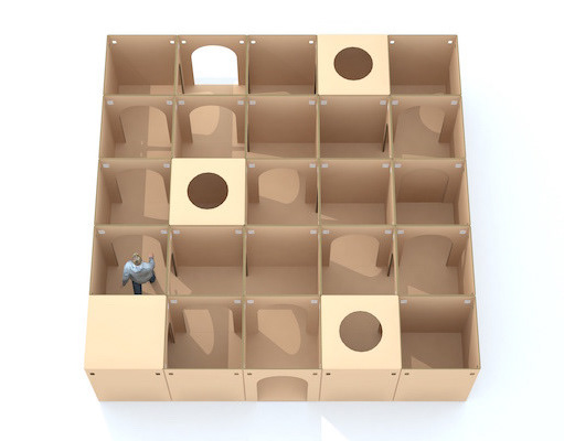
TSUCHINOCO CARDBOARD MAZE
ブランディングを担当しました、つちのこブランドからまったく新しいダンボール迷路の登場です! このダンボール迷路の最大の特徴は、宝探しをしながら遊べる迷路です。 入口で宝物カードを受け取り、その宝物を探しながら迷路を探検します。 宝物を見つけたら、カードに穴を空けてゆきます。 全部の宝物を発見するまで出る事はできません。 段ボール迷路をより面白く体験できる「宝探し迷路」です。 25,50,100など自由にマス目をカスタムできます。 納品事例多数です。 We are proud to introduce a brand-new cardboard maze from the Tsuchinoko brand, for which we were in charge of branding! The main feature of this cardboard maze is that it is a maze where visitors can play while searching for treasure. You receive a treasure card at the entrance and explore the maze looking for the treasure. When you find the treasure, you make a hole in the card. You cannot leave the maze until you have found all the treasures. This is a "treasure hunting maze" that makes the cardboard maze experience more interesting. You can customize the number of squares to 25, 50, 100, etc. We have many delivery examples.
2014
Omi Beef Marinated in Miso & corned beef
近江牛のコンビーフと味噌漬けのパッケージデザインです。パッケージの厚紙を展開すると牛の姿が消えます。This is a package design for Omi beef corned beef and miso marinated beef. When the cardboard of the package is unfolded, the cow disappears.
2017
YOSHINO Luncheon Board
最高級吉野杉を用いたランチョンボードです。お盆ではなく、縁がないもので手入れが簡単かつ、上質感のあるものを目指しました。直接食材を載せることも可能です。持ちやすいように周囲は薄く削っています。This luncheon board is made of the finest Yoshino cedar. It is not a tray, but rather a rimless one that is easy to clean and has a high quality feel. It is also possible to place food directly on it. The perimeter has been thinly shaved so that it is easy to hold.
2011
TOYAMA FESTIVAL
第62回富山まつりの公式ポスターを担当しました。青空の下、市内のメイン道路で日中にダイナミックな踊りが行われるこのお祭りを象徴的に踊り子の姿でデザインしました。We were in charge of the official poster for the 62nd Toyama Festival. We designed the dancers to symbolize this festival, in which dynamic dancing takes place during the day on the city's main roads under a blue sky.
2022
KUROBUTA
段ボール箱のベロを差し込む部分を豚の鼻に見立てて、黒豚を立体的にパッケージ全体に描くデザインとしました。 既存のロゴに使われている豚の鼻、目、放射状の装飾をパッケージにあしらうことで、ロゴとパッケージがつながる統一的ブランディングとしています。お尻の側に社名と、尻尾を描いています。箱を開けるときに鼻を引き出すと「THNAK YOU」の文字が見えるようにしています。 お店にパッケージが並んでいる際も、豚がたくさん並んでいるように見え、可愛く、遠目にも目を引くデザインとなっています。 もらったあとも取っておきたいパッケージということで、極力商品名や社名は前面に出さないことを意図しており、段ボール製の収納用品として販売していそうなものを目指し、シンプルで抽象的なデザインとしています。それゆえ、ギフトボックス以外の、壁面デザインやのぼりなど、様々な媒体に展開しやすいものになっています。 段ボールのクラフトの地色を活かしたナチュラル感のあるデザインにしており、素材の良さを感じさせるものです。 The design depicts a black pig three-dimensionally on the entire package, using the part of the cardboard box where the tongue is inserted as a pig's nose. The pig's nose, eyes, and radial decorations used in the existing logo are used on the package to create a unified branding that connects the logo and the package. The company name and tail are drawn on the butt side. When the box is opened, the nose is pulled out to reveal the words "THNAK YOU. When the package is lined up in a store, it looks like a bunch of pigs, which is cute and eye-catching from a distance. The design is simple and abstract, aiming for something that would be sold as a cardboard storage product. Therefore, the design can be easily applied to a variety of media other than gift boxes, such as wall designs and banners. The design has a natural feel, taking advantage of the ground color of the corrugated kraft, and gives a sense of the quality of the material.
2023
Back to Top