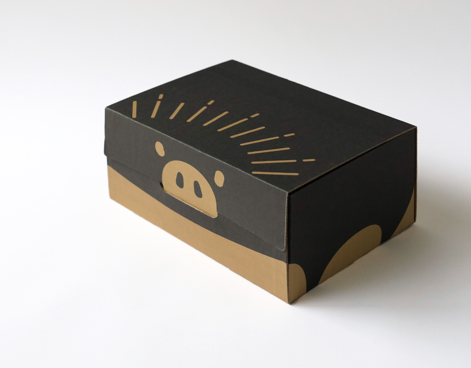
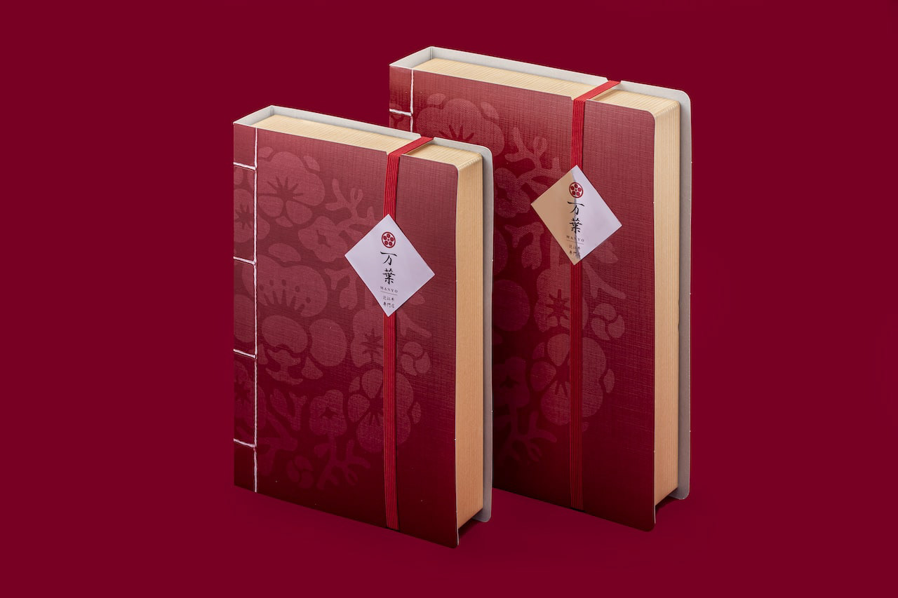
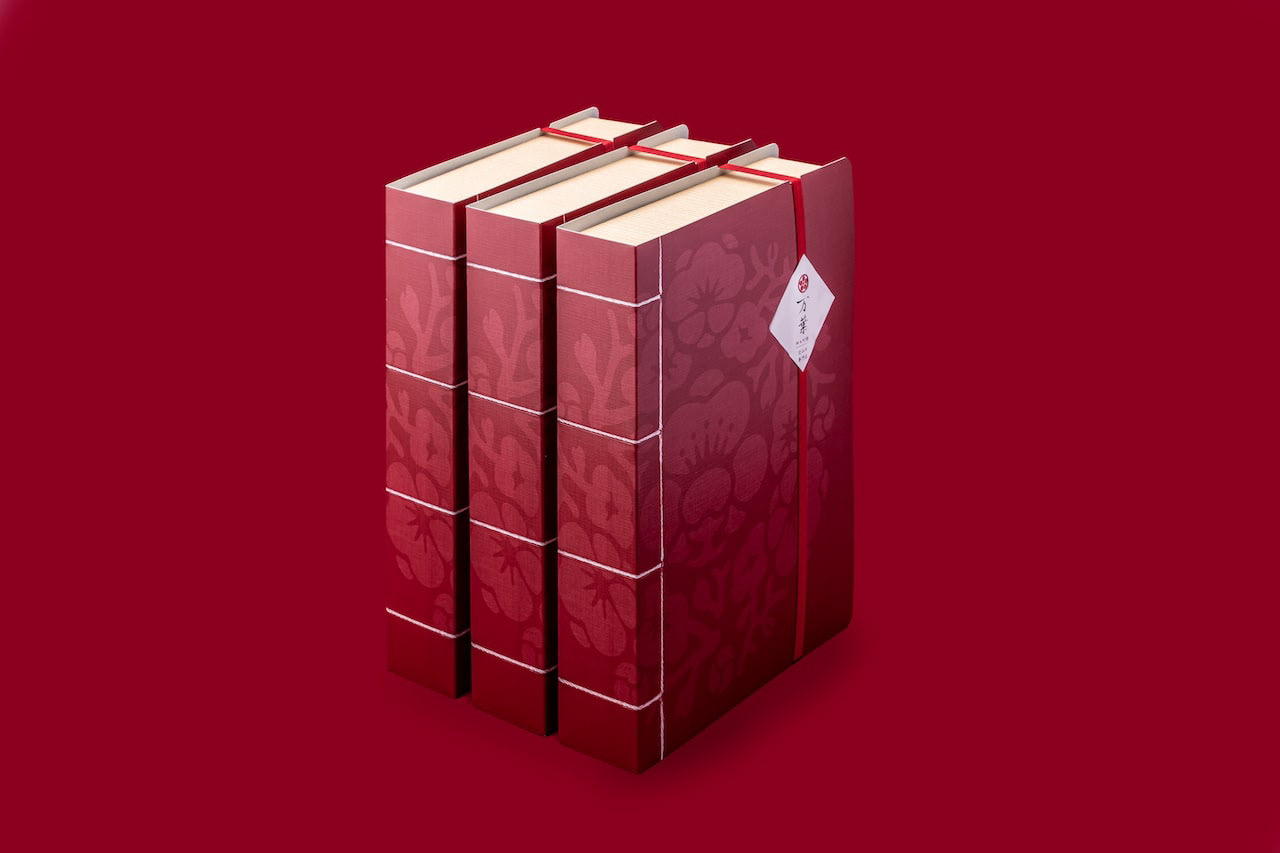
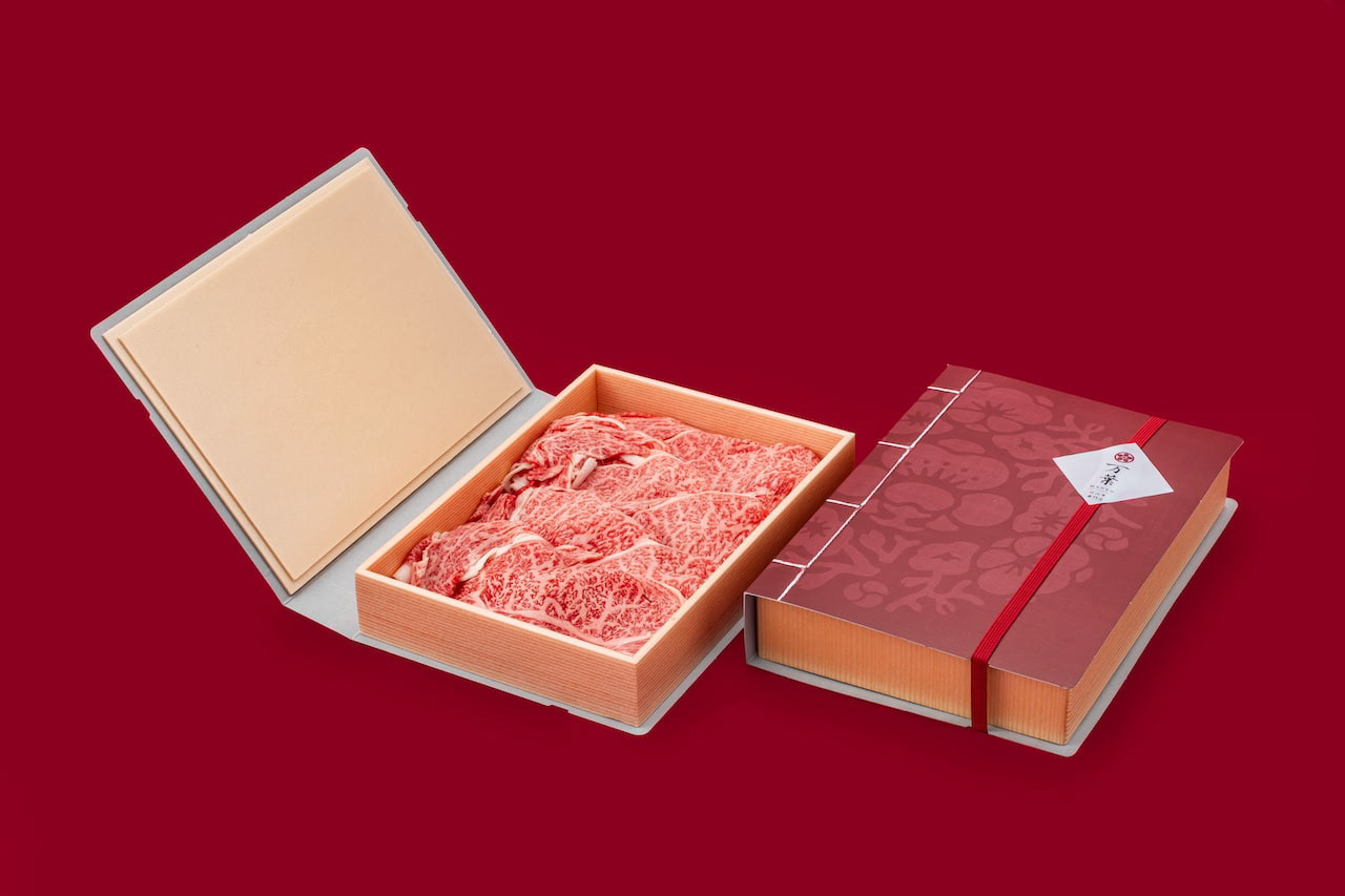
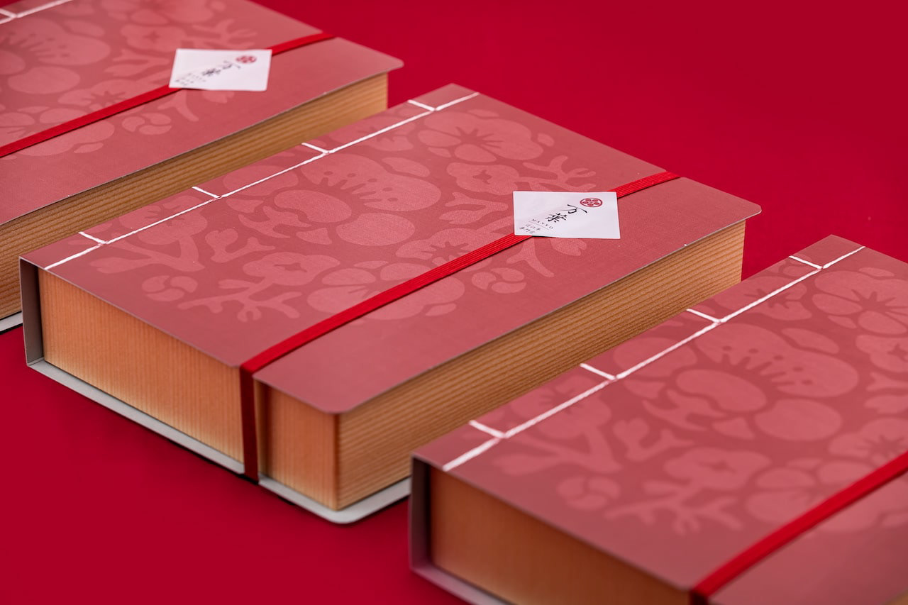
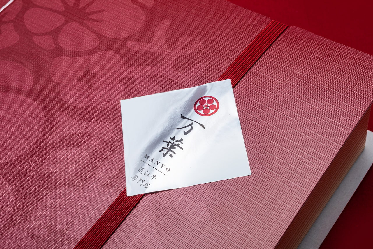
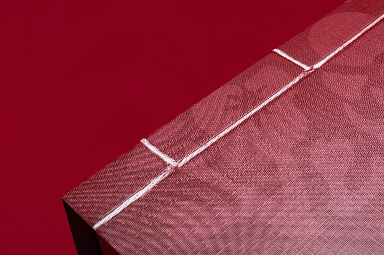
You may also like

CUBRIC HOOK
CUBRICはシンプルなデザインの木製の壁掛けフックです。 2つの立方体形状の組み合わせで構成されています。 どのような空間にもよく合う、なんでもないシンプルな形です。主張するわけでもなく、なんとなく壁にあり、玄関で向かえてくれる。 フックはあくまでも脇役。 主役は空間でありインテリアです。こんなシンプルな木製フックが意外と売っていませんでした。CUBRIC is a wooden wall hook with a simple design. It consists of a combination of two cube shapes. It is a simple, nondescript shape that fits well in any space. It does not make a statement, it is somehow on the wall, and it will greet you at the entrance. The hook is only a supporting role. The main role is the space and interior. Surprisingly, such a simple wooden hook was not sold.
2017
nasow
nasowはnatural soft woodの略でゴム素材と木屑、貝殻、様々な廃材を練りこんだ新素材です。リブランディングとプロダクトデザインを担当しました。独特の弾力のある素材の良さを引き出したデザインです。nasow stands for "natural soft wood," a new material made of rubber, wood chips, seashells, and various scrap wood. We rebranded and designed the product. The design brings out the best of the unique elasticity of the material.
2017
KOKA Cardboard Box
滋賀県甲賀市の段ボールのデザインです。甲賀市の市章の2色を使用し、忍者テーマで手裏剣のモノグラムを配置し、市章デザインもあしらっています。ふるさと納税返礼品を送るのに使用されたりしています。This is a cardboard design for Koka City, Shiga Prefecture. It uses the two colors of the Koka city emblem, and has a ninja theme with a shuriken monogram and the city emblem design. It is sometimes used to send tax returns from hometowns.
2021
VEHICLEN
室内用子供乗用玩具です。 中は収納で引出しになっていてお尻のほうから引き出せます。 オモチャなどを楽しく片付けながら遊べる乗り物です。 つののように張り出した部分は把手になっており、つかんで走ります。 子供の乗り物を考えるにあたって、子供の乗り物は暮らしの中で邪魔なものである。 あるいはいつか邪魔になる。と思っていました。 ですので、有用な引出し型の収納が走れば良いなと思っていたのです。 そして、子供は引出しが大好きなのです。 出来るだけコストを抑えるためにシンプルな板のみで作ろうと思いました。 でも、考えていくうち、少しずつ、箱が斜めになったのでした。 その方が、角がなく乗り心地も良いのです。
2007
uluru
真っ赤なブビンガのカタマリを見て、エアーズロックに見えました。 世界最大級の一枚岩が夕焼けに染まるこんな写真が浮かんだのです。 ブビンガはエアーズロックになりたがっていた。と私は思いました。 そんな思いつきから生まれた素材を活かしたペーパーウェイトです。 I saw the bright red Bubinga Katamari and it looked like Ayers Rock. This photo of one of the world's largest monoliths colored by the setting sun came to mind. Bubinga wanted to be Ayers Rock. I thought. This is a paperweight that makes use of materials born from such an idea.
2008
SAISIR
SAISIRはサカエヤに併設されたフレンチレストランです。SAISIRは掴むという意味であり、象形文字の牛の文字にヒントを得ながら、ナイフのようなロゴマークのデザインとしました。SAISIR is a French restaurant attached to Sakaeya, and the logo mark was designed to look like a knife, inspired by the hieroglyphic character for cow, SAISIR meaning "to grasp.
2019
GINDAWARA
釜炊き近江米 銀俵のロゴをデザインしました。シンボルマークは米俵を横から見た姿。銀俵の文字は古い文字から引用しました。We designed a logo for GINDAWARA. This restaurant cooks rice in a Shigaraki earthenware pot. The symbol mark is a side view of a rice bale. The letters of "Ginbawara" are taken from old characters.
2019
Cosmopolitan Tourism R&D
国際観光政策研究所のロゴデザインです。CとTを組み合わせて地球のように見せています。Logo design for the Institute for Cosmopolitan Tourism R&D, combining the C and the T to look like the earth.
2015
IZUMI YAMASAKI
2017
DECCHI YOKAN 3
3本入りの丁稚羊羹のパッケージリニューアルです。以前のパッケージが包装の手間がかかるということで、風呂敷をモチーフにしつつ、ワンタッチでとじることが可能なパッケージを考案しました。This is a renewal of the packaging for 3-packs of Decchi-Yokan. The previous package was time-consuming to wrap, so we devised a package with a furoshiki (wrapping cloth) motif that can be closed with a single touch.
2020
Back to Top