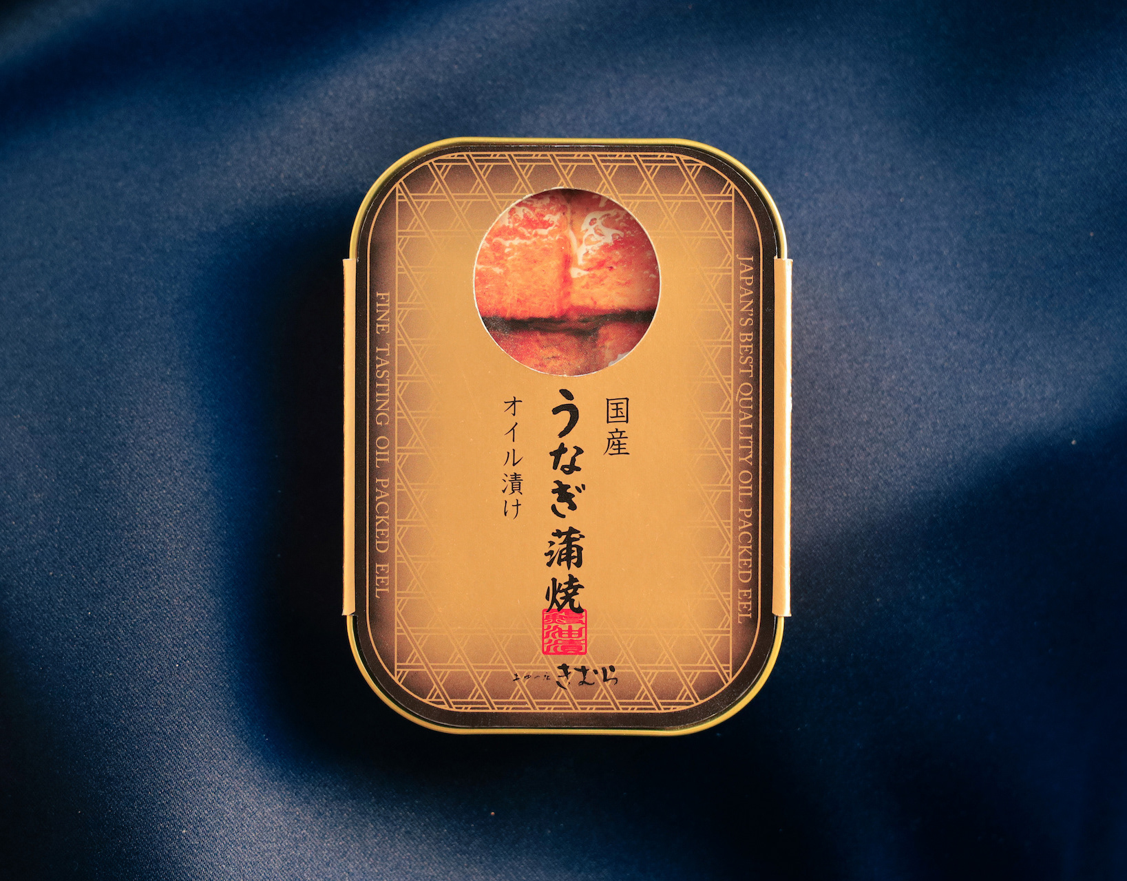
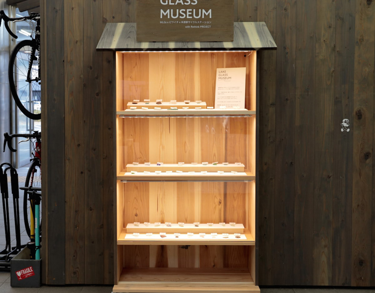
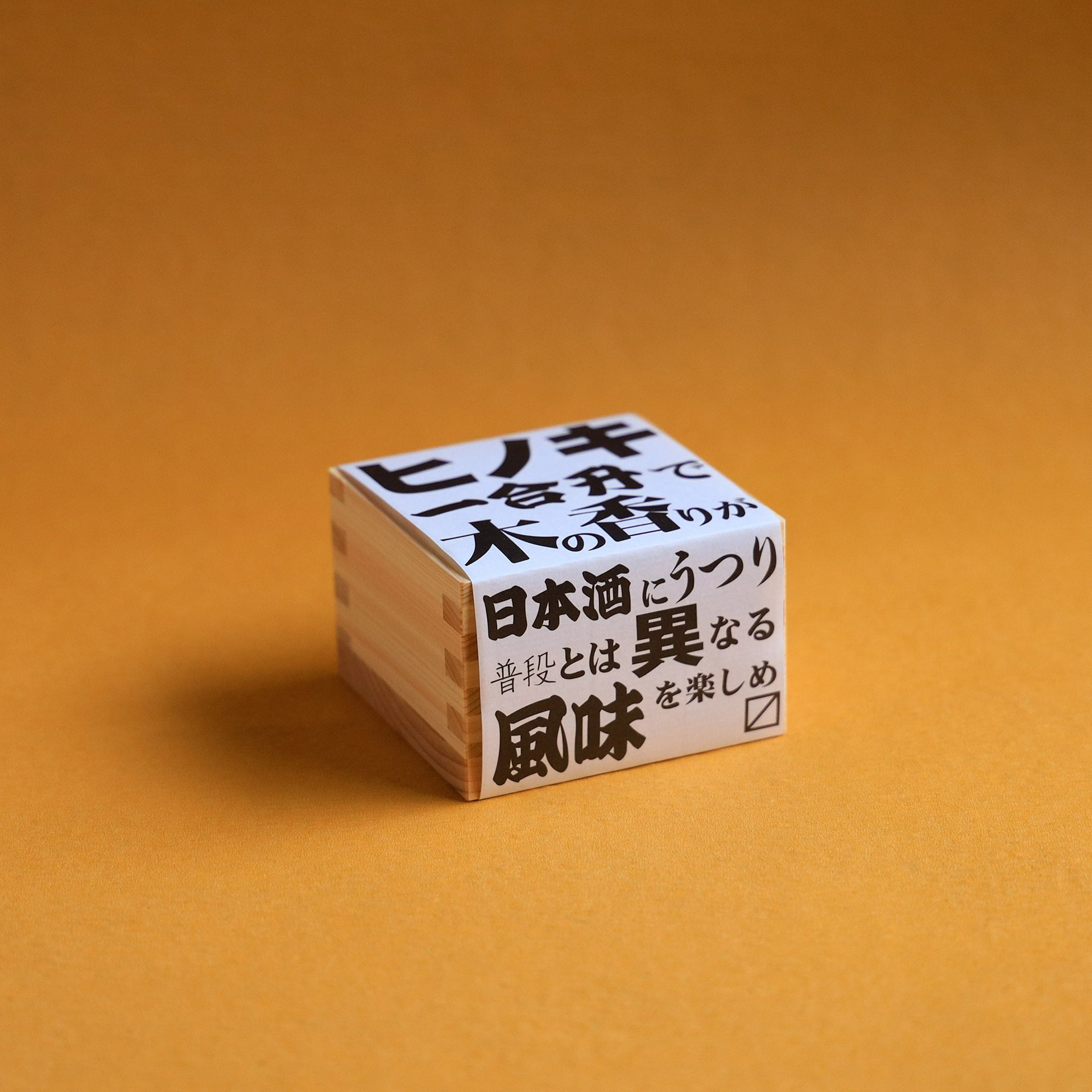
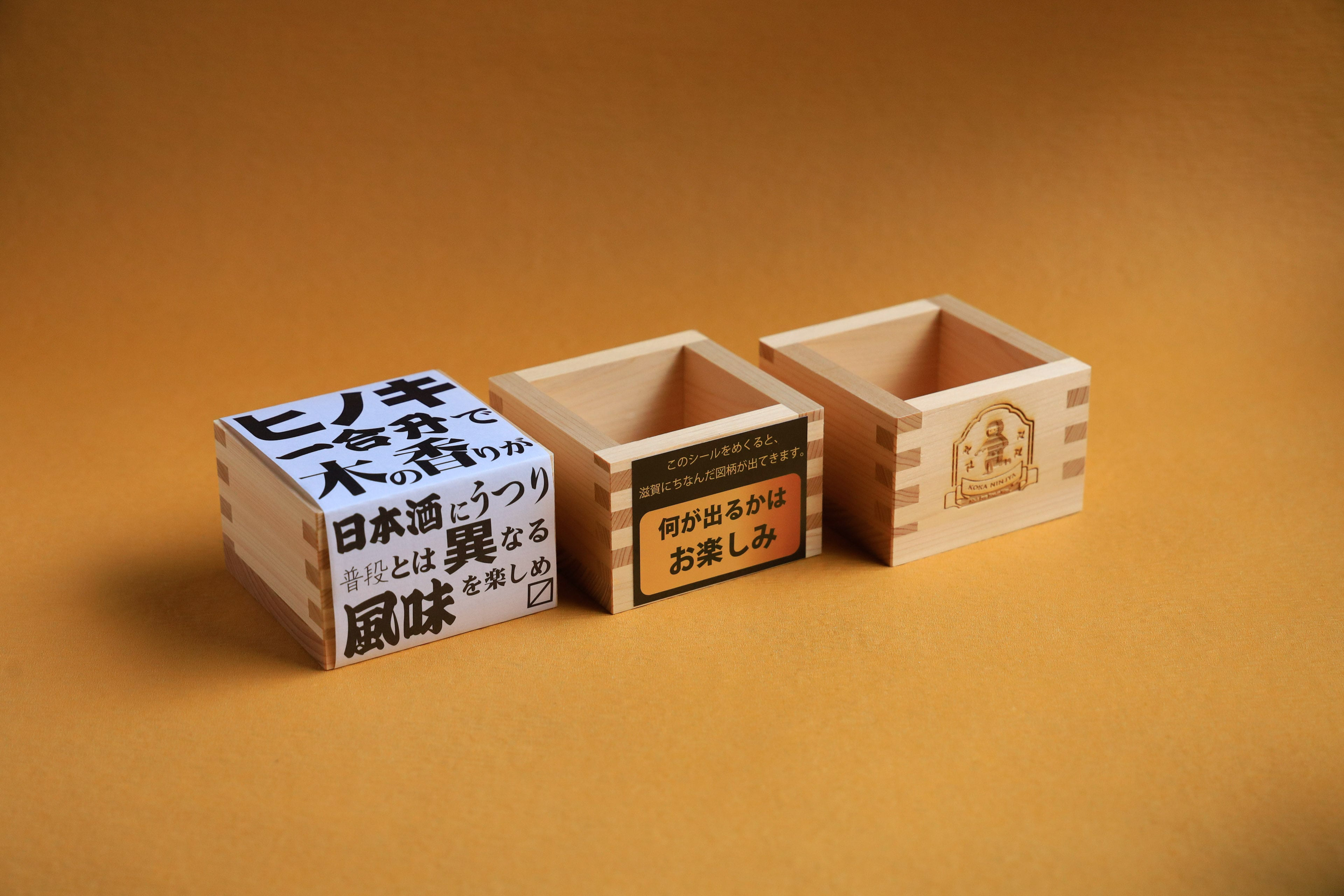
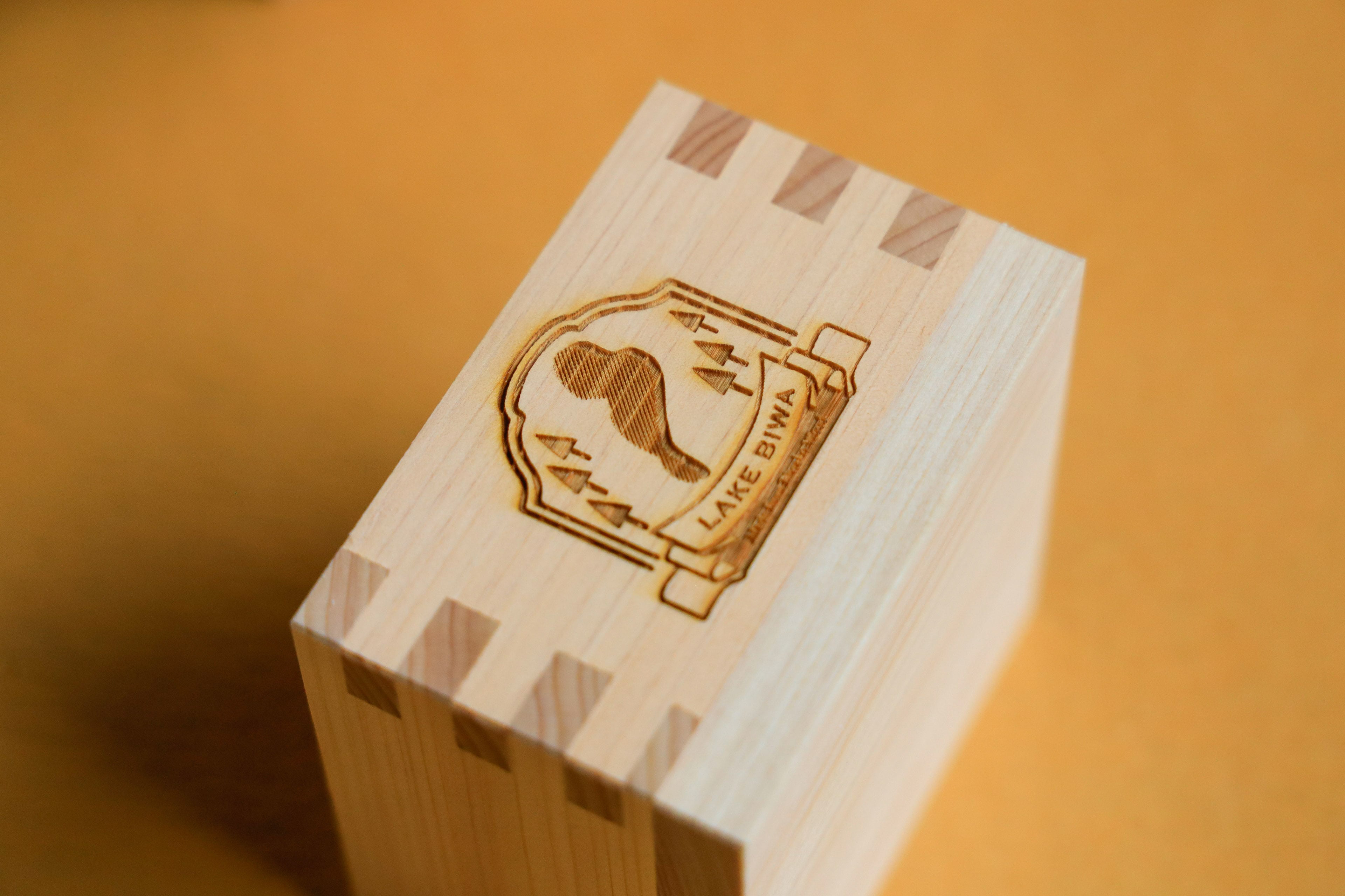
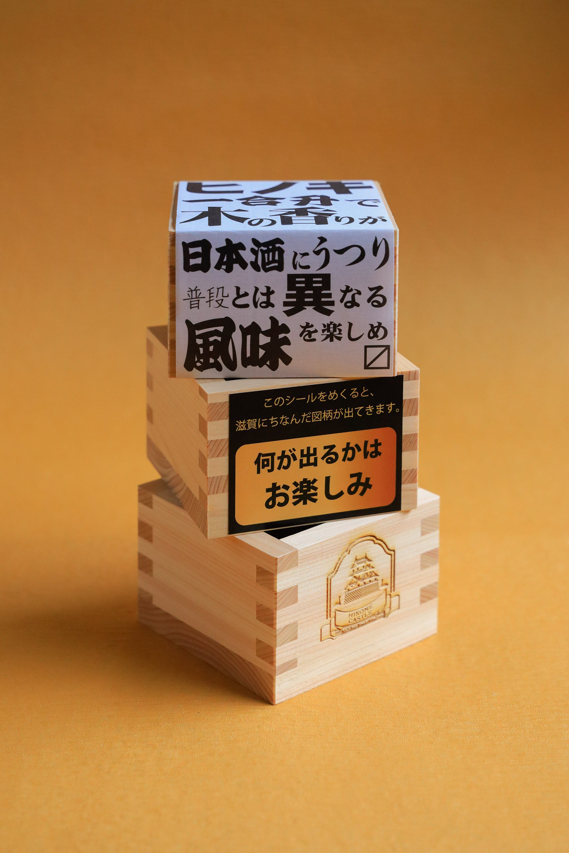
You may also like

AYU, SALT-GRILLED FLAKES
あゆの塩焼きをほぐした瓶詰めです。高級感を大切に、塩焼きであったことを引用し、竹串で封印をしています。紙も四角い金のマスがキラキラ見えるものを選択しています。This is a jar of ayu fish unglazed with salt. To emphasize the importance of luxury, it is sealed with a bamboo skewer, citing that it was grilled with salt. The paper is also selected to show a square gold square with glittering gold squares.
2021
HOP VISA
これはHOP VISAカードリニューアル指名コンペでの案です。滋賀の美しい緑、田園風景を水彩画を用いて表現したものです。手描きの四角い不均一なマス目が重なったりにじんだりして、一つの自然を形成しているようなイメージです。このようなおおらかさこそが滋賀のイメージであり、今までの緑のvisaカードのイメージも踏襲しながら、若々しく優しい、滋賀と、平和堂の空気感を表現できていると思います。This is a watercolor rendering of the beautiful green, rural landscape of Shiga. The image is of hand-painted squares of uneven squares overlapping and blurring to form a single natural feature. This kind of generosity is the image of Shiga, and I think it expresses the youthful and gentle atmosphere of Shiga and Heiwado, while also following the image of the existing green visa cards.
2023
AYU BOILED in SOY SOURCE
あゆの醤油煮の缶詰です。高級感があり、美味しそうに見えるように、醤油が染み込んでいくようなイメージでデザインしました。Canned ayu fish simmered in soy sauce. We designed it to look luxurious and delicious, with the image of soy sauce soaking into the product.
2021
minami design school
2025年6月〜2026年2月まで、大津北商工会にて、全10回のスクール形式で新商品開発、既存商品ブラッシュアップの講師を勤めることになりました。 事業者における新商品開発の際も、全てが決まってから「最後に外注するものが デザイン」ではなく、 リサーチから、今企業内にあるリソースを最大限に活かしながら、誰に向けて何を作るのか、サービスを考えることから、商品開発、売り場のデザインまで、その全てが「デザイン」であります。 ものづくりの事業者にとって、デザインは遠いものではなく、 それらの仕事の多くは実は「デザイン」です。 このスクールでは、事業者自身が自律的に考え、商品開発し、デザインができるように、私の力でどこまでできるかわかりませんがやることになりました。 I will be teaching a 10-session school-style course on new product development and product refining for existing products. When developing a new product for a business, it is not a case of “the last thing to be outsourced is the design” after everything has been decided, Design” is everything from research, to thinking about what to make and for whom, to product development, to designing the sales floor, all while making the most of the resources currently available within the company. For manufacturing businesses, design is not something far away, Many of those jobs are actually “design”. In this school, I don't know how far I can go, but I will do it so that the businesses themselves can think, develop products, and design autonomously. 我将以 10 期学校的形式教授新产品开发和现有产品的更新。 在为企业开发新产品时,并不是在确定了一切之后 “最后外包的是设计”、 设计 "是指从研究、思考制造什么和为谁制造、服务、产品开发到销售空间设计的所有工作,同时还要充分利用公司内部现有的资源。 对于制造企业来说,设计并不遥远、 很多工作其实就是 “设计”。 在这所学校里,我不知道自己能走多远,但我会做到让企业自己能够自主思考、自主开发产品、自主设计。
2025
BRANCH
「枝」を意味する店名のロゴデザイン。花屋さんでありますので「枝、森、花」そのどれもを感じさせる明るいデザインとしました。 Logo design for a store name meaning “branch. As a florist, the logo is bright and evocative of “branches, forests, and flowers. 为一个意为 “枝条 ”的店名设计徽标。 作为一家花店,徽标色彩明亮,令人联想到 “树枝、森林和鲜花”。
2024
Golden Sesami AYU
金ごまあゆは、琵琶湖産の小鮎の佃煮に、ごまをまぶした商品です。ご飯にのせたりして食べると美味しいのでその姿をパッケージデザインとしました。Golden Sesami Ayu is a tsukudani, a small sweetfish from Lake Biwa, sprinkled with sesame seeds. It is delicious when eaten over rice, so we designed the package to look like that.
2021
DECCHI YOKAN 3
3本入りの丁稚羊羹のパッケージリニューアルです。以前のパッケージが包装の手間がかかるということで、風呂敷をモチーフにしつつ、ワンタッチでとじることが可能なパッケージを考案しました。This is a renewal of the packaging for 3-packs of Decchi-Yokan. The previous package was time-consuming to wrap, so we devised a package with a furoshiki (wrapping cloth) motif that can be closed with a single touch.
2020
AYU in Olive Oil
鮎のオリーブオイル漬けのパッケージデザインです。メタリックの紙にオリーブの果実とオリーブグリーンの印刷でシンプルにデザインしました。他のシリーズと同様に缶の上面に中身の写真を表現し、中身のわかりやすい美味しそうなデザインとしています。 Package design for ayu fish marinated in olive oil. The design is simple with olive fruit and olive green printing on metallic paper. As with the other products in the series, a picture of the contents is expressed on the top of the can, making it easy to understand the contents of the tasty design. 橄榄油鲶鱼的包装设计。 设计简洁,在金属纸上印有橄榄果和橄榄绿。 与该系列的其他产品一样,罐头顶部印有内容物的图片,使人一目了然,看起来美味可口。
2025
SUPER DRY ART 2004
表参道旧同潤会青山アパート仮囲いに掲出されるという立地条件から、道路を挟んだ手前側の歩道と向こう側の歩道からとでは見え方が異なるようなデザインを意図しました。近くで見ると細かく印刷された[DRY]の文字ばかりが目立ち、遠くからでは[DRY]の文字は見えず、ビールの缶の姿がはっきり見えるというものです。 Given its location on the temporary fence surrounding the former Dojunkai Aoyama Apartments in Omotesando, the design was intended to look different depending on whether you were viewing it from the sidewalk on the near side of the road or the sidewalk on the far side. When viewed up close, the finely printed word "DRY" is the most prominent feature, while from a distance, the word "DRY" is not visible, and the image of the beer can is clearly seen.
2004
NORIKAU OGAWA/KENZO OGAWA
陶芸家 小川顕三氏と小川記一氏のブランドディレクションを担当しました。 陶芸家のお二人に対し、まず、作品から印象を得た二色のコンセプトカラーを設定しました。 その二色を、名刺から、リーフレット、ホームページに至るまで、対比的に使用することで、お互いを引き立てあうように計画しました。
2017
Back to Top