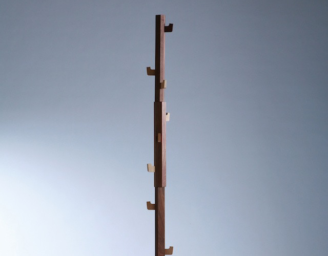
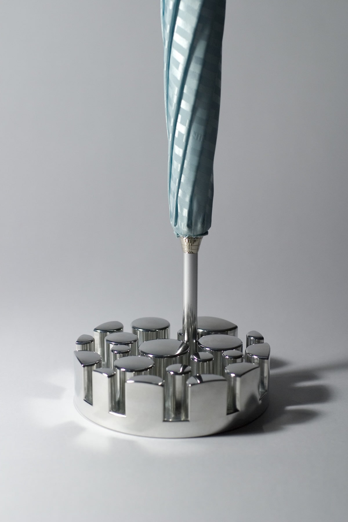
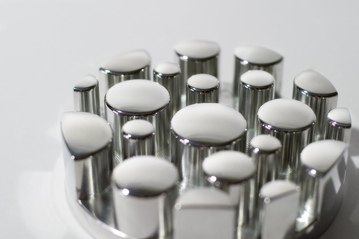
You may also like

MOTONOKI MOCHI
本之木餅は菓匠禄兵衛における長年ベストセラー商品です。 そのリニューアルデザインを担当しました。 今までの商品同様赤をベースに金との組み合わせは変えませんが、箱の型に抜きを使うことで立体感ある仕上がりに、印刷にもツヤニスを多様することで光の当たり方で浮かび上がる深みのある演出としました。 今までの印象を損なわず、さらに表現を進化させたデザインとしています。 お菓子は、ふっくらと炊き上げた粒あんを、餅粉入りのもっちり生地で包み、焼き上げたものです。8個入りと5個入りがあります。 Motonoki Mochi has been a best-selling product of Kasho Rokubei for many years. We were in charge of its renewal design. The red base color is the same as the previous products, and the combination of gold and gold is the same, but the box is die-cut to give it a three-dimensional finish, and a variety of glossy varnishes are used in the printing to create a deep effect that comes to life when the light hits it. The design has evolved further in expression without losing the impression of the past. The confectionery is made by wrapping softly cooked sweet bean paste in mochi dough and baking it. 8 pieces and 5 pieces are available.
 Motonoki mochi (红豆沙馅麻糬)多年来一直是 Kasho Rokubei 的畅销产品。 我们负责其更新设计。 与以前的产品一样,金色和红色底色的组合保持不变,但在包装盒上使用了模切模具,使其具有立体感,印刷时使用了亮光漆,产生了深邃的效果,在光线照射下栩栩如生。 设计在表现形式上有了进一步的发展,但又不失过去的印象。 这种点心是用煮软的甜豆沙,裹上麻糬粉烘烤而成。
2025
CUBRIC TEAK HOOK
CUBRICはシンプルなデザインの木製の壁掛けフックです。 幻の銘木「ユーラシアン チーク材」で製作しました。 濃い色は塗装の色ではございません。木質は重硬でとても高級感があります。 高価な材料ですが、もう一種類のCUBRICとあまり変わらないようにお値段は頑張っています。2つの立方体形状の組み合わせで構成されています。 どのような空間にもよく合う、なんでもないシンプルな形です。CUBRIC is a wooden wall hook with a simple design.It is made of Eurasian teak, a fantastic wood.The dark color is not the color of the paint.The wood is heavy, hard, and very luxurious.It is an expensive material, but we are trying our best to keep the price not much different from the other type of CUBRIC.It is composed of a combination of two cube shapes.It is a simple, nondescript shape that fits well in any space.
2017
Pizza Shigaraki
2015
TSUCHINOCO
2012
RENOVATION EXPO
リノベーションエキスポ大阪の公式ポスターのデザインです。建築空間で文字を形成したデザインとしました。This is the design for the official poster of Renovation Expo Osaka. The design was made to form letters in architectural space.
2019
convesso
日本は、安価な輸入材に頼ってきたので、日本中に植えられた杉の森は放置され、林業の衰退と森の荒廃が進んでいます。 日本の杉を使う事で、日本の森は元気になります。 これは、そのような杉材を用いた家具デザインの提案です。 杉の柔らかく、あたたかな質感をソファの背もたれに活かしました。 デザイン的にも暖かみのある木の質感を引き出すため、ぽってりした黒いカタマリとコントラストを活かしたデザインとしました。   杉の活用ということで、杉ばかりで家具を作る事を考えてしましますが、ここでは、杉を象徴的に用いています。 黒く重たいものに対して、軽やかな杉を対比させて見せています。 ふわっと柔らかい造形とすることで、シャープな黒とのコントラストを強調しています。 人の手の触れる部分に杉を積極的に用い、温かみある杉を触ってもらいたいと意図しました。
2008
BIWAICHI
2019
KIRAMIZUKI OMI RICE
近江米の新品種「きらみずき」のパッケージデザインおよびブランディングプロポーザル応募案。パッケージの絵は、きらきらと輝く琵琶湖を中心に、豊かな生物、山林、気候、田畑のイラストをちりばめ、それらの恩恵を受けたみずみずしい米粒を描きました。全体的に金色でデザインを、下地は旨味を感じさせる淡いベージュ色で高級感とシズル感(美味しそうに見える感覚)を演出しました。のぼりや法被、コンセプトブック、ポスターなど販促品も合わせてデザインしました。Proposal entry proposal for a new variety of Omi rice. The package picture depicts a sparkling Lake Biwa, interspersed with illustrations of rich living creatures, mountains, forests, climate, and fields, and the lush rice grains that benefit from them. The overall design is in gold, while the base color is a light beige that evokes a sense of deliciousness and a sense of luxury. The base color is a light beige color that evokes a sense of deliciousness, creating a sense of luxury and sizzle (a sense of looking delicious).
2023
1/6 fabric
滋賀の繊維を使ったファブリックブランドです。湖東地域の麻織物と高島ちぢみを使って小物を作りました。柄になっているのは滋賀にゆかりあるモチーフのデザインです。使うほどに良さがわかる気持ち良い生地と評判です。These are fabric brands using fibers from Shiga. Hemp fabrics from the Koto region and Takashima chijimi are used to make these small items. The patterns are designed with motifs associated with Shiga. The fabrics have a reputation for being pleasant to the touch, and the more you use them, the more you appreciate their quality.
2018
AYU CUT OPEN and DRIED
あゆのひらき(干物)です。干物はザルで干すので竹で編んだザルをイメージして高級感あるパッケージをデザインしました。このパッケージはpantawards 2020の金賞を受賞しています。AYU HIRAKI (dried ayu fish). Dried ayu is dried in a colander, so we designed a luxurious package with the image of a colander made of woven bamboo. This package won a gold medal at pantawards 2020.
2020
Back to Top