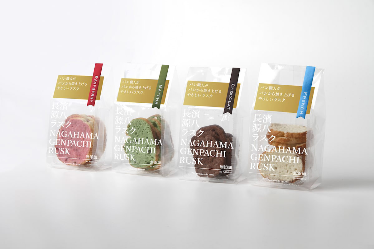
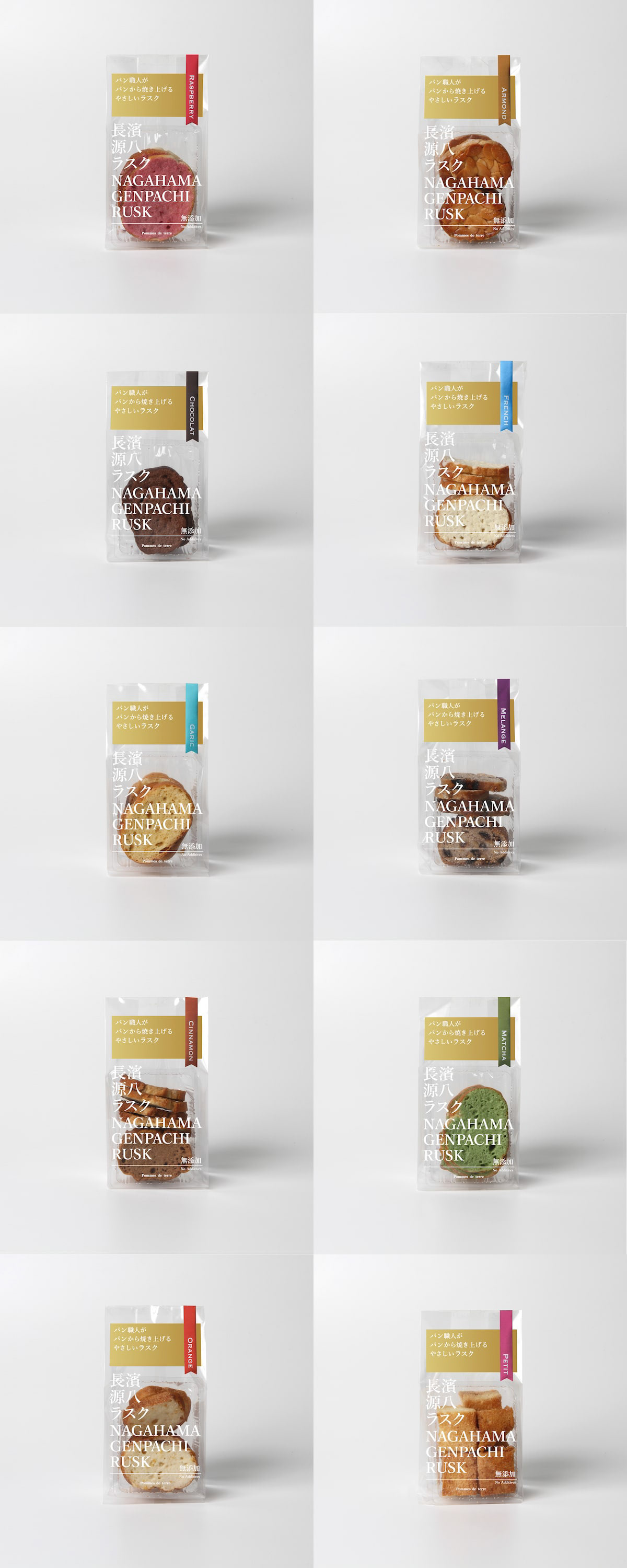
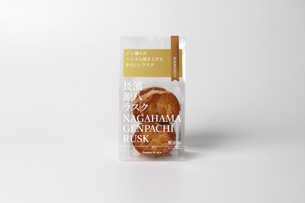
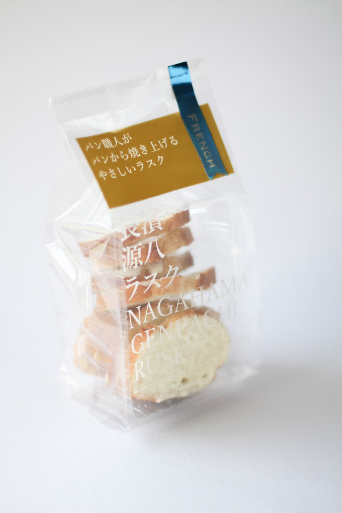
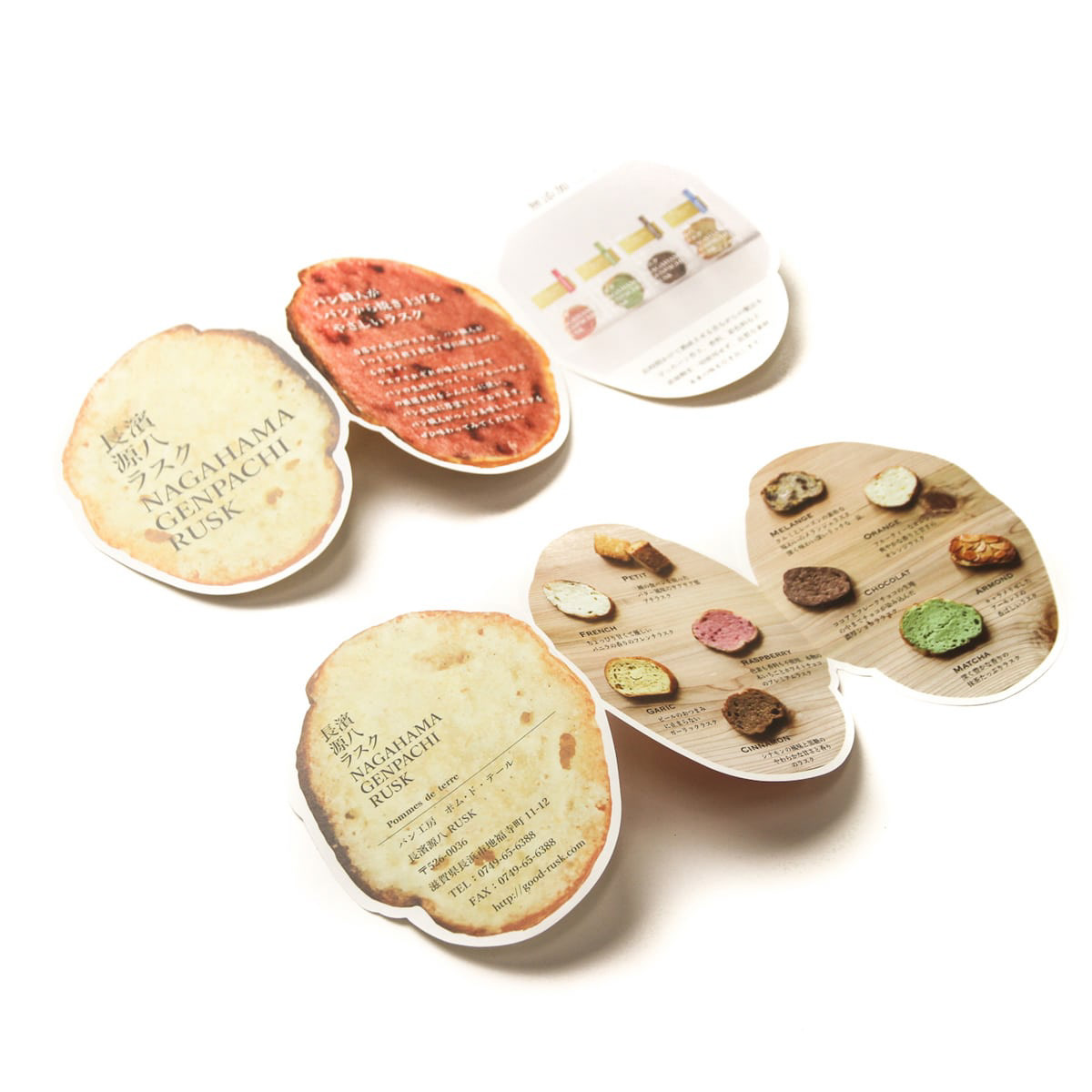
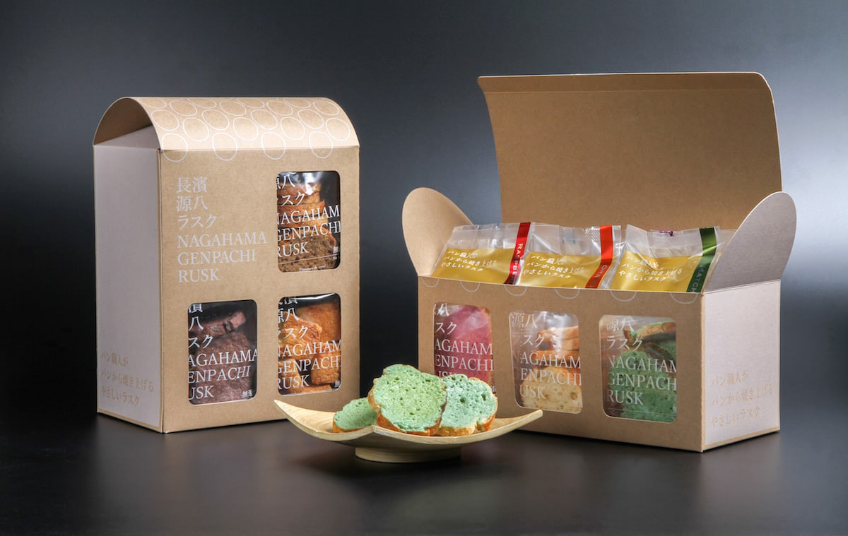
You may also like

TAKASHIMA A MONO GP 2024
高島ええものグランプリ2024のブランディングを担当しました。 今回は受賞者への取材を記事にし、商品を見るだけではわからない作り手の熱い想いやストーリーを大切に伝えようと考え、高島市内の道の駅への集客に新聞折込のB3チラシをデザインしました。また道の駅の専用什器、POPなど売り場のデザインもしました。 また、受賞者へは、「センスがええ」ということで高島産のセンスと賞状、副賞がプレゼントされました。 We were in charge of branding for the Takashima Eemono Grand Prix 2024. This time, we turned interviews with the winners into articles, with the aim of conveying the passion and stories of the makers that cannot be understood just by looking at the products, and designed a B3 flyer to be inserted into newspapers to attract customers to roadside stations in Takashima City. In addition, the winners were presented with Takashima-made products, a certificate, and a prize in recognition of their "good sense. "我们负责 2024 年高岛艾莫诺大奖赛的品牌推广工作。 这次,我们采访了获奖者并撰写了一篇文章,还设计了一张 B3 传单,刊登在报纸上,以吸引顾客前往高岛市的路边车站。 我们还在路边车站设计了专用固定装置、POP 和其他销售区域。 我们还向获奖者颁发了 “时尚感”、证书和额外奖品,所有这些都是高岛制造,以表彰他们的 “时尚感”!
2025
DECCHI YOKAN 3
3本入りの丁稚羊羹のパッケージリニューアルです。以前のパッケージが包装の手間がかかるということで、風呂敷をモチーフにしつつ、ワンタッチでとじることが可能なパッケージを考案しました。This is a renewal of the packaging for 3-packs of Decchi-Yokan. The previous package was time-consuming to wrap, so we devised a package with a furoshiki (wrapping cloth) motif that can be closed with a single touch.
2020
BRANCH
「枝」を意味する店名のロゴデザイン。花屋さんでありますので「枝、森、花」そのどれもを感じさせる明るいデザインとしました。 Logo design for a store name meaning “branch. As a florist, the logo is bright and evocative of “branches, forests, and flowers. 为一个意为 “枝条 ”的店名设计徽标。 作为一家花店,徽标色彩明亮,令人联想到 “树枝、森林和鲜花”。
2024
HACHIMANJIKAN
近江八幡の西の湖周辺をビーチクルーザーで自転車ツアーをするツーリズムのブランディング「ハチマンジカン」です。Hachimanjikan" is a branding for a tourism brand that offers bicycle tours by beach cruiser around Lake Nishi in Omi Hachiman.
2019
220
220は特殊な触媒を用いて飲料の味を変化させる魔法のマドラーです。数秒かき混ぜるだけでワインが熟成されたような味になります。プロダクトデザインは秋田道夫氏、ブランディングを弊社が担当しました。220 is a magic muddler that uses a special catalyst to change the taste of beverages. Just a few seconds of stirring is all it takes to make wine taste like it has been aged. Product design was done by Michio Akita and branding by our company.
2022
saruyama
saruyamaは、無垢材のソリッド感を活かしたコートーハンガーです。本体は4つにノックダウン可能です。いろいろな高さにフックがあり、家族みんなで使えるコートハンガーです。フックの部分は山に登っているサルのイメージで、頂上にいる赤いのがボスザルです。
2013
CHINDON FESTIVAL
第67回全日本チンドンコンクールのポスターデザイン案です。賑やかな音が聞こえて来そうな立体的で動きのあるデザインとしました。「ちんどん」の文字が描かれています。This is a poster design for the 67th All Japan Chindon Competition. The design is three-dimensional and full of movement, as if one can hear the lively sound of the chindon. The word "Chindon" is drawn on the poster.
2021
Cosmopolitan Tourism R&D
国際観光政策研究所のロゴデザインです。CとTを組み合わせて地球のように見せています。Logo design for the Institute for Cosmopolitan Tourism R&D, combining the C and the T to look like the earth.
2015
LAKEWOOD
2021
KUJYAKU
KUJYAKUは折りたためるパーティションです。孔雀のように羽を広げて展開することができます。柄は菊と松があります。驚きのあるプロダクトです。KUJYAKU is a foldable partition. It can be unfolded by spreading its wings like a peacock. The patterns are chrysanthemum and pine. It is a surprising product.
2013
Back to Top