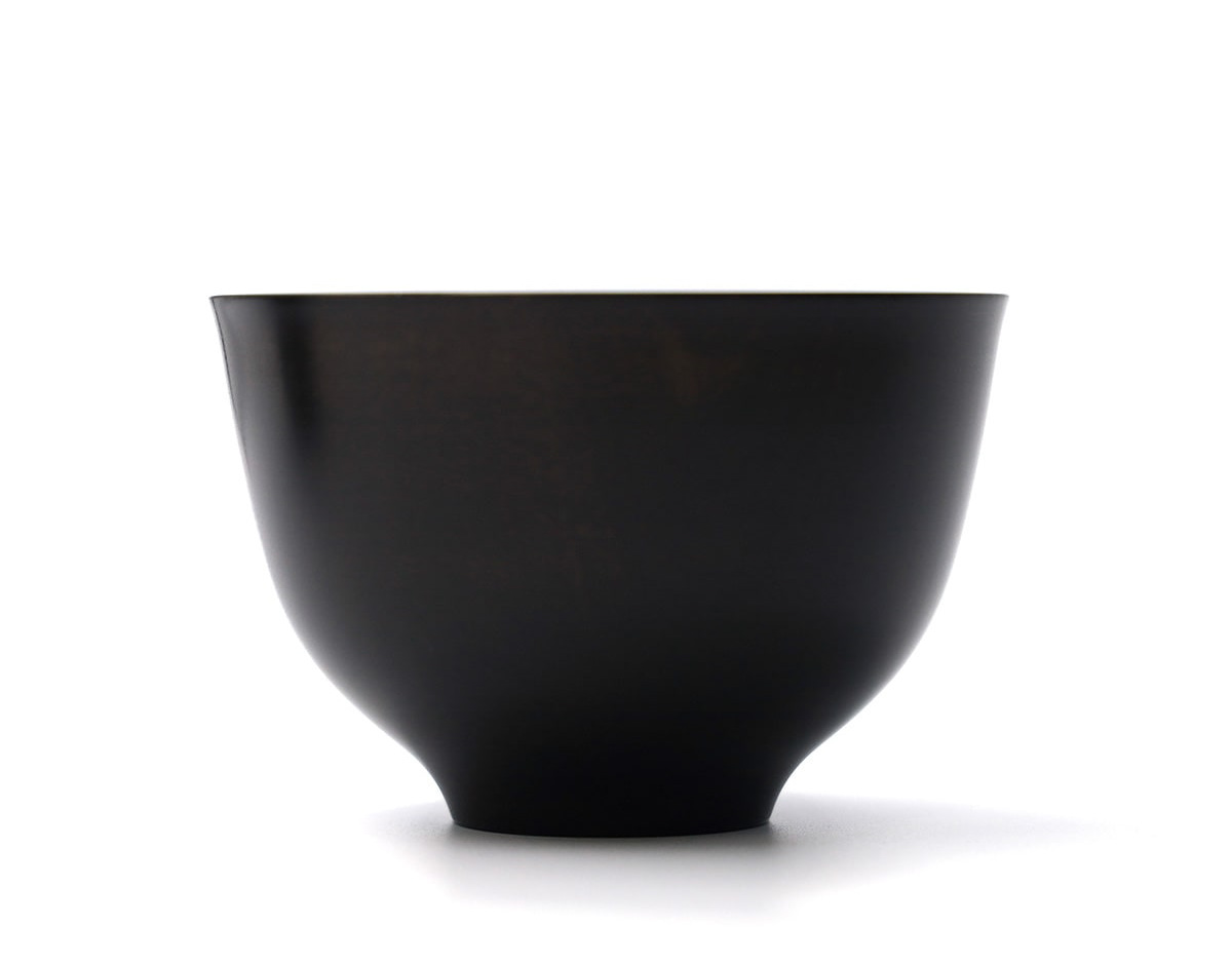
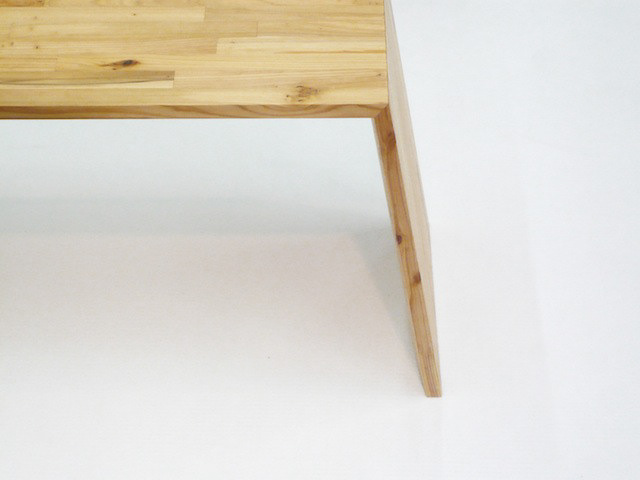
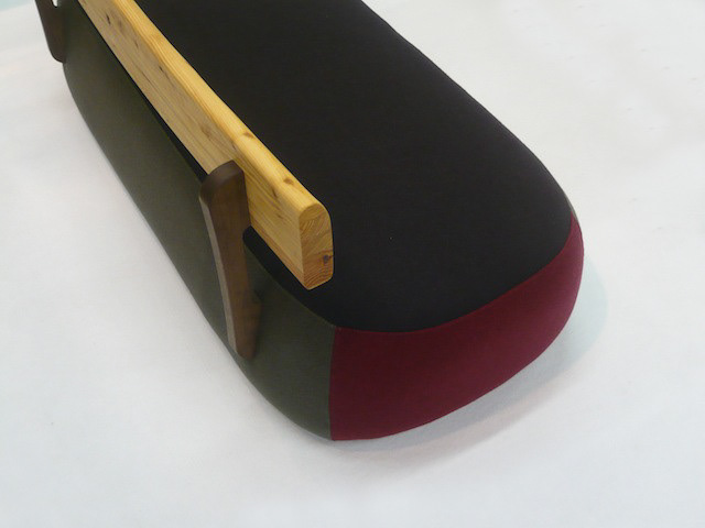
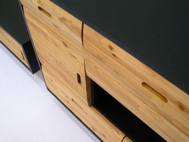
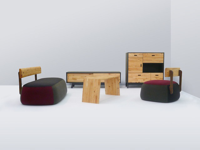
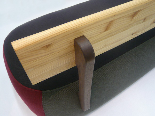
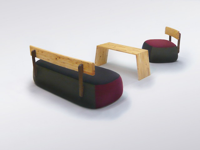
You may also like

minami design school
2025年6月〜2026年2月まで、大津北商工会にて、全10回のスクール形式で新商品開発、既存商品ブラッシュアップの講師を勤めることになりました。 事業者における新商品開発の際も、全てが決まってから「最後に外注するものが デザイン」ではなく、 リサーチから、今企業内にあるリソースを最大限に活かしながら、誰に向けて何を作るのか、サービスを考えることから、商品開発、売り場のデザインまで、その全てが「デザイン」であります。 ものづくりの事業者にとって、デザインは遠いものではなく、 それらの仕事の多くは実は「デザイン」です。 このスクールでは、事業者自身が自律的に考え、商品開発し、デザインができるように、私の力でどこまでできるかわかりませんがやることになりました。 I will be teaching a 10-session school-style course on new product development and product refining for existing products. When developing a new product for a business, it is not a case of “the last thing to be outsourced is the design” after everything has been decided, Design” is everything from research, to thinking about what to make and for whom, to product development, to designing the sales floor, all while making the most of the resources currently available within the company. For manufacturing businesses, design is not something far away, Many of those jobs are actually “design”. In this school, I don't know how far I can go, but I will do it so that the businesses themselves can think, develop products, and design autonomously. 我将以 10 期学校的形式教授新产品开发和现有产品的更新。 在为企业开发新产品时,并不是在确定了一切之后 “最后外包的是设计”、 设计 "是指从研究、思考制造什么和为谁制造、服务、产品开发到销售空间设计的所有工作,同时还要充分利用公司内部现有的资源。 对于制造企业来说,设计并不遥远、 很多工作其实就是 “设计”。 在这所学校里,我不知道自己能走多远,但我会做到让企业自己能够自主思考、自主开发产品、自主设计。
2025
KYO AKARI
赤坂サカスで開催されたCool Kyoto2011に間接照明用のLED「ウィルライン」を展示するためのブースのデザインを担当しました。 京都らしいアイデンティティと、ブースに強化ダンボールを用いることを求められました。 強化ダンボールの特性を活かし、美しい光の陰影を表現し、全体を統合させるデザインを考えました。 あかりの縦格子 間接照明によって強化ダンボールの縦格子を照らし出します。 狭く小さなスペースでありますが、遠くからでも目を引く空間的な展示什器としています。 LEDの商品をそのままただ見せるのではなく、どのようにLEDの効果があるのかを見せるものとし、 落ち着きのある美しい陰影をダンボールで描き出す事に成功しました。 LEDはあくまでも脇役であり、引き立たせるべきもの、照らし出すべきものを配置しました。
2007
CHISO
2011
AYU in Olive Oil
鮎のオリーブオイル漬けのパッケージデザインです。メタリックの紙にオリーブの果実とオリーブグリーンの印刷でシンプルにデザインしました。他のシリーズと同様に缶の上面に中身の写真を表現し、中身のわかりやすい美味しそうなデザインとしています。 Package design for ayu fish marinated in olive oil. The design is simple with olive fruit and olive green printing on metallic paper. As with the other products in the series, a picture of the contents is expressed on the top of the can, making it easy to understand the contents of the tasty design. 橄榄油鲶鱼的包装设计。 设计简洁,在金属纸上印有橄榄果和橄榄绿。 与该系列的其他产品一样,罐头顶部印有内容物的图片,使人一目了然,看起来美味可口。
2025
MID DAY 2017
7月2日は、元日から182日、大晦日まで同じく182日。 “一年のまんなかの日(=MIDDAY)”である7月2日を「ミッドデイ(まんなかの日)」と名付け、新しい半年の始まりをお祝いするイベントが東京MIDTOWNで開催されます。 その中で、1年の初めのご挨拶である「年賀状」にちなみ、新たな半年の初めに「半賀状」を送ることを提案する企画があります。 HAPPY HALF BOX内で、日本のトップクリエイターとTokyo Midtown Award出身の作家15組がデザインした「半賀状」が展示されます。 <作品コンセプト> 「僕の前に道はない僕の後ろに道は出来る。」高村光太郎氏の詩です。 道の向こうにある一本の木と広がる空。 一本の木は両手を広げた私の頭であるかもしれない。 一年の半分。 人生もまだ、道半ば。 今日の一日を大切にしたい。 というメッセージを表現しました。
2017
TAKASHIMA A MONO GP 2024
高島ええものグランプリ2024のブランディングを担当しました。 今回は受賞者への取材を記事にし、商品を見るだけではわからない作り手の熱い想いやストーリーを大切に伝えようと考え、高島市内の道の駅への集客に新聞折込のB3チラシをデザインしました。また道の駅の専用什器、POPなど売り場のデザインもしました。 また、受賞者へは、「センスがええ」ということで高島産のセンスと賞状、副賞がプレゼントされました。 We were in charge of branding for the Takashima Eemono Grand Prix 2024. This time, we turned interviews with the winners into articles, with the aim of conveying the passion and stories of the makers that cannot be understood just by looking at the products, and designed a B3 flyer to be inserted into newspapers to attract customers to roadside stations in Takashima City. In addition, the winners were presented with Takashima-made products, a certificate, and a prize in recognition of their "good sense. "我们负责 2024 年高岛艾莫诺大奖赛的品牌推广工作。 这次,我们采访了获奖者并撰写了一篇文章,还设计了一张 B3 传单,刊登在报纸上,以吸引顾客前往高岛市的路边车站。 我们还在路边车站设计了专用固定装置、POP 和其他销售区域。 我们还向获奖者颁发了 “时尚感”、证书和额外奖品,所有这些都是高岛制造,以表彰他们的 “时尚感”!
2025
DECCHI YOKAN 3
3本入りの丁稚羊羹のパッケージリニューアルです。以前のパッケージが包装の手間がかかるということで、風呂敷をモチーフにしつつ、ワンタッチでとじることが可能なパッケージを考案しました。This is a renewal of the packaging for 3-packs of Decchi-Yokan. The previous package was time-consuming to wrap, so we devised a package with a furoshiki (wrapping cloth) motif that can be closed with a single touch.
2020
saruyama
saruyamaは、無垢材のソリッド感を活かしたコートーハンガーです。本体は4つにノックダウン可能です。いろいろな高さにフックがあり、家族みんなで使えるコートハンガーです。フックの部分は山に登っているサルのイメージで、頂上にいる赤いのがボスザルです。
2013
KIRAMIZUKI OMI RICE
近江米の新品種「きらみずき」のパッケージデザインおよびブランディングプロポーザル応募案。パッケージの絵は、きらきらと輝く琵琶湖を中心に、豊かな生物、山林、気候、田畑のイラストをちりばめ、それらの恩恵を受けたみずみずしい米粒を描きました。全体的に金色でデザインを、下地は旨味を感じさせる淡いベージュ色で高級感とシズル感(美味しそうに見える感覚)を演出しました。のぼりや法被、コンセプトブック、ポスターなど販促品も合わせてデザインしました。Proposal entry proposal for a new variety of Omi rice. The package picture depicts a sparkling Lake Biwa, interspersed with illustrations of rich living creatures, mountains, forests, climate, and fields, and the lush rice grains that benefit from them. The overall design is in gold, while the base color is a light beige that evokes a sense of deliciousness and a sense of luxury. The base color is a light beige color that evokes a sense of deliciousness, creating a sense of luxury and sizzle (a sense of looking delicious).
2023
TOFU ICCHO
和紙でできたノート豆腐一帳のロゴデザイン。 エッジがピンとしつつも、中身はやわらかい、そんな豆腐のような手作り感のあるロゴを目指してデザインしました。
2014
Back to Top