NAGAHAMA GOEN DEAPARTMENT STORE
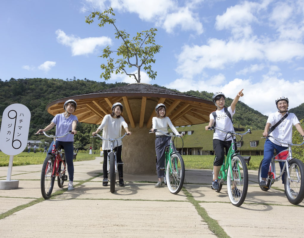
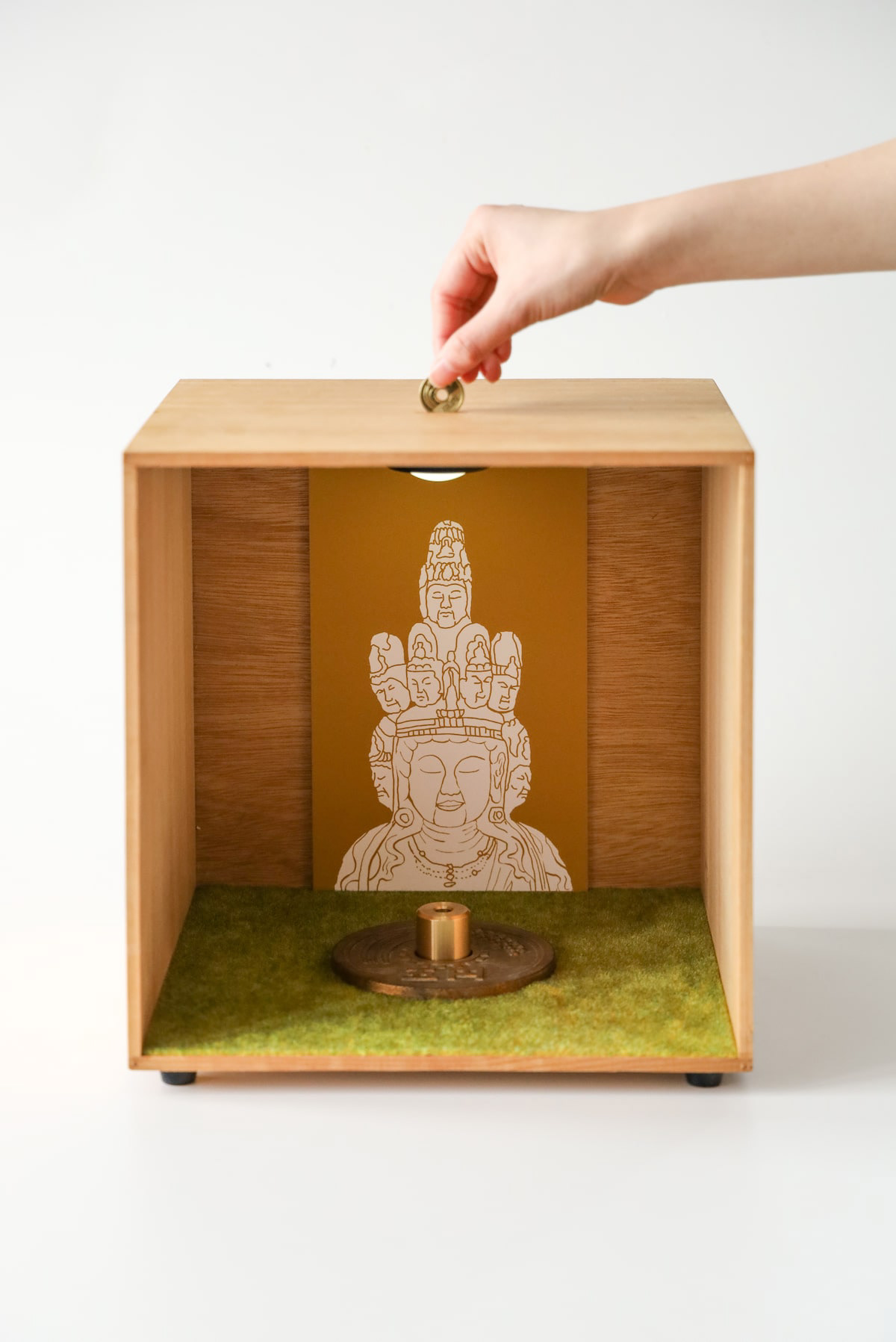
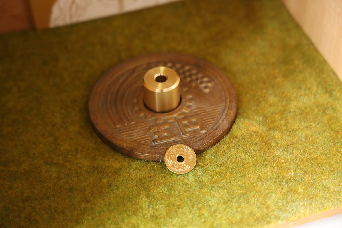
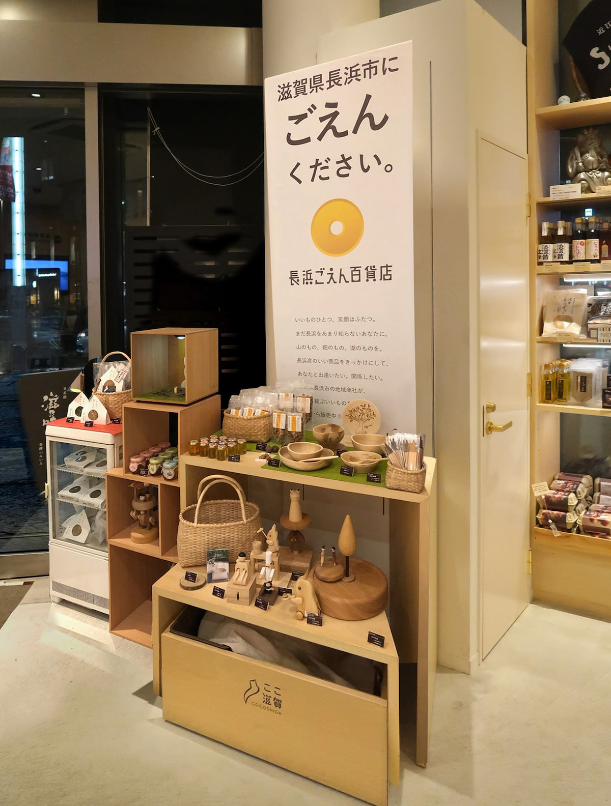
長浜ごえん百貨店のロゴデザインと企画です。長浜のいいものを集めて日本橋のここしがで催事をしました。5円玉を落として良いことが起きるご縁くださいボックスも作成しました。 Logo design and planning for Nagahama Goen Department Store. We also created a box in which you can drop a 5-yen coin and something good will happen to you. 为 Nagahama Goen 百货公司设计和规划徽标。 我们还制作了一个盒子,投下一枚五元硬币,就会有好事发生。
You may also like
FLOCK
FLOCKは群を意味します。信楽焼の陶器で作られた箸置きやブローチなどのブランディングデザインとネーミングです。商品数がとても多く、動物や植物など生物が多くを占めているので群と名付けました。FLOCK means flock. It is a branding design and naming of chopstick rests and brooches made of Shigaraki ware pottery. We named it "Flock" because there are so many products and many of them are creatures such as animals and plants.
2018
GINDAWARA
釜炊き近江米 銀俵のロゴをデザインしました。シンボルマークは米俵を横から見た姿。銀俵の文字は古い文字から引用しました。We designed a logo for GINDAWARA. This restaurant cooks rice in a Shigaraki earthenware pot. The symbol mark is a side view of a rice bale. The letters of "Ginbawara" are taken from old characters.
2019
OITA ASIA SCULPTURE EXHIBITION
大分アジア彫刻展公募の公式ポスターを担当しました。大分の頭文字OとアジアのAをモチーフに、現代彫刻作品を思わせるようなデザインとしました。大分の向こうにアジアを見据えるイメージでAを向こう側に配置し、また、賞の頂点を金色のAで表しています。
I designed the official poster for the Oita Asia Sculpture Exhibition open call. Using the initials O for Oita and A for Asia as motifs, I created a design reminiscent of contemporary sculpture. The letter A is positioned toward the horizon, symbolizing the vision of Asia beyond Oita, while the golden A represents the pinnacle of the awards.
我负责设计了大分亚洲雕塑展公开征集活动的官方海报。以大分首字母O和亚洲首字母A为设计元素,打造出令人联想到现代雕塑作品的视觉效果。将A字母置于远方,象征着从大分眺望亚洲的意境,同时以金色A字母代表奖项的巅峰。
2025
1/6 fabric
滋賀の繊維を使ったファブリックブランドです。湖東地域の麻織物と高島ちぢみを使って小物を作りました。柄になっているのは滋賀にゆかりあるモチーフのデザインです。使うほどに良さがわかる気持ち良い生地と評判です。These are fabric brands using fibers from Shiga. Hemp fabrics from the Koto region and Takashima chijimi are used to make these small items. The patterns are designed with motifs associated with Shiga. The fabrics have a reputation for being pleasant to the touch, and the more you use them, the more you appreciate their quality.
2018
Rethink Creator Contest
Rethink Creative Contestで優秀賞と地域PR賞を受賞しました。
このコンテストは身近な地域の魅力に注目し、発信するコンテストです。
「親か子か」優秀賞
丸亀市発祥の骨付鳥は、うどんに次ぐ香川のソウルフードです。親鳥か、若鳥のどっちが美味しいか?どっちが好きか?これはなかなか答えの出ない問題であり、どちらも、良いところがあって、どちらも美味しい。そんな論争が絶えない丸亀市は幸せです。
親鳥なんて売ってない県が多いですからね。
“Parents or children?”
Honetsukitori, which originated in Marugame City, is Kagawa's soul food, second only to udon. Which is tastier, the parent bird or the young bird? Which one do you like? This is a question that is difficult to answer; both have their good points, and both are delicious. Marugame City is happy that such controversy does not end.
There are many prefectures where parent birds are not sold.
「レイクグラスを探してください」地域PR賞
日本一の湖、琵琶湖は海のように波が立ちます。もともとはゴミだったガラス瓶が長い年月をかけて、丸く削られて美しい石のようになります。これをシーグラスならぬ、レイクグラスと呼びます。
レイクグラスを琵琶湖の湖岸で探してください。簡単には見つかりません。すぐに見つかるのは釣り糸や、プラスチックゴミばかり。でも、このレイクグラス探しをきっかけに、琵琶湖を大切に思ってくれたら良いなと思いました。
ゴミ拾い、環境美化、SDGs。そういうのではなく、
琵琶湖で純粋に、宝探しを楽しんでください。
琵琶湖に足を伸ばしてください。
“Look for Lake Grass.”
Lake Biwa, the largest lake in Japan, has waves like the ocean. Over many years, glass bottles, which were originally trash, are carved into beautiful shapes that resemble beautiful stones. This is called lake glass, not sea glass.
Look for Lake Grass on the shores of Lake Biwa. Not easy to find. All you can easily find are fishing lines and plastic trash. However, I hope that this search for lake glass will help people start to value Lake Biwa.
Picking up trash, beautifying the environment, SDGs. Not that, but
Please enjoy treasure hunting in Lake Biwa.
Please stretch your legs to Lake Biwa.
2022
https://rethink-creator.jp/2022_contest/exam.html
Honest Vegetables
小林ファームのPOP看板を作成しました。誠実な野菜作りをされている農家の良さを素朴な木製看板にしました。We created a POP signboard for Kobayashi Farm. We made a rustic wooden sign to show the goodness of a farmer who grows vegetables with sincerity.
2022
3 Glass Base Award Gift
2014
CHISO
2011
KUROBUTA
段ボール箱のベロを差し込む部分を豚の鼻に見立てて、黒豚を立体的にパッケージ全体に描くデザインとしました。
既存のロゴに使われている豚の鼻、目、放射状の装飾をパッケージにあしらうことで、ロゴとパッケージがつながる統一的ブランディングとしています。お尻の側に社名と、尻尾を描いています。箱を開けるときに鼻を引き出すと「THNAK YOU」の文字が見えるようにしています。
お店にパッケージが並んでいる際も、豚がたくさん並んでいるように見え、可愛く、遠目にも目を引くデザインとなっています。
もらったあとも取っておきたいパッケージということで、極力商品名や社名は前面に出さないことを意図しており、段ボール製の収納用品として販売していそうなものを目指し、シンプルで抽象的なデザインとしています。それゆえ、ギフトボックス以外の、壁面デザインやのぼりなど、様々な媒体に展開しやすいものになっています。
段ボールのクラフトの地色を活かしたナチュラル感のあるデザインにしており、素材の良さを感じさせるものです。
The design depicts a black pig three-dimensionally on the entire package, using the part of the cardboard box where the tongue is inserted as a pig's nose.
The pig's nose, eyes, and radial decorations used in the existing logo are used on the package to create a unified branding that connects the logo and the package. The company name and tail are drawn on the butt side. When the box is opened, the nose is pulled out to reveal the words "THNAK YOU.
When the package is lined up in a store, it looks like a bunch of pigs, which is cute and eye-catching from a distance.
The design is simple and abstract, aiming for something that would be sold as a cardboard storage product. Therefore, the design can be easily applied to a variety of media other than gift boxes, such as wall designs and banners.
The design has a natural feel, taking advantage of the ground color of the corrugated kraft, and gives a sense of the quality of the material.
2023
ACRYLIC TOILET SIGN
LEDを内臓したアクリルのトイレサインです。サインのベースは木製でLEDが内臓されています。アクリル部分に切削加工が施されてあり、光を拡散し発光します。Acrylic restroom sign with built-in LEDs. The base of the sign is made of wood and contains LEDs. The acrylic part is machined to diffuse light and emit light.
2020