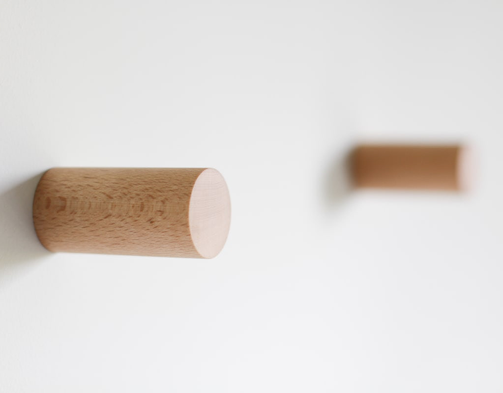
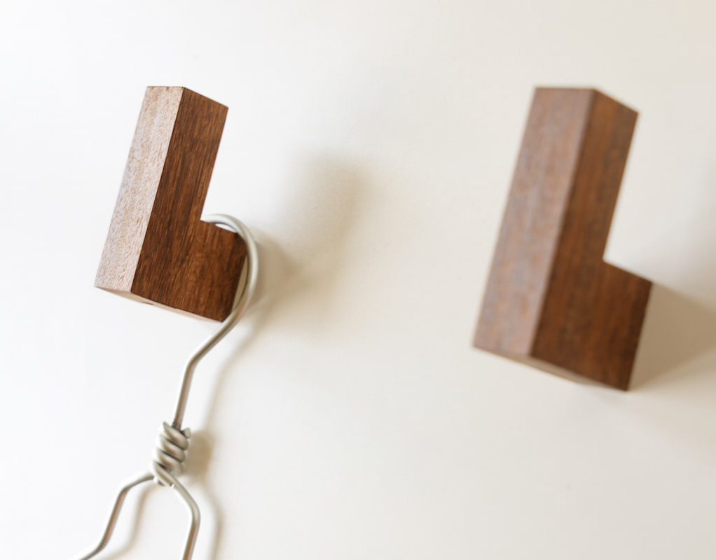
You may also like

among
傘立てのデザインです。一見、傘立てには見えませんが、全ての傘の先端が合うように円と円の隙間を調整しています。どこにはまるのか、最初は悩みますが、慣れるとすぐにわかります。自分で使いこなす美しいプロダクトです。This is the design of an umbrella stand. At first glance, it does not look like an umbrella stand, but the gap between the circles is adjusted so that the tips of all umbrellas fit together. At first you may have trouble figuring out where it fits, but once you get used to it, you will soon find out. It is a beautiful product that you can use yourself.
2015
PIZZLY BEARS
地球温暖化の影響で、北極の氷は溶け、ホッキョクグマは住む場所を失い始めています。 この木馬ではホッキョクグマが、その溶けて割れてしまった氷をたどたどしい足付きで歩いてゆく姿を現しています。この木馬は、自分の娘のために作ったものです。 売っているものを買って与えるより、せっかくだから、私のデザインしたものをあげたいとの思いからです。 私の父も、いろいろなものを作ってくれたものでした。それが、やはり私の中では印象が大きいのです。 この木馬は発表するや、世界中のデザインや環境系ブログを駆け巡りました。 その中には、カナダの北極の科学者から娘に買いたいとの連絡までありました。 これには驚きましたが、あいにくその時は商品化できていませんでした。 そして、2年くらい経ったある時、商品化したいと言ってくれる香港のブランドが現われたのです。 発表から3年の時を経てようやくHUZI DESIGNより商品化されました。
2008
TOYAMA FESTIVAL
第62回富山まつりの公式ポスターを担当しました。青空の下、市内のメイン道路で日中にダイナミックな踊りが行われるこのお祭りを象徴的に踊り子の姿でデザインしました。We were in charge of the official poster for the 62nd Toyama Festival. We designed the dancers to symbolize this festival, in which dynamic dancing takes place during the day on the city's main roads under a blue sky.
2022
CUBRIC TEAK HOOK
CUBRICはシンプルなデザインの木製の壁掛けフックです。 幻の銘木「ユーラシアン チーク材」で製作しました。 濃い色は塗装の色ではございません。木質は重硬でとても高級感があります。 高価な材料ですが、もう一種類のCUBRICとあまり変わらないようにお値段は頑張っています。2つの立方体形状の組み合わせで構成されています。 どのような空間にもよく合う、なんでもないシンプルな形です。CUBRIC is a wooden wall hook with a simple design.It is made of Eurasian teak, a fantastic wood.The dark color is not the color of the paint.The wood is heavy, hard, and very luxurious.It is an expensive material, but we are trying our best to keep the price not much different from the other type of CUBRIC.It is composed of a combination of two cube shapes.It is a simple, nondescript shape that fits well in any space.
2017
IZUMI YAMASAKI
2017
NAGAHAMA GENPACHI RUSK
長浜市にあるパン屋ポムドテールの源八ラスクのデザインです。パン職人こだわりの生地から作るラスク。種類も多いですが最小限の資材で対応できるシステムを作りました。ギフトボックスはパンの形をしています。This is a design of Genpachi rusk from bakery Pomme de Terre in Nagahama, Shiga Prefecture. These rusks are made from dough with the baker's special care. There are many different flavors, but we have created a system that can handle a minimum amount of packaging materials. The gift box is in the shape of a loaf of bread.
2020
AYU, SALT-GRILLED FLAKES
あゆの塩焼きをほぐした瓶詰めです。高級感を大切に、塩焼きであったことを引用し、竹串で封印をしています。紙も四角い金のマスがキラキラ見えるものを選択しています。This is a jar of ayu fish unglazed with salt. To emphasize the importance of luxury, it is sealed with a bamboo skewer, citing that it was grilled with salt. The paper is also selected to show a square gold square with glittering gold squares.
2021
TOILET SIGN
白い壁面にも際立つ美しいデザインのトイレサインです。JIS規格のトイレサインの形状は堅すぎるけど、売っているものはカジュアルすぎるものが多いので、ちょうど良いバランスで飽きのこないシンプルデザインを考えました。トイレマークも一度貼ったら10年、20年は変えないと思いますので、普遍性を大事にデザインしました。厚みは7mmでしっかりと木の厚みが感じられます。This is a beautifully designed toilet sign that stands out against the white wall. the JIS standard toilet sign shape is too rigid, but many of the ones sold are too casual, so we came up with a simple design that strikes just the right balance and will never become boring. Once the toilet sign is affixed, it is not likely to be changed for 10 or 20 years, so we designed it with universality in mind. The thickness is 7mm, and you can feel the thickness of the wood.
2018
KUROBUTA
段ボール箱のベロを差し込む部分を豚の鼻に見立てて、黒豚を立体的にパッケージ全体に描くデザインとしました。 既存のロゴに使われている豚の鼻、目、放射状の装飾をパッケージにあしらうことで、ロゴとパッケージがつながる統一的ブランディングとしています。お尻の側に社名と、尻尾を描いています。箱を開けるときに鼻を引き出すと「THNAK YOU」の文字が見えるようにしています。 お店にパッケージが並んでいる際も、豚がたくさん並んでいるように見え、可愛く、遠目にも目を引くデザインとなっています。 もらったあとも取っておきたいパッケージということで、極力商品名や社名は前面に出さないことを意図しており、段ボール製の収納用品として販売していそうなものを目指し、シンプルで抽象的なデザインとしています。それゆえ、ギフトボックス以外の、壁面デザインやのぼりなど、様々な媒体に展開しやすいものになっています。 段ボールのクラフトの地色を活かしたナチュラル感のあるデザインにしており、素材の良さを感じさせるものです。 The design depicts a black pig three-dimensionally on the entire package, using the part of the cardboard box where the tongue is inserted as a pig's nose. The pig's nose, eyes, and radial decorations used in the existing logo are used on the package to create a unified branding that connects the logo and the package. The company name and tail are drawn on the butt side. When the box is opened, the nose is pulled out to reveal the words "THNAK YOU. When the package is lined up in a store, it looks like a bunch of pigs, which is cute and eye-catching from a distance. The design is simple and abstract, aiming for something that would be sold as a cardboard storage product. Therefore, the design can be easily applied to a variety of media other than gift boxes, such as wall designs and banners. The design has a natural feel, taking advantage of the ground color of the corrugated kraft, and gives a sense of the quality of the material.
2023
OOBUKU-CHA
滋賀県民なら誰もが知っている千紀園のCM。 千紀園のお茶や抹茶スイーツへのこだわりは並々ならぬものがあり、この度、その千紀園の大福茶のパッケージデザインを担当させていただきました。 大福茶(おおぶくちゃ)はお正月に無病息災と幸せを願い飲むお茶です。 千紀園と言えば鶴のマークなので、デザインにはあえて亀でいこうと早い段階で思いました。 鶴と亀があるとさらにおめでたい感じがするためです。 最初は具象的な亀の絵も描いてみたのですが、抽象的であるほうが良いと思い、デザインを抽象化しました。 大福茶の文字の周囲にある六角形の形が亀をイメージしたものなのです。 蓋をあけると千紀園の鶴が蓋の内側に現れるようにしました。 袋タイプの方も、缶のプロポーションをそのまま投影したデザインとしました。 Everyone in Shiga Prefecture is familiar with Senkien's commercials. Senkien's commitment to tea and matcha sweets is extraordinary, We are pleased to announce that we are now in charge of the packaging design for Senkien's Daifuku tea. Daifuku tea is a tea to be drunk at New Year's to wish for good health and happiness. Senkien is known for its crane logo, so I decided at an early stage to use a tortoise in the design. The reason is that having a crane and a turtle on the tea makes it look even more festive. At first, I tried drawing a figurative turtle, but I thought it would be better to make the design abstract. The hexagonal shape around the word "Daifuku-cha" is the image of a turtle. When you open the lid, we made the Senkien crane appear inside the lid. The design of the pouch type is also a direct projection of the proportions of the can. https://shop.senkien.jp/fs/senkien/c/goodfortunetea I designed the package for Senkien's Oobuku tea. Oobuku-cha is a tea that is drunk on New Year's Day to wish for good health and happiness. Senkien is known for its crane symbol, so I decided to use a turtle for the design. I decided to use a tortoise for the design because I felt that having a crane and a tortoise would make the tea more festive. It is available at the main store, Kintetsu Kusatsu, and on line stores.
2021
Back to Top