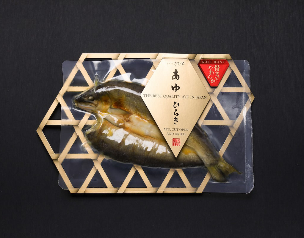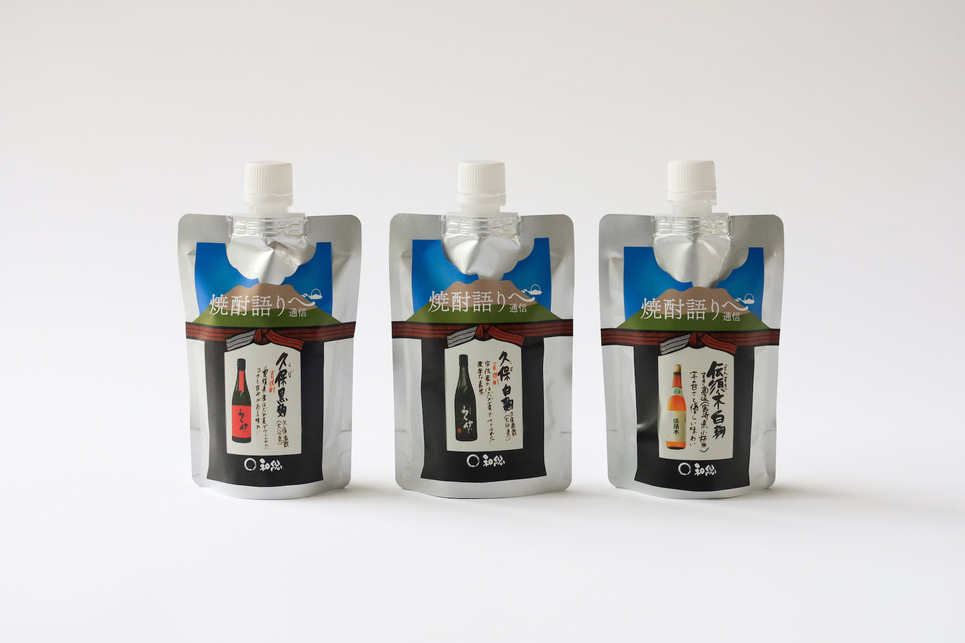


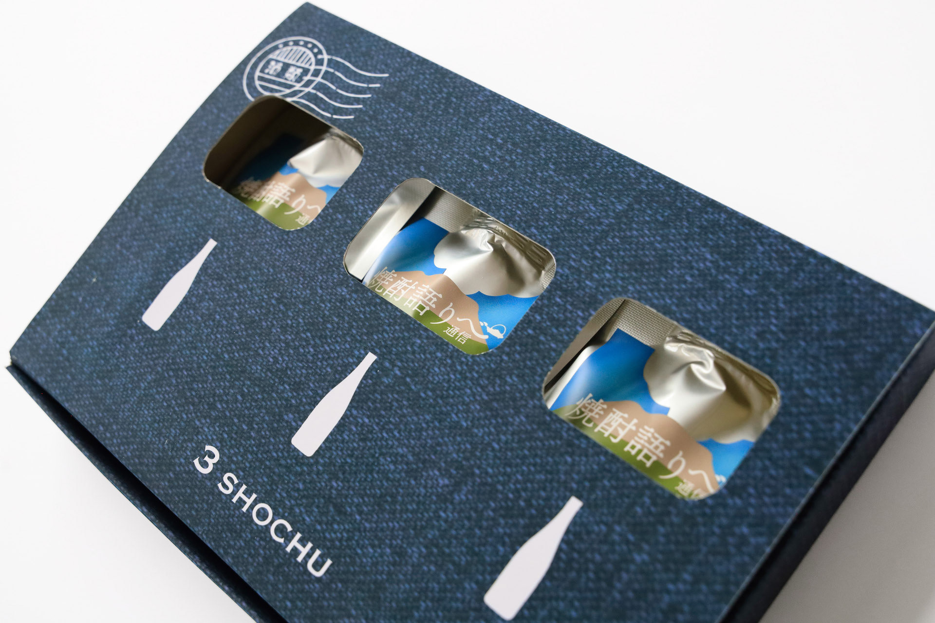
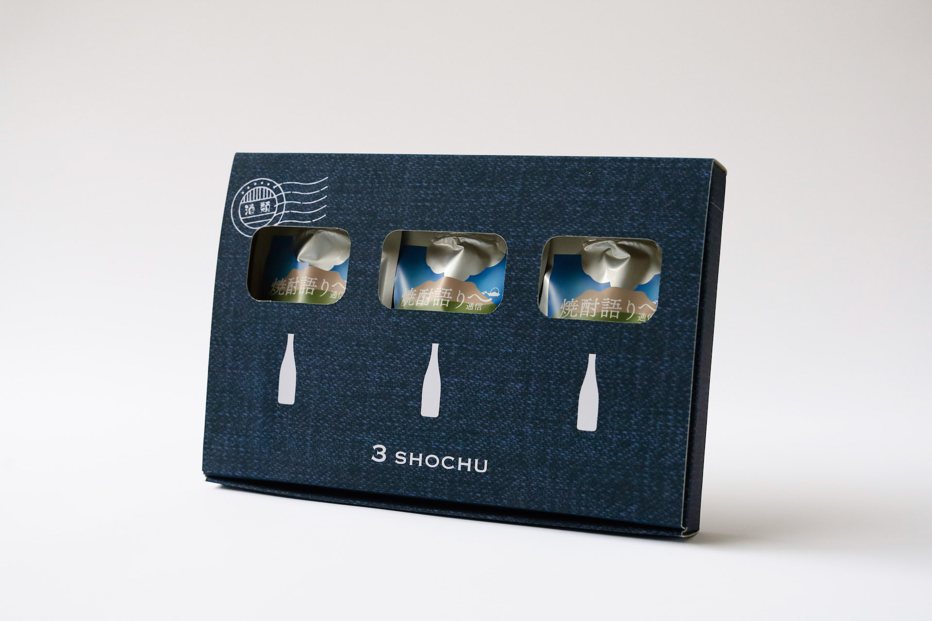

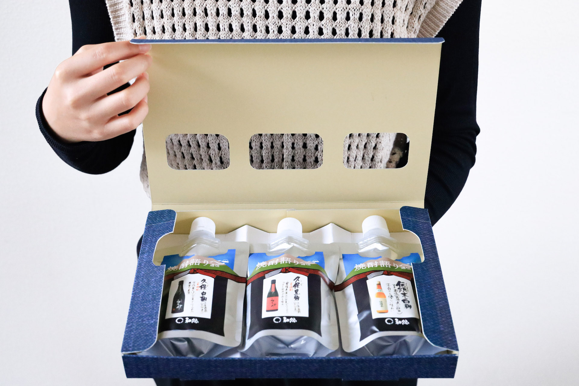
鹿児島の焼酎のパッケージデザインです。設計の条件としてアルミパウチを使用すること、銘柄をシールで表示することがありました。 酒屋のイメージと言えば前掛けなので、前掛けと桜島をデザインしたラベルをパウチにぐるっと巻くパッケージとしました。様々な銘柄に対応するため、商品を書いた説明紙をラベルで貼ることができる方法を考えました。立体感があり、見栄えのするデザインです。 パウチの銀色を活かし上部の桜島からは銀の噴煙が上がっているように見せます。無愛想なアルミパウチの良さを引き出すデザインを心がけました。ギフト箱もインディゴのテクスチャーで窓から中身が見えるようにしました。 This is a package design for Kagoshima shochu. The design requirements were to use an aluminum pouch and to display the brand name with a sticker. Since the image of a liquor store is that of a front hanging, we decided to use a package that wraps a label with a design of a front hanging and Sakurajima around the pouch. In order to accommodate a variety of brands, we came up with a method that allows the label to be attached to an explanatory paper with the product written on it. The design has a three-dimensional feel and looks great. The silver color of the pouch makes it look like a silver plume rising from Sakurajima at the top. We tried to create a design that would bring out the best of the bland aluminum pouch. 这是鹿儿岛烧酒的包装设计。 设计条件是使用铝制小袋,并用贴纸标明品牌名称。 酒铺的形象是正面悬挂,因此包装设计的标签上印有正面悬挂和樱岛的图案,并将酒袋包裹起来。 为了适应各种品牌,我们想出了一种方法,可以将标签贴在写有产品说明的纸上。 这种设计具有立体效果,看起来很不错。 包装袋采用银色,看上去就像从樱岛顶部升起的银色翎羽。 我们努力创造一种设计,使不起眼的铝制小袋发挥出最大的作用。