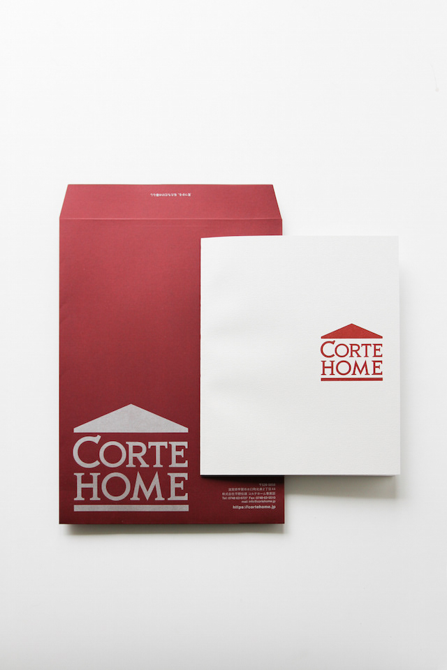
CORTE HOME
コルテホームは、自分らしいライフスタイルを提案する住宅のブランドです。 ブランドロゴをはじめとする、ブランド構築を担当しました。
You may also like
MANYO BEEF
近江牛専門店万葉のパッケージデザインを担当しました。
近江牛は日本三大和牛の一つ。日本でも最高の品質の牛肉です。
万葉というお店の名前から万葉集を思いました。
万葉集は、7世紀後半から8世紀後半にかけて編纂された、現存するわが国最古の歌集です。
精肉会社が経営する専門店であり、お肉作りの思いをお客さんに伝えてゆくのに「本」の形が思い浮かび万葉集とつながりました。
和綴と呼ばれる日本の伝統的なの本の綴じ方を模したパッケージに包まれたお肉。本を開ける高揚感と高級感のあるパッケージになっています。
紙にはエンボスの加工で布製本のような表現としました。ゴムとメタルシールでパッケージを封印しています。
最高級のお肉にふさわしいデザインとしました。
We were in charge of package design for the Omi beef specialty restaurant Manyo.
Omi beef is one of Japan's three major beef varieties. It is the highest quality beef in Japan.
The name of the restaurant, Manyo, made me think of the Manyoshu (The Anthology of Myriad Leaves).
The Manyoshu is the oldest existing collection of poetry in Japan, compiled from the late 7th to the late 8th century. As a specialty store run by a meat company, the shape of a "book" came to mind for conveying the concept of meat production to customers, which led me to Manyoshu.
The meat is wrapped in a package that resembles the traditional Japanese book binding method called Watoji.The package has an exuberant and luxurious feel of opening a book. The paper is embossed to give it the appearance of a cloth-bound book. The package is sealed with rubber and metal seals. The design was appropriate for top quality meat.
The package is designed to be opened with a sense of exhilaration and luxury.
2024
Adam&Eve Bottle
2008
KOKA Cardboard Box
滋賀県甲賀市の段ボールのデザインです。甲賀市の市章の2色を使用し、忍者テーマで手裏剣のモノグラムを配置し、市章デザインもあしらっています。ふるさと納税返礼品を送るのに使用されたりしています。This is a cardboard design for Koka City, Shiga Prefecture. It uses the two colors of the Koka city emblem, and has a ninja theme with a shuriken monogram and the city emblem design. It is sometimes used to send tax returns from hometowns.
2021
YOSHINO Luncheon Board
最高級吉野杉を用いたランチョンボードです。お盆ではなく、縁がないもので手入れが簡単かつ、上質感のあるものを目指しました。直接食材を載せることも可能です。持ちやすいように周囲は薄く削っています。This luncheon board is made of the finest Yoshino cedar. It is not a tray, but rather a rimless one that is easy to clean and has a high quality feel. It is also possible to place food directly on it. The perimeter has been thinly shaved so that it is easy to hold.
2011
DRWERS OF PAST,PRESENT,FUTURE
引出しにはそれぞれ、過去の引き出し、現在の引き出し、未来の引き出しと名前が付けられています。
それぞれ過去、現在、未来をイメージした特徴の異なった三枚の陶板で前板が作られています。
陶板は信楽焼で手作りによって作られています。
引き出しを開けるとそこには、past, present, futureの文字が刻まれています。
陶板の引き出しは、何か特別な印象を引き出しにもたらします。
この引き出しをどのように使うかは使用者に委ねられていますが、人にはみなそれぞれの、現在、過去、未来があります。
何か大切なものや情報を入れたりする特別な箱になることを願っています。
2024
TACHI
シンプルでオーソドックスなデザインを心がけてデザインしました。
とても軽く、使いやすく、あまり緊張しすぎない、しかしそこまでカジュアルでもない。
runoの丸く柔らかいデザインと対照的に、tachiは、凛とした佇まいを持ったデザインです。(写真の後半はrunoとの比較です)
非常に軽く出来ています。
斜め上からはあまり裏側が見えませんが、裏側の削り込みにより手がすっと入り、大変持ちやすくデザインされています。
山中塗とは、石川県加賀市の山中温泉地区で作られる漆器で、山中漆器と呼ばれます。国産のミズメ桜を轆轤挽きで仕上げ、拭き漆技法で仕上げました。
We designed this product with a simple and orthodox design in mind.
It is very light, easy to use, not too strained, but not that casual either.
In contrast to the round and soft design of runo, tachi has a dignified appearance. (The second half of the photo is a comparison with runo.)
It is made very light.
Although you cannot see the back side of the bowl from an angle, the back side has been cut down so that you can easily put your hand into the bowl, making it very easy to hold.
Yamanaka-nuri is a type of lacquerware produced in the Yamanaka Onsen area of Kaga City, Ishikawa Prefecture, and is called Yamanaka lacquerware. The potter's wheel is made of domestically produced mizume-zakura (cherry tree) and finished with the wipe lacquer technique.
2024
FUNAZUSHI ICE
「ふなずしアイス」のパッケージデザインです。
彦根の老舗「いと重菓舗」と「あゆの店きむら」のコラボ商品です。
正確には飯(いい)と呼ばれる、ふなと一緒に漬け込むお米を使っており、ふながこの中に入っているわけではありません。
この飯は、今までは、あまり用途がなく捨てられる事も多かったふなずしの材料です。
ふなずしのイメージを覆し、臭みもなく、レアチーズのようでとても美味しいです。 このデザインを考える上で、まず想像したのは「ふなずし=臭い」という認識が一般にはされやすいことを想像しました。
この中身は決して臭くない、美味しいものですから、このレアチーズのような美味しさをパッケージを通して適切に伝える必要があると思いました。
率直に美味しそうだと感じてもらえるシズル感のあるパッケージを提案しました。
2024
SAKAEYA
肉サカエヤのCIデザインを担当しました。牛という文字を使いながら和にならない洋のイメージを感じさせるデザインとし、ナイフで切ったような手作り感、クラフト感のあるロゴデザインとしています。We designed the CI for Sakaeya Meat shop. The logo design uses the character for "beef" but gives a Western image that is not Japanese, and has a handmade, crafty feel as if it were cut with a knife.
2019
ONDA
ONDAはイタリア語で波を意味します。これはチェストですが表面が波のようにカーブしています。ウォルナットとヨーロッパビーチに2種類の木のコントラストがあるデザインです。ONDA means wave in Italian. This is a chest, but its surface is curved like a wave. The design has a contrast between two types of wood in walnut and European beach.
2009
BEEF SOUP
選りすぐりの近江牛の精肉加工時に骨を外す工程があります。
丁寧な職人の技術で骨に残るうまみの十分なお肉をせせり取り、牛骨とともに地元産の野菜、厳選した昆布で煮出したスープです。
この商品は、冷凍スープということでデザインできる幅が狭かったのですが、
「骨まわり肉を無駄にしない」ということを
「シールラベルを無駄にしない」へ置き換えて、
牛のシルエットは背面では成分表示ラベルに活用しました。
ラベルは縦横の面積で価格が決まってしまいます。
一枚のラベルを両面に使い、コストも抑えることにも繋がりました。
近江八幡市のふるさと納税でも、注文が増えていおり「パッケージが明快でかわいらしく商品内容を反映させている」というお声をいただいたりと非常に好評だそうです。
During the butchering process of selected Omi beef, there is a process of removing the bones.
With careful craftsmanship, the meat with ample umami remaining on the bones is sesseeded, and the soup is simmered with local vegetables and carefully selected kelp along with the beef bones.
This product was a frozen soup, which narrowed the scope of what we could design,
We were able to design a product that would not waste the meat around the bones.
The silhouette of the beef on the back of the label is a symbol of the beef's health,
The silhouette of a cow was used for the ingredient label on the back.
The price of a label is determined by its vertical and horizontal area.
Using a single label on both sides also helped to reduce costs.
Orders from Omi Hachiman City's hometown taxpayers have been increasing, and the product has been very well received, with comments such as, "The package is clear, cute, and reflects the product content.
这种方法被用于展示标签。
标签的价格由其垂直和水平面积决定。
双面使用一个标签也有助于降低成本。
在 Omi Hachiman City 的家乡,订单量一直在增加,产品也广受好评,客户认为包装清晰、可爱,反映了产品的内容。
2024