1/6 fabric

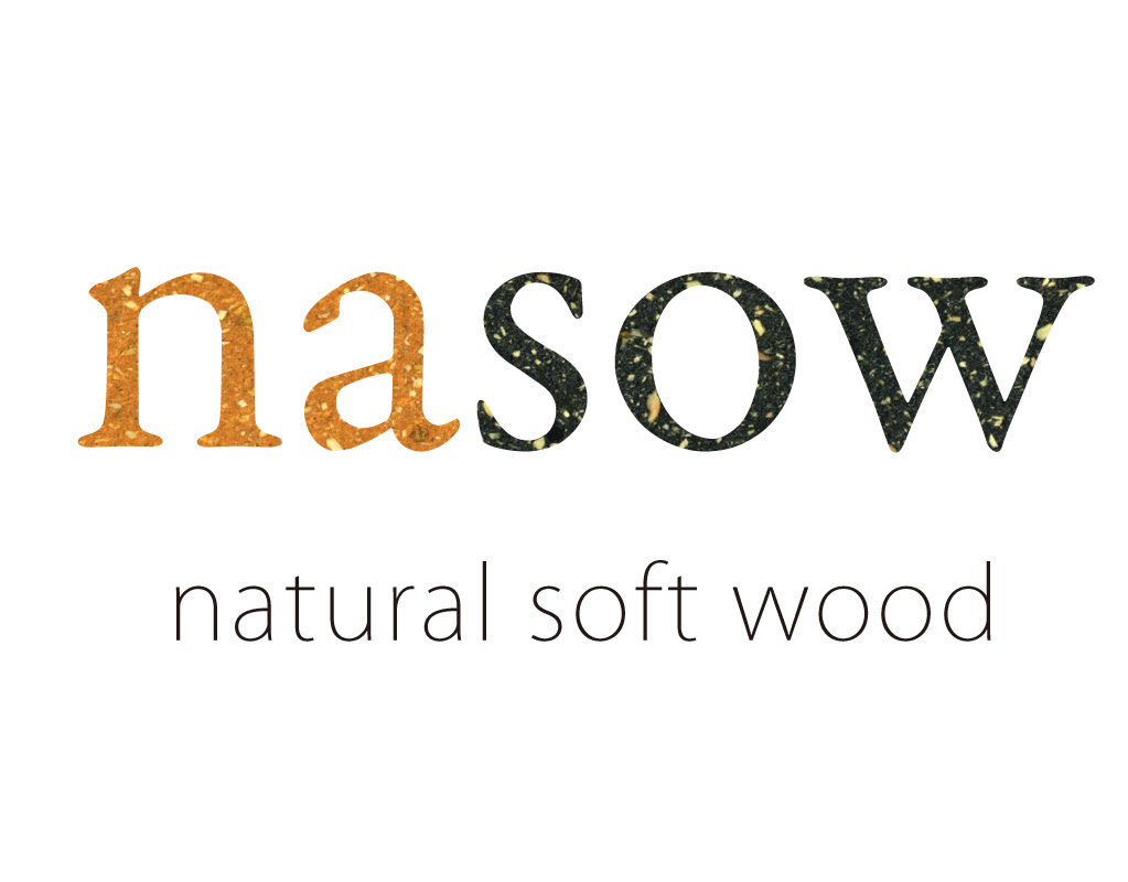
​​​​​​​商品開発・ブランディング・実装まで一貫して支援します。​​​​​​​
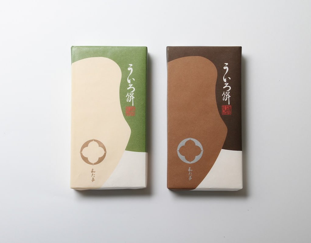
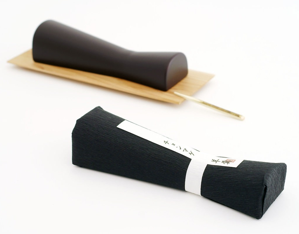
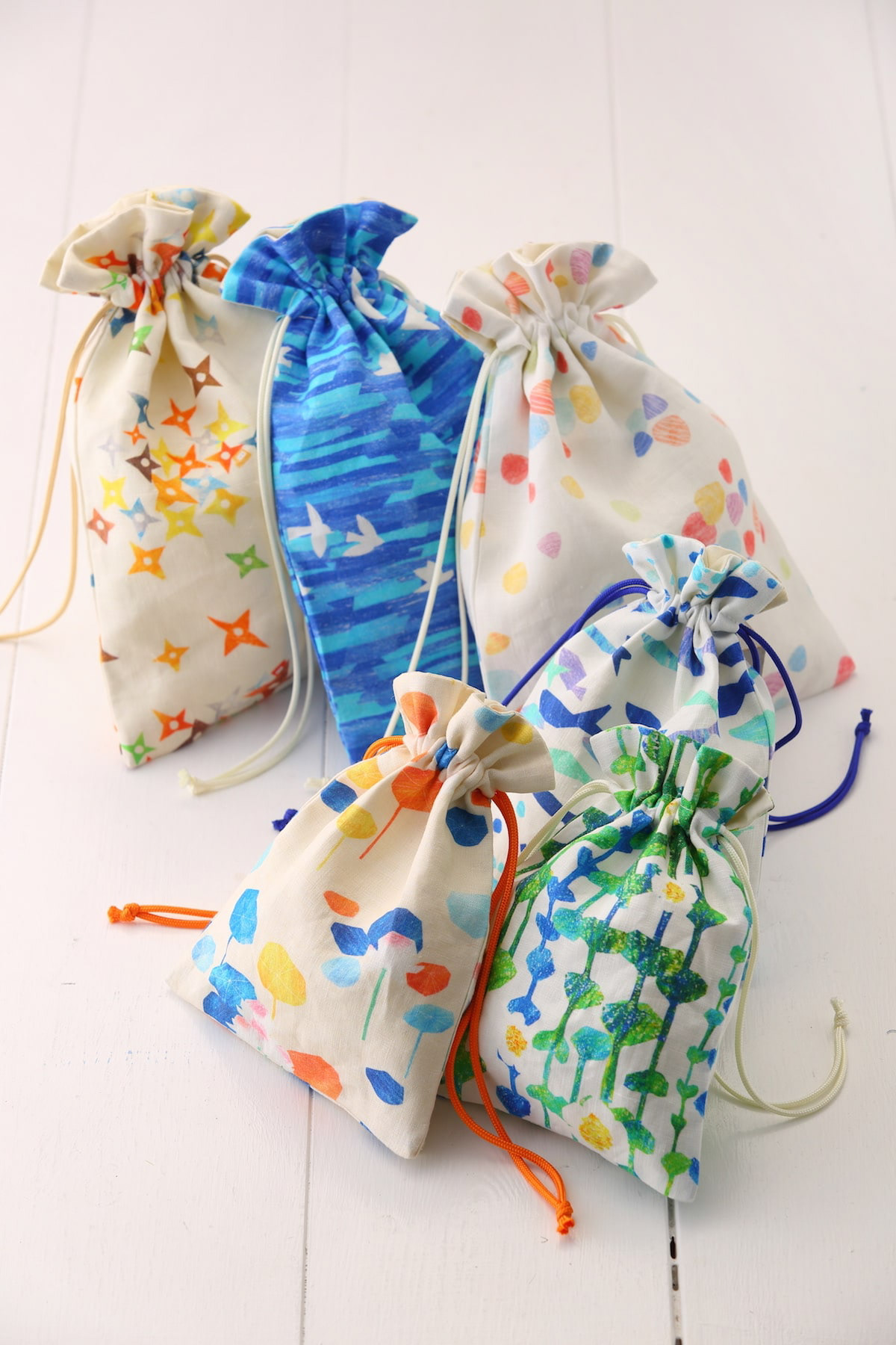
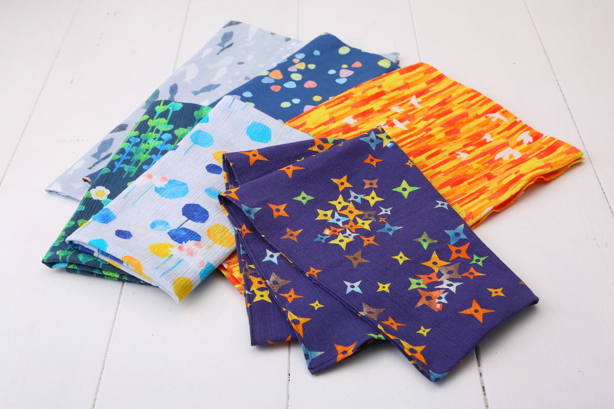
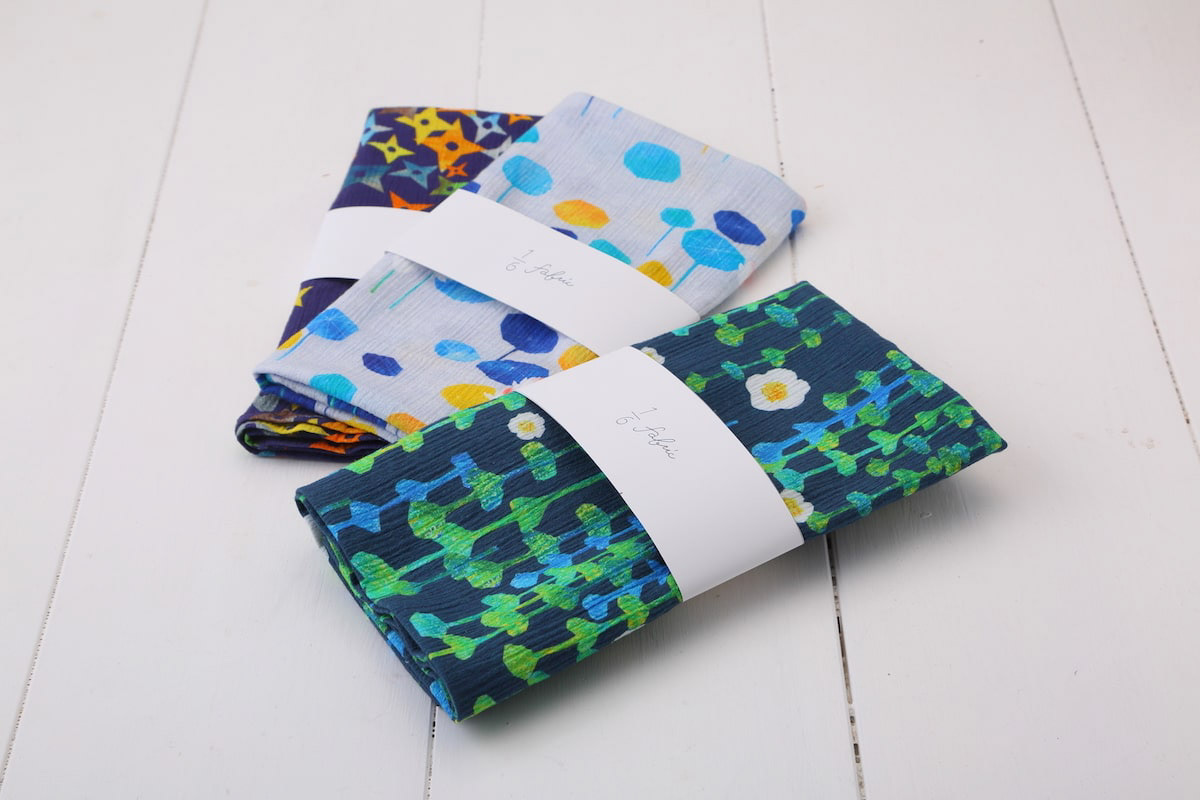
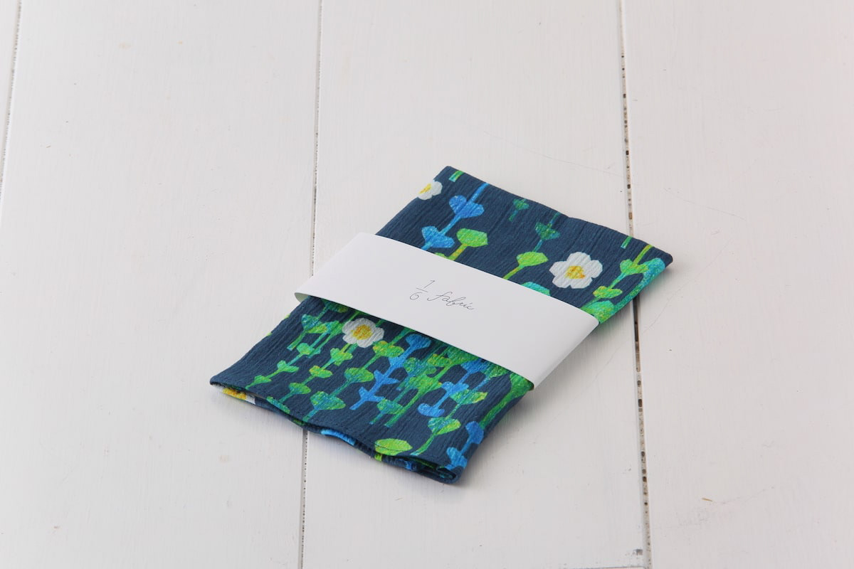
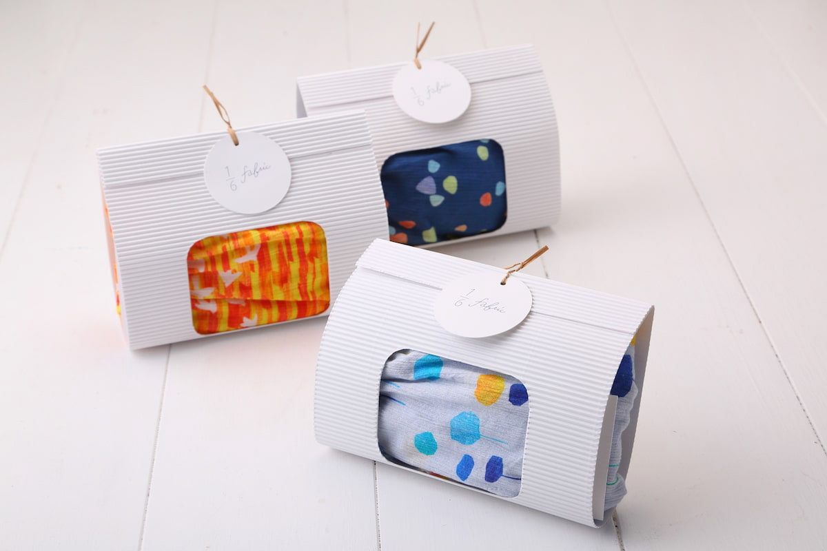
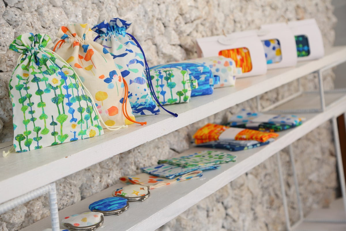
You may also like

nasow
nasowはnatural soft woodの略でゴム素材と木屑、貝殻、様々な廃材を練りこんだ新素材です。リブランディングとプロダクトデザインを担当しました。独特の弾力のある素材の良さを引き出したデザインです。nasow stands for "natural soft wood," a new material made of rubber, wood chips, seashells, and various scrap wood. We rebranded and designed the product. The design brings out the best of the unique elasticity of the material.
2017
OITA ASIA SCULPTURE EXHIBITION
大分アジア彫刻展公募の公式ポスターを担当しました。大分の頭文字OとアジアのAをモチーフに、現代彫刻作品を思わせるようなデザインとしました。大分の向こうにアジアを見据えるイメージでAを向こう側に配置し、また、賞の頂点を金色のAで表しています。 I designed the official poster for the Oita Asia Sculpture Exhibition open call. Using the initials O for Oita and A for Asia as motifs, I created a design reminiscent of contemporary sculpture. The letter A is positioned toward the horizon, symbolizing the vision of Asia beyond Oita, while the golden A represents the pinnacle of the awards. 我负责设计了大分亚洲雕塑展公开征集活动的官方海报。以大分首字母O和亚洲首字母A为设计元素,打造出令人联想到现代雕塑作品的视觉效果。将A字母置于远方,象征着从大分眺望亚洲的意境,同时以金色A字母代表奖项的巅峰。
2025
OITA ASIAN SCULPTURE EXHIBITION
さまざまな表情をした金属の帯のようなものが右のほうへ伸びて、コンペティションを競いあっている様を表現しました。一つ一つが異なるカラフルな作家の違った個性であり、全体で現代彫刻のような表現としました。遠くからでも目をひくキラリとした表現としています。The work depicts a series of metal strips with various expressions extending toward the right, competing with each other in a competition. Each piece is a different colorful individuality of a different artist, and the overall expression is that of a contemporary sculpture. The overall effect is that of a contemporary sculpture, which is eye-catching even from a distance.
2023
Cosmopolitan Tourism R&D
国際観光政策研究所のロゴデザインです。CとTを組み合わせて地球のように見せています。Logo design for the Institute for Cosmopolitan Tourism R&D, combining the C and the T to look like the earth.
2015
HOP VISA
これはHOP VISAカードリニューアル指名コンペでの案です。滋賀の美しい緑、田園風景を水彩画を用いて表現したものです。手描きの四角い不均一なマス目が重なったりにじんだりして、一つの自然を形成しているようなイメージです。このようなおおらかさこそが滋賀のイメージであり、今までの緑のvisaカードのイメージも踏襲しながら、若々しく優しい、滋賀と、平和堂の空気感を表現できていると思います。This is a watercolor rendering of the beautiful green, rural landscape of Shiga. The image is of hand-painted squares of uneven squares overlapping and blurring to form a single natural feature. This kind of generosity is the image of Shiga, and I think it expresses the youthful and gentle atmosphere of Shiga and Heiwado, while also following the image of the existing green visa cards.
2023
OMI MAIKO
近江米粉は滋賀県の近江米を使った米粉です。ロゴデザインやパッケージデザインを担当しました。Omi Rice Flour is a rice flour made from Omi rice in Shiga Prefecture. We were in charge of logo design and package design.
2015
UIROMOCHI
「和た与」のういろ餅のパッケージリニューアルです。こちらのういろは、米粉を使用していることから米の形をあしらっています。包装紙を開くとわかるようなデザインです。一つは抹茶と白、もう一つは黒糖をあらわし、中身を表現したものです。This is a package renewal of Uiro rice cake of "Wata-yo". This Uiro is decorated with the shape of rice because it is made of rice flour. The design can be recognized by opening the wrapping paper. One is a matcha green tea and white, and the other is brown sugar, representing the contents of the rice cake.
2020
CHONMAGE YOKAN
チョンマゲ羊羹はチョンマゲの形をした羊羹です。日本では人に何かをおねがいするときに、〜〜してチョンマゲ。という文化があります。このお土産を渡して、〜〜してチョンマゲとお願いしてみましょう。Chonmage Yokan is a type of yokan jelly in the shape of a chonmage. In Japan, when you ask someone to do something for you, you say "〜〜してチョンマゲ. In Japan, there is a culture of saying, "Please give me this souvenir and ask me to do something for you. Give this souvenir to someone and ask them to do something for you.
2011
TAKASHIMA A MONO GP 2024
高島ええものグランプリ2024のブランディングを担当しました。 今回は受賞者への取材を記事にし、商品を見るだけではわからない作り手の熱い想いやストーリーを大切に伝えようと考え、高島市内の道の駅への集客に新聞折込のB3チラシをデザインしました。また道の駅の専用什器、POPなど売り場のデザインもしました。 また、受賞者へは、「センスがええ」ということで高島産のセンスと賞状、副賞がプレゼントされました。 We were in charge of branding for the Takashima Eemono Grand Prix 2024. This time, we turned interviews with the winners into articles, with the aim of conveying the passion and stories of the makers that cannot be understood just by looking at the products, and designed a B3 flyer to be inserted into newspapers to attract customers to roadside stations in Takashima City. In addition, the winners were presented with Takashima-made products, a certificate, and a prize in recognition of their "good sense. "我们负责 2024 年高岛艾莫诺大奖赛的品牌推广工作。 这次,我们采访了获奖者并撰写了一篇文章,还设计了一张 B3 传单,刊登在报纸上,以吸引顾客前往高岛市的路边车站。 我们还在路边车站设计了专用固定装置、POP 和其他销售区域。 我们还向获奖者颁发了 “时尚感”、证书和额外奖品,所有这些都是高岛制造,以表彰他们的 “时尚感”!
2025
BIWAKO HOMARE
近江茶 琵琶湖ほまれのパッケージデザインです。茶の栽培地である、三重県境から琵琶湖まで繋がっているというイメージを水彩画で表現しました。This is the package design for Omi Tea Biwako Homare. The image of the connection from the border of Mie Prefecture to Lake Biwa, where the tea is grown, is expressed in watercolor.
2021
Back to Top