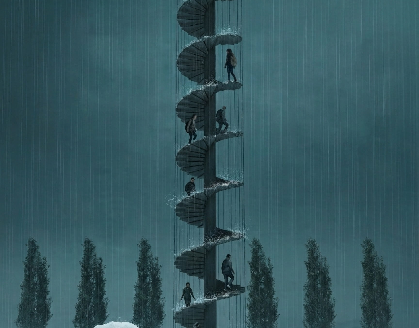
amana
「あまな」は近江八幡丁稚羊羹の老舗和た与の経営するカフェです。そのインテリアデザインを担当しました。外観は和風であり、テイクアウト導線も設けました。モダンな和、円をテーマにしてデザインしています。Amana" is a café run by the long-established Ohmi-Hachiman Decchiyokan (sweet bean jelly) shop, Wataoyo. We were in charge of the interior design. The exterior is Japanese style, and a take-out line is also provided. The theme of the design is modern harmony and circle.
You may also like
TOFU ICCHO
和紙でできたノート豆腐一帳のロゴデザイン。
エッジがピンとしつつも、中身はやわらかい、そんな豆腐のような手作り感のあるロゴを目指してデザインしました。
2014
FUNAZUSHI ICE
「ふなずしアイス」のパッケージデザインです。
彦根の老舗「いと重菓舗」と「あゆの店きむら」のコラボ商品です。
正確には飯(いい)と呼ばれる、ふなと一緒に漬け込むお米を使っており、ふながこの中に入っているわけではありません。
この飯は、今までは、あまり用途がなく捨てられる事も多かったふなずしの材料です。
ふなずしのイメージを覆し、臭みもなく、レアチーズのようでとても美味しいです。 このデザインを考える上で、まず想像したのは「ふなずし=臭い」という認識が一般にはされやすいことを想像しました。
この中身は決して臭くない、美味しいものですから、このレアチーズのような美味しさをパッケージを通して適切に伝える必要があると思いました。
率直に美味しそうだと感じてもらえるシズル感のあるパッケージを提案しました。
2024
RENOVATION EXPO
リノベーションエキスポ大阪の公式ポスターのデザインです。建築空間で文字を形成したデザインとしました。This is the design for the official poster of Renovation Expo Osaka. The design was made to form letters in architectural space.
2019
CUBRIC HOOK
CUBRICはシンプルなデザインの木製の壁掛けフックです。
2つの立方体形状の組み合わせで構成されています。
どのような空間にもよく合う、なんでもないシンプルな形です。主張するわけでもなく、なんとなく壁にあり、玄関で向かえてくれる。
フックはあくまでも脇役。
主役は空間でありインテリアです。こんなシンプルな木製フックが意外と売っていませんでした。CUBRIC is a wooden wall hook with a simple design.
It consists of a combination of two cube shapes.
It is a simple, nondescript shape that fits well in any space. It does not make a statement, it is somehow on the wall, and it will greet you at the entrance.
The hook is only a supporting role.
The main role is the space and interior. Surprisingly, such a simple wooden hook was not sold.
2017
Rethink Creator Contest
Rethink Creative Contestで優秀賞と地域PR賞を受賞しました。
このコンテストは身近な地域の魅力に注目し、発信するコンテストです。
「親か子か」優秀賞
丸亀市発祥の骨付鳥は、うどんに次ぐ香川のソウルフードです。親鳥か、若鳥のどっちが美味しいか?どっちが好きか?これはなかなか答えの出ない問題であり、どちらも、良いところがあって、どちらも美味しい。そんな論争が絶えない丸亀市は幸せです。
親鳥なんて売ってない県が多いですからね。
“Parents or children?”
Honetsukitori, which originated in Marugame City, is Kagawa's soul food, second only to udon. Which is tastier, the parent bird or the young bird? Which one do you like? This is a question that is difficult to answer; both have their good points, and both are delicious. Marugame City is happy that such controversy does not end.
There are many prefectures where parent birds are not sold.
「レイクグラスを探してください」地域PR賞
日本一の湖、琵琶湖は海のように波が立ちます。もともとはゴミだったガラス瓶が長い年月をかけて、丸く削られて美しい石のようになります。これをシーグラスならぬ、レイクグラスと呼びます。
レイクグラスを琵琶湖の湖岸で探してください。簡単には見つかりません。すぐに見つかるのは釣り糸や、プラスチックゴミばかり。でも、このレイクグラス探しをきっかけに、琵琶湖を大切に思ってくれたら良いなと思いました。
ゴミ拾い、環境美化、SDGs。そういうのではなく、
琵琶湖で純粋に、宝探しを楽しんでください。
琵琶湖に足を伸ばしてください。
“Look for Lake Grass.”
Lake Biwa, the largest lake in Japan, has waves like the ocean. Over many years, glass bottles, which were originally trash, are carved into beautiful shapes that resemble beautiful stones. This is called lake glass, not sea glass.
Look for Lake Grass on the shores of Lake Biwa. Not easy to find. All you can easily find are fishing lines and plastic trash. However, I hope that this search for lake glass will help people start to value Lake Biwa.
Picking up trash, beautifying the environment, SDGs. Not that, but
Please enjoy treasure hunting in Lake Biwa.
Please stretch your legs to Lake Biwa.
2022
https://rethink-creator.jp/2022_contest/exam.html
LAKE BIWA TROUT
琵琶湖の宝石と言われるビワマスを使った缶詰です。サーモンのようなピンク色に白い筋の入った身をパッケージにもデザインしました。This canned product is made from Biwa trout, the jewel of Lake Biwa. The pink, salmon-like color with white streaked flesh is also designed into the package.
2021
ZIPANG
日本列島を模した信楽焼の器です。食卓に日本列島を描いて楽しめます。
あまり具体的な日本列島にならないように、言われたら、わかる。くらいの、抽象的でかわいい日本列島のデザインとしました。
This is a Shigaraki ware vessel in the shape of the Japanese Islands. You can enjoy drawing the Japanese Islands on your dining table.
The design is abstract and cute, so as not to be too concrete. The design is abstract and cute.
2022
OOBUKU-CHA
滋賀県民なら誰もが知っている千紀園のCM。
千紀園のお茶や抹茶スイーツへのこだわりは並々ならぬものがあり、この度、その千紀園の大福茶のパッケージデザインを担当させていただきました。
大福茶(おおぶくちゃ)はお正月に無病息災と幸せを願い飲むお茶です。
千紀園と言えば鶴のマークなので、デザインにはあえて亀でいこうと早い段階で思いました。
鶴と亀があるとさらにおめでたい感じがするためです。
最初は具象的な亀の絵も描いてみたのですが、抽象的であるほうが良いと思い、デザインを抽象化しました。
大福茶の文字の周囲にある六角形の形が亀をイメージしたものなのです。
蓋をあけると千紀園の鶴が蓋の内側に現れるようにしました。
袋タイプの方も、缶のプロポーションをそのまま投影したデザインとしました。
Everyone in Shiga Prefecture is familiar with Senkien's commercials.
Senkien's commitment to tea and matcha sweets is extraordinary, We are pleased to announce that we are now in charge of the packaging design for Senkien's Daifuku tea.
Daifuku tea is a tea to be drunk at New Year's to wish for good health and happiness.
Senkien is known for its crane logo, so I decided at an early stage to use a tortoise in the design.
The reason is that having a crane and a turtle on the tea makes it look even more festive.
At first, I tried drawing a figurative turtle, but I thought it would be better to make the design abstract.
The hexagonal shape around the word "Daifuku-cha" is the image of a turtle.
When you open the lid, we made the Senkien crane appear inside the lid.
The design of the pouch type is also a direct projection of the proportions of the can.
https://shop.senkien.jp/fs/senkien/c/goodfortunetea
I designed the package for Senkien's Oobuku tea.
Oobuku-cha is a tea that is drunk on New Year's Day to wish for good health and happiness.
Senkien is known for its crane symbol, so I decided to use a turtle for the design.
I decided to use a tortoise for the design because I felt that having a crane and a tortoise would make the tea more festive.
It is available at the main store, Kintetsu Kusatsu, and on line stores.
2021
CHISO
2011
HACHIMANJIKAN
近江八幡の西の湖周辺をビーチクルーザーで自転車ツアーをするツーリズムのブランディング「ハチマンジカン」です。Hachimanjikan" is a branding for a tourism brand that offers bicycle tours by beach cruiser around Lake Nishi in Omi Hachiman.
2019