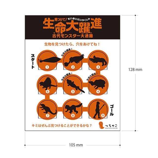
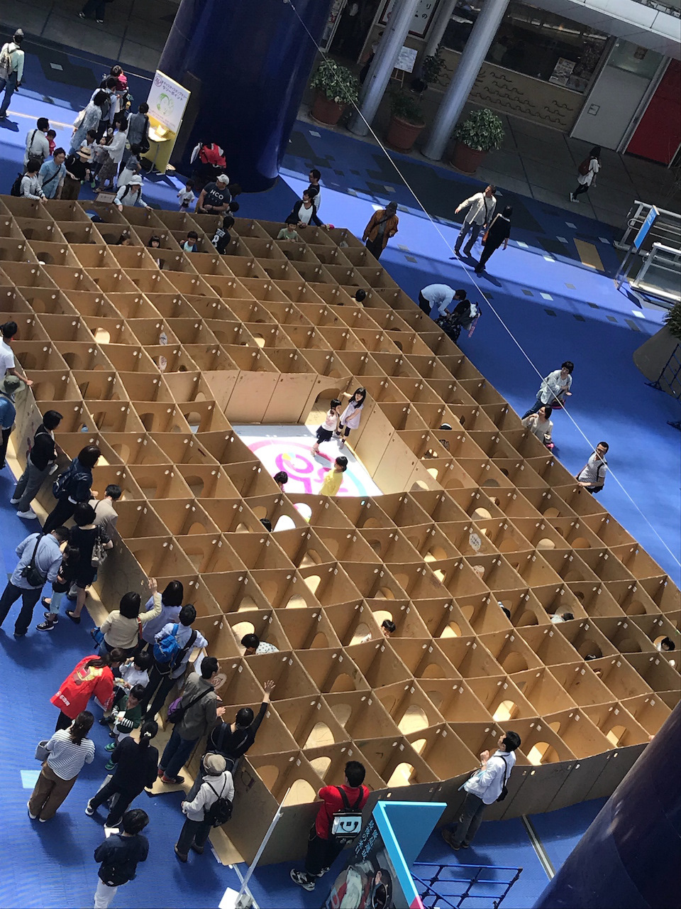
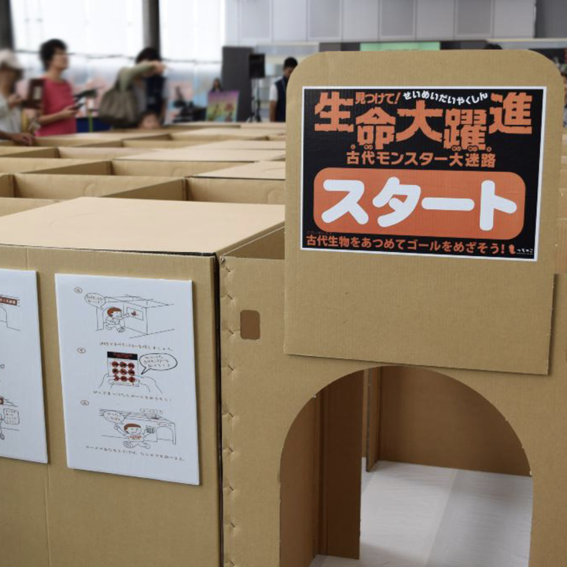
2016年7月 NHK岡山 岡山シティミュージアム 生命大躍進
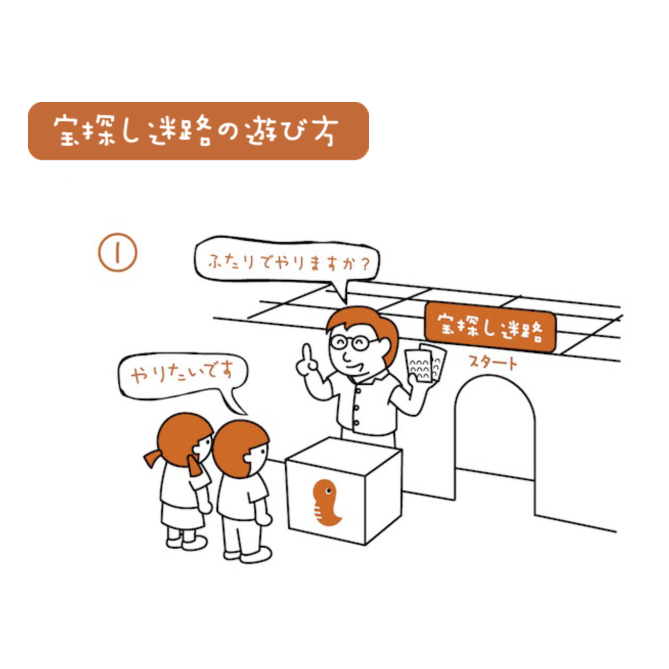
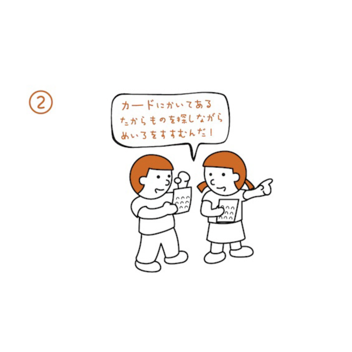
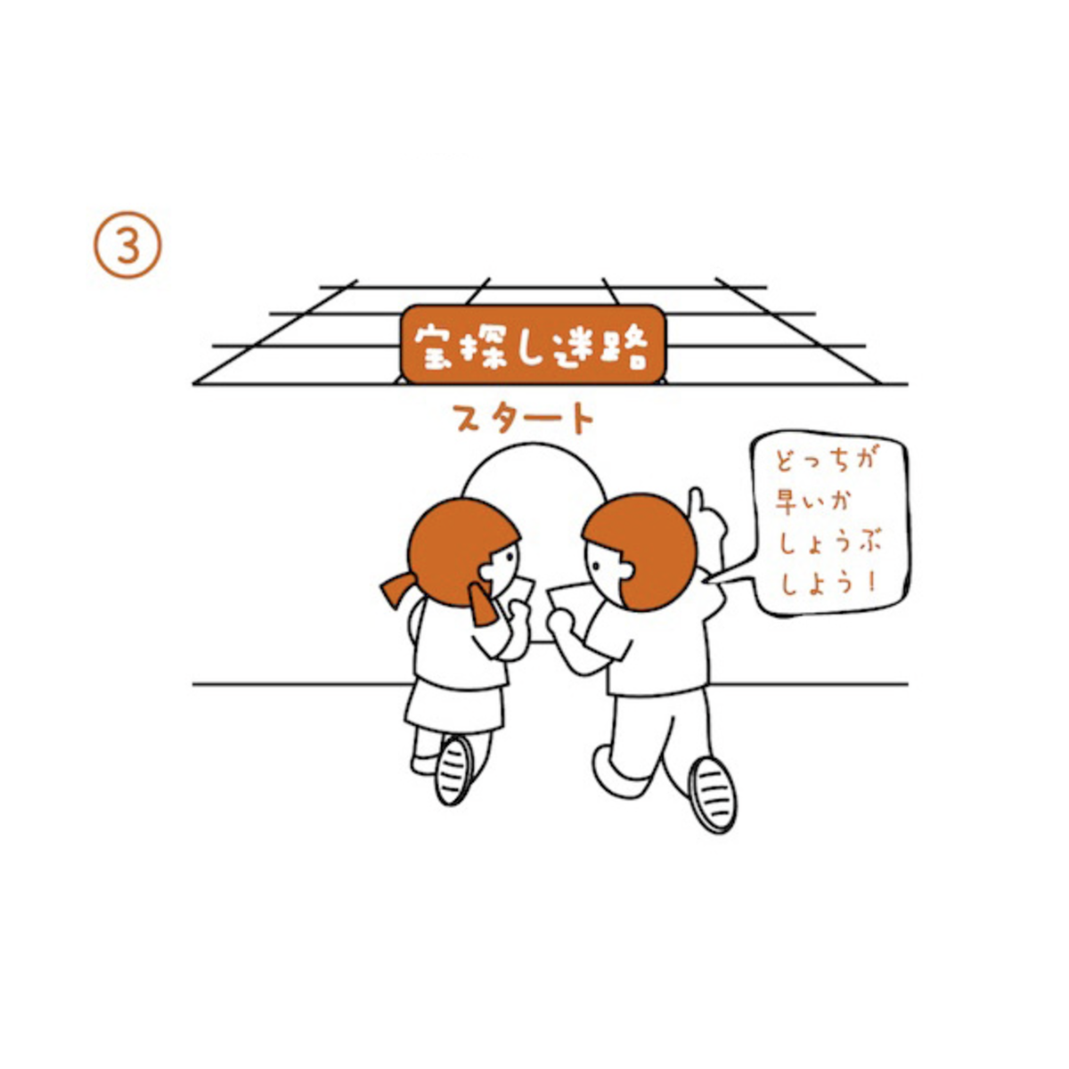
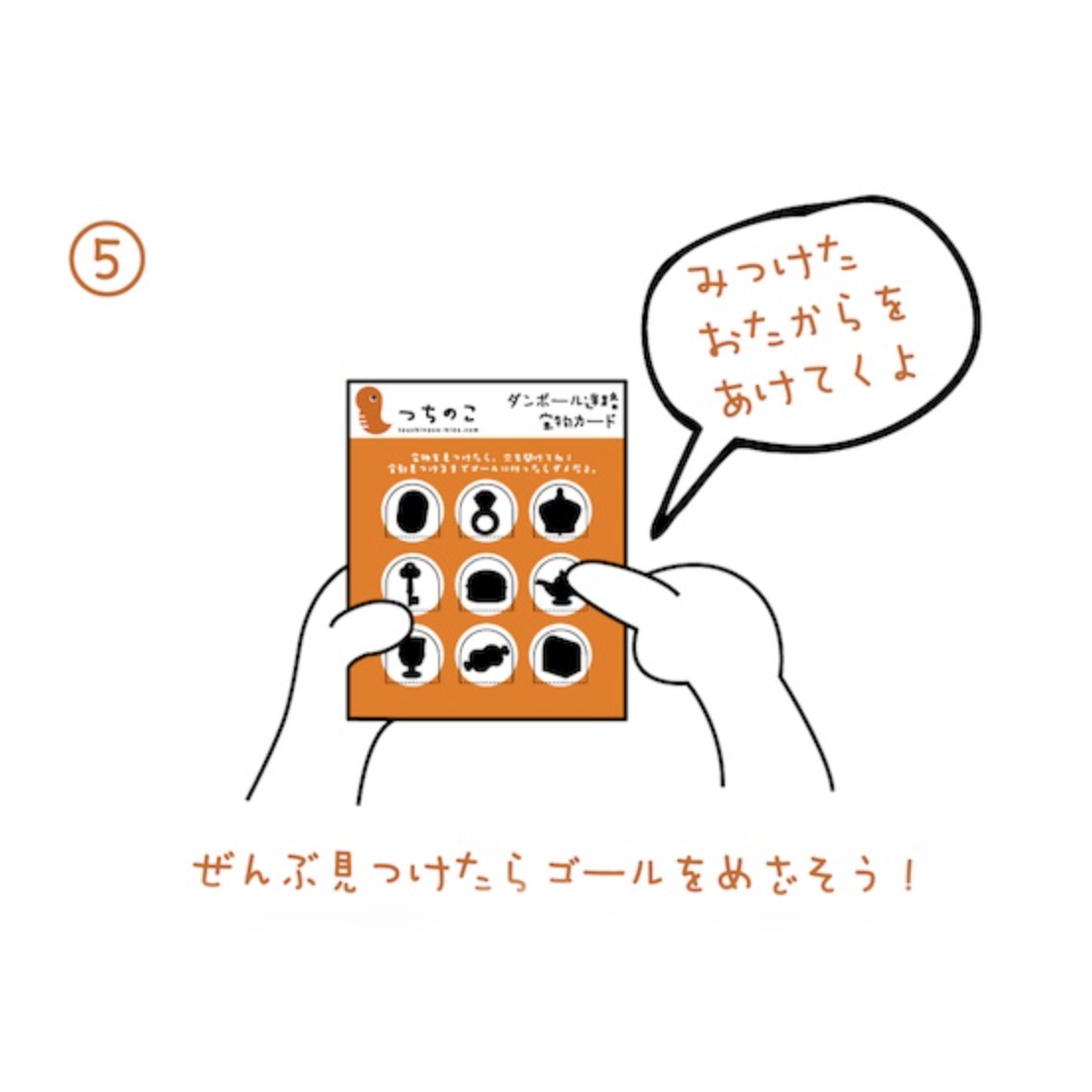
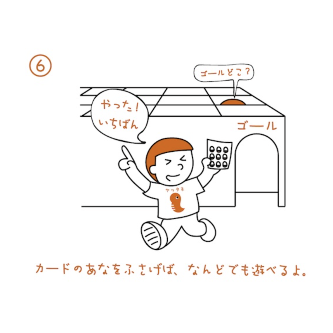
古代生物を集めてゴールを目指そう!
つちのこの宝探し迷路のカスタムプロデュースで実施されました。
2日間で1200人の来場者を集め、大盛況でした。
July 2016 NHK Okayama Okayama City Museum Great Leap Forward for Life
Let's collect ancient organisms and reach the goal!
This was a custom produced version of Tsuchinoko's treasure hunt maze.
It was a great success, attracting 1,200 visitors over two days.

You may also like

LAKE BIWA TROUT
琵琶湖の宝石と言われるビワマスを使った缶詰です。サーモンのようなピンク色に白い筋の入った身をパッケージにもデザインしました。This canned product is made from Biwa trout, the jewel of Lake Biwa. The pink, salmon-like color with white streaked flesh is also designed into the package.
2021
MASU of Shiga
滋賀県産のびわ湖材を用いたノベルティ用のひのき枡のデザインです。 枡で日本酒を飲む機会も減りましたが、日本酒を木の枡で飲むと木の香りがお酒に移り一味違った楽しみ方ができます。この巻き紙にはその楽しみ方を前面に出して記述しています。 巻き紙を取るとシールが貼られています。 そのシールを剥がすと、枡にレーザー刻印された滋賀のモチーフが現れます。モチーフは4種類ありますが何種類あるかは記されていません。何が出るかはお楽しみということにしました。SNSなどで調べると何種類あるのかもわかったり、調べたくなる、シェアしたくなる仕組みとしました。単なる押しつけのノベルティにならないよう、日本酒を楽しんでもらう、心に残る体験デザインとして考えたものです。 Hinoki Masu is a novelty item designed using Biwako wood from Shiga Prefecture. Masu is a vessel for drinking sake. Although the number of occasions to drink sake with wooden Masu has decreased, drinking sake with wooden sake cups offers a different way to enjoy the sake, as the aroma of the wood is transferred to the sake. This paper roll describes how to enjoy sake in a different way. When you take off the paper roll, you will find a sticker attached to it. When the sticker is removed, the Shiga motif laser-engraved on the Masu is revealed. There are four different motifs, but the number of motifs is not indicated. The idea was to make people want to check and share the information by checking on social networking sites. We did not want this to be a mere novelty item, but rather a memorable experience designed to encourage people to enjoy sake. 新颖的桧木 Masu 设计采用滋贺县的琵琶湖木材。 Masu 是喝清酒的容器。 虽然用木制 Masu 喝清酒的机会较少,但用木制 Masu 喝清酒时,木头的香气会传递到清酒中,给人一种与众不同的享受。 这个纸卷描述的就是这种品酒方式。 取下纸卷后,会贴上一张贴纸。 撕下贴纸后,马苏上激光雕刻的滋贺图案就会显现出来。 共有四个不同的图案,但没有说明有多少个。 我们的想法是让人们可以通过社交网站轻松查找到有哪些图案,并让人们愿意查找这些图案并与他人分享。 设计的初衷是让人们享受清酒带来的难忘体验,而不仅仅是一种勉强的新奇感。
2025
西谷堂
西谷堂の手提げ袋と小袋のデザインです。 西谷堂の代表商品であるきんつば「ぐーどすぇ」は丸い形と、さまざまな具材バリエーションが特徴です。 そのことを端的に表現し、西谷堂といえばというデザインとしています。 小袋は小豆をイメージしたものとし、手提げと兄弟のようなイメージで構成しました。 This is the design of Nishitani-do's handbag and sachet. Nishitani-do's signature product, the kintsuba “Gudosue,” is characterized by its round shape and variety of ingredients. The design is intended to express this in a simple way, and to be a symbol of the Nishitani-do brand. The sachet is designed to resemble azuki beans, and the handbag is designed to resemble its siblings. 西谷堂手提包和小袋设计。 西谷堂的招牌产品--金枪鱼 “Gudosue ”的特点是圆形和各种成分。 西谷堂的设计就是这一特点的简单体现。 小袋的设计与红豆相似,手提包的设计与手提包及其同类产品相似。
2020
OIDEN FESTIVAL
豊田おいでんまつりは、おいでん総踊りと花火大会の構成で始まりました。おいでんの曲にあわせて工夫をこらした衣装で踊ります。初めての人でも参加可能な踊りでオープンな雰囲気が特徴です。 踊りと同時に開催される花火大会は東海地区最大の花火です。踊りと花火が一緒になっている祭りは国内でも珍しく、そのダイナミックで躍動的な姿をイメージし、踊りの舞を残光として表現し、美しい花火の光も重ね合わせたポスターとしてデザインしました。日本の美しい夜の祭を描きました。 The Toyota Oiden Festival began with the Oiden So Odori dance and a fireworks display. The dancers wear ingenious costumes and dance to the music of Oiden. The dance is open to even first-time dancers and is characterized by its open atmosphere. The fireworks display held at the same time as the dance is the largest fireworks display in the Tokai area. It is rare in Japan to have a festival that combines dancing and fireworks, and we designed this poster to express the dynamic and dynamic image of the dancing as afterglow, superimposed on the beautiful light of the fireworks as well. We depicted a beautiful night festival in Japan.
2023
NAGAHAMA GENPACHI RUSK
長浜市にあるパン屋ポムドテールの源八ラスクのデザインです。パン職人こだわりの生地から作るラスク。種類も多いですが最小限の資材で対応できるシステムを作りました。ギフトボックスはパンの形をしています。This is a design of Genpachi rusk from bakery Pomme de Terre in Nagahama, Shiga Prefecture. These rusks are made from dough with the baker's special care. There are many different flavors, but we have created a system that can handle a minimum amount of packaging materials. The gift box is in the shape of a loaf of bread.
2020
BRANCH
「枝」を意味する店名のロゴデザイン。花屋さんでありますので「枝、森、花」そのどれもを感じさせる明るいデザインとしました。 Logo design for a store name meaning “branch. As a florist, the logo is bright and evocative of “branches, forests, and flowers. 为一个意为 “枝条 ”的店名设计徽标。 作为一家花店,徽标色彩明亮,令人联想到 “树枝、森林和鲜花”。
2024
NORIKAU OGAWA/KENZO OGAWA
陶芸家 小川顕三氏と小川記一氏のブランドディレクションを担当しました。 陶芸家のお二人に対し、まず、作品から印象を得た二色のコンセプトカラーを設定しました。 その二色を、名刺から、リーフレット、ホームページに至るまで、対比的に使用することで、お互いを引き立てあうように計画しました。
2017
FLOCK
FLOCKは群を意味します。信楽焼の陶器で作られた箸置きやブローチなどのブランディングデザインとネーミングです。商品数がとても多く、動物や植物など生物が多くを占めているので群と名付けました。FLOCK means flock. It is a branding design and naming of chopstick rests and brooches made of Shigaraki ware pottery. We named it "Flock" because there are so many products and many of them are creatures such as animals and plants.
2018
IKA'S MONO
旧伊香郡4町のアンテナショップIKA'S MONO STOREのブランディング、パッケージデザインなどです。四つの町が一つになって高みを目指す。というイメージでロゴデザインをしました。イカのイメージでパッケージにもヘッダーを作って様々な業者の商品に統一感を持たせて販売しました。This includes branding and package design for IKA'S MONO STORE, an antenna store for four former Ika-gun towns. The four towns are united as one and aim high. We designed the logo with this image. We also created a header on the package with the image of squid to give a sense of unity to the products of various vendors and sell them.
2019
KUROBUTA
段ボール箱のベロを差し込む部分を豚の鼻に見立てて、黒豚を立体的にパッケージ全体に描くデザインとしました。 既存のロゴに使われている豚の鼻、目、放射状の装飾をパッケージにあしらうことで、ロゴとパッケージがつながる統一的ブランディングとしています。お尻の側に社名と、尻尾を描いています。箱を開けるときに鼻を引き出すと「THNAK YOU」の文字が見えるようにしています。 お店にパッケージが並んでいる際も、豚がたくさん並んでいるように見え、可愛く、遠目にも目を引くデザインとなっています。 もらったあとも取っておきたいパッケージということで、極力商品名や社名は前面に出さないことを意図しており、段ボール製の収納用品として販売していそうなものを目指し、シンプルで抽象的なデザインとしています。それゆえ、ギフトボックス以外の、壁面デザインやのぼりなど、様々な媒体に展開しやすいものになっています。 段ボールのクラフトの地色を活かしたナチュラル感のあるデザインにしており、素材の良さを感じさせるものです。 The design depicts a black pig three-dimensionally on the entire package, using the part of the cardboard box where the tongue is inserted as a pig's nose. The pig's nose, eyes, and radial decorations used in the existing logo are used on the package to create a unified branding that connects the logo and the package. The company name and tail are drawn on the butt side. When the box is opened, the nose is pulled out to reveal the words "THNAK YOU. When the package is lined up in a store, it looks like a bunch of pigs, which is cute and eye-catching from a distance. The design is simple and abstract, aiming for something that would be sold as a cardboard storage product. Therefore, the design can be easily applied to a variety of media other than gift boxes, such as wall designs and banners. The design has a natural feel, taking advantage of the ground color of the corrugated kraft, and gives a sense of the quality of the material.
2023
Back to Top