DRWERS OF PAST,PRESENT,FUTURE
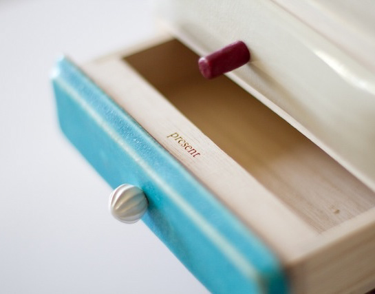
引出しにはそれぞれ、過去の引き出し、現在の引き出し、未来の引き出しと名前が付けられています。
それぞれ過去、現在、未来をイメージした特徴の異なった三枚の陶板で前板が作られています。
陶板は信楽焼で手作りによって作られています。
引き出しを開けるとそこには、past, present, futureの文字が刻まれています。
陶板の引き出しは、何か特別な印象を引き出しにもたらします。
この引き出しをどのように使うかは使用者に委ねられていますが、人にはみなそれぞれの、現在、過去、未来があります。
何か大切なものや情報を入れたりする特別な箱になることを願っています。
2024