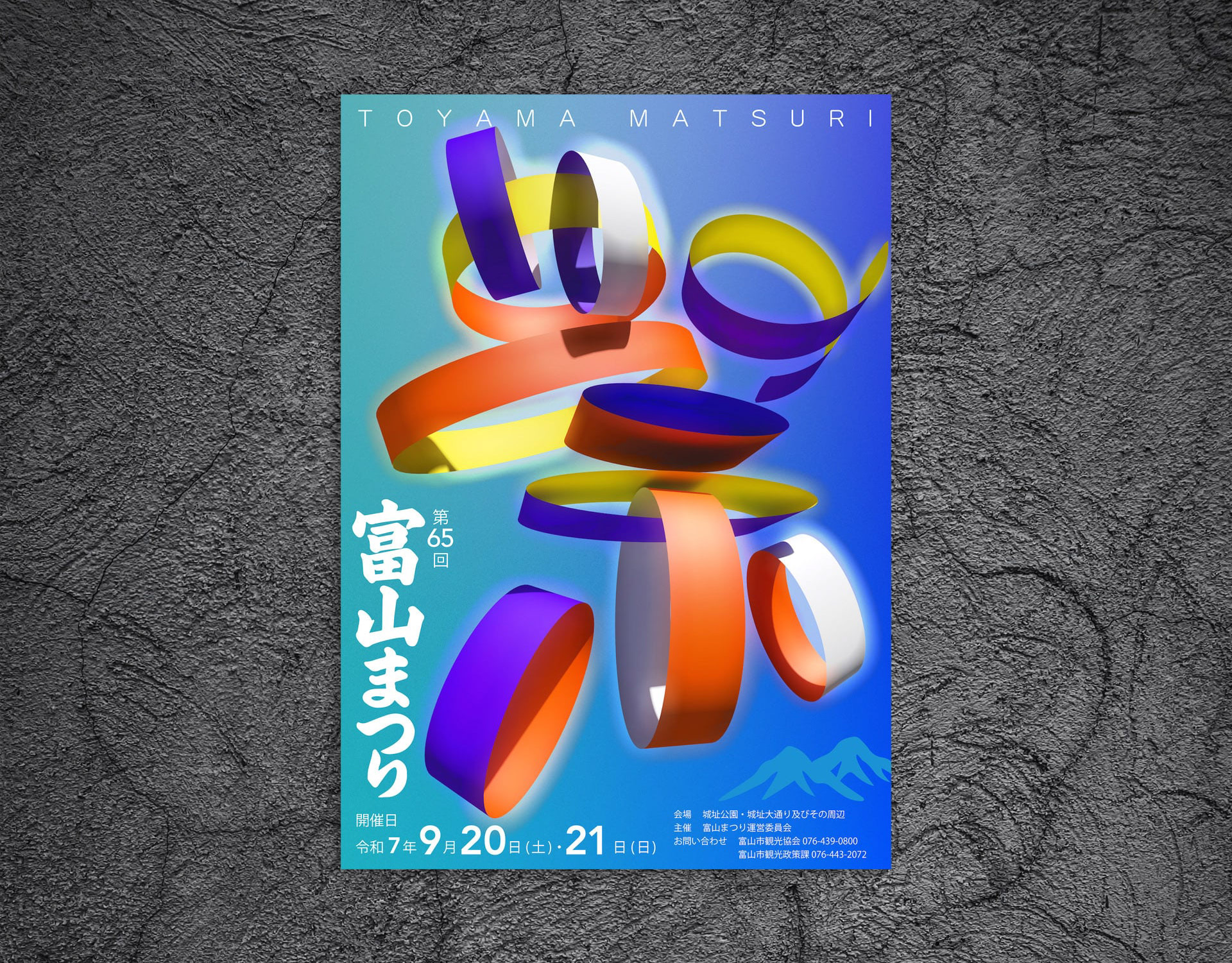
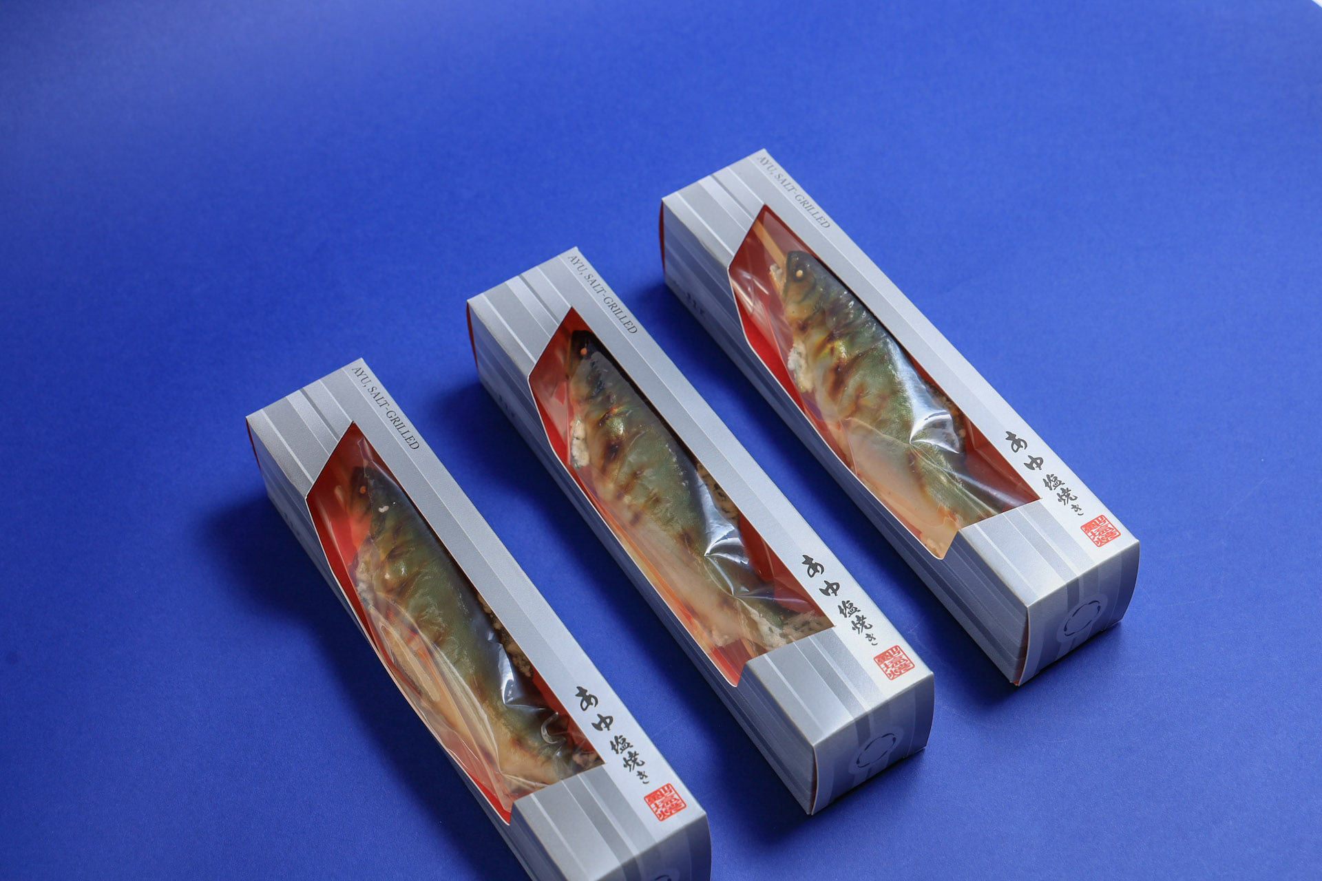
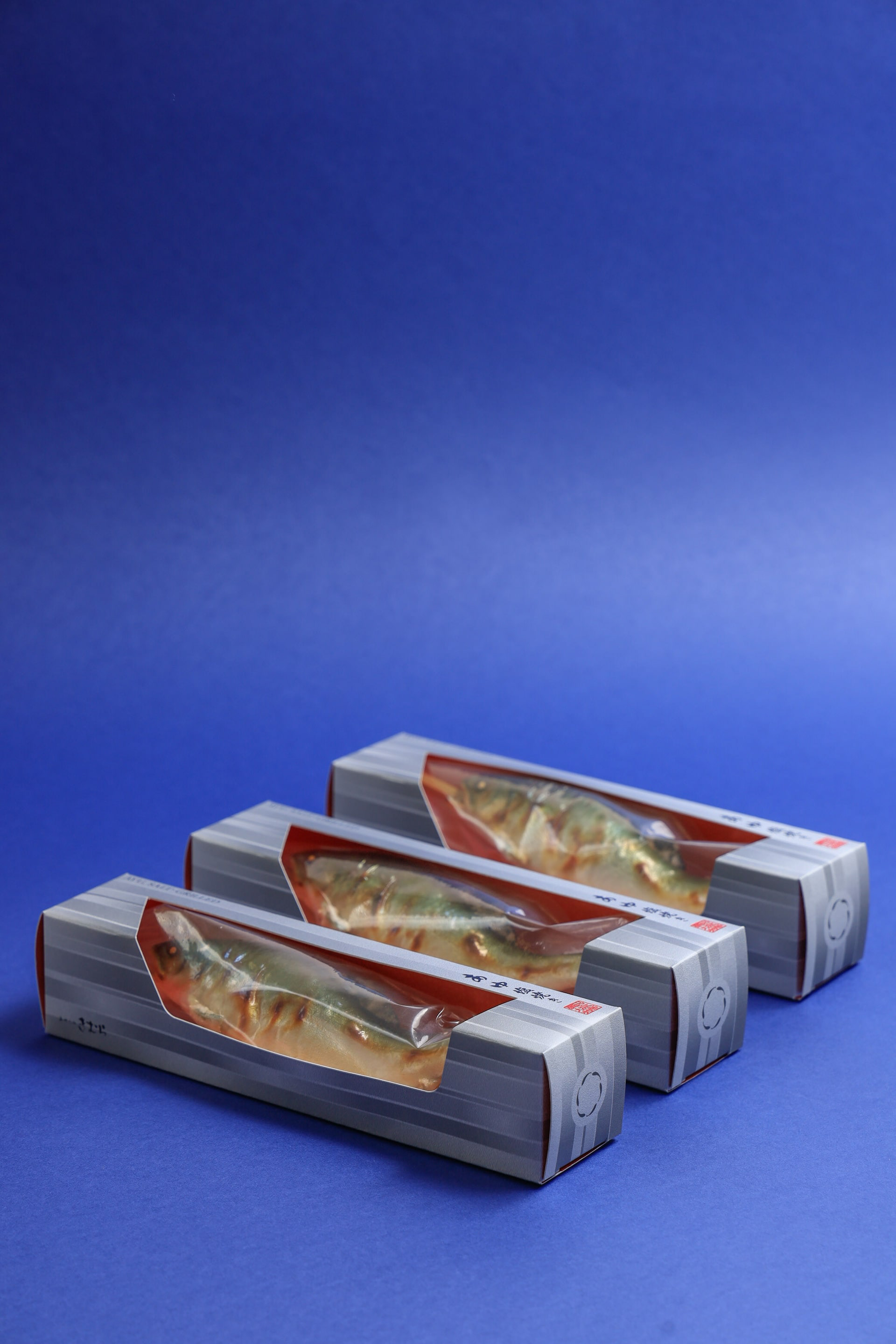
You may also like

CORTE HOME
コルテホームは、自分らしいライフスタイルを提案する住宅のブランドです。 ブランドロゴをはじめとする、ブランド構築を担当しました。
2017
Golden Sesami AYU
金ごまあゆは、琵琶湖産の小鮎の佃煮に、ごまをまぶした商品です。ご飯にのせたりして食べると美味しいのでその姿をパッケージデザインとしました。Golden Sesami Ayu is a tsukudani, a small sweetfish from Lake Biwa, sprinkled with sesame seeds. It is delicious when eaten over rice, so we designed the package to look like that.
2021
GOENMAN
ご縁まんは、菓匠禄兵衛の商品でおめでたい縁起の良いイメージでパッケージを依頼されました。紅白と金色を用いて「円」と「縁」を掛け合わせて縁起の良いデザインを目指しました。e were asked to create a package for Gohan Man, a product of the confectioner Rokubei, with a festive and auspicious image. We aimed to create an auspicious design by using red, white, and gold colors to cross the words "yen" and "en" together.
2020
amana
「あまな」は近江八幡丁稚羊羹の老舗和た与の経営するカフェです。そのインテリアデザインを担当しました。外観は和風であり、テイクアウト導線も設けました。モダンな和、円をテーマにしてデザインしています。Amana" is a café run by the long-established Ohmi-Hachiman Decchiyokan (sweet bean jelly) shop, Wataoyo. We were in charge of the interior design. The exterior is Japanese style, and a take-out line is also provided. The theme of the design is modern harmony and circle.
2020
BIWAICHI
2019
3 Glass Base Award Gift
2014
TOFU ICCHO
和紙でできたノート豆腐一帳のロゴデザイン。 エッジがピンとしつつも、中身はやわらかい、そんな豆腐のような手作り感のあるロゴを目指してデザインしました。
2014
HOP VISA
これはHOP VISAカードリニューアル指名コンペでの案です。滋賀の美しい緑、田園風景を水彩画を用いて表現したものです。手描きの四角い不均一なマス目が重なったりにじんだりして、一つの自然を形成しているようなイメージです。このようなおおらかさこそが滋賀のイメージであり、今までの緑のvisaカードのイメージも踏襲しながら、若々しく優しい、滋賀と、平和堂の空気感を表現できていると思います。This is a watercolor rendering of the beautiful green, rural landscape of Shiga. The image is of hand-painted squares of uneven squares overlapping and blurring to form a single natural feature. This kind of generosity is the image of Shiga, and I think it expresses the youthful and gentle atmosphere of Shiga and Heiwado, while also following the image of the existing green visa cards.
2023
GINDAWARA
釜炊き近江米 銀俵のロゴをデザインしました。シンボルマークは米俵を横から見た姿。銀俵の文字は古い文字から引用しました。We designed a logo for GINDAWARA. This restaurant cooks rice in a Shigaraki earthenware pot. The symbol mark is a side view of a rice bale. The letters of "Ginbawara" are taken from old characters.
2019
CUBRIC HOOK
CUBRICはシンプルなデザインの木製の壁掛けフックです。 2つの立方体形状の組み合わせで構成されています。 どのような空間にもよく合う、なんでもないシンプルな形です。主張するわけでもなく、なんとなく壁にあり、玄関で向かえてくれる。 フックはあくまでも脇役。 主役は空間でありインテリアです。こんなシンプルな木製フックが意外と売っていませんでした。CUBRIC is a wooden wall hook with a simple design. It consists of a combination of two cube shapes. It is a simple, nondescript shape that fits well in any space. It does not make a statement, it is somehow on the wall, and it will greet you at the entrance. The hook is only a supporting role. The main role is the space and interior. Surprisingly, such a simple wooden hook was not sold.
2017
Back to Top