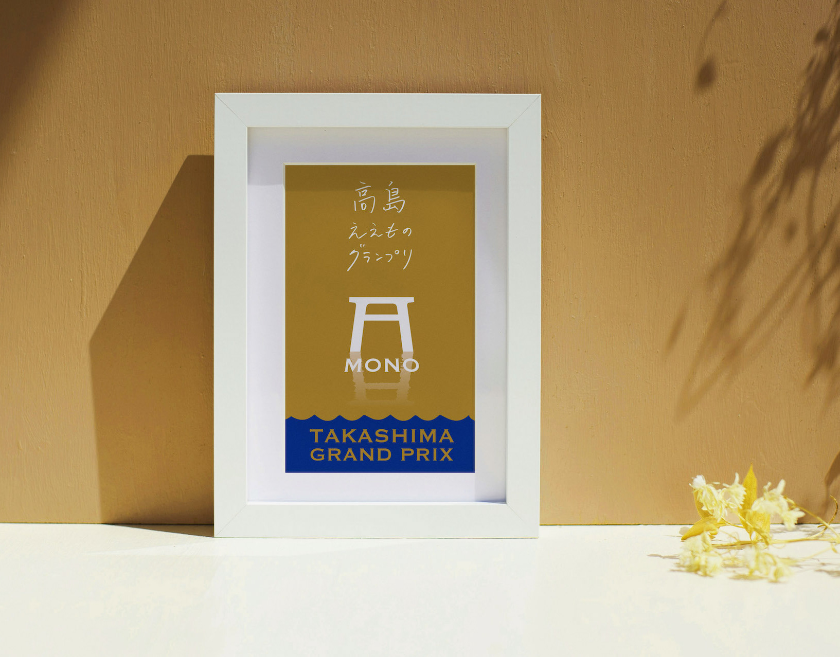
TAKASHIMA A MONO GP
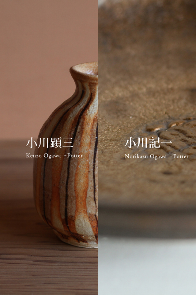
今年で8回目を迎える滋賀県高島市の「ええもの」を集めたコンテスト「高島ええものグランプリ」のリニューアルブランディングに関わりました。
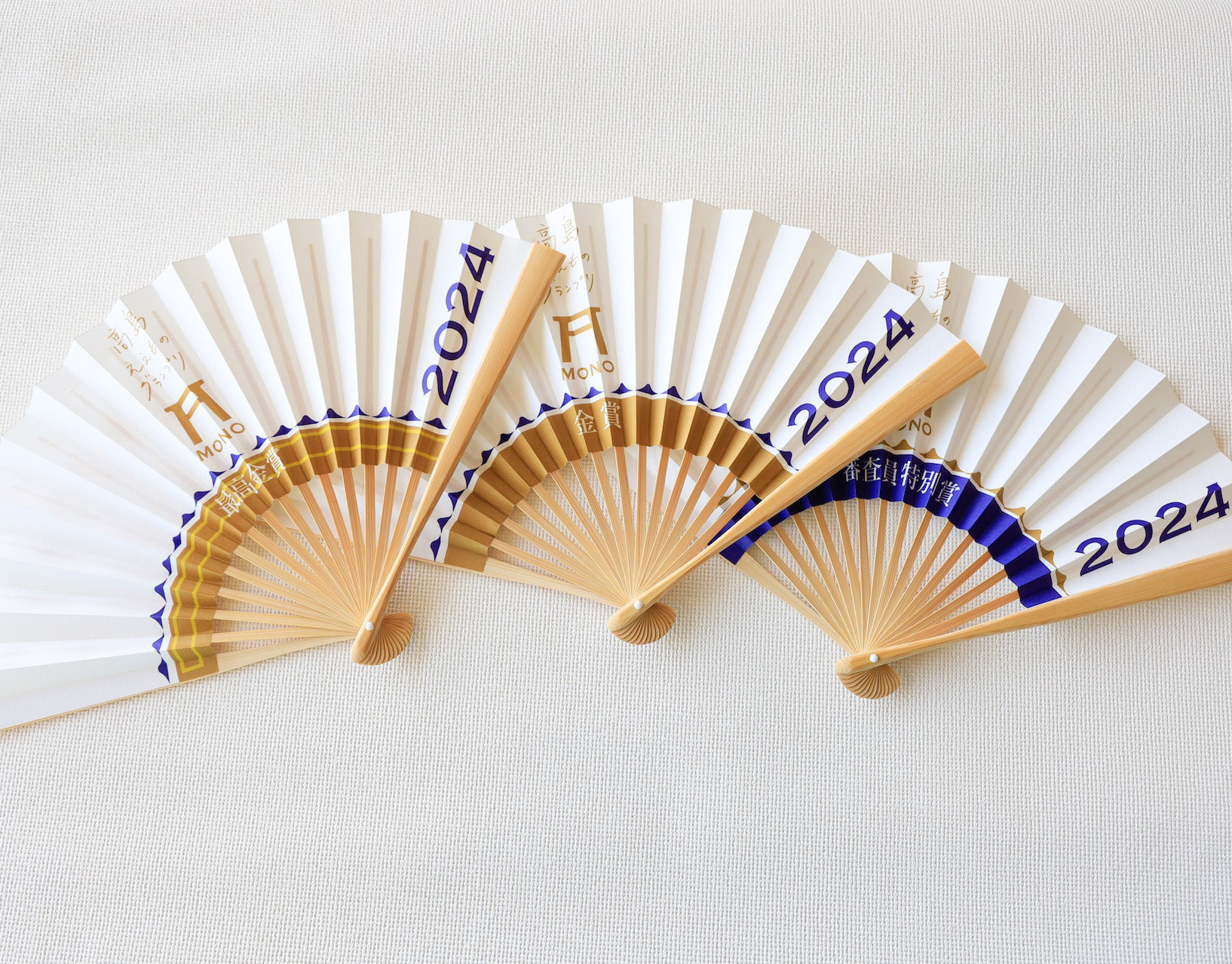
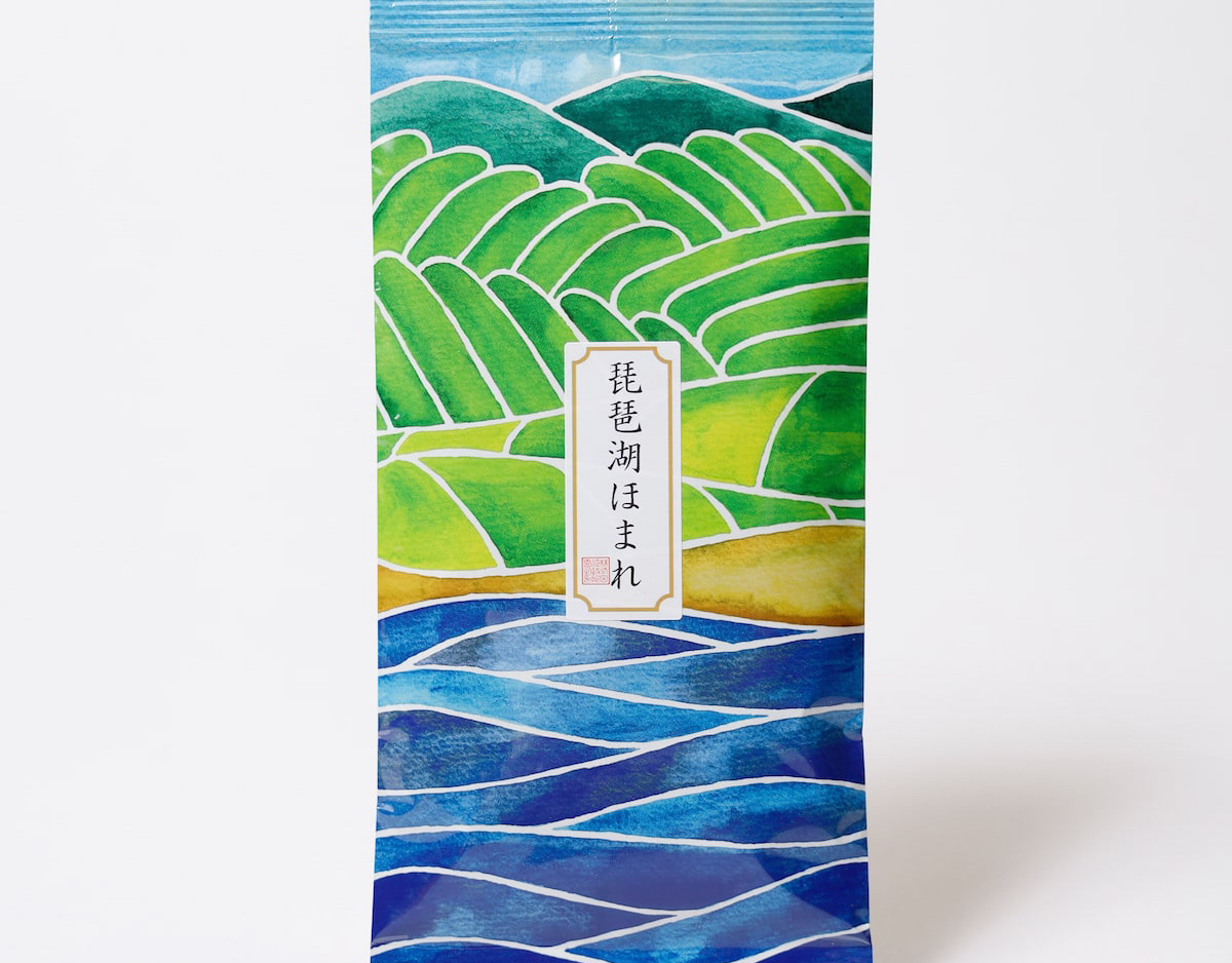
受賞者は「センスがええ」ということで、トロフィー代わりに高島扇子が贈呈されました。
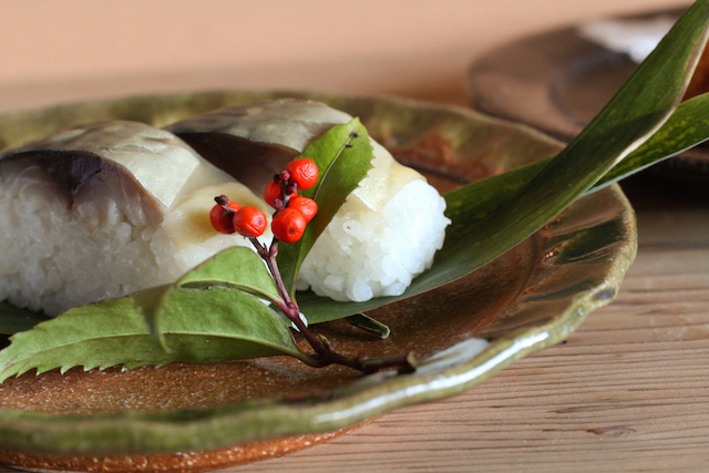
最高金賞に選ばれたのは、とも栄さんの「ふなずしxベイクド羊羹」の”ふなチー”です。
滋賀の人って、本当に鮒寿司を美味しくすることに執念を燃やしています!これが鮒寿司なの?っていうくらい美味しいもの沢山あります。これも、チーズ不使用なのに濃厚チーズケーキそのもので、審査員絶賛でした。
他にも金賞の発酵ドルチェ米シュワグルトも鮒寿司を作る際の飯から作られたヨーグルトです。
その他の金賞には、和ろうそくの大與さんは有名ですが、高島発アウトドアブランドの業界最小クラスの焚火台や、琵琶湖の宝石と呼ばれるビワマスひつまぶし、メタセコイアのブラウニーケーキなど、ユニークな商品が揃いました。
審査委員長も近年稀に見るハイレベルとおっしゃっていました。
We were involved in the renewal branding of the contest that featured "ehimono" (good things) from Takashima City, Shiga Prefecture, which is now in its 8th year.
In lieu of a trophy, a Takashima fan was presented to the winners for their "good taste.
The top gold medal went to Tomoei's "Funachie" (Funazushi x Baked Yokan).
The people of Shiga are really dedicated to making funa-zushi delicious! There are so many delicious funazushi that you may wonder, "Is this really funazushi? There are so many delicious funa-zushi that you may ask yourself, "Is this funa-zushi? The judges also praised the cheesecake, saying that it was just like a rich cheesecake, even though it did not contain cheese.
Another gold award winner, Fermented Dolce Rice Schwagurt, is a yogurt made from the rice used to make funa-zushi.
Other Gold Award winners included Ooyo, a well-known Japanese candle maker, the smallest fire pit in the industry from an outdoor brand from Takashima, Biwa trout hittomabushi, the jewel of Lake Biwa, metasequoia brownie cake, and many other unique products.
The long-time chairman of the judging committee, said that the level of the competition was of a high level rarely seen in recent years.
我们参与了 "高岛 A-mono 大奖赛 "的品牌更新工作,这是滋贺县高岛市的一项 "优秀产品 "竞赛,今年已是第八届。
获奖者获得的不是 "美味 "奖杯,而是一把高岛扇。
最高金奖由 Tomoei 的 Funa-zushi x Baked Yokan(Funachii)获得。
滋贺人真的很用心地把船寿司做得美味可口! 这是船卷寿司吗? 美味的寿司有很多。 这款寿司也得到了评委们的高度评价,虽然不含奶酪,但吃起来就像浓郁的芝士蛋糕。
评委会主席还说,这是近年来少见的高水平作品。
2024