KIRAMIZUKI OMI RICE
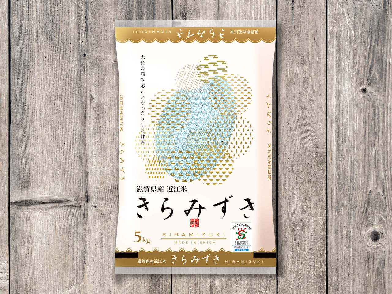
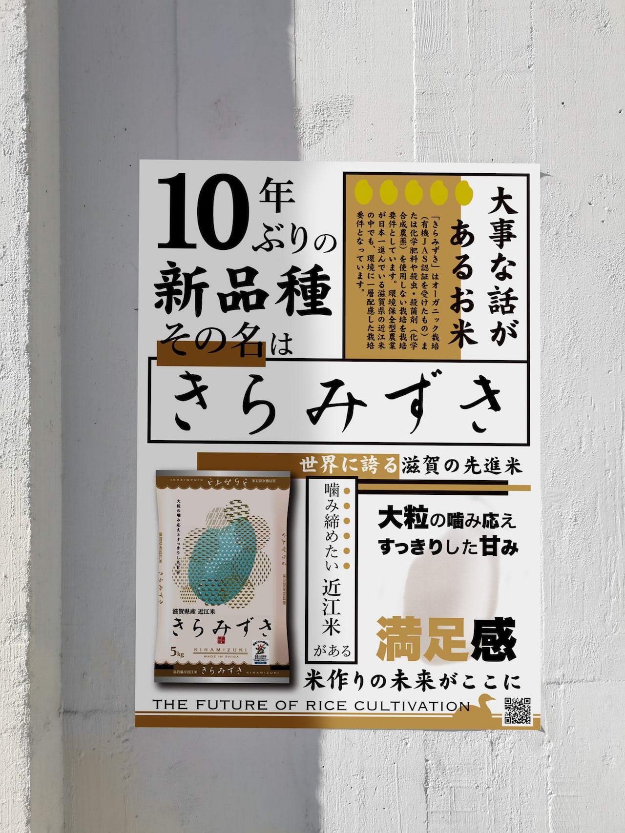
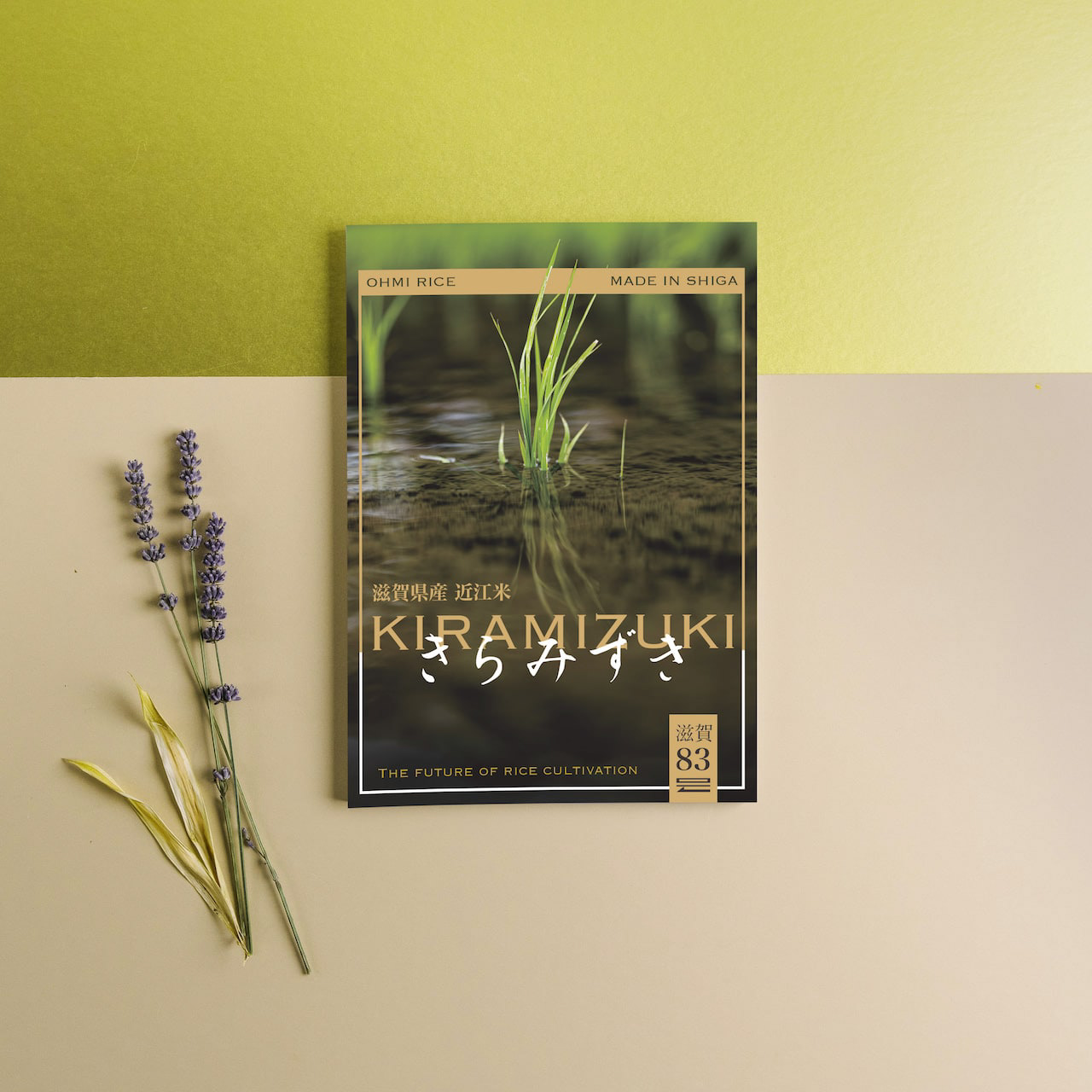
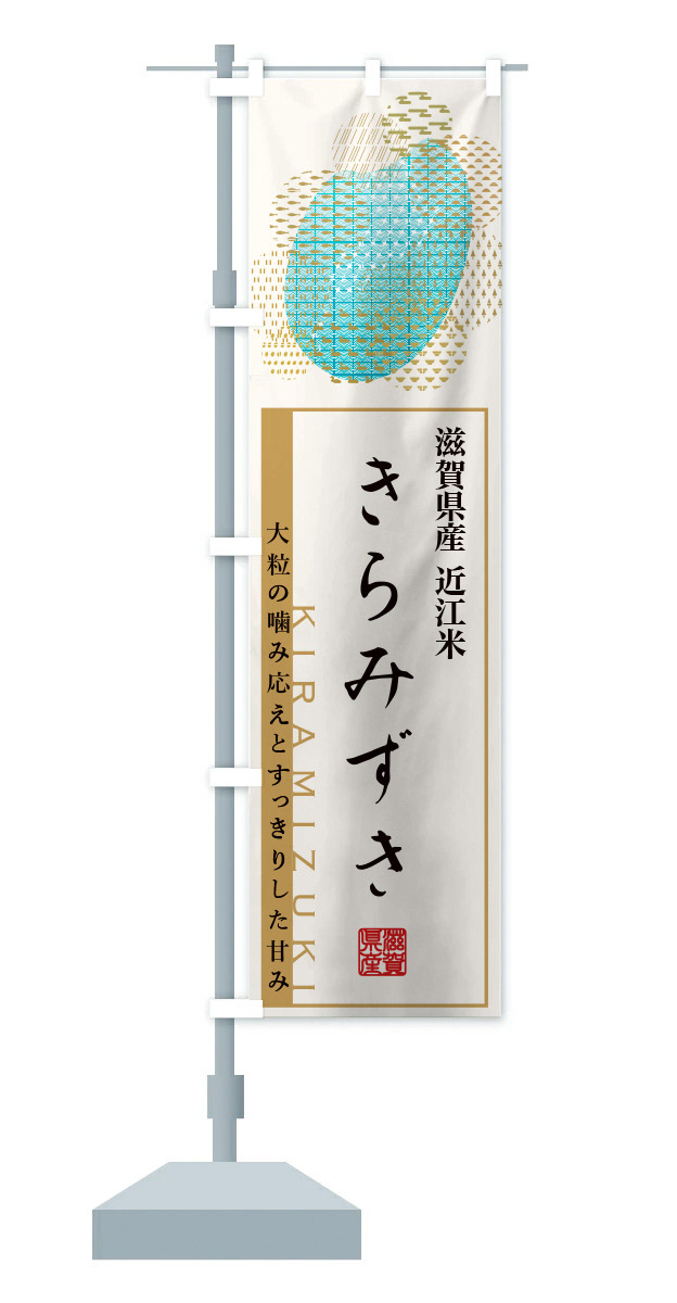
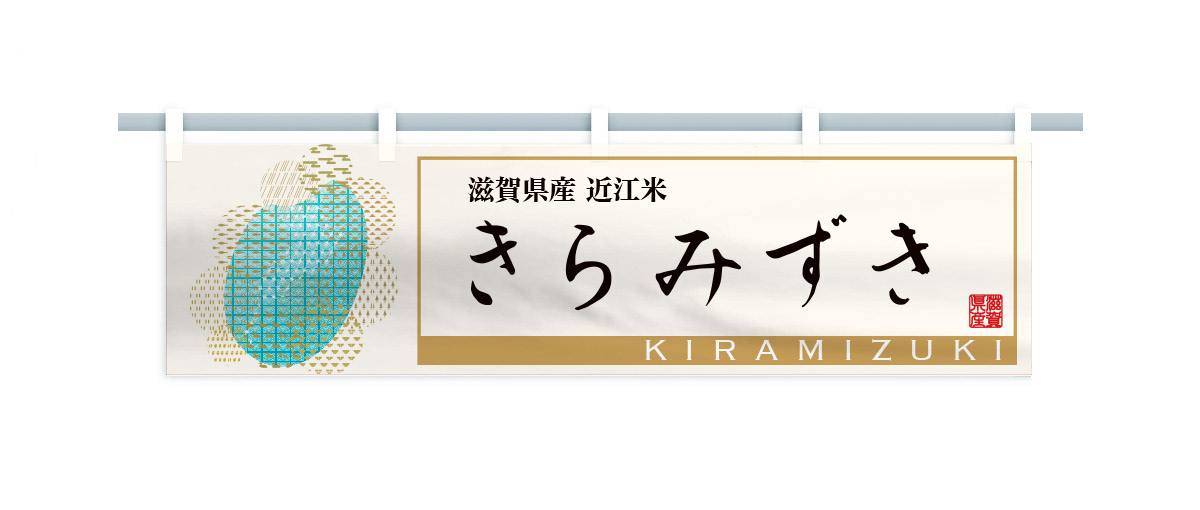
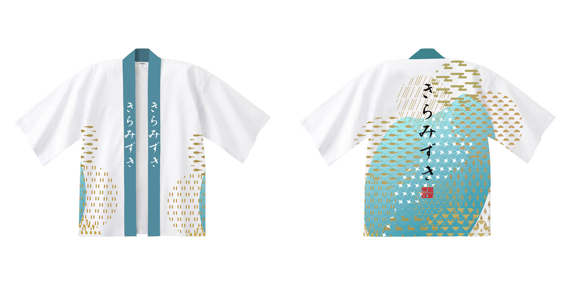
近江米の新品種「きらみずき」のパッケージデザインおよびブランディングプロポーザル応募案。パッケージの絵は、きらきらと輝く琵琶湖を中心に、豊かな生物、山林、気候、田畑のイラストをちりばめ、それらの恩恵を受けたみずみずしい米粒を描きました。全体的に金色でデザインを、下地は旨味を感じさせる淡いベージュ色で高級感とシズル感(美味しそうに見える感覚)を演出しました。のぼりや法被、コンセプトブック、ポスターなど販促品も合わせてデザインしました。Proposal entry proposal for a new variety of Omi rice. The package picture depicts a sparkling Lake Biwa, interspersed with illustrations of rich living creatures, mountains, forests, climate, and fields, and the lush rice grains that benefit from them. The overall design is in gold, while the base color is a light beige that evokes a sense of deliciousness and a sense of luxury. The base color is a light beige color that evokes a sense of deliciousness, creating a sense of luxury and sizzle (a sense of looking delicious).
You may also like
KUROBUTA
段ボール箱のベロを差し込む部分を豚の鼻に見立てて、黒豚を立体的にパッケージ全体に描くデザインとしました。
既存のロゴに使われている豚の鼻、目、放射状の装飾をパッケージにあしらうことで、ロゴとパッケージがつながる統一的ブランディングとしています。お尻の側に社名と、尻尾を描いています。箱を開けるときに鼻を引き出すと「THNAK YOU」の文字が見えるようにしています。
お店にパッケージが並んでいる際も、豚がたくさん並んでいるように見え、可愛く、遠目にも目を引くデザインとなっています。
もらったあとも取っておきたいパッケージということで、極力商品名や社名は前面に出さないことを意図しており、段ボール製の収納用品として販売していそうなものを目指し、シンプルで抽象的なデザインとしています。それゆえ、ギフトボックス以外の、壁面デザインやのぼりなど、様々な媒体に展開しやすいものになっています。
段ボールのクラフトの地色を活かしたナチュラル感のあるデザインにしており、素材の良さを感じさせるものです。
The design depicts a black pig three-dimensionally on the entire package, using the part of the cardboard box where the tongue is inserted as a pig's nose.
The pig's nose, eyes, and radial decorations used in the existing logo are used on the package to create a unified branding that connects the logo and the package. The company name and tail are drawn on the butt side. When the box is opened, the nose is pulled out to reveal the words "THNAK YOU.
When the package is lined up in a store, it looks like a bunch of pigs, which is cute and eye-catching from a distance.
The design is simple and abstract, aiming for something that would be sold as a cardboard storage product. Therefore, the design can be easily applied to a variety of media other than gift boxes, such as wall designs and banners.
The design has a natural feel, taking advantage of the ground color of the corrugated kraft, and gives a sense of the quality of the material.
2023
minamo
2021
DEN-EN KITCHEN
den-en kitchen ロゴデザイン。おうみ福祉会の新施設、きみいろ内に併設されたden-en kitchen(田園キッチン)のロゴデザインを担当しました。田んぼの田を両手で抱き抱えるような暖かさを感じさせるデザインです。のどかな田園風景に溶け込むカフェは、どなたでもご利用頂けます。Logo design for den-en kitchen.We designed the logo for den-en kitchen (Den-en kitchen), which is located in Kimiiro, a new facility of Ohmi Fukushi Kai.The design evokes a warm feeling of embracing the rice paddies with both hands.
The café blends into the peaceful countryside and is open to everyone.
2023
THE WORLD SOCIETY FOR EKISTICS
世界駅スティクス学会2005の公式ポスターをデザインしました。ekisticsは人間居住工学の意味です。その文字を居住空間に見立ててデザインしました。We designed the official poster for the World Ekistics Congress 2005. Ekistics means "human habitation engineering. We designed the letters as if they were living spaces.
2005
ITO
2017
TOILET SIGN
白い壁面にも際立つ美しいデザインのトイレサインです。JIS規格のトイレサインの形状は堅すぎるけど、売っているものはカジュアルすぎるものが多いので、ちょうど良いバランスで飽きのこないシンプルデザインを考えました。トイレマークも一度貼ったら10年、20年は変えないと思いますので、普遍性を大事にデザインしました。厚みは7mmでしっかりと木の厚みが感じられます。This is a beautifully designed toilet sign that stands out against the white wall. the JIS standard toilet sign shape is too rigid, but many of the ones sold are too casual, so we came up with a simple design that strikes just the right balance and will never become boring. Once the toilet sign is affixed, it is not likely to be changed for 10 or 20 years, so we designed it with universality in mind. The thickness is 7mm, and you can feel the thickness of the wood.
2018
PIZZLY BEARS
地球温暖化の影響で、北極の氷は溶け、ホッキョクグマは住む場所を失い始めています。
この木馬ではホッキョクグマが、その溶けて割れてしまった氷をたどたどしい足付きで歩いてゆく姿を現しています。この木馬は、自分の娘のために作ったものです。
売っているものを買って与えるより、せっかくだから、私のデザインしたものをあげたいとの思いからです。
私の父も、いろいろなものを作ってくれたものでした。それが、やはり私の中では印象が大きいのです。
この木馬は発表するや、世界中のデザインや環境系ブログを駆け巡りました。
その中には、カナダの北極の科学者から娘に買いたいとの連絡までありました。
これには驚きましたが、あいにくその時は商品化できていませんでした。
そして、2年くらい経ったある時、商品化したいと言ってくれる香港のブランドが現われたのです。
発表から3年の時を経てようやくHUZI DESIGNより商品化されました。
2008
among
傘立てのデザインです。一見、傘立てには見えませんが、全ての傘の先端が合うように円と円の隙間を調整しています。どこにはまるのか、最初は悩みますが、慣れるとすぐにわかります。自分で使いこなす美しいプロダクトです。This is the design of an umbrella stand. At first glance, it does not look like an umbrella stand, but the gap between the circles is adjusted so that the tips of all umbrellas fit together. At first you may have trouble figuring out where it fits, but once you get used to it, you will soon find out. It is a beautiful product that you can use yourself.
2015
SAISIR
SAISIRはサカエヤに併設されたフレンチレストランです。SAISIRは掴むという意味であり、象形文字の牛の文字にヒントを得ながら、ナイフのようなロゴマークのデザインとしました。SAISIR is a French restaurant attached to Sakaeya, and the logo mark was designed to look like a knife, inspired by the hieroglyphic character for cow, SAISIR meaning "to grasp.
2019
BIWAICHI
2019