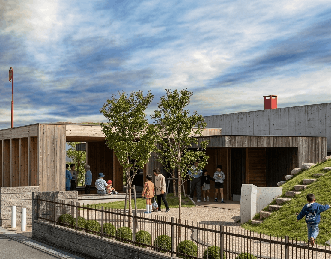
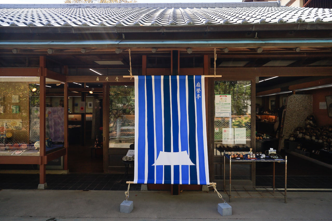
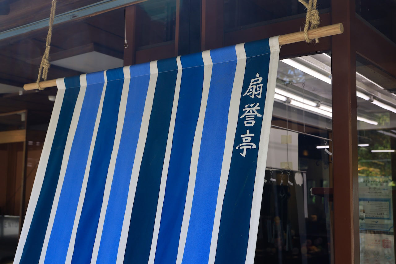
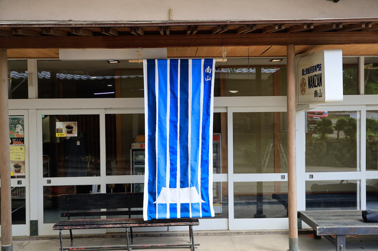
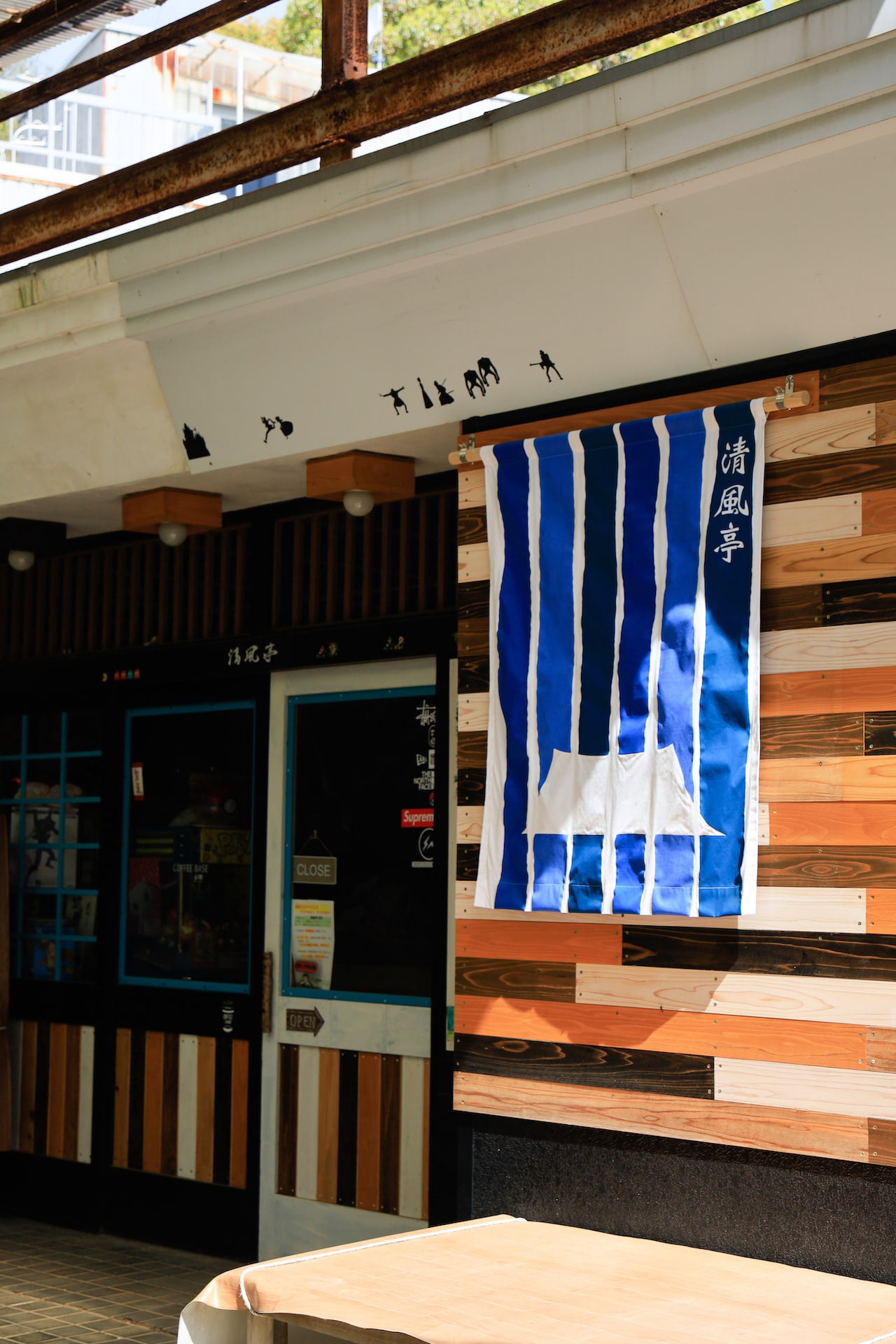
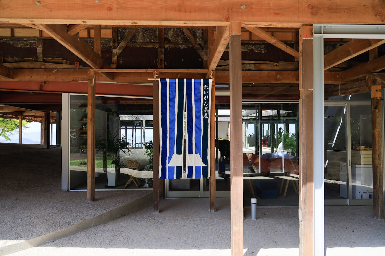
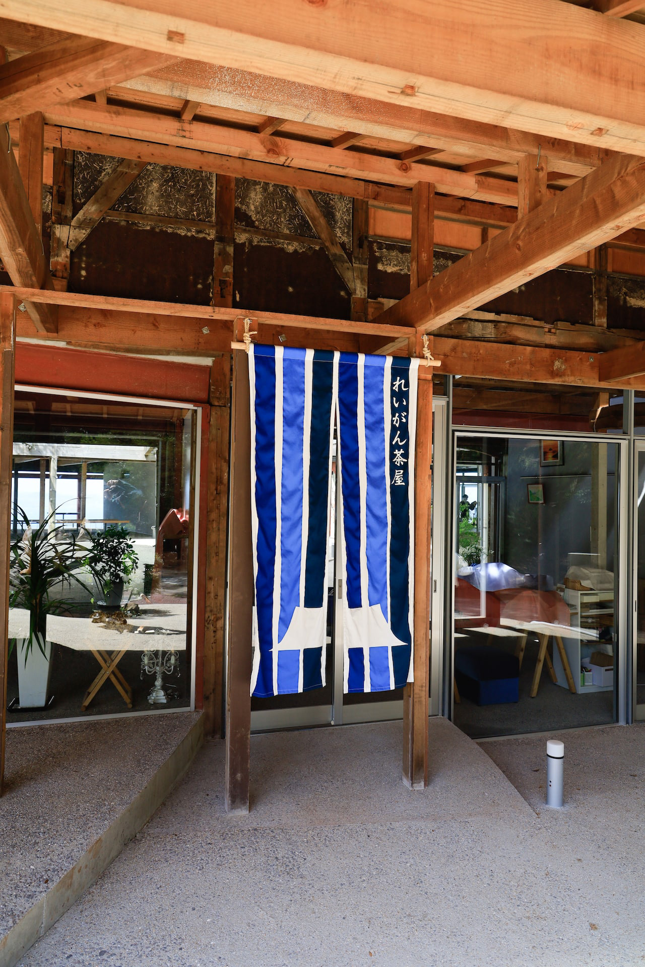
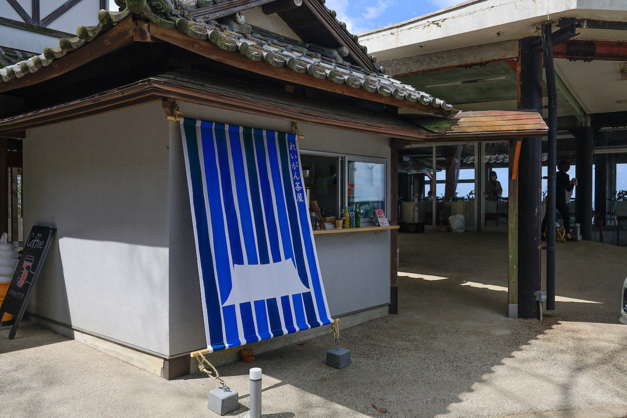
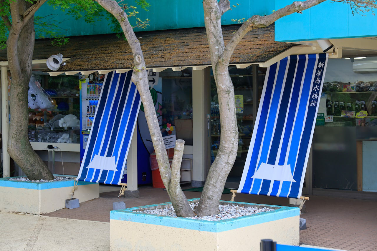
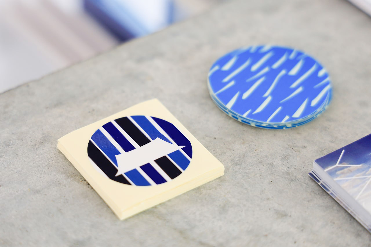
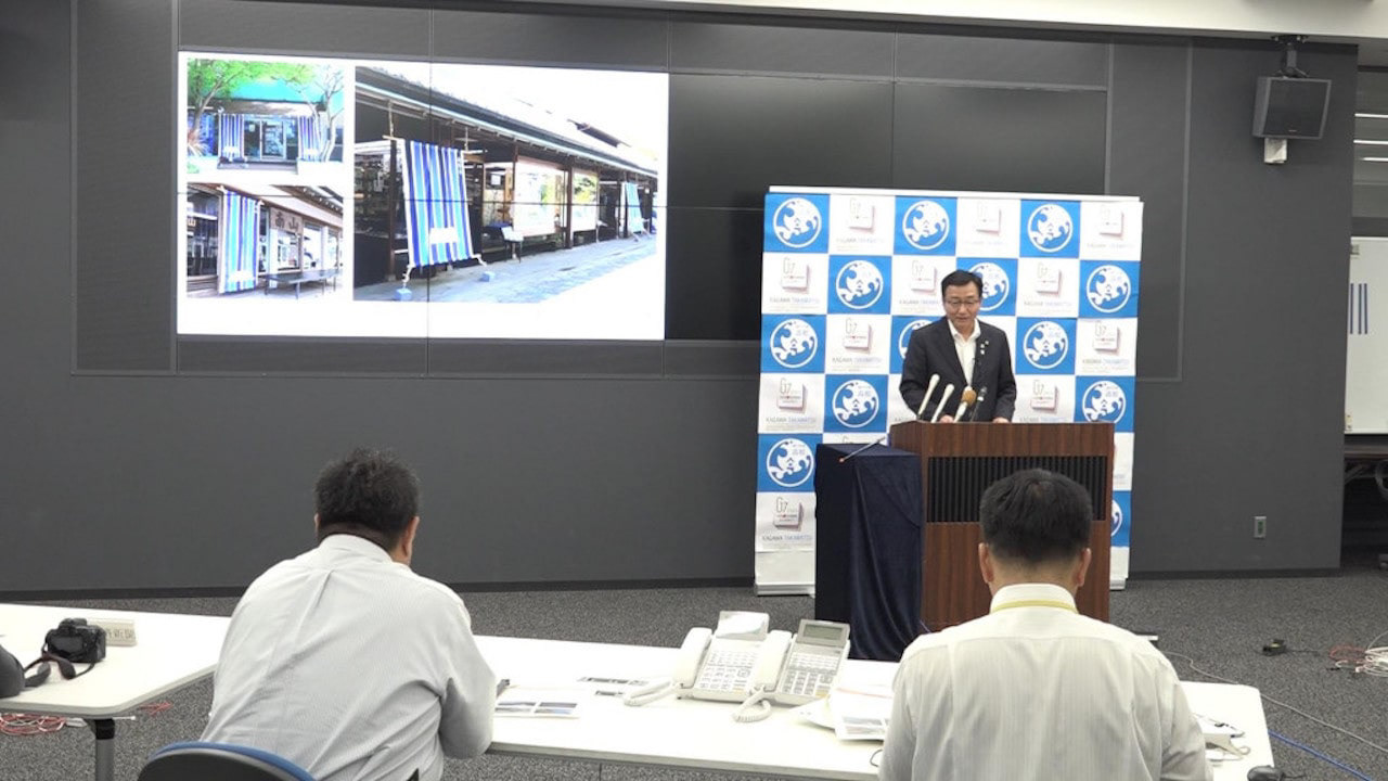
You may also like

220
220は特殊な触媒を用いて飲料の味を変化させる魔法のマドラーです。数秒かき混ぜるだけでワインが熟成されたような味になります。プロダクトデザインは秋田道夫氏、ブランディングを弊社が担当しました。220 is a magic muddler that uses a special catalyst to change the taste of beverages. Just a few seconds of stirring is all it takes to make wine taste like it has been aged. Product design was done by Michio Akita and branding by our company.
2022
Miso soup with Seta shijimi
琵琶湖のセタシジミを使ったインスタントの味噌汁です。しじみの殻をデザインとして使いました。高級なしじみなので金色にしています。This instant miso soup is made with Lake Biwa's seta shijimi clam. We used the shells of shijimi clam as a design. The color is gold because of the high quality shijimi clam.
2020
AYU PORRIDGE
あゆ雑炊のパッケージデザインです。あゆのひらきを使い、レンジアップご飯で手間要らずで簡単に雑炊が作れるように開発されました。鉄鍋に木の蓋をデザインモチーフとし、レトルトご飯と、だし汁を隙間なくホールド可能なパッケージに逆台形型の箱としました。一枚のシートから立体になるデザインです。青い紙に金印刷でローコストに制作しました。 This is the package design of Ayu Porridge. It was developed to make Zosui (rice porridge) easily and hassle-free with microwaved rice using Ayu flounder. The design motif is an iron pot with a wooden lid, and the package is an inverted trapezoid-shaped box that can hold retort rice and the broth without gaps. The design is three-dimensional from a single sheet. Gold printing on blue paper was used for low-cost production. 鲶鱼粥包装设计。 它的开发目的是让人们能够使用鲶鱼比目鱼用微波炉简单方便地煮粥。 设计图案是铁锅上的木盖、甑饭和一个倒梯形盒子,用于盛放无缝隙肉汤的包装。 该设计是由单张板材制作而成的三维作品。 它是用蓝色纸张上的金色印刷以低成本制作的。
2024
ONDA
ONDAはイタリア語で波を意味します。これはチェストですが表面が波のようにカーブしています。ウォルナットとヨーロッパビーチに2種類の木のコントラストがあるデザインです。ONDA means wave in Italian. This is a chest, but its surface is curved like a wave. The design has a contrast between two types of wood in walnut and European beach.
2009
OITA ASIA SCULPTURE EXHIBITION
大分アジア彫刻展公募の公式ポスターを担当しました。大分の頭文字OとアジアのAをモチーフに、現代彫刻作品を思わせるようなデザインとしました。大分の向こうにアジアを見据えるイメージでAを向こう側に配置し、また、賞の頂点を金色のAで表しています。 I designed the official poster for the Oita Asia Sculpture Exhibition open call. Using the initials O for Oita and A for Asia as motifs, I created a design reminiscent of contemporary sculpture. The letter A is positioned toward the horizon, symbolizing the vision of Asia beyond Oita, while the golden A represents the pinnacle of the awards. 我负责设计了大分亚洲雕塑展公开征集活动的官方海报。以大分首字母O和亚洲首字母A为设计元素,打造出令人联想到现代雕塑作品的视觉效果。将A字母置于远方,象征着从大分眺望亚洲的意境,同时以金色A字母代表奖项的巅峰。
2025
KIMIIRO SIGN
近江八幡市で、社会福祉法人 おうみ福祉会の新しい建物が5月に開所しました。 その建物は「きみいろ」と言います。きみいろは日本語であなたの色という意味です。 作業所に訪れる人、それぞれの個性が彩る家族のような場所。そんなイメージかもしれません。今回、内部のサインを担当させていただきました。その「きみいろ」=「君色」というネーミングから、キャンバスに絵の具で描いたような、にじみと温かみのあるサインとすることを思いつきました。ここでは「せんべい」も作っており、せんべいルームのサインも作りました。A new building of Ohmi Fukushi Kai social welfare corporation opened in May in Ohmi-Hachiman City.The building is called "Kimiiro. Kimiiro means "your color" in Japanese.It is a family-like place where the individuality of each person who visits the workshop adds color to the place. That may be the image of this building.This time, I was in charge of the interior signage.From the name "Kimiiro" = "Kimiiro," we came up with the idea of making the signage blotchy and warm, as if painted on a canvas. We also make "senbei" here, so we created a sign for the senbei room.
2023
Granular 2
香川県の庵治石を使った屋外照明器具のデザインです。光が当たる下の部分は荒い仕上げにしています。天板に座ることも可能ですがそこは柔らかく膨らんでおり鏡面仕上げになっております。光が美しいグラデーションで浮かび上がります。This is a design for an outdoor lighting fixture using Aji stone from Kagawa Prefecture. The lower part where the light hits the stone has a rough finish. It is possible to sit on the top panel, which is softly bulged and has a mirror finish. The light emerges in a beautiful gradation.
2023
JAPAN-FRANCE 150th
2008年日仏交流150周年記念ロゴマークの応募案です。日本国旗とフランス国旗の融合をデザインしました。This is a proposal for a logo mark to commemorate the 150th anniversary of Japan-France relations in 2008. The design is a fusion of the Japanese and French flags.
2008
AYU BOILED in SOY SOURCE
あゆの醤油煮の缶詰です。高級感があり、美味しそうに見えるように、醤油が染み込んでいくようなイメージでデザインしました。Canned ayu fish simmered in soy sauce. We designed it to look luxurious and delicious, with the image of soy sauce soaking into the product.
2021
FUNAZUSHI ICE
「ふなずしアイス」のパッケージデザインです。 彦根の老舗「いと重菓舗」と「あゆの店きむら」のコラボ商品です。 正確には飯(いい)と呼ばれる、ふなと一緒に漬け込むお米を使っており、ふながこの中に入っているわけではありません。 この飯は、今までは、あまり用途がなく捨てられる事も多かったふなずしの材料です。 ふなずしのイメージを覆し、臭みもなく、レアチーズのようでとても美味しいです。 このデザインを考える上で、まず想像したのは「ふなずし=臭い」という認識が一般にはされやすいことを想像しました。 この中身は決して臭くない、美味しいものですから、このレアチーズのような美味しさをパッケージを通して適切に伝える必要があると思いました。 率直に美味しそうだと感じてもらえるシズル感のあるパッケージを提案しました。
2024
Back to Top