Rethink Creator Contest
Rethink Creative Contestで優秀賞と地域PR賞を受賞しました。
このコンテストは身近な地域の魅力に注目し、発信するコンテストです。
「親か子か」優秀賞
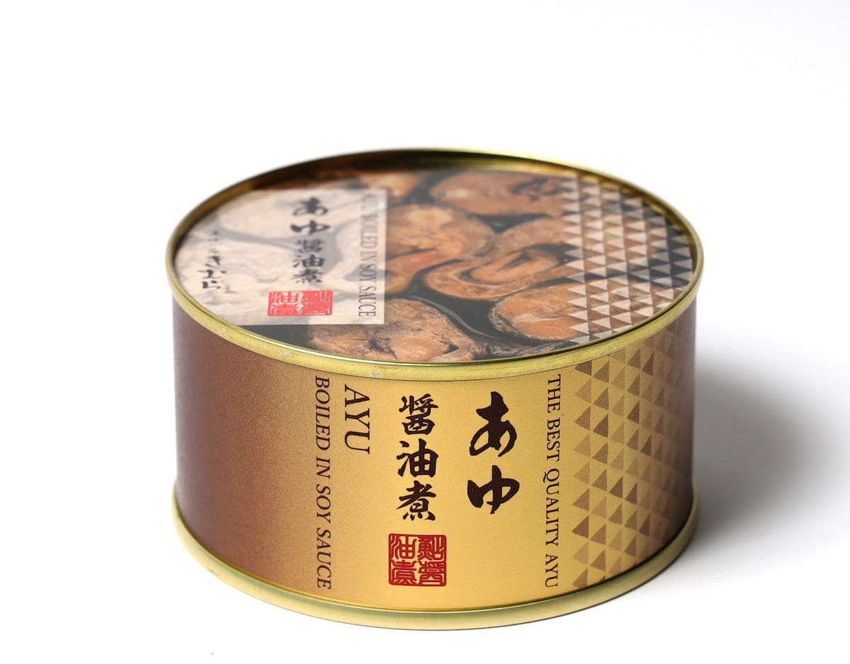
丸亀市発祥の骨付鳥は、うどんに次ぐ香川のソウルフードです。親鳥か、若鳥のどっちが美味しいか?どっちが好きか?これはなかなか答えの出ない問題であり、どちらも、良いところがあって、どちらも美味しい。そんな論争が絶えない丸亀市は幸せです。
親鳥なんて売ってない県が多いですからね。
“Parents or children?”
Honetsukitori, which originated in Marugame City, is Kagawa's soul food, second only to udon. Which is tastier, the parent bird or the young bird? Which one do you like? This is a question that is difficult to answer; both have their good points, and both are delicious. Marugame City is happy that such controversy does not end.
There are many prefectures where parent birds are not sold.
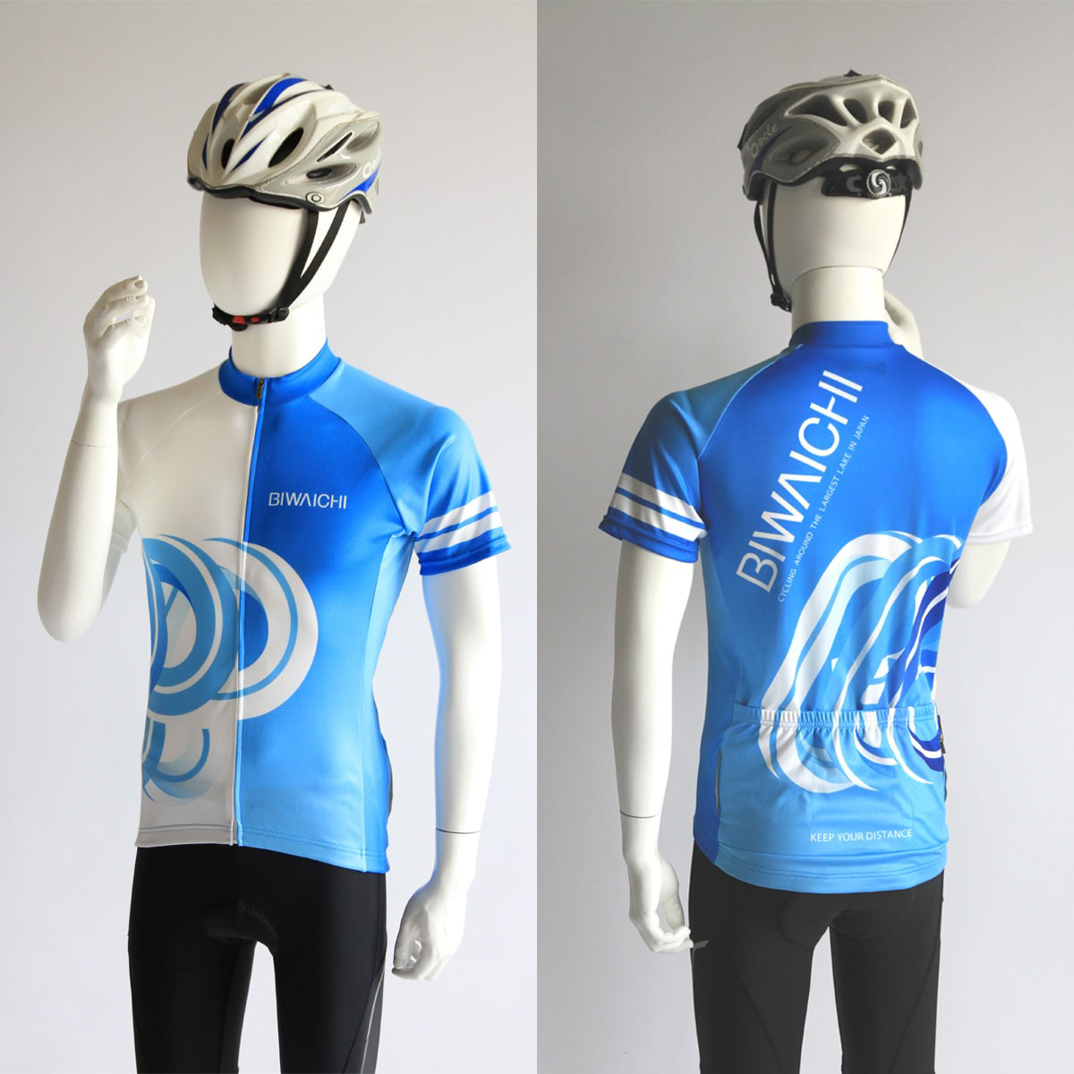
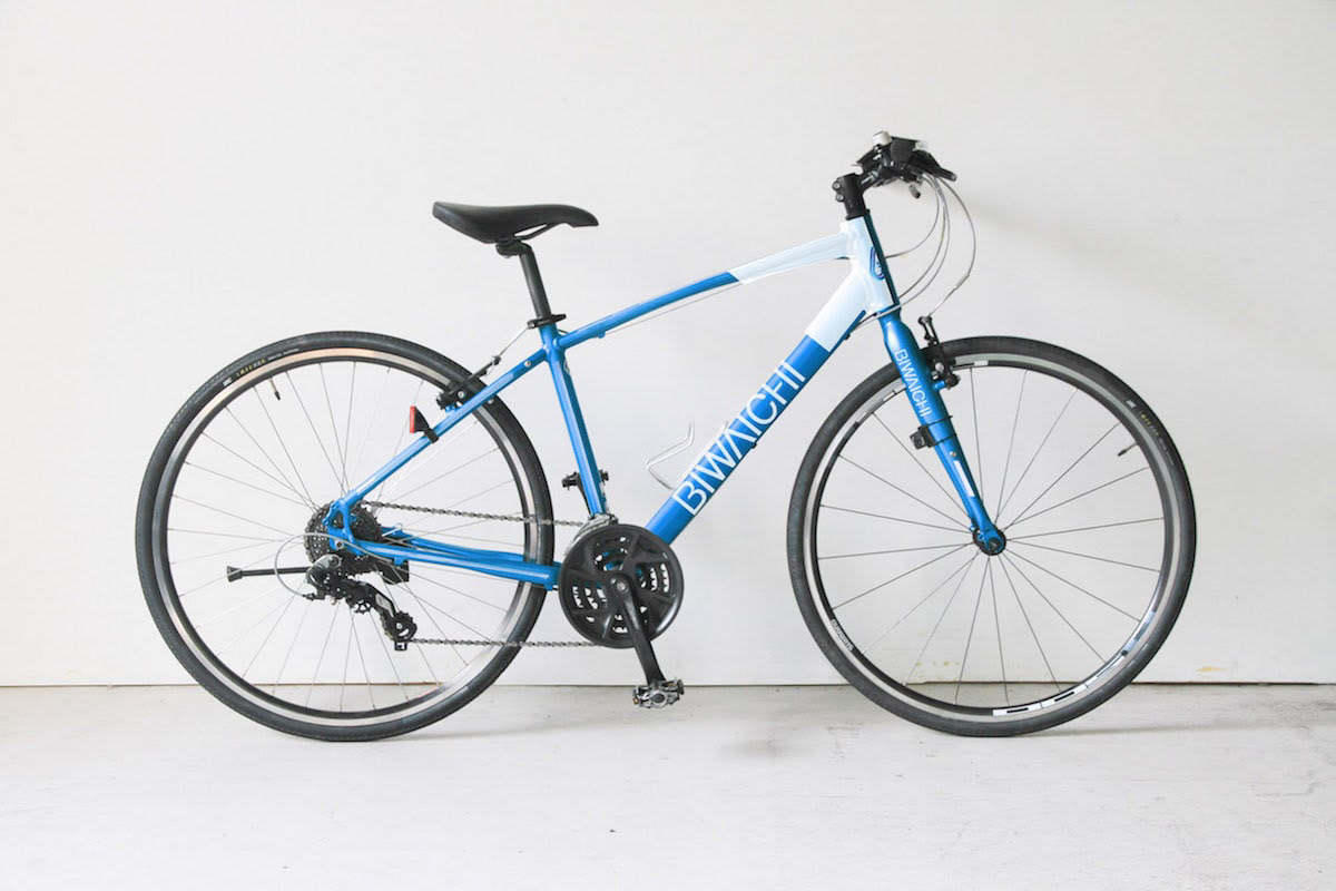
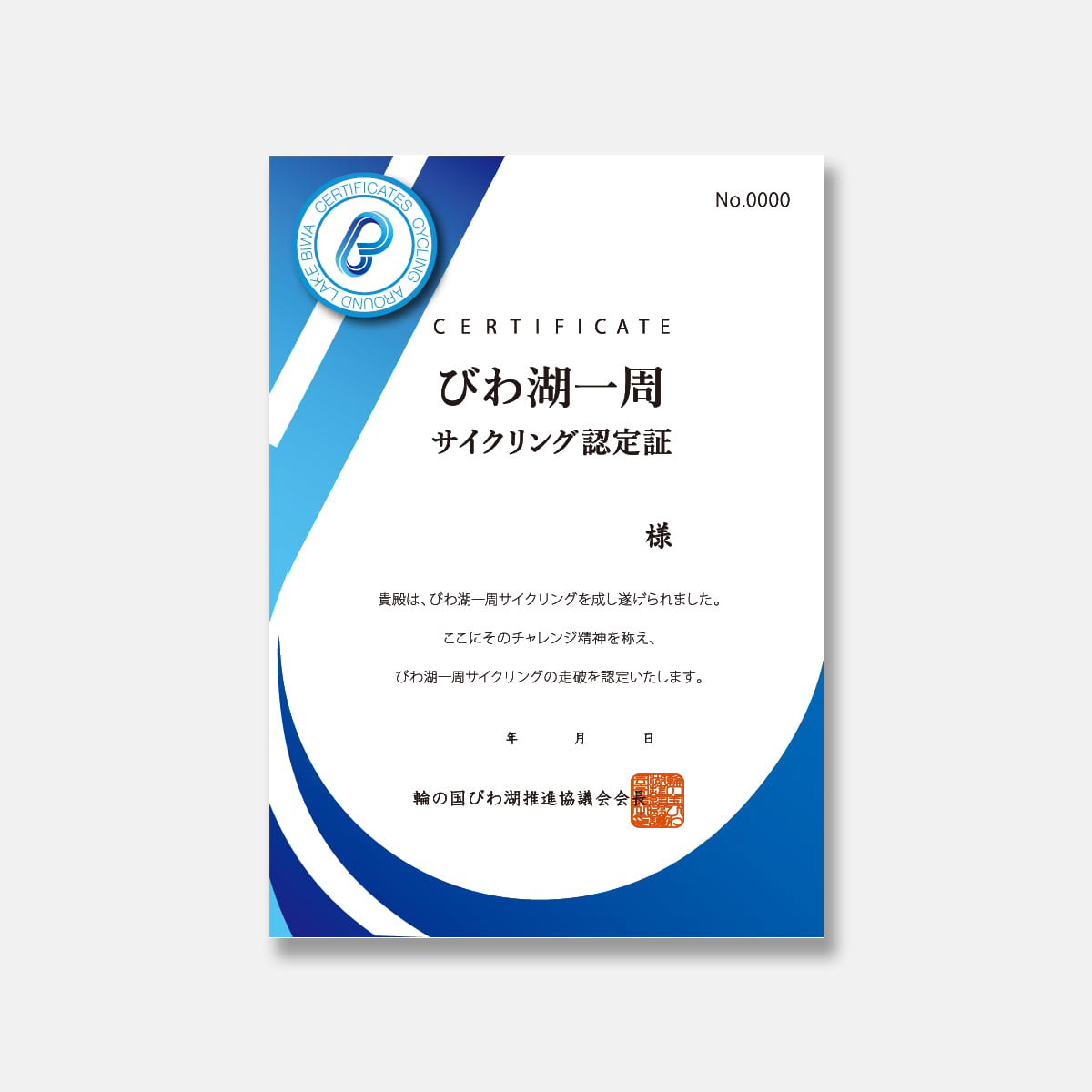
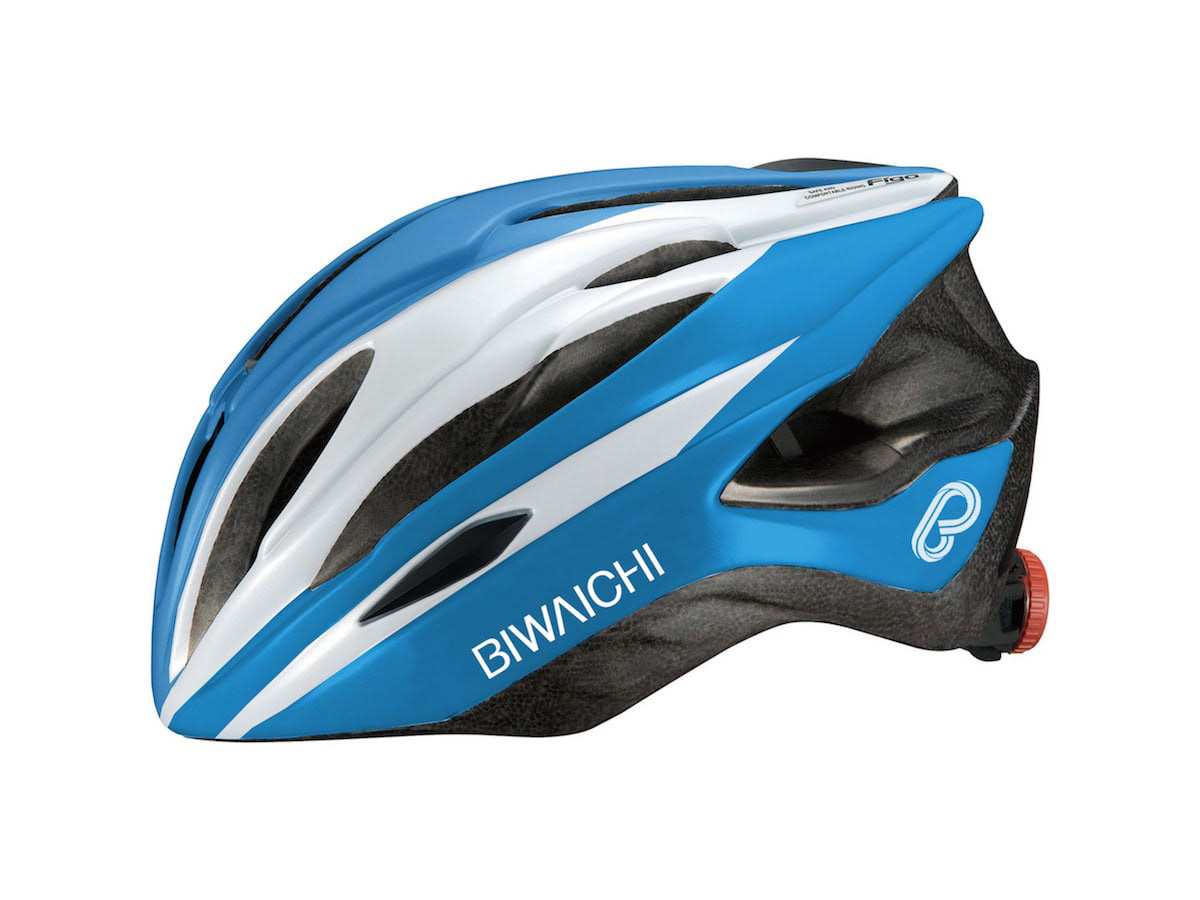
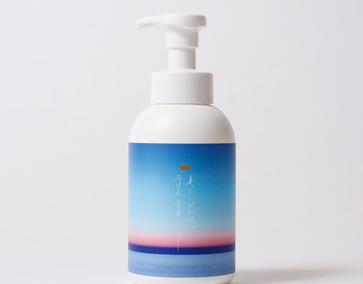
「レイクグラスを探してください」地域PR賞
日本一の湖、琵琶湖は海のように波が立ちます。もともとはゴミだったガラス瓶が長い年月をかけて、丸く削られて美しい石のようになります。これをシーグラスならぬ、レイクグラスと呼びます。
レイクグラスを琵琶湖の湖岸で探してください。簡単には見つかりません。すぐに見つかるのは釣り糸や、プラスチックゴミばかり。でも、このレイクグラス探しをきっかけに、琵琶湖を大切に思ってくれたら良いなと思いました。
ゴミ拾い、環境美化、SDGs。そういうのではなく、
琵琶湖で純粋に、宝探しを楽しんでください。
琵琶湖に足を伸ばしてください。
“Look for Lake Grass.”
Lake Biwa, the largest lake in Japan, has waves like the ocean. Over many years, glass bottles, which were originally trash, are carved into beautiful shapes that resemble beautiful stones. This is called lake glass, not sea glass.
Look for Lake Grass on the shores of Lake Biwa. Not easy to find. All you can easily find are fishing lines and plastic trash. However, I hope that this search for lake glass will help people start to value Lake Biwa.
Picking up trash, beautifying the environment, SDGs. Not that, but
Please enjoy treasure hunting in Lake Biwa.
Please stretch your legs to Lake Biwa.
2022
https://rethink-creator.jp/2022_contest/exam.html