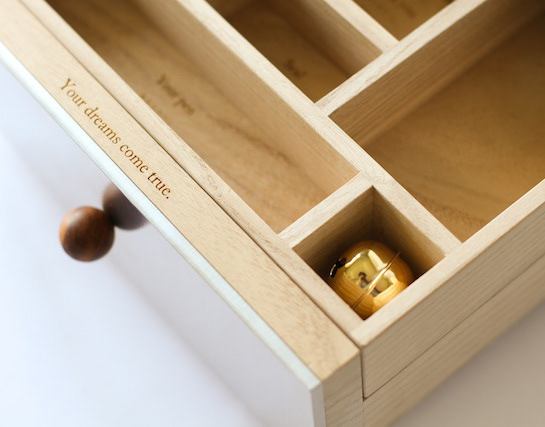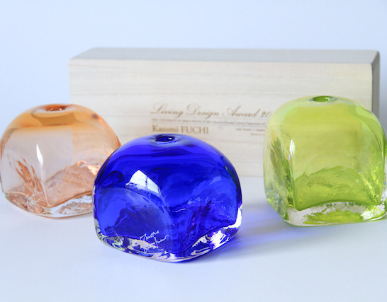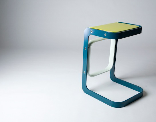
商品開発・ブランディング・実装まで一貫して支援します。
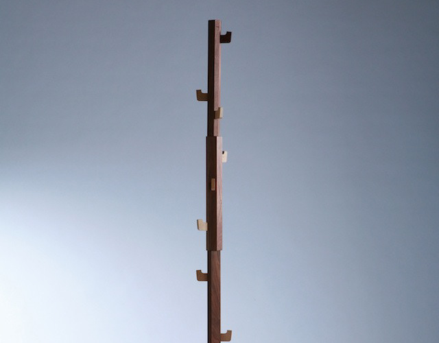
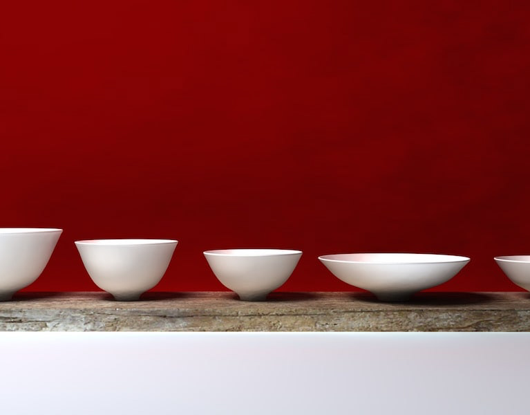
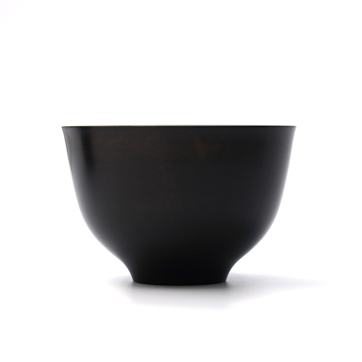
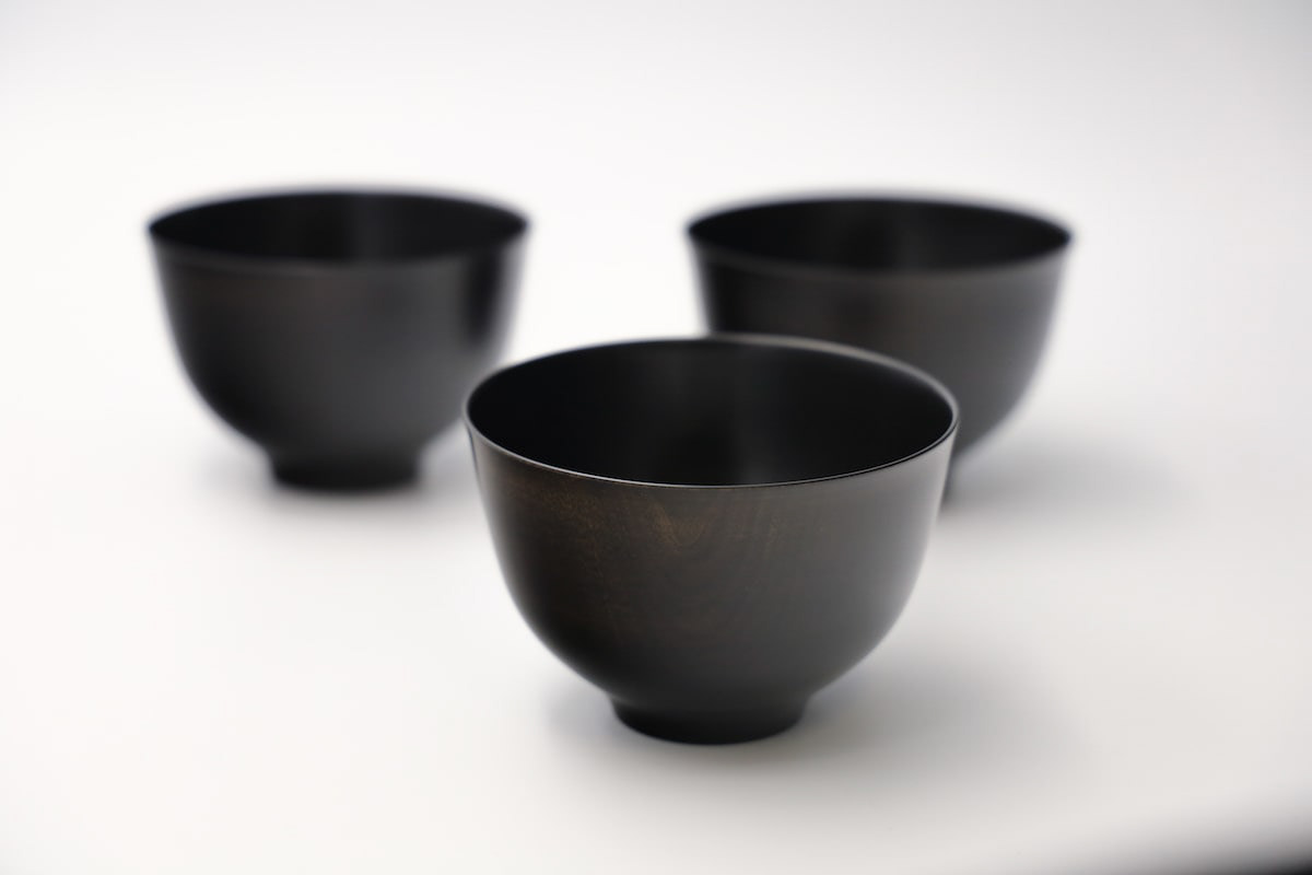
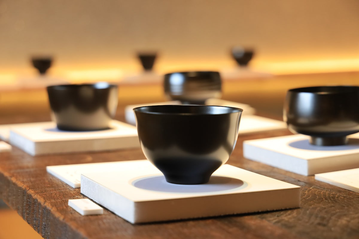
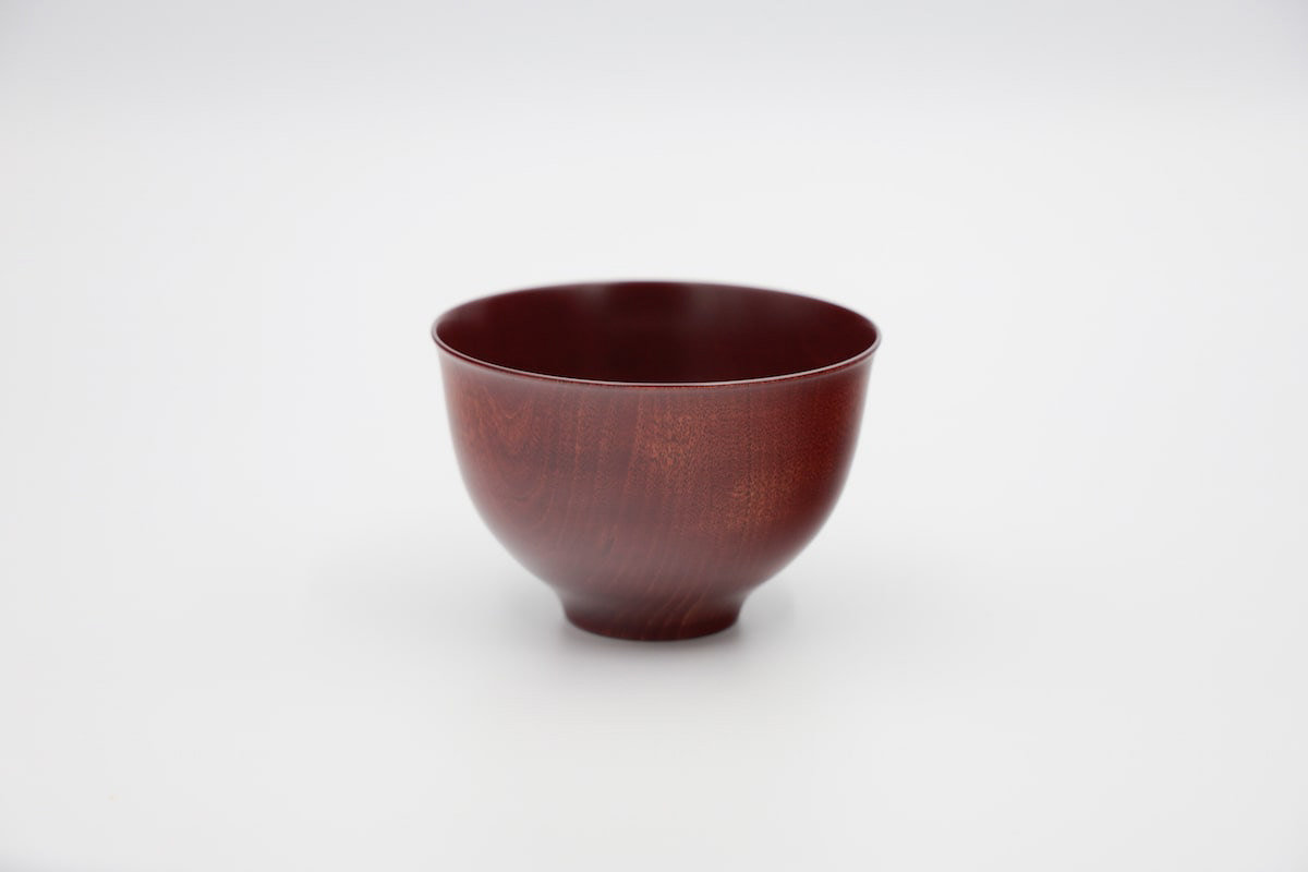
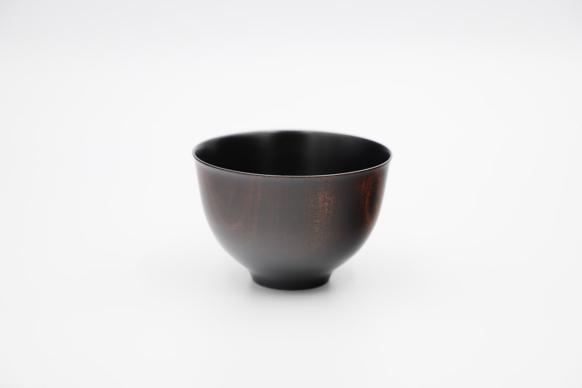
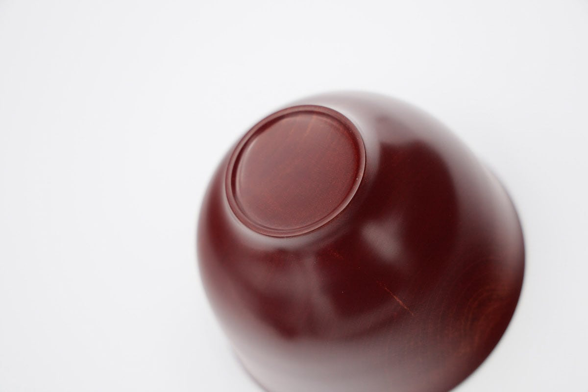
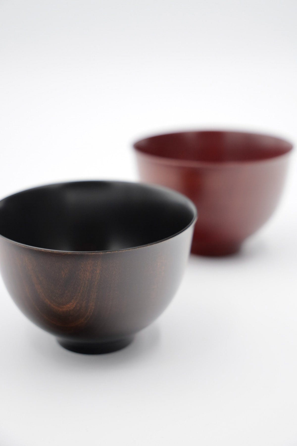
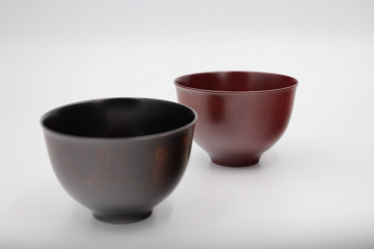
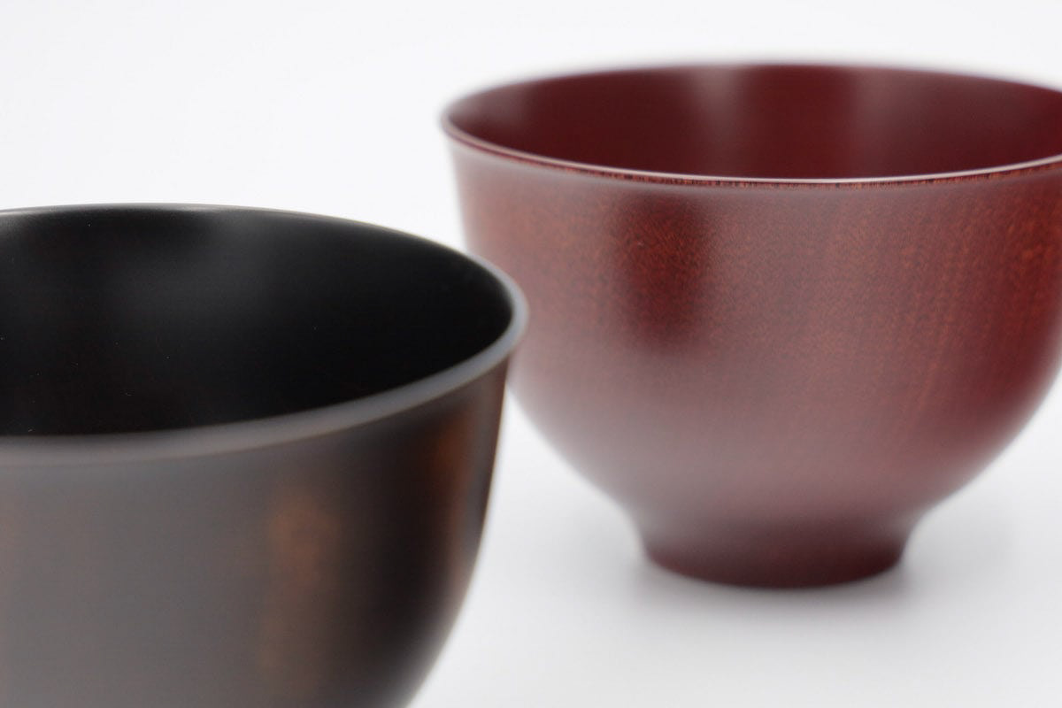
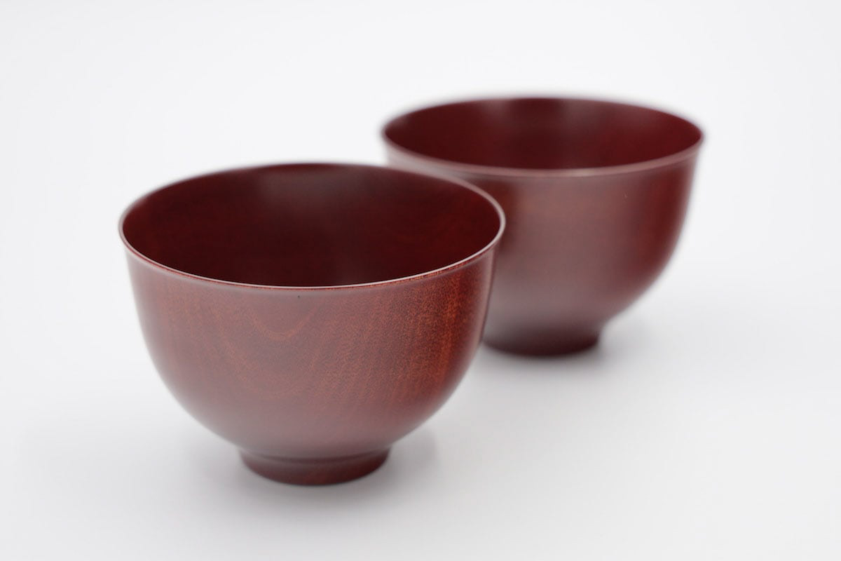
山中漆器の拭き漆の器です。黒と赤があります。 シンプルでオーソドックスなデザインを心がけてデザインしました。とても軽く、使いやすく、あまり緊張しすぎない、しかしそこまでカジュアルでもない。ふつうな上質さを目指したデザインです。非常に軽く出来ています。山中塗とは、石川県加賀市の山中温泉地区で作られる漆器で、山中漆器と呼ばれます。国産のミズメ桜を轆轤挽きで仕上げ、拭き漆技法で仕上げました。Yamanaka Lacquerware wipe lacquer vessels. Available in black and red.We designed it with a simple and orthodox design in mind. It is very light, easy to use, not too strained, but not that casual either. It is a design that aims for ordinary quality. It is very light. Yamanaka-nuri is a type of lacquerware produced in the Yamanaka Onsen area of Kaga City, Ishikawa Prefecture, and is called Yamanaka lacquerware. Domestically produced mizume-zakura cherry wood is wheel-thrown and finished with a wiping lacquer technique.