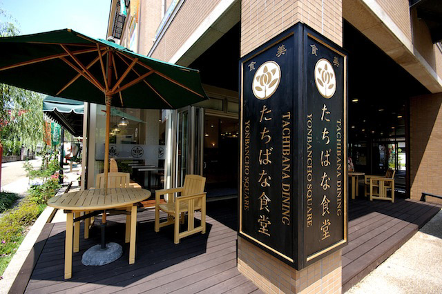
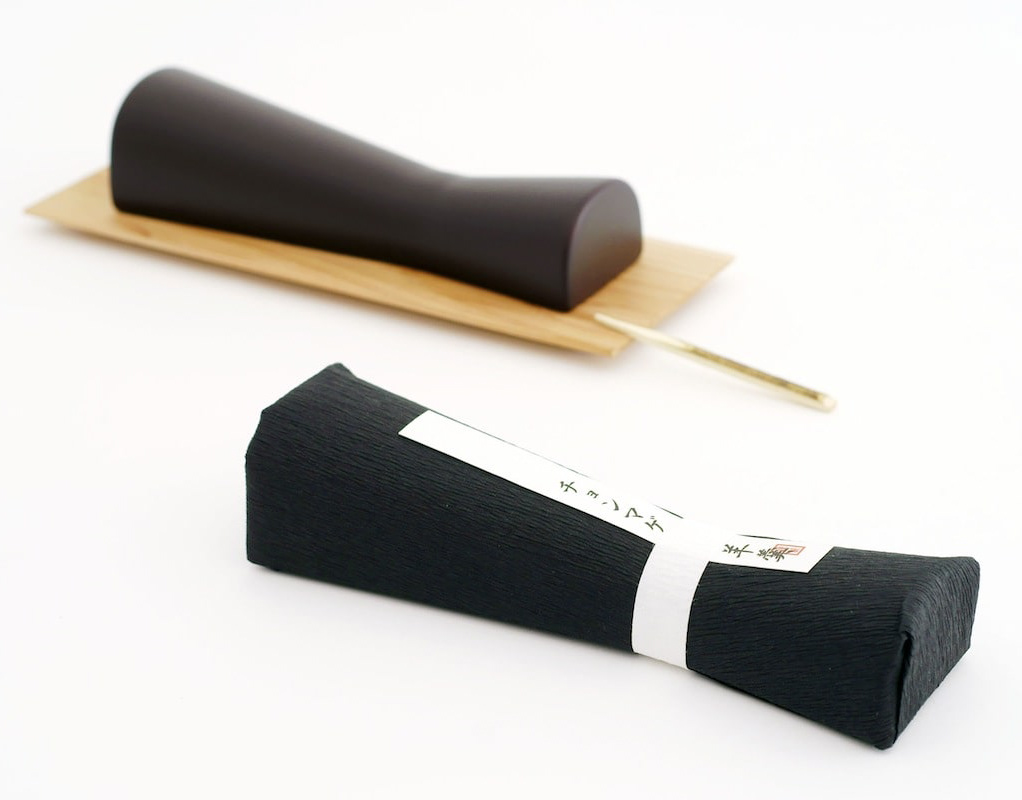
You may also like

SAKAEYA
肉サカエヤのCIデザインを担当しました。牛という文字を使いながら和にならない洋のイメージを感じさせるデザインとし、ナイフで切ったような手作り感、クラフト感のあるロゴデザインとしています。We designed the CI for Sakaeya Meat shop. The logo design uses the character for "beef" but gives a Western image that is not Japanese, and has a handmade, crafty feel as if it were cut with a knife.
2019
CORTE HOME
コルテホームは、自分らしいライフスタイルを提案する住宅のブランドです。 ブランドロゴをはじめとする、ブランド構築を担当しました。
2017
TOYAMA DESIGN FAIR 2024 GRAND PRIX AWARD
富山デザインフェア2024のポスターデザインコンペにおいて大賞を受賞しました。 コンセプトは「富山デザインふんばり!」 能登の震災で被害を受けた富山でもありますが、ここがふんばり所だと思います。 踏ん張ってバーベルを持ち上げる、その姿は富山の「富」の姿であります。 富の背景は立山連山の山を模し、紅潮して顔を赤く染め頑張っている姿を表現しています。 強靭そうな富山ブラックの踏ん張りに期待します。 Toyama Design Fair 2024 Poster Design Competition Grand Prize Winner The concept was “Toyama Design Fumbari! Toyama was damaged by the Noto earthquake, but I think this is the place to be. The figure of a man standing on his feet and lifting a barbell is the image of Toyama's “wealth”. The background of the “Tomi” is a mountain range in the Tateyama Mountain Range, and the image of a man working hard with his face reddening in the face of the earthquake is represented. We look forward to seeing the strong-looking Toyama Black stand firm in the face of the mountains. 2024 年富山设计展海报设计竞赛中获得了大奖。 设计概念是 “富山设计丰收!”。 富山虽然在能登地震中受到了破坏,但我认为这里是值得一去的地方。 双脚站立、举起杠铃的男子形象代表了富山的 “财富”。 财富 "的背景是立山山脉,人物形象表现的是一个正在努力工作、面色红润的男子形象。 我们期待着看到外表强壮的富山黑子挺身而出。
2024
convesso
日本は、安価な輸入材に頼ってきたので、日本中に植えられた杉の森は放置され、林業の衰退と森の荒廃が進んでいます。 日本の杉を使う事で、日本の森は元気になります。 これは、そのような杉材を用いた家具デザインの提案です。 杉の柔らかく、あたたかな質感をソファの背もたれに活かしました。 デザイン的にも暖かみのある木の質感を引き出すため、ぽってりした黒いカタマリとコントラストを活かしたデザインとしました。   杉の活用ということで、杉ばかりで家具を作る事を考えてしましますが、ここでは、杉を象徴的に用いています。 黒く重たいものに対して、軽やかな杉を対比させて見せています。 ふわっと柔らかい造形とすることで、シャープな黒とのコントラストを強調しています。 人の手の触れる部分に杉を積極的に用い、温かみある杉を触ってもらいたいと意図しました。
2008
JAPAN-FRANCE 150th
2008年日仏交流150周年記念ロゴマークの応募案です。日本国旗とフランス国旗の融合をデザインしました。This is a proposal for a logo mark to commemorate the 150th anniversary of Japan-France relations in 2008. The design is a fusion of the Japanese and French flags.
2008
RED Animal Crayon
2012
OITA HOVERCRAFT
このホーバークラフトは、ボディの前面のボンネットに搭乗口があり、大きなボリューム感がありますが、このラッピングデザインで最も重要なのは、その部分の活かし方であると考えました。遠くからでも目につきやすくキラリと光る印象を与えたいと思い、宇宙、海、空、大地、大分の自然をイメージさせるカラフルなストライプをキーデザインとして、このボンネットから全体に流すように配置しました。ストライプは進行方向に流れるようなデザインで、海上で走っている姿が美しいものになることを考えました。宇宙や自然へとつながる未来感のあるデザインとしています。This hovercraft has a boarding gate on the front hood of the body, giving it a large volume, and we thought the most important aspect of this wrapping design was how to make the most of this area. We wanted to create an impression that would be easily noticeable from afar and would shine brightly, so we used colorful stripes that evoke space, the sea, the sky, the earth, and Oita's natural environment as the key design, and arranged them to flow from this hood to the entire area. The stripes are designed to flow in the direction of travel, and we thought it would be beautiful to see it running at sea. The design has a futuristic feel that leads to space and nature.
2022
Adam&Eve Bottle
2008
YUTANPO
磁器の湯たんぽのデザインです。布団の中へ入れて使用する湯たんぽですが、多くの湯たんぽは、蓋の部分が突起として出ています。その出っ張りをなくし、人が触れる形状としてもっともあってほしかった形態を目指しました。This is a porcelain hot water bottle design. Most hot-water bottles are placed in a futon and the lid of the bottle protrudes from the futon. We eliminated the protrusion and aimed to create a shape that people can touch.
2012
MATSUMOTO YUKI FURNITURE
松本雄樹家具製作所のロゴマークをデザインしました。ノミのようで暖かい家のようで、手作り感のあるマークとしています。We designed a logo mark for Yuki Matsumoto Furniture Manufacturing. The mark is designed to look like a chisel and a warm house, with a handmade feel.
2022
Back to Top