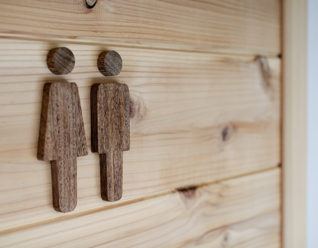
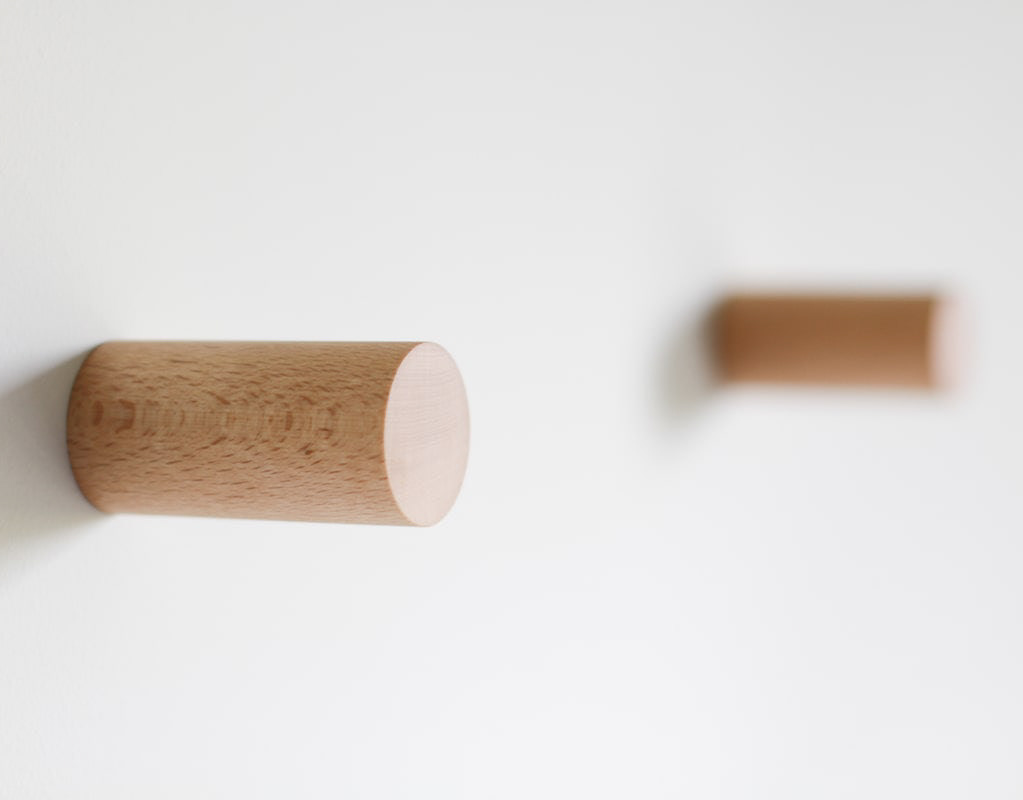
You may also like

JAPAN-FRANCE 150th
2008年日仏交流150周年記念ロゴマークの応募案です。日本国旗とフランス国旗の融合をデザインしました。This is a proposal for a logo mark to commemorate the 150th anniversary of Japan-France relations in 2008. The design is a fusion of the Japanese and French flags.
2008
MOTONOKI MOCHI
本之木餅は菓匠禄兵衛における長年ベストセラー商品です。 そのリニューアルデザインを担当しました。 今までの商品同様赤をベースに金との組み合わせは変えませんが、箱の型に抜きを使うことで立体感ある仕上がりに、印刷にもツヤニスを多様することで光の当たり方で浮かび上がる深みのある演出としました。 今までの印象を損なわず、さらに表現を進化させたデザインとしています。 お菓子は、ふっくらと炊き上げた粒あんを、餅粉入りのもっちり生地で包み、焼き上げたものです。8個入りと5個入りがあります。 Motonoki Mochi has been a best-selling product of Kasho Rokubei for many years. We were in charge of its renewal design. The red base color is the same as the previous products, and the combination of gold and gold is the same, but the box is die-cut to give it a three-dimensional finish, and a variety of glossy varnishes are used in the printing to create a deep effect that comes to life when the light hits it. The design has evolved further in expression without losing the impression of the past. The confectionery is made by wrapping softly cooked sweet bean paste in mochi dough and baking it. 8 pieces and 5 pieces are available.
 Motonoki mochi (红豆沙馅麻糬)多年来一直是 Kasho Rokubei 的畅销产品。 我们负责其更新设计。 与以前的产品一样,金色和红色底色的组合保持不变,但在包装盒上使用了模切模具,使其具有立体感,印刷时使用了亮光漆,产生了深邃的效果,在光线照射下栩栩如生。 设计在表现形式上有了进一步的发展,但又不失过去的印象。 这种点心是用煮软的甜豆沙,裹上麻糬粉烘烤而成。
2025
GOENMAN
ご縁まんは、菓匠禄兵衛の商品でおめでたい縁起の良いイメージでパッケージを依頼されました。紅白と金色を用いて「円」と「縁」を掛け合わせて縁起の良いデザインを目指しました。e were asked to create a package for Gohan Man, a product of the confectioner Rokubei, with a festive and auspicious image. We aimed to create an auspicious design by using red, white, and gold colors to cross the words "yen" and "en" together.
2020
RENOVATION EXPO
リノベーションエキスポ大阪の公式ポスターのデザインです。建築空間で文字を形成したデザインとしました。This is the design for the official poster of Renovation Expo Osaka. The design was made to form letters in architectural space.
2019
LINDO CUP
信楽で開発された世界初の透ける陶土を使ったグラスです。一つ一つロクロによる手作り品で、その土の独特の質感は他の陶器にはないものです。 使っていくうちにエイジングしてよい味わいが出てくると思います。 ワイングラスとしても、あるいは様々な用途でもお使い頂けます。 トールは祝杯のシャンパンにも。 ワイドは、山菜の和え物やアイスクリームなど、小鉢のように使うことも。 小さなキャンドルを入れても素敵です。 TALL 80x80x150mm WIDE 90×90×110mm
2008
78 shochu
78は米焼酎です。78のステンレスコップにデザインを合わせた焼酎です。78 is a rice shochu; the design of this shochu matches the stainless steel cup of 78.
2021
Root Cowaorking
2017
NISHITANIDO MISO STEW
京都の老舗西谷堂の京都野菜の味噌煮込みのパッケージデザインです。シルバーのパウチでは味気ないので味噌桶に漬かった中身が一目でわかるパッケージとしました。白味噌と赤味噌があります。This is the package design for Nishitanido's Kyoto vegetable miso stew. A silver pouch would be bland, so we designed a package that allows you to see at a glance what's inside the miso tub. There are white miso and red miso.
2022
WATAYO
和た与のCI と包装紙のリニューアルデザインです。竹の皮に包まれた羊羹を開いた瞬間の形をグラフィックパターンとして包装紙に散りばめました。複数のサイズを作ることになっていた包装紙はサイズによって柄のパターンを変えて楽しいものにしています。This is a renewal design of Wata-yo's CI and wrapping paper. The graphic pattern of the shape of a yokan wrapped in a bamboo skin at the moment it is opened is scattered on the wrapping paper. The wrapping paper, which was to be made in multiple sizes, has a different pattern for each size to make it fun.
2020
Cosmopolitan Tourism R&D
国際観光政策研究所のロゴデザインです。CとTを組み合わせて地球のように見せています。Logo design for the Institute for Cosmopolitan Tourism R&D, combining the C and the T to look like the earth.
2015
Back to Top