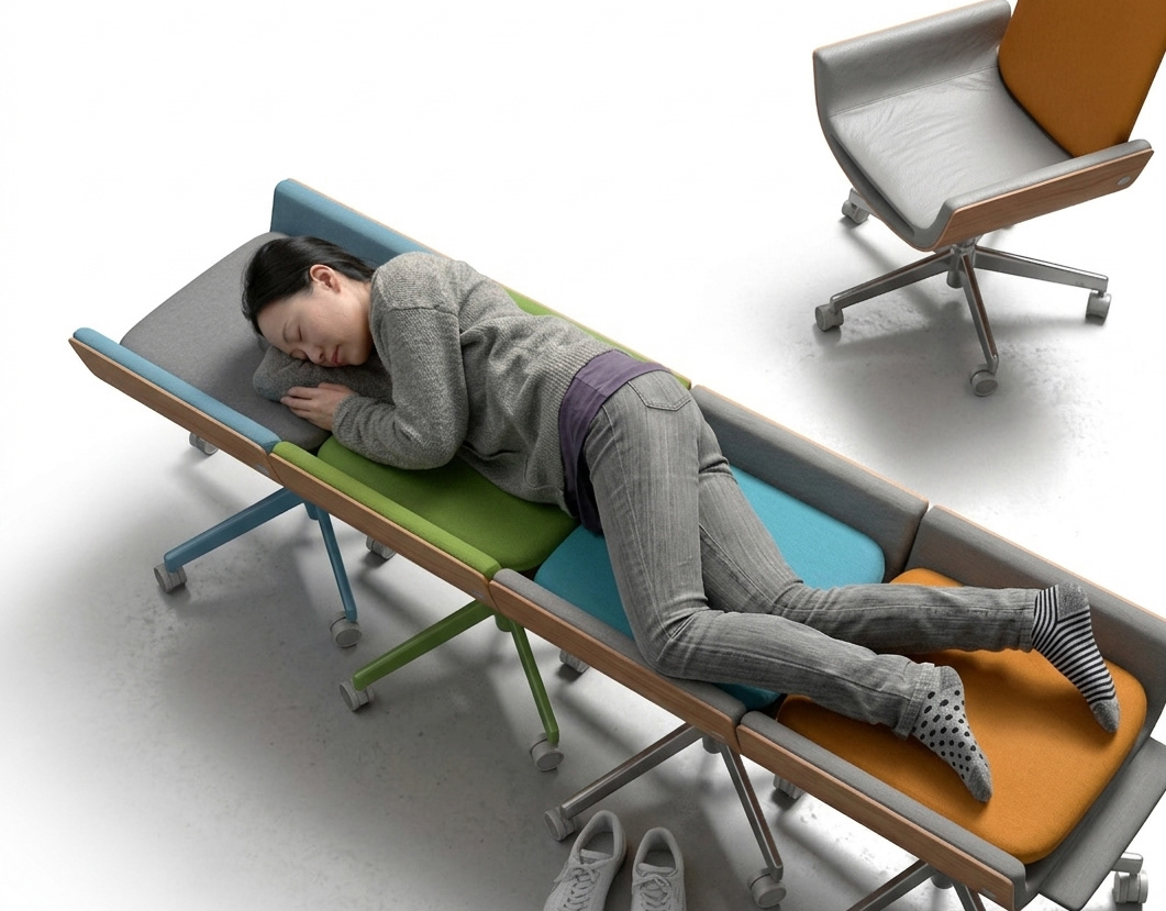
You may also like

GINDAWARA
釜炊き近江米 銀俵のロゴをデザインしました。シンボルマークは米俵を横から見た姿。銀俵の文字は古い文字から引用しました。We designed a logo for GINDAWARA. This restaurant cooks rice in a Shigaraki earthenware pot. The symbol mark is a side view of a rice bale. The letters of "Ginbawara" are taken from old characters.
2019
BRANCH
「枝」を意味する店名のロゴデザイン。花屋さんでありますので「枝、森、花」そのどれもを感じさせる明るいデザインとしました。 Logo design for a store name meaning “branch. As a florist, the logo is bright and evocative of “branches, forests, and flowers. 为一个意为 “枝条 ”的店名设计徽标。 作为一家花店,徽标色彩明亮,令人联想到 “树枝、森林和鲜花”。
2024
chamochi
わかりやすくお茶の鉄瓶を描き、紙を重ねた抜き窓からその姿を覗かせます。 箱の上下にはほうじ茶をイメージした茶色い茶葉を描いています。 ほうじ茶のイメージで焦茶と金(黄土色の部分)インクを使い、ニスも使って茶葉や落款模様を描きます。 輪郭をまとった蓋を開くと鉄瓶も茶葉も見えなくなり、蓋の一枚を重ね合わせることでモチーフが切り取られるデザインとしています。 そうなると、茶瓶の蓋の取手に見えたものは、最澄の坐禅の姿のようであり、最澄を中心とし、光を周囲に放っていることをニスで表現しています。 滋賀は日本茶発祥の地とされており、延暦寺を開いたとされる最澄が唐より種子を持ち帰り、比叡山麓の大津・坂本に 植えたことが日本茶の始まりといわれています。 そこで、ページの端には比叡山延暦寺を描き、最澄の言葉である「一隅を照らす」である隅から伸びる光を表現しています。 その言葉の意味は一人ひとりがその場を大切にし、努力することで、社会全体を明るくできるという考え方です。 そこまで気が付く人はいないと思いますが、デザインに忍ばせたメッセージです。 An iron tea kettle is drawn clearly, with its shape peeking through a window made of layered paper. Brown tea leaves are drawn on the top and bottom of the box, evoking the image of roasted green tea. Dark brown and gold (ochre parts) ink is used to evoke the image of roasted green tea, and the tea leaves and seal pattern are drawn using varnish as well. When the outlined lid is opened, neither the kettle nor the tea leaves are visible, and the motif is cut out by overlapping one lid over the other. 铁壶轮廓清晰,透过叠纸上的小窗,可见壶身轮廓。 盒子的上下绘有棕色茶叶,令人联想到焙茶。 盒子采用深棕色和金色(部分为赭石色)墨水绘制,令人联想到焙茶,茶叶图案和印章则以清漆绘制。 打开勾勒轮廓的壶盖,壶身和茶叶均不可见,图案被叠纸镂空。
2025
BIWAICHI RENTAL CYCLE
米原駅構内にびわ湖一周レンタサイクルをオープンしました。その店舗設計をしました。県産材の杉を使い、宿場町を多く有する米原に合う佇まいを目指しました。A round-the-lake Biwa bicycle rental shop has opened in Maibara Station. We designed the store. We used Japanese cedar produced in Shiga Prefecture. The design of this building was intended to fit the appearance of Yonehara, which has many old inn towns.
2020
Hikizuri Bell Manjyu
三井寺の有名な饅頭です。その昔弁慶がひきづったとされる鐘がモチーフになっています。一つの箱で何種類もの中身に対応できるようパッケージシステムを考えました。わかりやすいように封印のシールで中身も伝えています。It is a famous bun of Mitsui Temple. The motif is a bell said to have been pulled by Benkei in the old days. We designed the packaging system so that a single box can be used for several kinds of contents. The contents are also indicated with a seal for easy identification.
2022
ACRYLIC TOILET SIGN
LEDを内臓したアクリルのトイレサインです。サインのベースは木製でLEDが内臓されています。アクリル部分に切削加工が施されてあり、光を拡散し発光します。Acrylic restroom sign with built-in LEDs. The base of the sign is made of wood and contains LEDs. The acrylic part is machined to diffuse light and emit light.
2020
MAEKAKE SHOCHU PACKAGE
鹿児島の焼酎のパッケージデザインです。設計の条件としてアルミパウチを使用すること、銘柄をシールで表示することがありました。 酒屋のイメージと言えば前掛けなので、前掛けと桜島をデザインしたラベルをパウチにぐるっと巻くパッケージとしました。様々な銘柄に対応するため、商品を書いた説明紙をラベルで貼ることができる方法を考えました。立体感があり、見栄えのするデザインです。 パウチの銀色を活かし上部の桜島からは銀の噴煙が上がっているように見せます。無愛想なアルミパウチの良さを引き出すデザインを心がけました。ギフト箱もインディゴのテクスチャーで窓から中身が見えるようにしました。 This is a package design for Kagoshima shochu. The design requirements were to use an aluminum pouch and to display the brand name with a sticker. Since the image of a liquor store is that of a front hanging, we decided to use a package that wraps a label with a design of a front hanging and Sakurajima around the pouch. In order to accommodate a variety of brands, we came up with a method that allows the label to be attached to an explanatory paper with the product written on it. The design has a three-dimensional feel and looks great. The silver color of the pouch makes it look like a silver plume rising from Sakurajima at the top. We tried to create a design that would bring out the best of the bland aluminum pouch. 这是鹿儿岛烧酒的包装设计。 设计条件是使用铝制小袋,并用贴纸标明品牌名称。 酒铺的形象是正面悬挂,因此包装设计的标签上印有正面悬挂和樱岛的图案,并将酒袋包裹起来。 为了适应各种品牌,我们想出了一种方法,可以将标签贴在写有产品说明的纸上。 这种设计具有立体效果,看起来很不错。 包装袋采用银色,看上去就像从樱岛顶部升起的银色翎羽。 我们努力创造一种设计,使不起眼的铝制小袋发挥出最大的作用。

2023
AYU BOILED in SOY SOURCE
あゆの醤油煮の缶詰です。高級感があり、美味しそうに見えるように、醤油が染み込んでいくようなイメージでデザインしました。Canned ayu fish simmered in soy sauce. We designed it to look luxurious and delicious, with the image of soy sauce soaking into the product.
2021
TACHI
シンプルでオーソドックスなデザインを心がけてデザインしました。 とても軽く、使いやすく、あまり緊張しすぎない、しかしそこまでカジュアルでもない。 runoの丸く柔らかいデザインと対照的に、tachiは、凛とした佇まいを持ったデザインです。(写真の後半はrunoとの比較です) 非常に軽く出来ています。 斜め上からはあまり裏側が見えませんが、裏側の削り込みにより手がすっと入り、大変持ちやすくデザインされています。 山中塗とは、石川県加賀市の山中温泉地区で作られる漆器で、山中漆器と呼ばれます。国産のミズメ桜を轆轤挽きで仕上げ、拭き漆技法で仕上げました。 We designed this product with a simple and orthodox design in mind. It is very light, easy to use, not too strained, but not that casual either. In contrast to the round and soft design of runo, tachi has a dignified appearance. (The second half of the photo is a comparison with runo.) It is made very light. Although you cannot see the back side of the bowl from an angle, the back side has been cut down so that you can easily put your hand into the bowl, making it very easy to hold. Yamanaka-nuri is a type of lacquerware produced in the Yamanaka Onsen area of Kaga City, Ishikawa Prefecture, and is called Yamanaka lacquerware. The potter's wheel is made of domestically produced mizume-zakura (cherry tree) and finished with the wipe lacquer technique.
2024
OMEDETAMAGO
おめでたまごは、これまでにない新しいギフト商品、大切な人に忘れられない思い出を贈る「たまご」です。手触りのやさしいたまご型の信楽焼。 このまま飾ってもかわいいかたちですが、実は横に倒して堅いところでコツンとたまごを割るように叩くと、パカっと綺麗に二つに割れました。すると中には、陶器のふくろうがひょっこりと入っています。 そして、割れたたまごの断面をよくみてみると、そこには祝福のメッセージと名前と日付が刻まれています。 割ったたまごの殻を重ねるようにおいて、中にふくろうを飾ったら完成です。 出産祝い、結婚祝い、誕生日、引き出物、還暦祝いなど、大切な人への忘れられないサプライズなプレゼントとして贈ってみるのはいかがですか。
2011
Back to Top