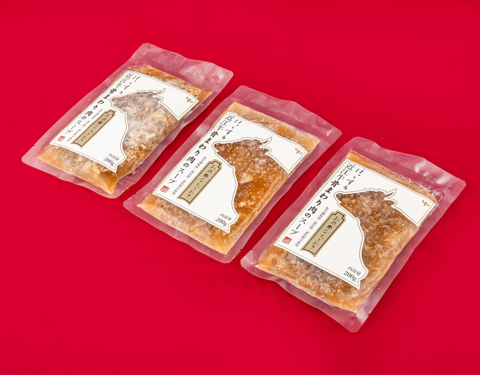
Hikizuri Bell Manjyu
三井寺の有名な饅頭です。その昔弁慶がひきづったとされる鐘がモチーフになっています。一つの箱で何種類もの中身に対応できるようパッケージシステムを考えました。わかりやすいように封印のシールで中身も伝えています。It is a famous bun of Mitsui Temple. The motif is a bell said to have been pulled by Benkei in the old days. We designed the packaging system so that a single box can be used for several kinds of contents. The contents are also indicated with a seal for easy identification.
You may also like
NAGAHAMA GENPACHI RUSK
長浜市にあるパン屋ポムドテールの源八ラスクのデザインです。パン職人こだわりの生地から作るラスク。種類も多いですが最小限の資材で対応できるシステムを作りました。ギフトボックスはパンの形をしています。This is a design of Genpachi rusk from bakery Pomme de Terre in Nagahama, Shiga Prefecture. These rusks are made from dough with the baker's special care. There are many different flavors, but we have created a system that can handle a minimum amount of packaging materials. The gift box is in the shape of a loaf of bread.
2020
Mt.IBUKI
日本最高積雪記録はどこでしょう?意外にも関西、滋賀県の米原市にある伊吹山です。その記録は11m82cmと実は世界一の記録でもあります。
実際に滋賀県北部に住んでいると、冬は北風がとても強いです。福井県の若狭湾からの雪雲を遮る山が低く、伊吹山にぶち当たるということです。
最近、隣の彦根市でも60年ぶりの大雪を記録しました。滋賀県の意外な姿ということで「どこの山だろう?」と気になるポスターをデザインしました。
Where is the record for the highest snowfall in Japan? Surprisingly, it is Mt. Ibuki in Maibara City, Shiga Prefecture, Kansai. Its record is 11m82cm, which is actually the highest record in the world.
In fact, living in the northern part of Shiga Prefecture, the north wind is very strong in winter. This means that the mountains are low enough to block the snow clouds from Wakasa Bay in Fukui Prefecture and hit Mt. Ibuki.
Recently, the neighboring city of Hikone also recorded its heaviest snowfall in 60 years. Being an unexpected sight in Shiga Prefecture, I designed this poster to make people wonder, "Which mountain is it?" I designed this poster to make you wonder "Which mountain is it?
2023
Root Cowaorking
2017
SAKAEYA
肉サカエヤのCIデザインを担当しました。牛という文字を使いながら和にならない洋のイメージを感じさせるデザインとし、ナイフで切ったような手作り感、クラフト感のあるロゴデザインとしています。We designed the CI for Sakaeya Meat shop. The logo design uses the character for "beef" but gives a Western image that is not Japanese, and has a handmade, crafty feel as if it were cut with a knife.
2019
DEN-EN KITCHEN
den-en kitchen ロゴデザイン。おうみ福祉会の新施設、きみいろ内に併設されたden-en kitchen(田園キッチン)のロゴデザインを担当しました。田んぼの田を両手で抱き抱えるような暖かさを感じさせるデザインです。のどかな田園風景に溶け込むカフェは、どなたでもご利用頂けます。Logo design for den-en kitchen.We designed the logo for den-en kitchen (Den-en kitchen), which is located in Kimiiro, a new facility of Ohmi Fukushi Kai.The design evokes a warm feeling of embracing the rice paddies with both hands.
The café blends into the peaceful countryside and is open to everyone.
2023
chamochi
わかりやすくお茶の鉄瓶を描き、紙を重ねた抜き窓からその姿を覗かせます。
箱の上下にはほうじ茶をイメージした茶色い茶葉を描いています。
ほうじ茶のイメージで焦茶と金(黄土色の部分)インクを使い、ニスも使って茶葉や落款模様を描きます。
輪郭をまとった蓋を開くと鉄瓶も茶葉も見えなくなり、蓋の一枚を重ね合わせることでモチーフが切り取られるデザインとしています。
そうなると、茶瓶の蓋の取手に見えたものは、最澄の坐禅の姿のようであり、最澄を中心とし、光を周囲に放っていることをニスで表現しています。
滋賀は日本茶発祥の地とされており、延暦寺を開いたとされる最澄が唐より種子を持ち帰り、比叡山麓の大津・坂本に 植えたことが日本茶の始まりといわれています。
そこで、ページの端には比叡山延暦寺を描き、最澄の言葉である「一隅を照らす」である隅から伸びる光を表現しています。
その言葉の意味は一人ひとりがその場を大切にし、努力することで、社会全体を明るくできるという考え方です。
そこまで気が付く人はいないと思いますが、デザインに忍ばせたメッセージです。
An iron tea kettle is drawn clearly, with its shape peeking through a window made of layered paper.
Brown tea leaves are drawn on the top and bottom of the box, evoking the image of roasted green tea.
Dark brown and gold (ochre parts) ink is used to evoke the image of roasted green tea, and the tea leaves and seal pattern are drawn using varnish as well.
When the outlined lid is opened, neither the kettle nor the tea leaves are visible, and the motif is cut out by overlapping one lid over the other.
铁壶轮廓清晰,透过叠纸上的小窗,可见壶身轮廓。
盒子的上下绘有棕色茶叶,令人联想到焙茶。
盒子采用深棕色和金色(部分为赭石色)墨水绘制,令人联想到焙茶,茶叶图案和印章则以清漆绘制。
打开勾勒轮廓的壶盖,壶身和茶叶均不可见,图案被叠纸镂空。
2025
FLOCK
FLOCKは群を意味します。信楽焼の陶器で作られた箸置きやブローチなどのブランディングデザインとネーミングです。商品数がとても多く、動物や植物など生物が多くを占めているので群と名付けました。FLOCK means flock. It is a branding design and naming of chopstick rests and brooches made of Shigaraki ware pottery. We named it "Flock" because there are so many products and many of them are creatures such as animals and plants.
2018
WATAYO
和た与のCI と包装紙のリニューアルデザインです。竹の皮に包まれた羊羹を開いた瞬間の形をグラフィックパターンとして包装紙に散りばめました。複数のサイズを作ることになっていた包装紙はサイズによって柄のパターンを変えて楽しいものにしています。This is a renewal design of Wata-yo's CI and wrapping paper. The graphic pattern of the shape of a yokan wrapped in a bamboo skin at the moment it is opened is scattered on the wrapping paper. The wrapping paper, which was to be made in multiple sizes, has a different pattern for each size to make it fun.
2020
NAGAHAMA GOEN DEAPARTMENT STORE
長浜ごえん百貨店のロゴデザインと企画です。長浜のいいものを集めて日本橋のここしがで催事をしました。5円玉を落として良いことが起きるご縁くださいボックスも作成しました。
Logo design and planning for Nagahama Goen Department Store. We also created a box in which you can drop a 5-yen coin and something good will happen to you.
为 Nagahama Goen 百货公司设计和规划徽标。 我们还制作了一个盒子,投下一枚五元硬币,就会有好事发生。
2020
LAKE BIWA TROUT
琵琶湖の宝石と言われるビワマスを使った缶詰です。サーモンのようなピンク色に白い筋の入った身をパッケージにもデザインしました。This canned product is made from Biwa trout, the jewel of Lake Biwa. The pink, salmon-like color with white streaked flesh is also designed into the package.
2021