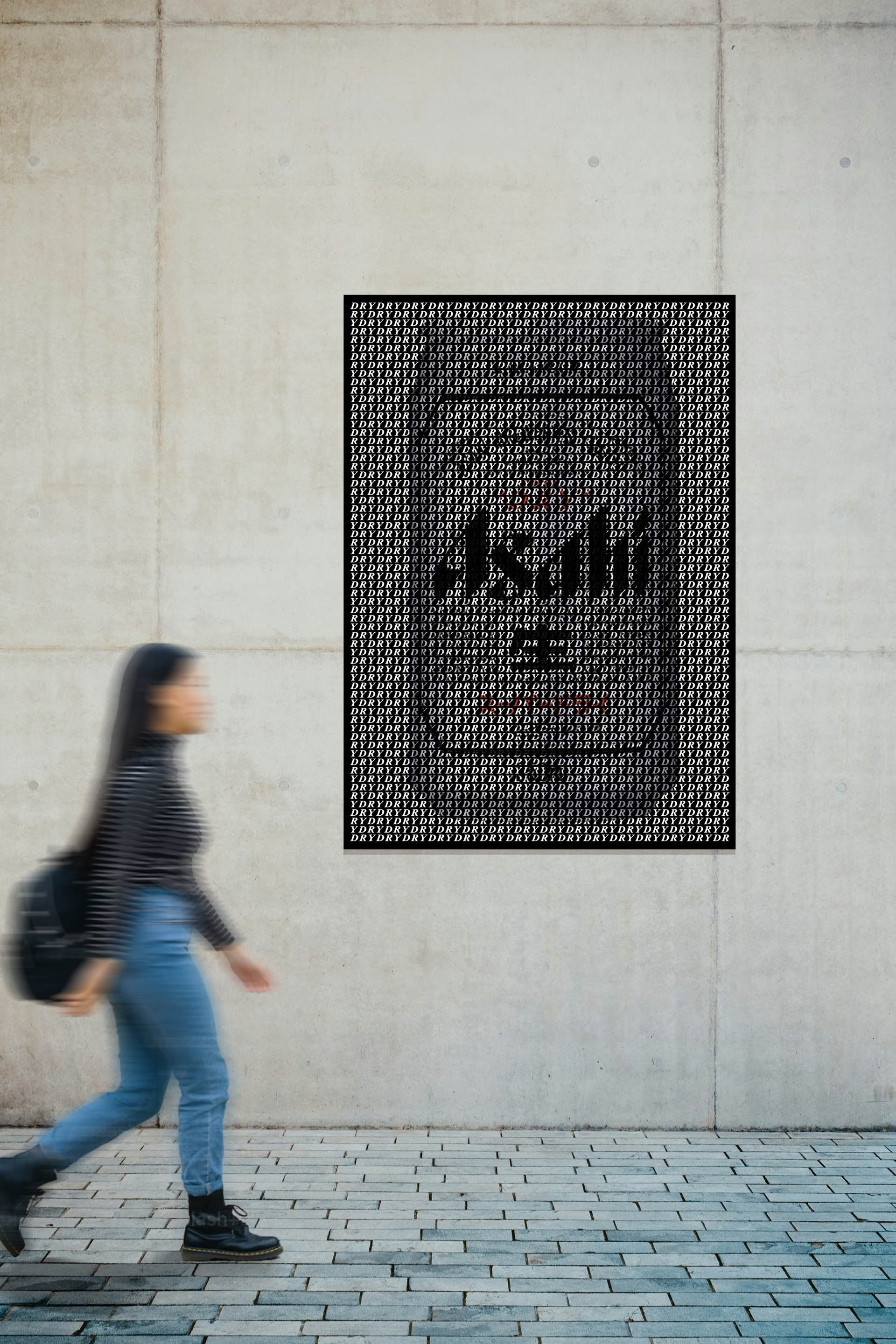
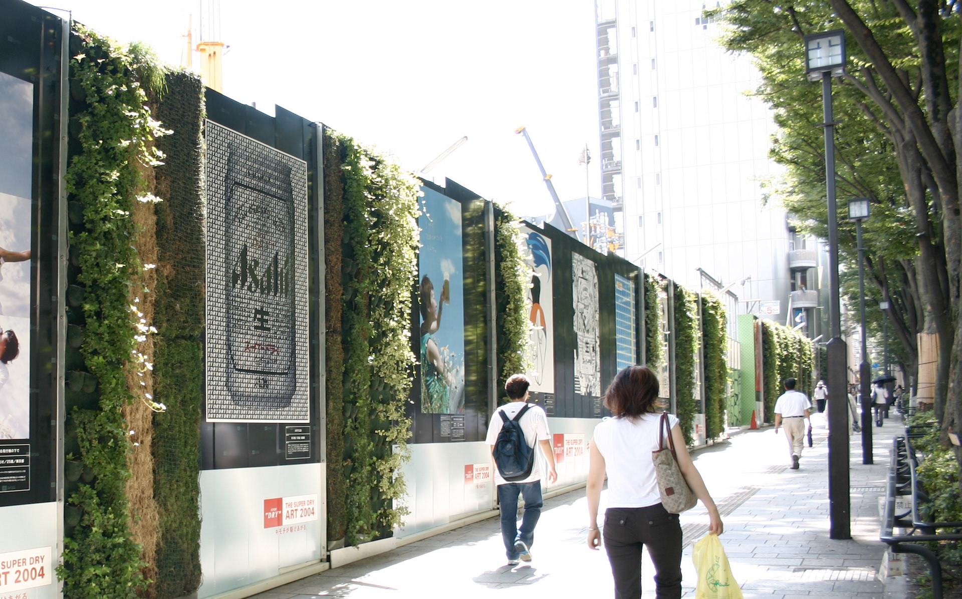
You may also like

RENOVATION EXPO
リノベーションエキスポ大阪の公式ポスターのデザインです。建築空間で文字を形成したデザインとしました。This is the design for the official poster of Renovation Expo Osaka. The design was made to form letters in architectural space.
2019
JAPAN-FRANCE 150th
2008年日仏交流150周年記念ロゴマークの応募案です。日本国旗とフランス国旗の融合をデザインしました。This is a proposal for a logo mark to commemorate the 150th anniversary of Japan-France relations in 2008. The design is a fusion of the Japanese and French flags.
2008
DECCHI YOKAN
近江八幡丁稚羊羹の老舗「和た与」の丁稚羊羹のパッケージデザインです。シンプルながら老舗の羊羹らしく伝統と新しさを融合させたデザインとしています。This is the package design of "Wata-yo", a long-established Omi-Hachiman Decchi-Yokan. The design is simple, but it is a fusion of tradition and novelty, as if it is a yokan made by a long-established store.
2020
NISHITANIDO MISO STEW
京都の老舗西谷堂の京都野菜の味噌煮込みのパッケージデザインです。シルバーのパウチでは味気ないので味噌桶に漬かった中身が一目でわかるパッケージとしました。白味噌と赤味噌があります。This is the package design for Nishitanido's Kyoto vegetable miso stew. A silver pouch would be bland, so we designed a package that allows you to see at a glance what's inside the miso tub. There are white miso and red miso.
2022
TACHIBANA SHOKUDO
彦根四番町スクエアにある、「たちばな食堂」のCIおよび看板制作を担当しました。 大正ロマンをテーマに作られた街にふさわしいイメージで、ブランディングを行いました。 「たちばな」は伊井家の家紋であり、彦根市の市の木であります。 花紋はより現代的にすっきりとデザインしています。 「たちばな食堂」のインテリアデザインは、DEWKSさんによるものです。
2013
FLOCK
FLOCKは群を意味します。信楽焼の陶器で作られた箸置きやブローチなどのブランディングデザインとネーミングです。商品数がとても多く、動物や植物など生物が多くを占めているので群と名付けました。FLOCK means flock. It is a branding design and naming of chopstick rests and brooches made of Shigaraki ware pottery. We named it "Flock" because there are so many products and many of them are creatures such as animals and plants.
2018
DEN-EN KITCHEN
den-en kitchen ロゴデザイン。おうみ福祉会の新施設、きみいろ内に併設されたden-en kitchen(田園キッチン)のロゴデザインを担当しました。田んぼの田を両手で抱き抱えるような暖かさを感じさせるデザインです。のどかな田園風景に溶け込むカフェは、どなたでもご利用頂けます。Logo design for den-en kitchen.We designed the logo for den-en kitchen (Den-en kitchen), which is located in Kimiiro, a new facility of Ohmi Fukushi Kai.The design evokes a warm feeling of embracing the rice paddies with both hands. The café blends into the peaceful countryside and is open to everyone.
2023
LAKE BIWA TROUT
琵琶湖の宝石と言われるビワマスを使った缶詰です。サーモンのようなピンク色に白い筋の入った身をパッケージにもデザインしました。This canned product is made from Biwa trout, the jewel of Lake Biwa. The pink, salmon-like color with white streaked flesh is also designed into the package.
2021
Cosmopolitan Tourism R&D
国際観光政策研究所のロゴデザインです。CとTを組み合わせて地球のように見せています。Logo design for the Institute for Cosmopolitan Tourism R&D, combining the C and the T to look like the earth.
2015
TOYAMA FESTIVAL
第62回富山まつりの公式ポスターを担当しました。青空の下、市内のメイン道路で日中にダイナミックな踊りが行われるこのお祭りを象徴的に踊り子の姿でデザインしました。We were in charge of the official poster for the 62nd Toyama Festival. We designed the dancers to symbolize this festival, in which dynamic dancing takes place during the day on the city's main roads under a blue sky.
2022
Back to Top