You may also like

TACHIBANA SHOKUDO
彦根四番町スクエアにある、「たちばな食堂」のCIおよび看板制作を担当しました。 大正ロマンをテーマに作られた街にふさわしいイメージで、ブランディングを行いました。 「たちばな」は伊井家の家紋であり、彦根市の市の木であります。 花紋はより現代的にすっきりとデザインしています。 「たちばな食堂」のインテリアデザインは、DEWKSさんによるものです。
2013
FUNAZUSHI ICE
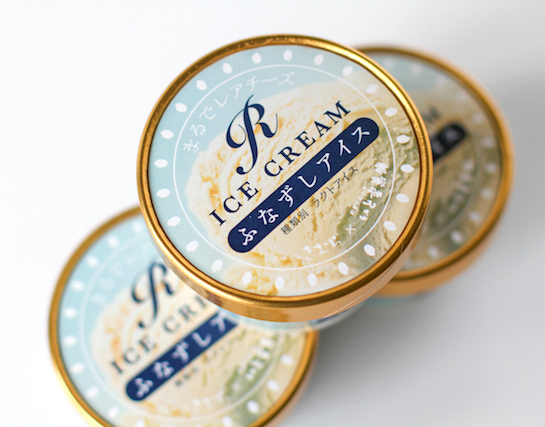
「ふなずしアイス」のパッケージデザインです。 彦根の老舗「いと重菓舗」と「あゆの店きむら」のコラボ商品です。 正確には飯(いい)と呼ばれる、ふなと一緒に漬け込むお米を使っており、ふながこの中に入っているわけではありません。 この飯は、今までは、あまり用途がなく捨てられる事も多かったふなずしの材料です。 ふなずしのイメージを覆し、臭みもなく、レアチーズのようでとても美味しいです。 このデザインを考える上で、まず想像したのは「ふなずし=臭い」という認識が一般にはされやすいことを想像しました。 この中身は決して臭くない、美味しいものですから、このレアチーズのような美味しさをパッケージを通して適切に伝える必要があると思いました。 率直に美味しそうだと感じてもらえるシズル感のあるパッケージを提案しました。
2024
MID DAY 2017
7月2日は、元日から182日、大晦日まで同じく182日。 “一年のまんなかの日(=MIDDAY)”である7月2日を「ミッドデイ(まんなかの日)」と名付け、新しい半年の始まりをお祝いするイベントが東京MIDTOWNで開催されます。 その中で、1年の初めのご挨拶である「年賀状」にちなみ、新たな半年の初めに「半賀状」を送ることを提案する企画があります。 HAPPY HALF BOX内で、日本のトップクリエイターとTokyo Midtown Award出身の作家15組がデザインした「半賀状」が展示されます。 <作品コンセプト> 「僕の前に道はない僕の後ろに道は出来る。」高村光太郎氏の詩です。 道の向こうにある一本の木と広がる空。 一本の木は両手を広げた私の頭であるかもしれない。 一年の半分。 人生もまだ、道半ば。 今日の一日を大切にしたい。 というメッセージを表現しました。
2017
OOBUKU-CHA
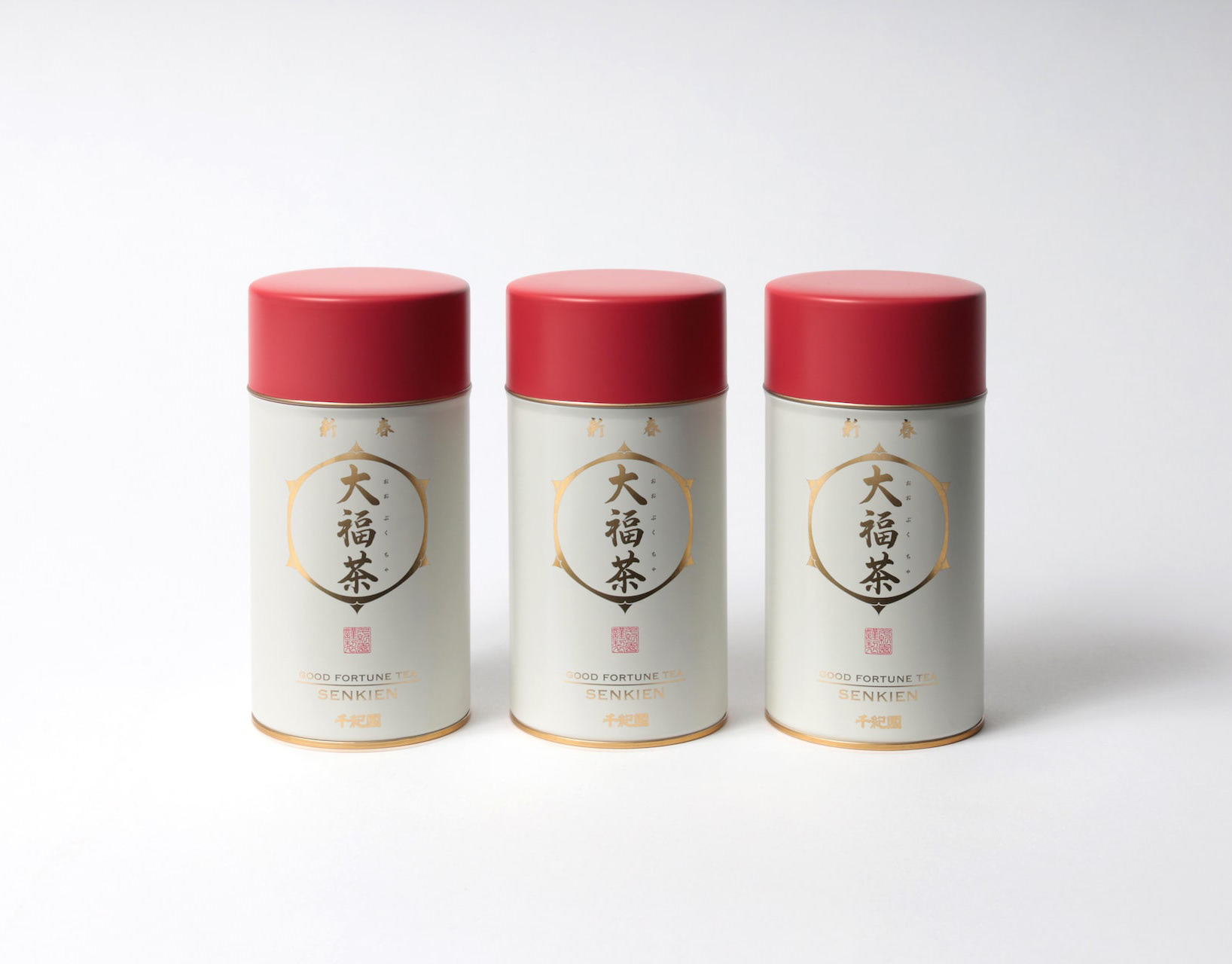
滋賀県民なら誰もが知っている千紀園のCM。 千紀園のお茶や抹茶スイーツへのこだわりは並々ならぬものがあり、この度、その千紀園の大福茶のパッケージデザインを担当させていただきました。 大福茶(おおぶくちゃ)はお正月に無病息災と幸せを願い飲むお茶です。 千紀園と言えば鶴のマークなので、デザインにはあえて亀でいこうと早い段階で思いました。 鶴と亀があるとさらにおめでたい感じがするためです。 最初は具象的な亀の絵も描いてみたのですが、抽象的であるほうが良いと思い、デザインを抽象化しました。 大福茶の文字の周囲にある六角形の形が亀をイメージしたものなのです。 蓋をあけると千紀園の鶴が蓋の内側に現れるようにしました。 袋タイプの方も、缶のプロポーションをそのまま投影したデザインとしました。 Everyone in Shiga Prefecture is familiar with Senkien's commercials. Senkien's commitment to tea and matcha sweets is extraordinary, We are pleased to announce that we are now in charge of the packaging design for Senkien's Daifuku tea. Daifuku tea is a tea to be drunk at New Year's to wish for good health and happiness. Senkien is known for its crane logo, so I decided at an early stage to use a tortoise in the design. The reason is that having a crane and a turtle on the tea makes it look even more festive. At first, I tried drawing a figurative turtle, but I thought it would be better to make the design abstract. The hexagonal shape around the word "Daifuku-cha" is the image of a turtle. When you open the lid, we made the Senkien crane appear inside the lid. The design of the pouch type is also a direct projection of the proportions of the can. https://shop.senkien.jp/fs/senkien/c/goodfortunetea I designed the package for Senkien's Oobuku tea. Oobuku-cha is a tea that is drunk on New Year's Day to wish for good health and happiness. Senkien is known for its crane symbol, so I decided to use a turtle for the design. I decided to use a tortoise for the design because I felt that having a crane and a tortoise would make the tea more festive. It is available at the main store, Kintetsu Kusatsu, and on line stores.
2021
BEEF SOUP
選りすぐりの近江牛の精肉加工時に骨を外す工程があります。 丁寧な職人の技術で骨に残るうまみの十分なお肉をせせり取り、牛骨とともに地元産の野菜、厳選した昆布で煮出したスープです。 この商品は、冷凍スープということでデザインできる幅が狭かったのですが、 「骨まわり肉を無駄にしない」ということを 「シールラベルを無駄にしない」へ置き換えて、 牛のシルエットは背面では成分表示ラベルに活用しました。 ラベルは縦横の面積で価格が決まってしまいます。 一枚のラベルを両面に使い、コストも抑えることにも繋がりました。 近江八幡市のふるさと納税でも、注文が増えていおり「パッケージが明快でかわいらしく商品内容を反映させている」というお声をいただいたりと非常に好評だそうです。 During the butchering process of selected Omi beef, there is a process of removing the bones. With careful craftsmanship, the meat with ample umami remaining on the bones is sesseeded, and the soup is simmered with local vegetables and carefully selected kelp along with the beef bones. This product was a frozen soup, which narrowed the scope of what we could design, We were able to design a product that would not waste the meat around the bones. The silhouette of the beef on the back of the label is a symbol of the beef's health, The silhouette of a cow was used for the ingredient label on the back. The price of a label is determined by its vertical and horizontal area. Using a single label on both sides also helped to reduce costs. Orders from Omi Hachiman City's hometown taxpayers have been increasing, and the product has been very well received, with comments such as, "The package is clear, cute, and reflects the product content. 这种方法被用于展示标签。 标签的价格由其垂直和水平面积决定。 双面使用一个标签也有助于降低成本。 在 Omi Hachiman City 的家乡,订单量一直在增加,产品也广受好评,客户认为包装清晰、可爱,反映了产品的内容。
2024
BRANCH
「枝」を意味する店名のロゴデザイン。花屋さんでありますので「枝、森、花」そのどれもを感じさせる明るいデザインとしました。 Logo design for a store name meaning “branch. As a florist, the logo is bright and evocative of “branches, forests, and flowers. 为一个意为 “枝条 ”的店名设计徽标。 作为一家花店,徽标色彩明亮,令人联想到 “树枝、森林和鲜花”。
2024
NAGAHAMA GENPACHI RUSK
長浜市にあるパン屋ポムドテールの源八ラスクのデザインです。パン職人こだわりの生地から作るラスク。種類も多いですが最小限の資材で対応できるシステムを作りました。ギフトボックスはパンの形をしています。This is a design of Genpachi rusk from bakery Pomme de Terre in Nagahama, Shiga Prefecture. These rusks are made from dough with the baker's special care. There are many different flavors, but we have created a system that can handle a minimum amount of packaging materials. The gift box is in the shape of a loaf of bread.
2020
NORIKAU OGAWA/KENZO OGAWA
陶芸家 小川顕三氏と小川記一氏のブランドディレクションを担当しました。 陶芸家のお二人に対し、まず、作品から印象を得た二色のコンセプトカラーを設定しました。 その二色を、名刺から、リーフレット、ホームページに至るまで、対比的に使用することで、お互いを引き立てあうように計画しました。
2017
Honest Vegetables
小林ファームのPOP看板を作成しました。誠実な野菜作りをされている農家の良さを素朴な木製看板にしました。We created a POP signboard for Kobayashi Farm. We made a rustic wooden sign to show the goodness of a farmer who grows vegetables with sincerity.
2022
HACHIMANJIKAN
近江八幡の西の湖周辺をビーチクルーザーで自転車ツアーをするツーリズムのブランディング「ハチマンジカン」です。Hachimanjikan" is a branding for a tourism brand that offers bicycle tours by beach cruiser around Lake Nishi in Omi Hachiman.
2019
Back to Top