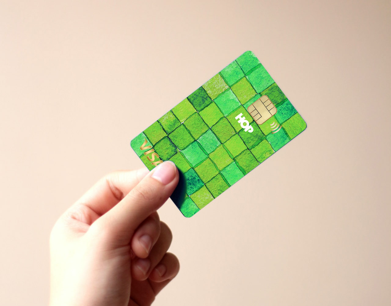
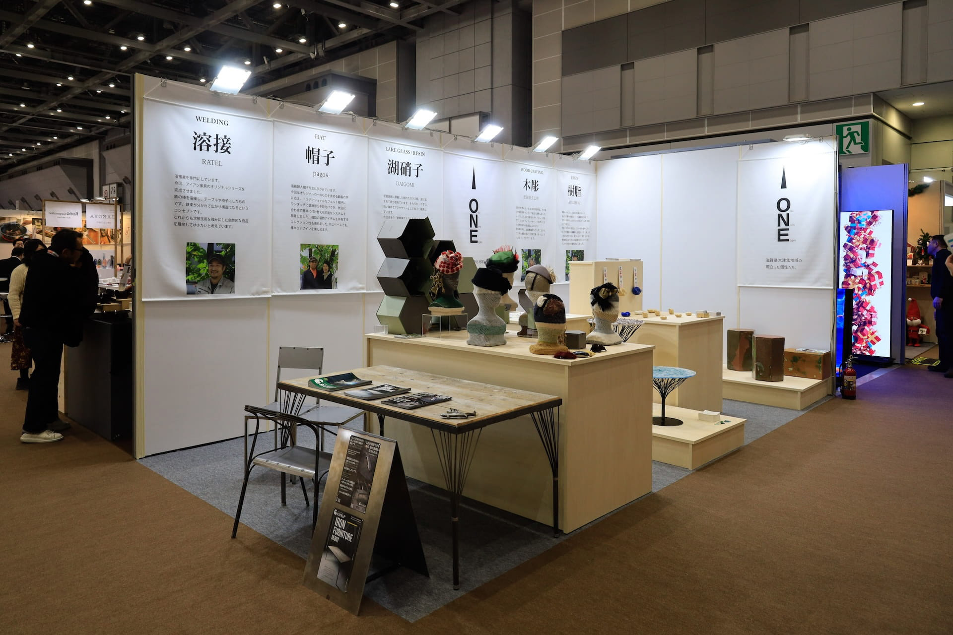
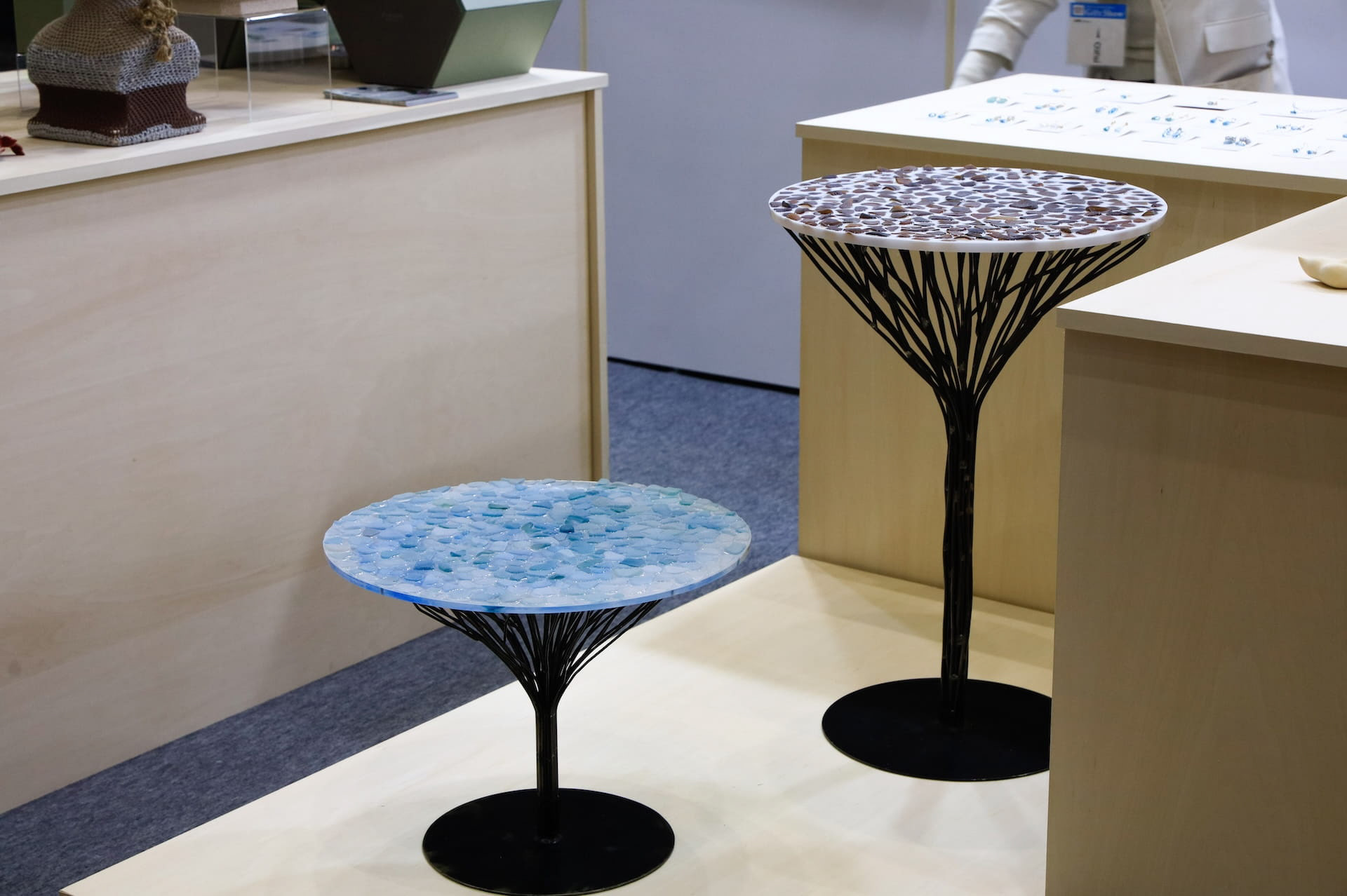
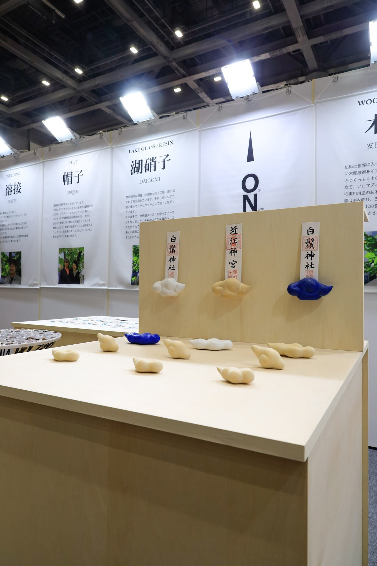
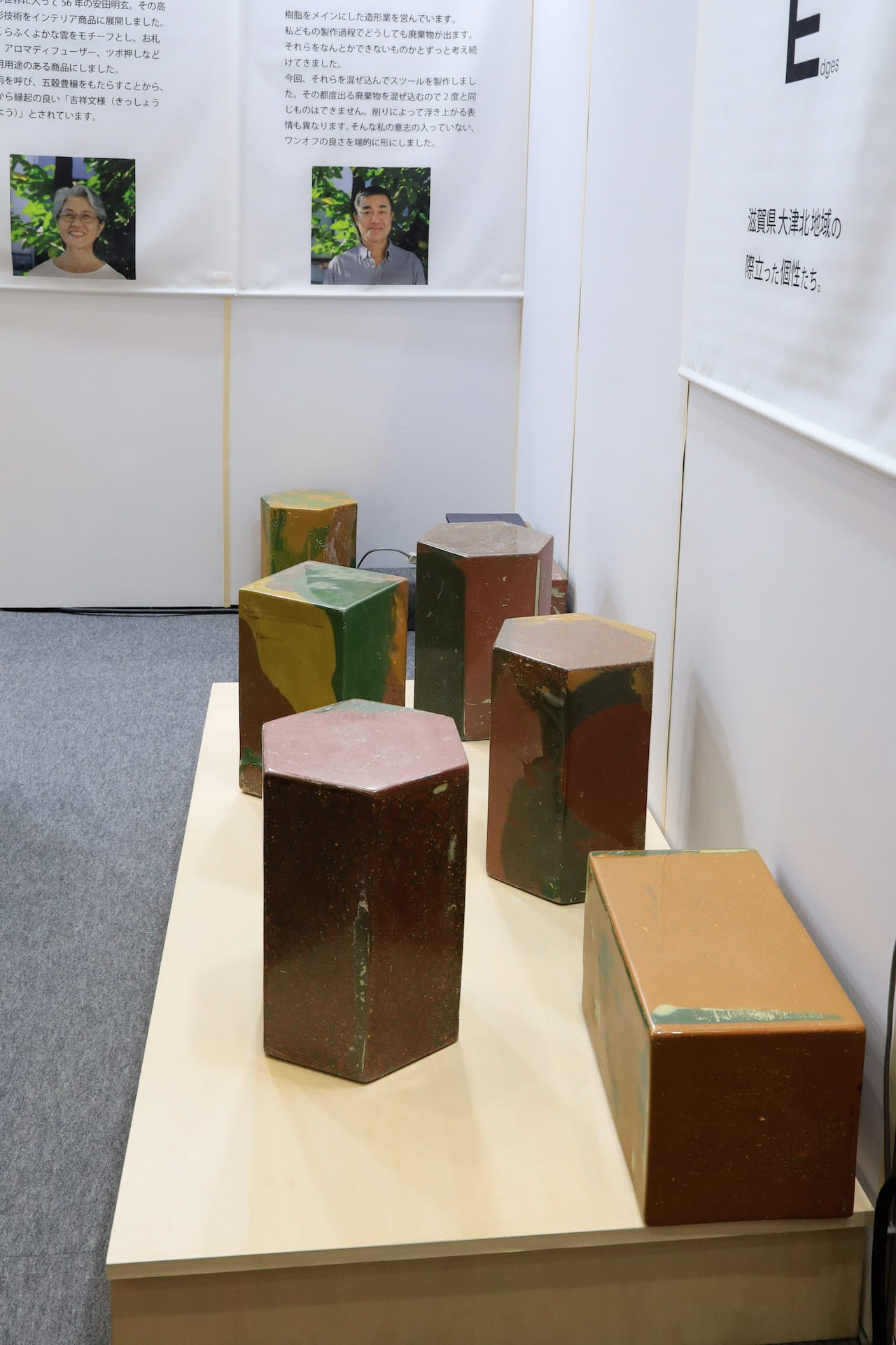
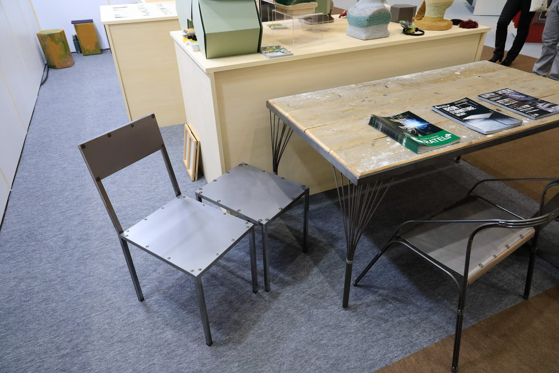
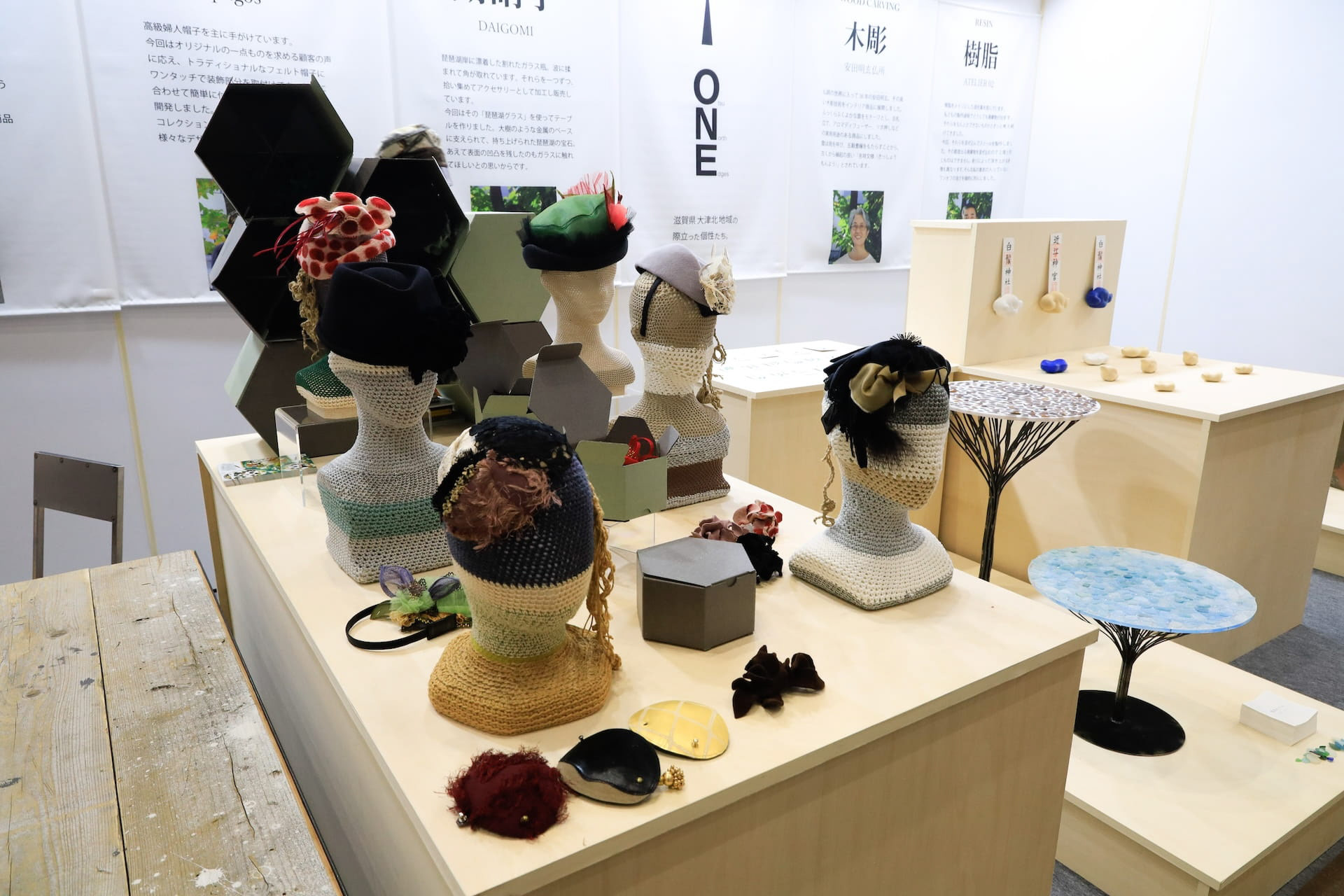
You may also like

THE WORLD SOCIETY FOR EKISTICS
世界駅スティクス学会2005の公式ポスターをデザインしました。ekisticsは人間居住工学の意味です。その文字を居住空間に見立ててデザインしました。We designed the official poster for the World Ekistics Congress 2005. Ekistics means "human habitation engineering. We designed the letters as if they were living spaces.
2005
GLORY
2005
AYU BOILED in SOY SOURCE
あゆの醤油煮の缶詰です。高級感があり、美味しそうに見えるように、醤油が染み込んでいくようなイメージでデザインしました。Canned ayu fish simmered in soy sauce. We designed it to look luxurious and delicious, with the image of soy sauce soaking into the product.
2021
YASHIMA BRANDING
屋島山頂の各店舗に統一的な暖簾、日除け幕を設置し、販売用の手ぬぐい、バッジも制作しました。それらは伝統工芸「讃岐のり染め」の大川原染色本舗さんに制作いただいたものです。 屋島のノスタルジックで少し寂れたイメージに合いつつも、モダンと和を併せ持ったイメージです。青色階調の差を生かした背景色と、 台形のシンボル形体の組み合わせで考えたものです。 メインモチーフの台形は屋島をシンボリックに力強く表現したもので、伝統建築の反り屋根のようでもあります。カーブをつける ことで和の印象を強めています。単体でも反復の繰り返しでも、様々な媒体などに展開されてゆくイメージで、強く柔軟に様々な ものに展開できるデザインとなっています。 背景は、「屋島をひらく」のブランドステートメントに呼応する舞台幕が開かれるようなイメージです。 この10年にわたる高松市の尽力により高松市屋島地区が、全国の優れた都市景観の事例を表彰する「都市景観大賞」で、大賞の国土交通大臣賞に選ばれました。香川県内では初の大賞受賞だそうです。 We set up a unified curtain and sunshade at each store on the top of Mt. Yashima, and also produced tenugui hand towels and badges for sales. These were produced by Okawahara Dyeing Honpo, a traditional craftsman of "Sanuki Nori Dyeing". The image of Yashima is nostalgic and a little desolate, yet modern and Japanese at the same time. The background color is a combination of different shades of blue and the trapezoidal shape of the symbol. The Yashima district of Takamatsu City was selected for the Minister of Land, Infrastructure, Transport and Tourism Award, the grand prize of the Urban Landscape Awards, which recognize outstanding examples of urban landscapes from across Japan. This is the first time that an area in Kagawa Prefecture has won the grand prize.
2023
ONDA
ONDAはイタリア語で波を意味します。これはチェストですが表面が波のようにカーブしています。ウォルナットとヨーロッパビーチに2種類の木のコントラストがあるデザインです。ONDA means wave in Italian. This is a chest, but its surface is curved like a wave. The design has a contrast between two types of wood in walnut and European beach.
2009
pluto
plutoは立つ磁器製のお皿です。洗った後の水切れも良く、清潔感があります。表面のくぼみにはケチャップを入れたりできますし、裏面では指のひっかかりになっています。PLUTO is a porcelain dish that stands. It drains easily after washing and looks clean. The dimple on the surface can be used to put ketchup, and on the back side, it can be used to catch your fingers.
2011
ZIPANG
日本列島を模した信楽焼の器です。食卓に日本列島を描いて楽しめます。 あまり具体的な日本列島にならないように、言われたら、わかる。くらいの、抽象的でかわいい日本列島のデザインとしました。 This is a Shigaraki ware vessel in the shape of the Japanese Islands. You can enjoy drawing the Japanese Islands on your dining table. The design is abstract and cute, so as not to be too concrete. The design is abstract and cute.
2022
SENKO
2013
AYU PORRIDGE
あゆ雑炊のパッケージデザインです。あゆのひらきを使い、レンジアップご飯で手間要らずで簡単に雑炊が作れるように開発されました。鉄鍋に木の蓋をデザインモチーフとし、レトルトご飯と、だし汁を隙間なくホールド可能なパッケージに逆台形型の箱としました。一枚のシートから立体になるデザインです。青い紙に金印刷でローコストに制作しました。 This is the package design of Ayu Porridge. It was developed to make Zosui (rice porridge) easily and hassle-free with microwaved rice using Ayu flounder. The design motif is an iron pot with a wooden lid, and the package is an inverted trapezoid-shaped box that can hold retort rice and the broth without gaps. The design is three-dimensional from a single sheet. Gold printing on blue paper was used for low-cost production. 鲶鱼粥包装设计。 它的开发目的是让人们能够使用鲶鱼比目鱼用微波炉简单方便地煮粥。 设计图案是铁锅上的木盖、甑饭和一个倒梯形盒子,用于盛放无缝隙肉汤的包装。 该设计是由单张板材制作而成的三维作品。 它是用蓝色纸张上的金色印刷以低成本制作的。
2024
西谷堂
西谷堂の手提げ袋と小袋のデザインです。 西谷堂の代表商品であるきんつば「ぐーどすぇ」は丸い形と、さまざまな具材バリエーションが特徴です。 そのことを端的に表現し、西谷堂といえばというデザインとしています。 小袋は小豆をイメージしたものとし、手提げと兄弟のようなイメージで構成しました。 This is the design of Nishitani-do's handbag and sachet. Nishitani-do's signature product, the kintsuba “Gudosue,” is characterized by its round shape and variety of ingredients. The design is intended to express this in a simple way, and to be a symbol of the Nishitani-do brand. The sachet is designed to resemble azuki beans, and the handbag is designed to resemble its siblings. 西谷堂手提包和小袋设计。 西谷堂的招牌产品--金枪鱼 “Gudosue ”的特点是圆形和各种成分。 西谷堂的设计就是这一特点的简单体现。 小袋的设计与红豆相似,手提包的设计与手提包及其同类产品相似。
2020
Back to Top