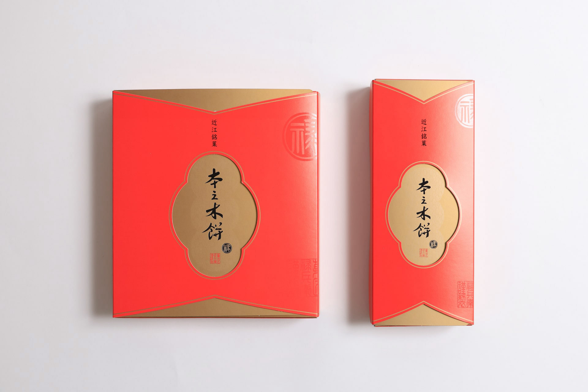
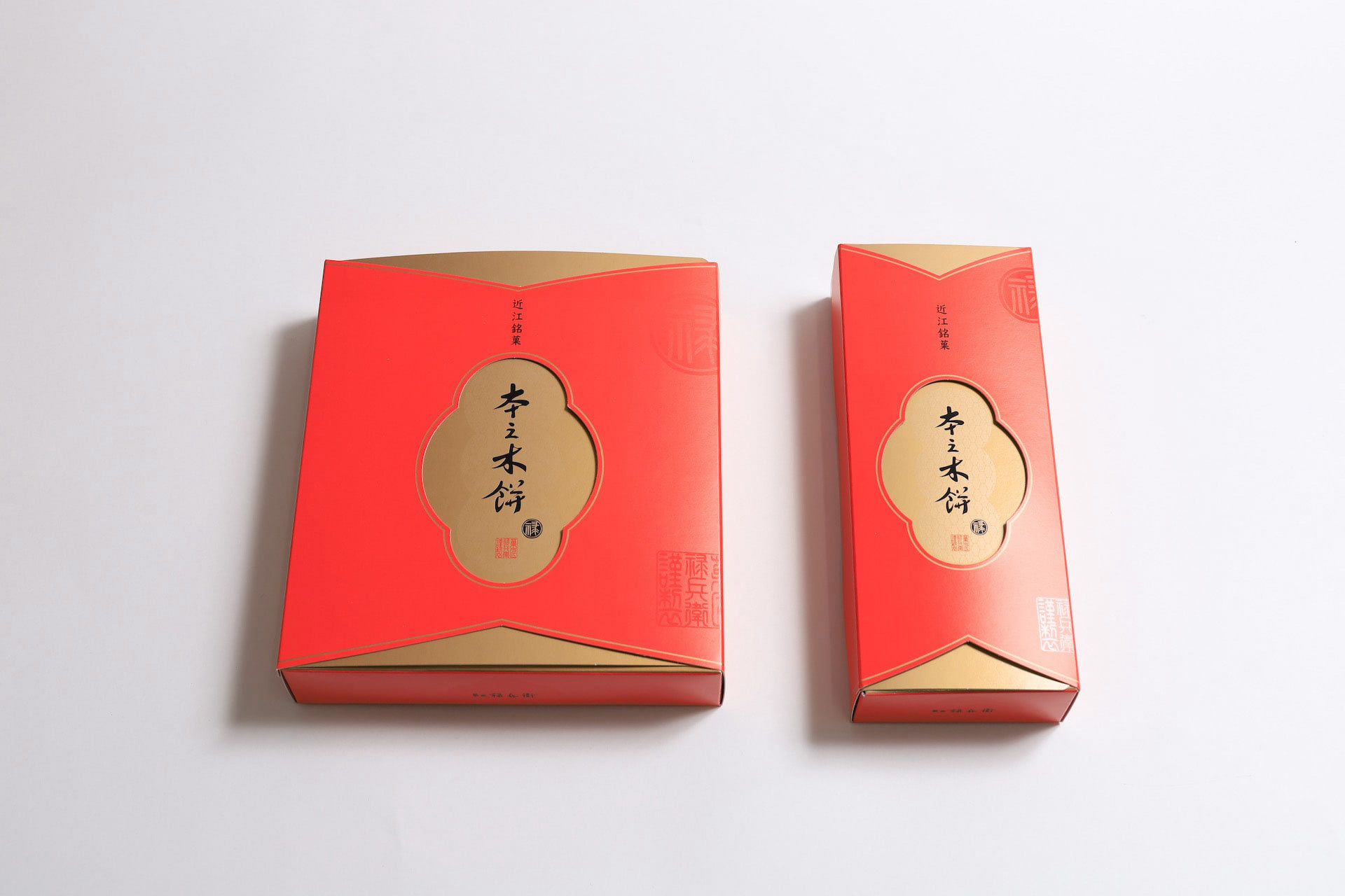
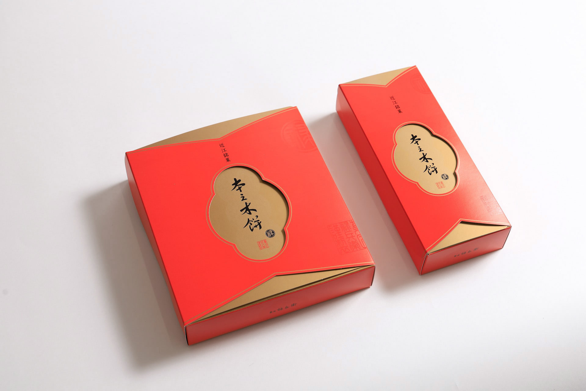
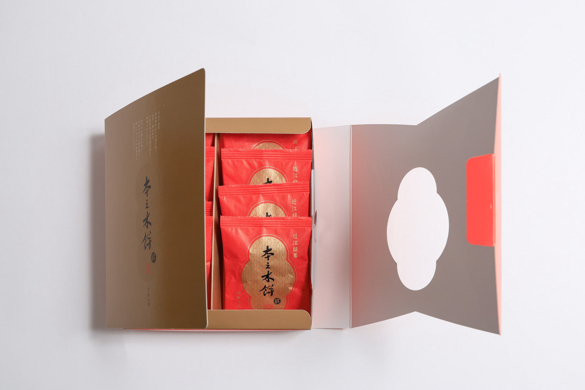
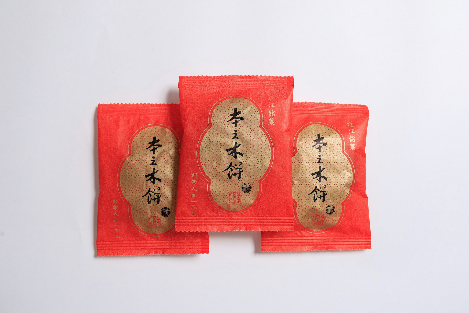
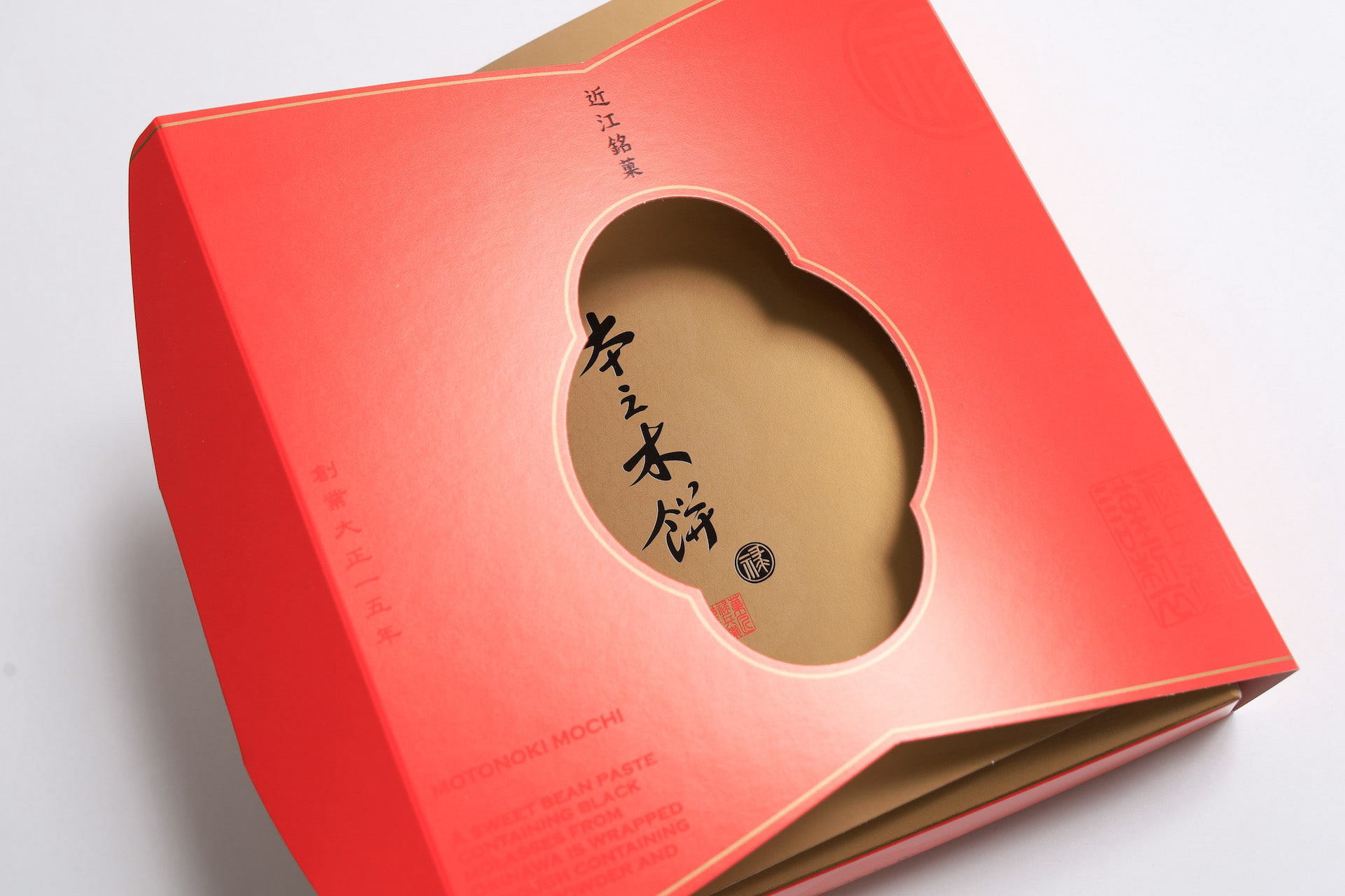
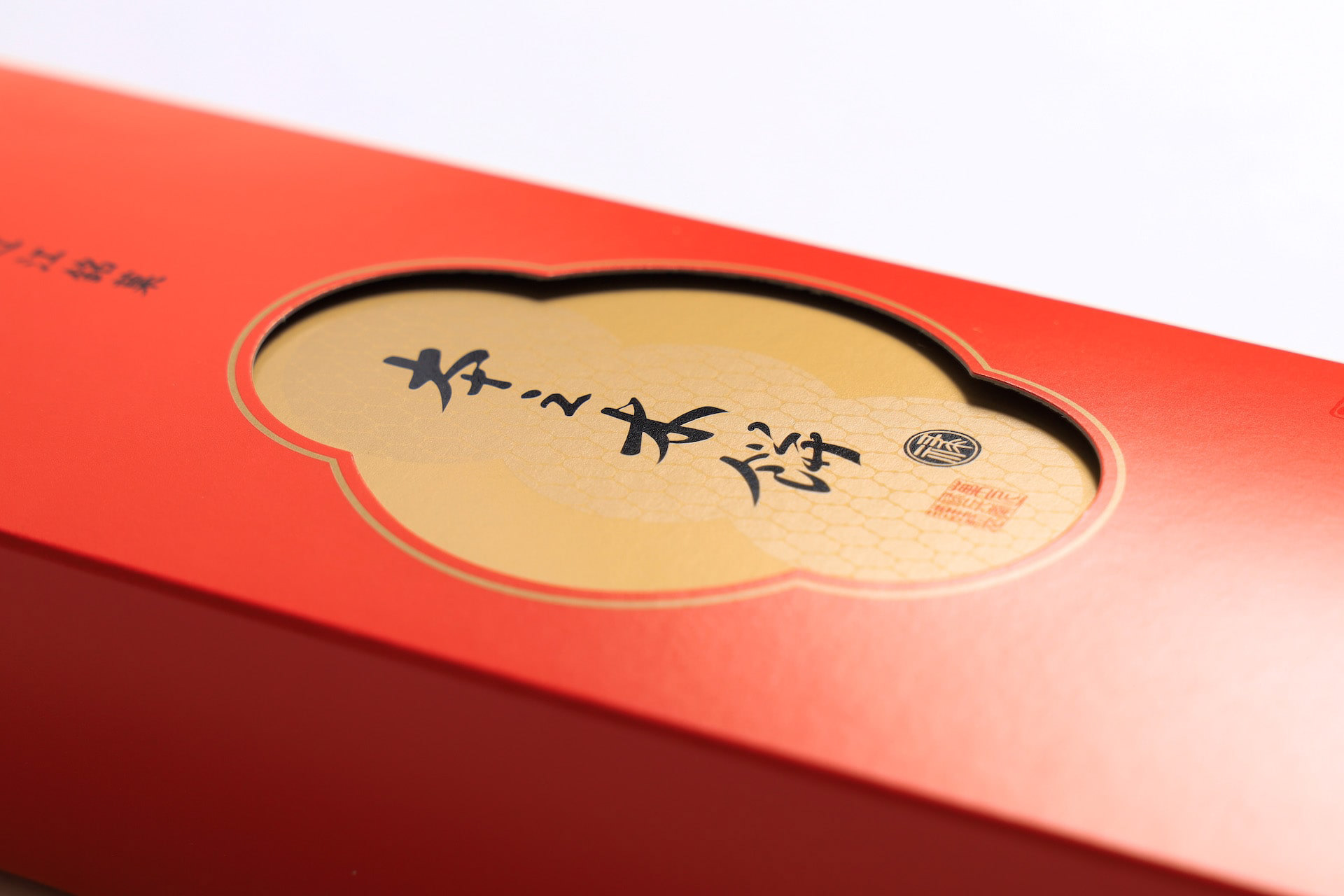
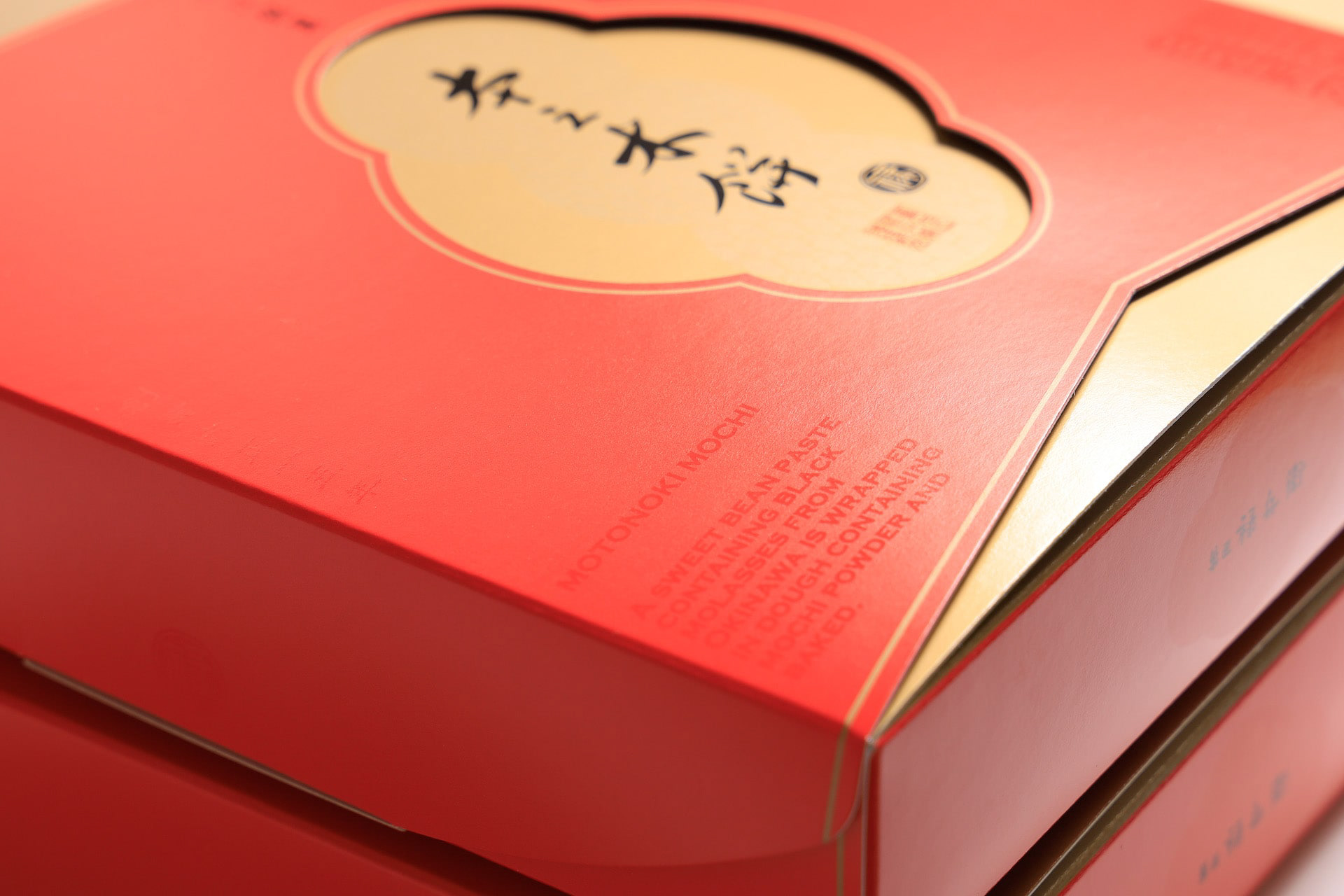
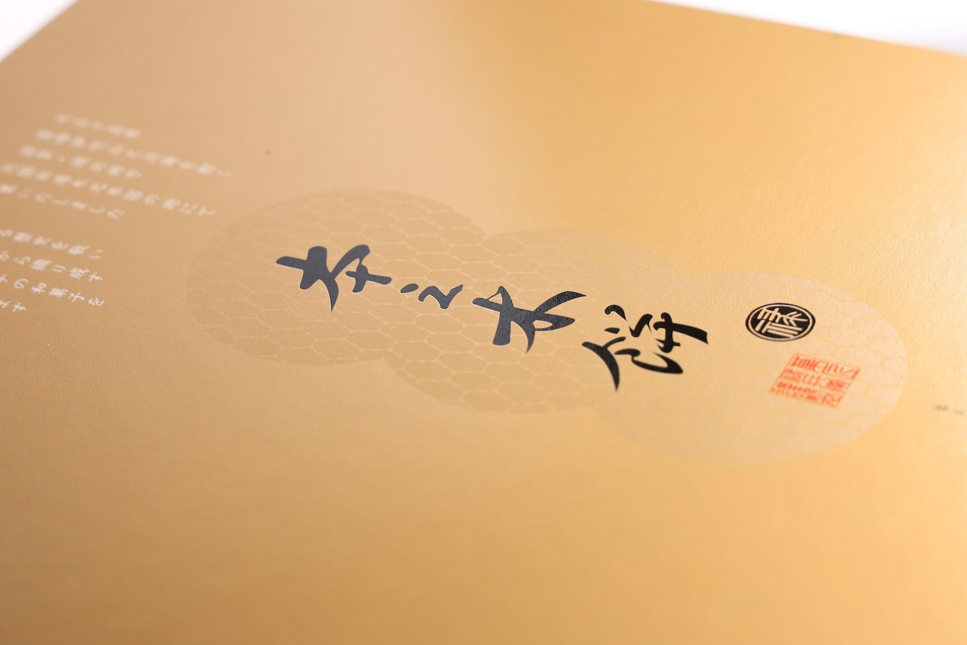
You may also like

1/6 fabric
滋賀の繊維を使ったファブリックブランドです。湖東地域の麻織物と高島ちぢみを使って小物を作りました。柄になっているのは滋賀にゆかりあるモチーフのデザインです。使うほどに良さがわかる気持ち良い生地と評判です。These are fabric brands using fibers from Shiga. Hemp fabrics from the Koto region and Takashima chijimi are used to make these small items. The patterns are designed with motifs associated with Shiga. The fabrics have a reputation for being pleasant to the touch, and the more you use them, the more you appreciate their quality.
2018
KUROBUTA
段ボール箱のベロを差し込む部分を豚の鼻に見立てて、黒豚を立体的にパッケージ全体に描くデザインとしました。 既存のロゴに使われている豚の鼻、目、放射状の装飾をパッケージにあしらうことで、ロゴとパッケージがつながる統一的ブランディングとしています。お尻の側に社名と、尻尾を描いています。箱を開けるときに鼻を引き出すと「THNAK YOU」の文字が見えるようにしています。 お店にパッケージが並んでいる際も、豚がたくさん並んでいるように見え、可愛く、遠目にも目を引くデザインとなっています。 もらったあとも取っておきたいパッケージということで、極力商品名や社名は前面に出さないことを意図しており、段ボール製の収納用品として販売していそうなものを目指し、シンプルで抽象的なデザインとしています。それゆえ、ギフトボックス以外の、壁面デザインやのぼりなど、様々な媒体に展開しやすいものになっています。 段ボールのクラフトの地色を活かしたナチュラル感のあるデザインにしており、素材の良さを感じさせるものです。 The design depicts a black pig three-dimensionally on the entire package, using the part of the cardboard box where the tongue is inserted as a pig's nose. The pig's nose, eyes, and radial decorations used in the existing logo are used on the package to create a unified branding that connects the logo and the package. The company name and tail are drawn on the butt side. When the box is opened, the nose is pulled out to reveal the words "THNAK YOU. When the package is lined up in a store, it looks like a bunch of pigs, which is cute and eye-catching from a distance. The design is simple and abstract, aiming for something that would be sold as a cardboard storage product. Therefore, the design can be easily applied to a variety of media other than gift boxes, such as wall designs and banners. The design has a natural feel, taking advantage of the ground color of the corrugated kraft, and gives a sense of the quality of the material.
2023
SUIRIN
2012
Oiled AYU
2016
TOFU ICCHO
和紙でできたノート豆腐一帳のロゴデザイン。 エッジがピンとしつつも、中身はやわらかい、そんな豆腐のような手作り感のあるロゴを目指してデザインしました。
2014
DEN-EN KITCHEN
den-en kitchen ロゴデザイン。おうみ福祉会の新施設、きみいろ内に併設されたden-en kitchen(田園キッチン)のロゴデザインを担当しました。田んぼの田を両手で抱き抱えるような暖かさを感じさせるデザインです。のどかな田園風景に溶け込むカフェは、どなたでもご利用頂けます。Logo design for den-en kitchen.We designed the logo for den-en kitchen (Den-en kitchen), which is located in Kimiiro, a new facility of Ohmi Fukushi Kai.The design evokes a warm feeling of embracing the rice paddies with both hands. The café blends into the peaceful countryside and is open to everyone.
2023
DRWERS OF PAST,PRESENT,FUTURE
引出しにはそれぞれ、過去の引き出し、現在の引き出し、未来の引き出しと名前が付けられています。 それぞれ過去、現在、未来をイメージした特徴の異なった三枚の陶板で前板が作られています。 陶板は信楽焼で手作りによって作られています。 引き出しを開けるとそこには、past, present, futureの文字が刻まれています。 陶板の引き出しは、何か特別な印象を引き出しにもたらします。 この引き出しをどのように使うかは使用者に委ねられていますが、人にはみなそれぞれの、現在、過去、未来があります。 何か大切なものや情報を入れたりする特別な箱になることを願っています。
2024
OITA ASIAN SCULPTURE EXHIBITION
さまざまな表情をした金属の帯のようなものが右のほうへ伸びて、コンペティションを競いあっている様を表現しました。一つ一つが異なるカラフルな作家の違った個性であり、全体で現代彫刻のような表現としました。遠くからでも目をひくキラリとした表現としています。The work depicts a series of metal strips with various expressions extending toward the right, competing with each other in a competition. Each piece is a different colorful individuality of a different artist, and the overall expression is that of a contemporary sculpture. The overall effect is that of a contemporary sculpture, which is eye-catching even from a distance.
2023
UIROMOCHI
「和た与」のういろ餅のパッケージリニューアルです。こちらのういろは、米粉を使用していることから米の形をあしらっています。包装紙を開くとわかるようなデザインです。一つは抹茶と白、もう一つは黒糖をあらわし、中身を表現したものです。This is a package renewal of Uiro rice cake of "Wata-yo". This Uiro is decorated with the shape of rice because it is made of rice flour. The design can be recognized by opening the wrapping paper. One is a matcha green tea and white, and the other is brown sugar, representing the contents of the rice cake.
2020
TOYAMA DESIGN FAIR 2024 GRAND PRIX AWARD
富山デザインフェア2024のポスターデザインコンペにおいて大賞を受賞しました。 コンセプトは「富山デザインふんばり!」 能登の震災で被害を受けた富山でもありますが、ここがふんばり所だと思います。 踏ん張ってバーベルを持ち上げる、その姿は富山の「富」の姿であります。 富の背景は立山連山の山を模し、紅潮して顔を赤く染め頑張っている姿を表現しています。 強靭そうな富山ブラックの踏ん張りに期待します。 Toyama Design Fair 2024 Poster Design Competition Grand Prize Winner The concept was “Toyama Design Fumbari! Toyama was damaged by the Noto earthquake, but I think this is the place to be. The figure of a man standing on his feet and lifting a barbell is the image of Toyama's “wealth”. The background of the “Tomi” is a mountain range in the Tateyama Mountain Range, and the image of a man working hard with his face reddening in the face of the earthquake is represented. We look forward to seeing the strong-looking Toyama Black stand firm in the face of the mountains. 2024 年富山设计展海报设计竞赛中获得了大奖。 设计概念是 “富山设计丰收!”。 富山虽然在能登地震中受到了破坏,但我认为这里是值得一去的地方。 双脚站立、举起杠铃的男子形象代表了富山的 “财富”。 财富 "的背景是立山山脉,人物形象表现的是一个正在努力工作、面色红润的男子形象。 我们期待着看到外表强壮的富山黑子挺身而出。
2024
Back to Top