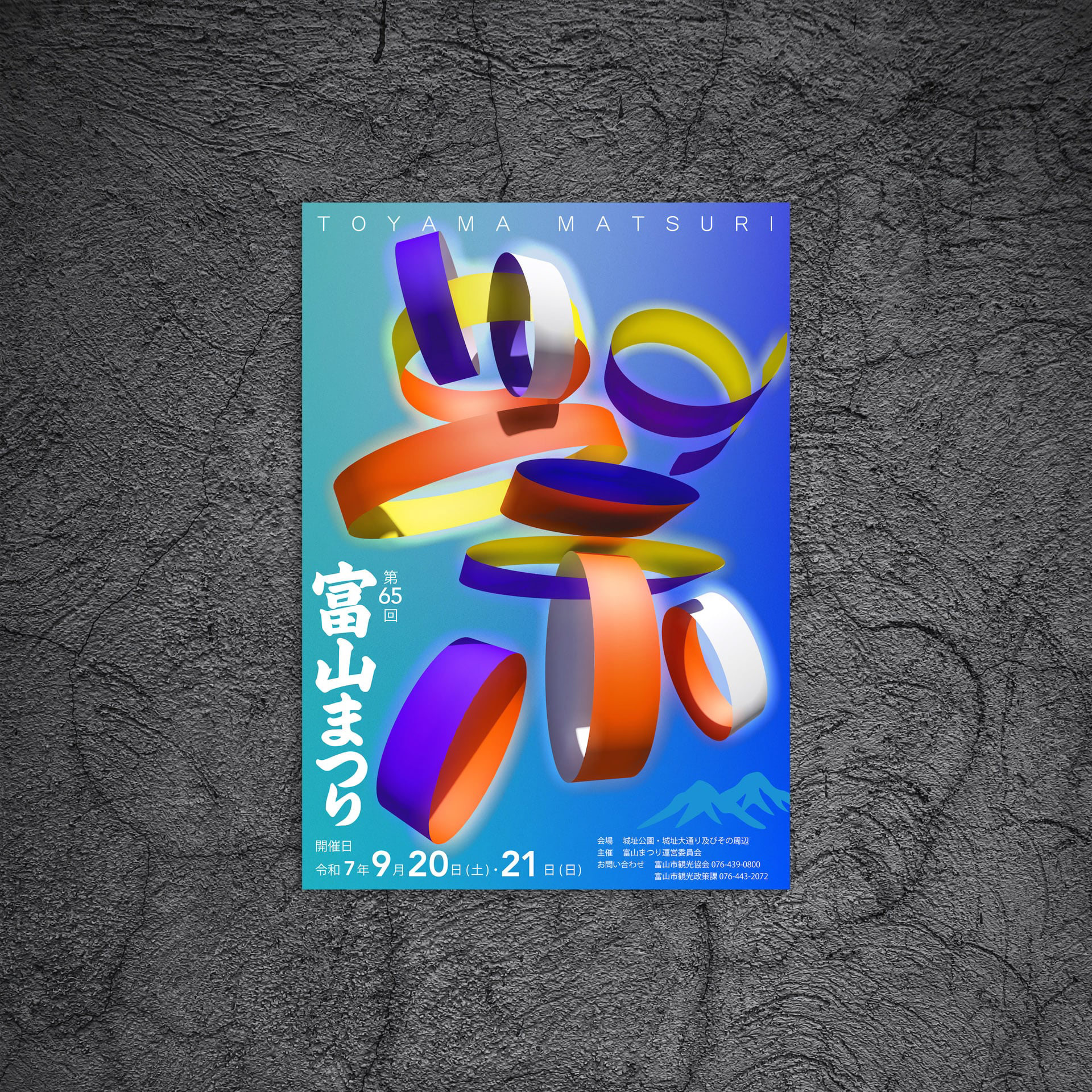
You may also like

RENOVATION EXPO
リノベーションエキスポ大阪の公式ポスターのデザインです。建築空間で文字を形成したデザインとしました。This is the design for the official poster of Renovation Expo Osaka. The design was made to form letters in architectural space.
2019
INAZUMA DACQUOISE
滋賀県産のジャンボレモンを使った、ダックワーズのデザインです。滋賀のナンバープレートはイナズマナンバーと言われたりするので、イナズマダックワーズと名付けられました。雲の下に閃光がきらめくイメージでデザインしました。This is a design for duck wares using jumbo lemons produced in Shiga Prefecture. The Shiga license plate is sometimes referred to as the Inazuma license plate, so it was named Inazuma Duckwars. The design is based on the image of a sparkling flash of light under the clouds.
2021
BIWAICHI
2019
ACRYLIC TOILET SIGN
LEDを内臓したアクリルのトイレサインです。サインのベースは木製でLEDが内臓されています。アクリル部分に切削加工が施されてあり、光を拡散し発光します。Acrylic restroom sign with built-in LEDs. The base of the sign is made of wood and contains LEDs. The acrylic part is machined to diffuse light and emit light.
2020
OOBUKU-CHA
滋賀県民なら誰もが知っている千紀園のCM。 千紀園のお茶や抹茶スイーツへのこだわりは並々ならぬものがあり、この度、その千紀園の大福茶のパッケージデザインを担当させていただきました。 大福茶(おおぶくちゃ)はお正月に無病息災と幸せを願い飲むお茶です。 千紀園と言えば鶴のマークなので、デザインにはあえて亀でいこうと早い段階で思いました。 鶴と亀があるとさらにおめでたい感じがするためです。 最初は具象的な亀の絵も描いてみたのですが、抽象的であるほうが良いと思い、デザインを抽象化しました。 大福茶の文字の周囲にある六角形の形が亀をイメージしたものなのです。 蓋をあけると千紀園の鶴が蓋の内側に現れるようにしました。 袋タイプの方も、缶のプロポーションをそのまま投影したデザインとしました。 Everyone in Shiga Prefecture is familiar with Senkien's commercials. Senkien's commitment to tea and matcha sweets is extraordinary, We are pleased to announce that we are now in charge of the packaging design for Senkien's Daifuku tea. Daifuku tea is a tea to be drunk at New Year's to wish for good health and happiness. Senkien is known for its crane logo, so I decided at an early stage to use a tortoise in the design. The reason is that having a crane and a turtle on the tea makes it look even more festive. At first, I tried drawing a figurative turtle, but I thought it would be better to make the design abstract. The hexagonal shape around the word "Daifuku-cha" is the image of a turtle. When you open the lid, we made the Senkien crane appear inside the lid. The design of the pouch type is also a direct projection of the proportions of the can. https://shop.senkien.jp/fs/senkien/c/goodfortunetea I designed the package for Senkien's Oobuku tea. Oobuku-cha is a tea that is drunk on New Year's Day to wish for good health and happiness. Senkien is known for its crane symbol, so I decided to use a turtle for the design. I decided to use a tortoise for the design because I felt that having a crane and a tortoise would make the tea more festive. It is available at the main store, Kintetsu Kusatsu, and on line stores.
2021
CHINDON FESTIVAL
第67回全日本チンドンコンクールのポスターデザイン案です。賑やかな音が聞こえて来そうな立体的で動きのあるデザインとしました。「ちんどん」の文字が描かれています。This is a poster design for the 67th All Japan Chindon Competition. The design is three-dimensional and full of movement, as if one can hear the lively sound of the chindon. The word "Chindon" is drawn on the poster.
2021
Miso soup with Seta shijimi
琵琶湖のセタシジミを使ったインスタントの味噌汁です。しじみの殻をデザインとして使いました。高級なしじみなので金色にしています。This instant miso soup is made with Lake Biwa's seta shijimi clam. We used the shells of shijimi clam as a design. The color is gold because of the high quality shijimi clam.
2020
CORTE HOME
コルテホームは、自分らしいライフスタイルを提案する住宅のブランドです。 ブランドロゴをはじめとする、ブランド構築を担当しました。
2017
MOTONOKI MOCHI
本之木餅は菓匠禄兵衛における長年ベストセラー商品です。 そのリニューアルデザインを担当しました。 今までの商品同様赤をベースに金との組み合わせは変えませんが、箱の型に抜きを使うことで立体感ある仕上がりに、印刷にもツヤニスを多様することで光の当たり方で浮かび上がる深みのある演出としました。 今までの印象を損なわず、さらに表現を進化させたデザインとしています。 お菓子は、ふっくらと炊き上げた粒あんを、餅粉入りのもっちり生地で包み、焼き上げたものです。8個入りと5個入りがあります。 Motonoki Mochi has been a best-selling product of Kasho Rokubei for many years. We were in charge of its renewal design. The red base color is the same as the previous products, and the combination of gold and gold is the same, but the box is die-cut to give it a three-dimensional finish, and a variety of glossy varnishes are used in the printing to create a deep effect that comes to life when the light hits it. The design has evolved further in expression without losing the impression of the past. The confectionery is made by wrapping softly cooked sweet bean paste in mochi dough and baking it. 8 pieces and 5 pieces are available.
 Motonoki mochi (红豆沙馅麻糬)多年来一直是 Kasho Rokubei 的畅销产品。 我们负责其更新设计。 与以前的产品一样,金色和红色底色的组合保持不变,但在包装盒上使用了模切模具,使其具有立体感,印刷时使用了亮光漆,产生了深邃的效果,在光线照射下栩栩如生。 设计在表现形式上有了进一步的发展,但又不失过去的印象。 这种点心是用煮软的甜豆沙,裹上麻糬粉烘烤而成。
2025
MATSUMOTO YUKI FURNITURE
松本雄樹家具製作所のロゴマークをデザインしました。ノミのようで暖かい家のようで、手作り感のあるマークとしています。We designed a logo mark for Yuki Matsumoto Furniture Manufacturing. The mark is designed to look like a chisel and a warm house, with a handmade feel.
2022
Back to Top