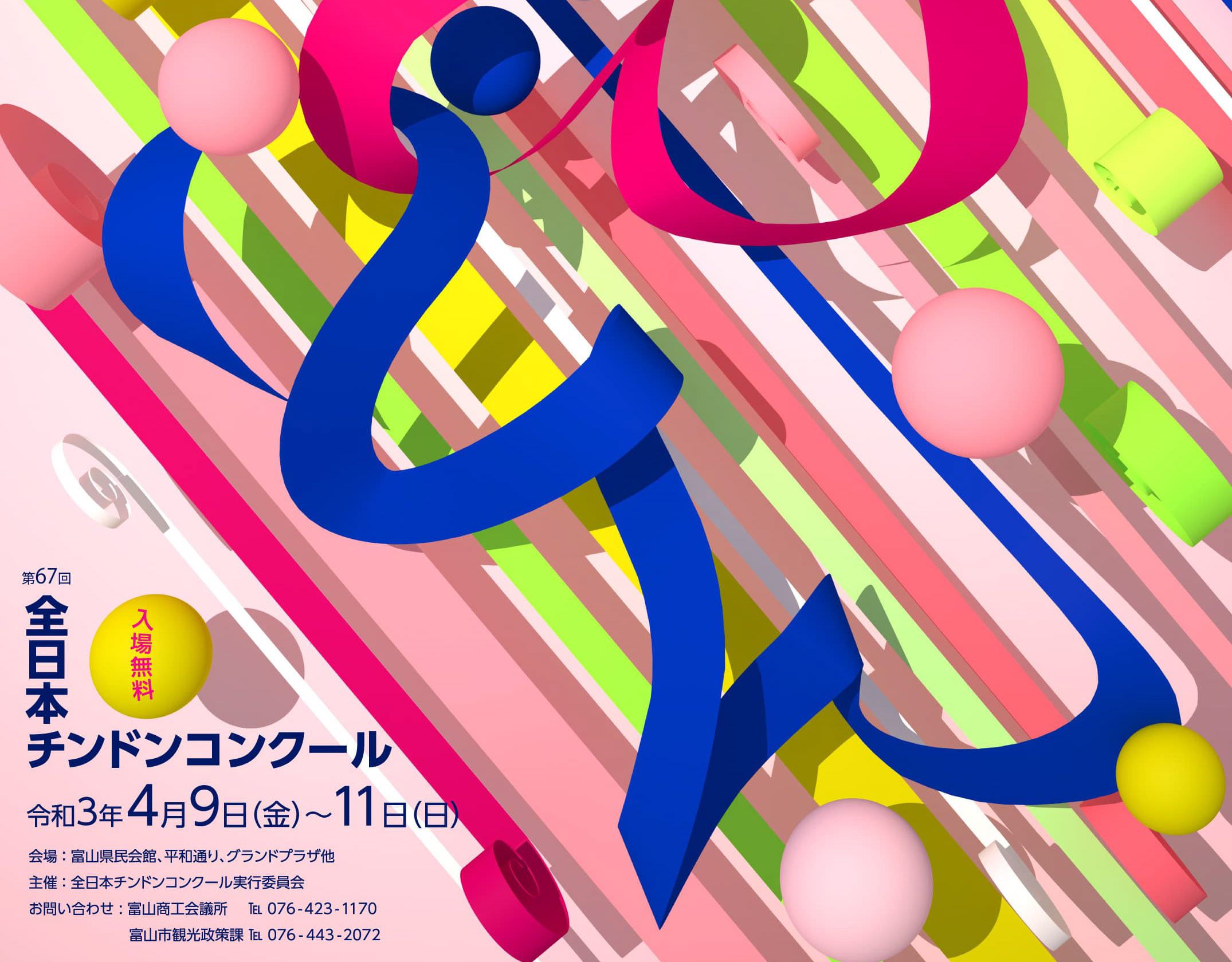
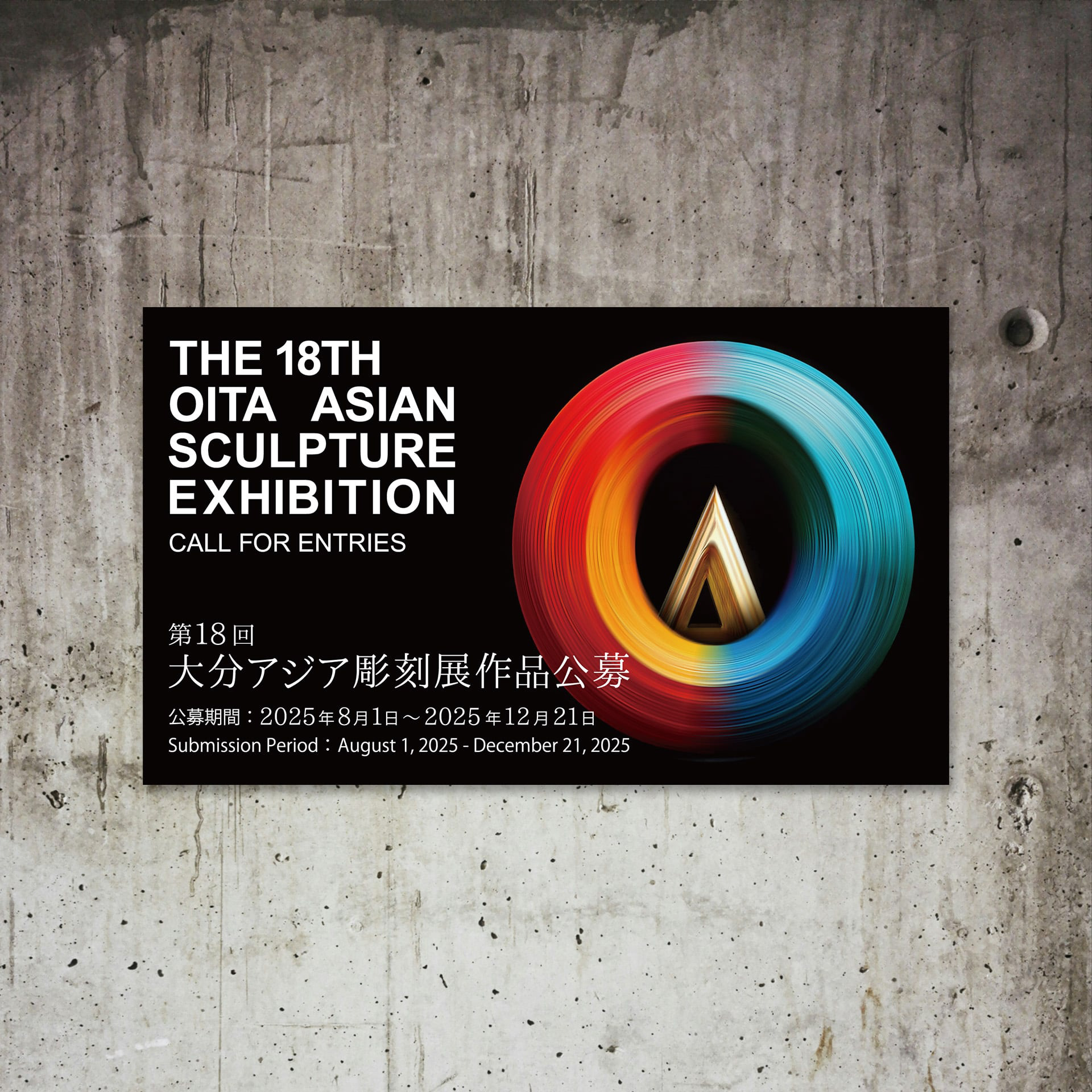
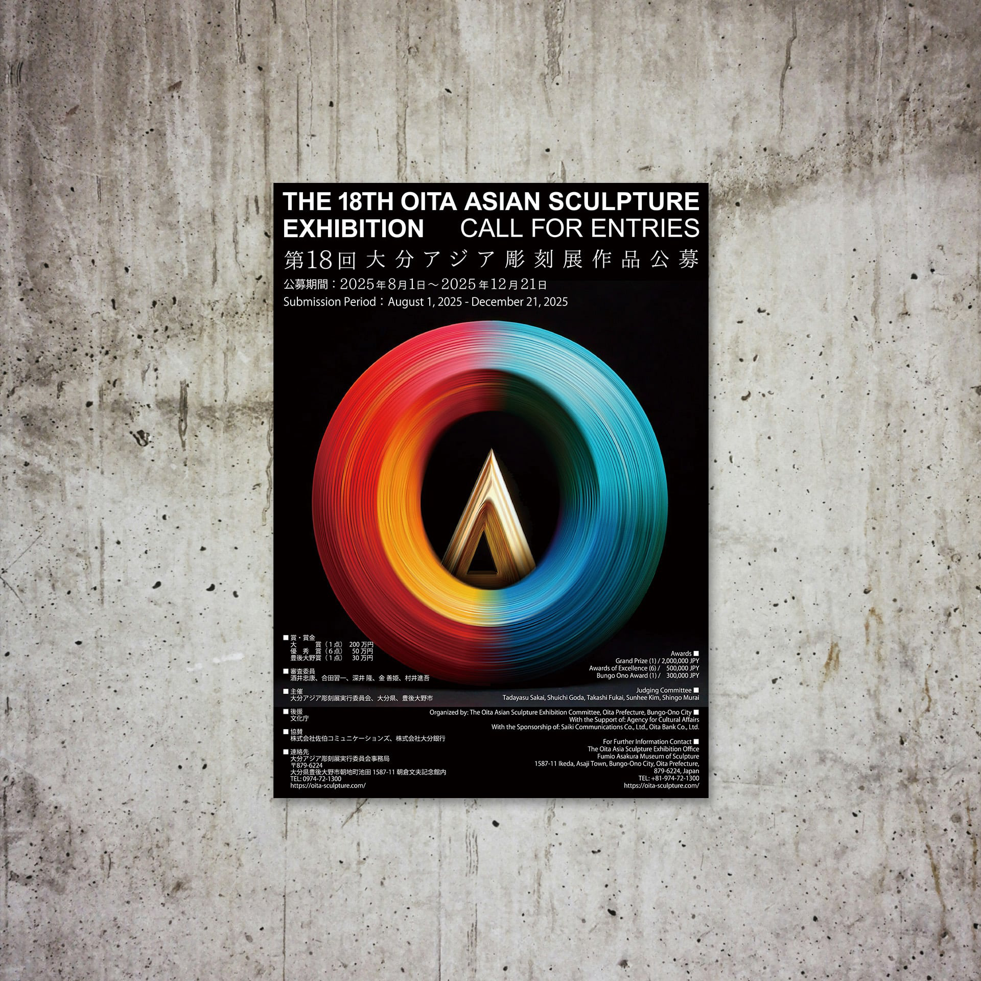
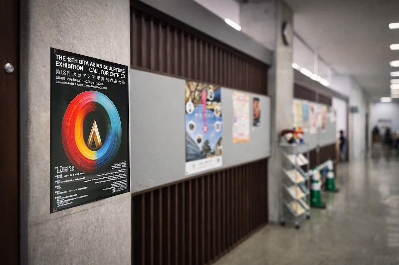
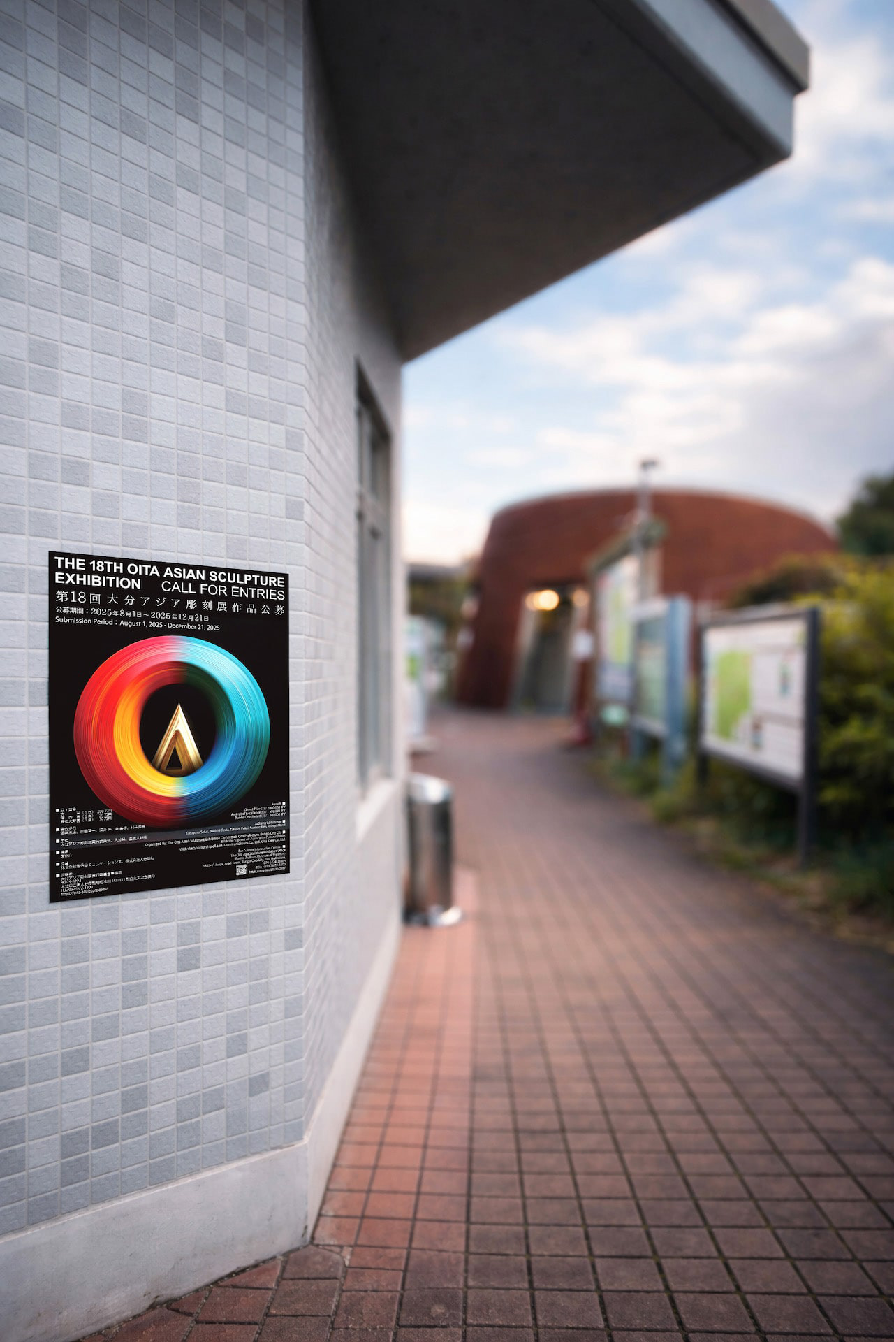
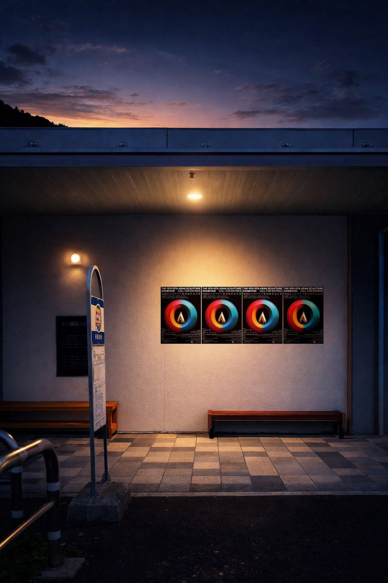
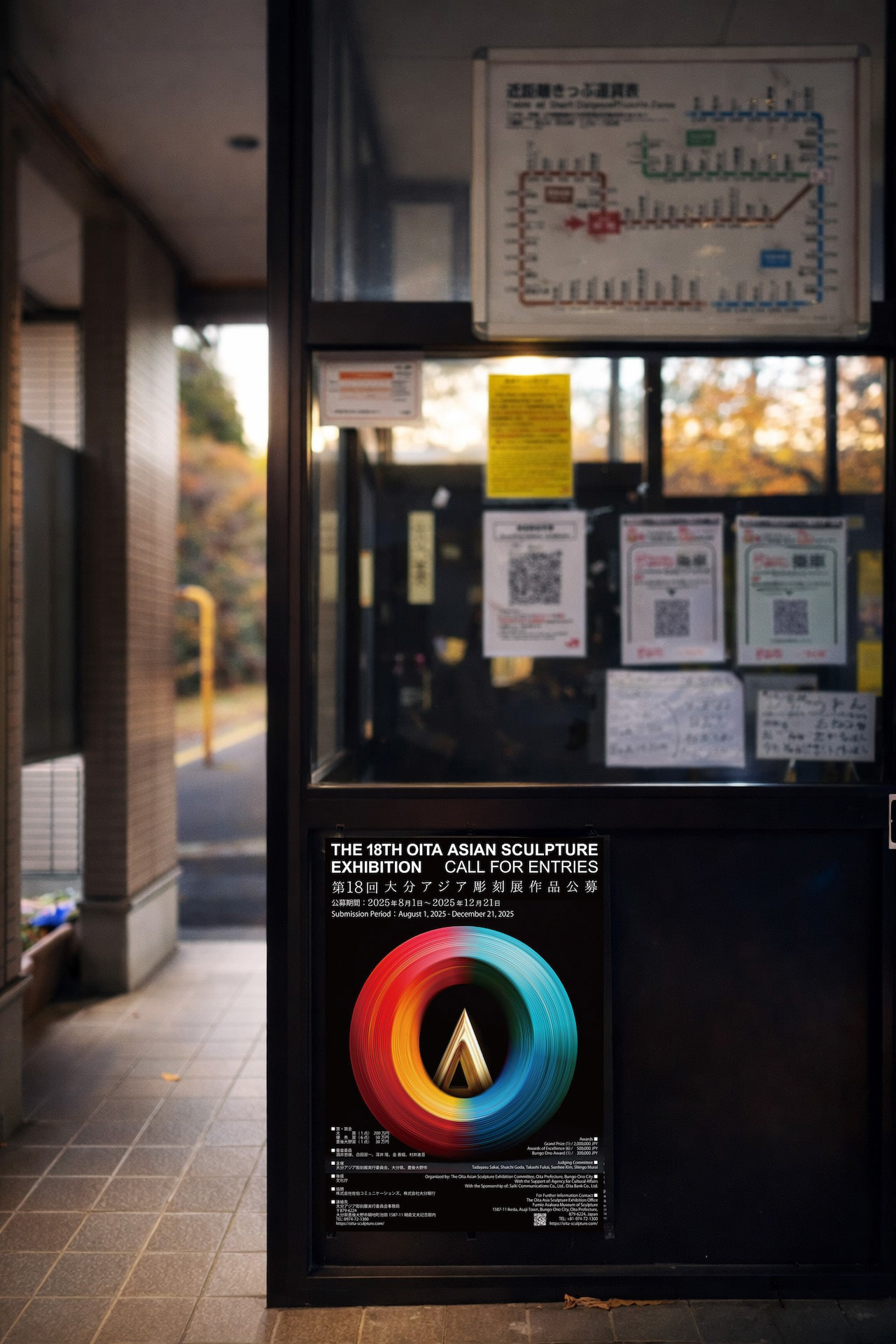
You may also like

FLOCK
FLOCKは群を意味します。信楽焼の陶器で作られた箸置きやブローチなどのブランディングデザインとネーミングです。商品数がとても多く、動物や植物など生物が多くを占めているので群と名付けました。FLOCK means flock. It is a branding design and naming of chopstick rests and brooches made of Shigaraki ware pottery. We named it "Flock" because there are so many products and many of them are creatures such as animals and plants.
2018
YASHIMA BRANDING
屋島山頂の各店舗に統一的な暖簾、日除け幕を設置し、販売用の手ぬぐい、バッジも制作しました。それらは伝統工芸「讃岐のり染め」の大川原染色本舗さんに制作いただいたものです。 屋島のノスタルジックで少し寂れたイメージに合いつつも、モダンと和を併せ持ったイメージです。青色階調の差を生かした背景色と、 台形のシンボル形体の組み合わせで考えたものです。 メインモチーフの台形は屋島をシンボリックに力強く表現したもので、伝統建築の反り屋根のようでもあります。カーブをつける ことで和の印象を強めています。単体でも反復の繰り返しでも、様々な媒体などに展開されてゆくイメージで、強く柔軟に様々な ものに展開できるデザインとなっています。 背景は、「屋島をひらく」のブランドステートメントに呼応する舞台幕が開かれるようなイメージです。 この10年にわたる高松市の尽力により高松市屋島地区が、全国の優れた都市景観の事例を表彰する「都市景観大賞」で、大賞の国土交通大臣賞に選ばれました。香川県内では初の大賞受賞だそうです。 We set up a unified curtain and sunshade at each store on the top of Mt. Yashima, and also produced tenugui hand towels and badges for sales. These were produced by Okawahara Dyeing Honpo, a traditional craftsman of "Sanuki Nori Dyeing". The image of Yashima is nostalgic and a little desolate, yet modern and Japanese at the same time. The background color is a combination of different shades of blue and the trapezoidal shape of the symbol. The Yashima district of Takamatsu City was selected for the Minister of Land, Infrastructure, Transport and Tourism Award, the grand prize of the Urban Landscape Awards, which recognize outstanding examples of urban landscapes from across Japan. This is the first time that an area in Kagawa Prefecture has won the grand prize.
2023
CUBRIC TEAK HOOK
CUBRICはシンプルなデザインの木製の壁掛けフックです。 幻の銘木「ユーラシアン チーク材」で製作しました。 濃い色は塗装の色ではございません。木質は重硬でとても高級感があります。 高価な材料ですが、もう一種類のCUBRICとあまり変わらないようにお値段は頑張っています。2つの立方体形状の組み合わせで構成されています。 どのような空間にもよく合う、なんでもないシンプルな形です。CUBRIC is a wooden wall hook with a simple design.It is made of Eurasian teak, a fantastic wood.The dark color is not the color of the paint.The wood is heavy, hard, and very luxurious.It is an expensive material, but we are trying our best to keep the price not much different from the other type of CUBRIC.It is composed of a combination of two cube shapes.It is a simple, nondescript shape that fits well in any space.
2017
BIWAKO HOMARE
近江茶 琵琶湖ほまれのパッケージデザインです。茶の栽培地である、三重県境から琵琶湖まで繋がっているというイメージを水彩画で表現しました。This is the package design for Omi Tea Biwako Homare. The image of the connection from the border of Mie Prefecture to Lake Biwa, where the tea is grown, is expressed in watercolor.
2021
TOYAMA DESIGN FAIR 2024 GRAND PRIX AWARD
富山デザインフェア2024のポスターデザインコンペにおいて大賞を受賞しました。 コンセプトは「富山デザインふんばり!」 能登の震災で被害を受けた富山でもありますが、ここがふんばり所だと思います。 踏ん張ってバーベルを持ち上げる、その姿は富山の「富」の姿であります。 富の背景は立山連山の山を模し、紅潮して顔を赤く染め頑張っている姿を表現しています。 強靭そうな富山ブラックの踏ん張りに期待します。 Toyama Design Fair 2024 Poster Design Competition Grand Prize Winner The concept was “Toyama Design Fumbari! Toyama was damaged by the Noto earthquake, but I think this is the place to be. The figure of a man standing on his feet and lifting a barbell is the image of Toyama's “wealth”. The background of the “Tomi” is a mountain range in the Tateyama Mountain Range, and the image of a man working hard with his face reddening in the face of the earthquake is represented. We look forward to seeing the strong-looking Toyama Black stand firm in the face of the mountains. 2024 年富山设计展海报设计竞赛中获得了大奖。 设计概念是 “富山设计丰收!”。 富山虽然在能登地震中受到了破坏,但我认为这里是值得一去的地方。 双脚站立、举起杠铃的男子形象代表了富山的 “财富”。 财富 "的背景是立山山脉,人物形象表现的是一个正在努力工作、面色红润的男子形象。 我们期待着看到外表强壮的富山黑子挺身而出。
2024
DECCHI YOKAN
近江八幡丁稚羊羹の老舗「和た与」の丁稚羊羹のパッケージデザインです。シンプルながら老舗の羊羹らしく伝統と新しさを融合させたデザインとしています。This is the package design of "Wata-yo", a long-established Omi-Hachiman Decchi-Yokan. The design is simple, but it is a fusion of tradition and novelty, as if it is a yokan made by a long-established store.
2020
HOP VISA
これはHOP VISAカードリニューアル指名コンペでの案です。滋賀の美しい緑、田園風景を水彩画を用いて表現したものです。手描きの四角い不均一なマス目が重なったりにじんだりして、一つの自然を形成しているようなイメージです。このようなおおらかさこそが滋賀のイメージであり、今までの緑のvisaカードのイメージも踏襲しながら、若々しく優しい、滋賀と、平和堂の空気感を表現できていると思います。This is a watercolor rendering of the beautiful green, rural landscape of Shiga. The image is of hand-painted squares of uneven squares overlapping and blurring to form a single natural feature. This kind of generosity is the image of Shiga, and I think it expresses the youthful and gentle atmosphere of Shiga and Heiwado, while also following the image of the existing green visa cards.
2023
TACHIBANA SHOKUDO
彦根四番町スクエアにある、「たちばな食堂」のCIおよび看板制作を担当しました。 大正ロマンをテーマに作られた街にふさわしいイメージで、ブランディングを行いました。 「たちばな」は伊井家の家紋であり、彦根市の市の木であります。 花紋はより現代的にすっきりとデザインしています。 「たちばな食堂」のインテリアデザインは、DEWKSさんによるものです。
2013
BIWAICHI
2019
MARCO HOOK
フックはあくまでも脇役、主役は空間でありインテリアです。こんなシンプルな木製フックが意外とありませんでした。どのような空間にもよく合う、なんでもないシンプルな形のフックです。Hooks are only a supporting role; the star is the space and the interior. This simple wooden hook was a surprise to me. It is a simple hook with a nondescript shape that fits well in any space.
2018
https://www.creema.jp/item/12499812/detail
Back to Top