You may also like

ZIPANG
日本列島を模した信楽焼の器です。食卓に日本列島を描いて楽しめます。 あまり具体的な日本列島にならないように、言われたら、わかる。くらいの、抽象的でかわいい日本列島のデザインとしました。 This is a Shigaraki ware vessel in the shape of the Japanese Islands. You can enjoy drawing the Japanese Islands on your dining table. The design is abstract and cute, so as not to be too concrete. The design is abstract and cute.
2022
CHISO
2011
FLOCK
FLOCKは群を意味します。信楽焼の陶器で作られた箸置きやブローチなどのブランディングデザインとネーミングです。商品数がとても多く、動物や植物など生物が多くを占めているので群と名付けました。FLOCK means flock. It is a branding design and naming of chopstick rests and brooches made of Shigaraki ware pottery. We named it "Flock" because there are so many products and many of them are creatures such as animals and plants.
2018
JAPAN-FRANCE 150th
2008年日仏交流150周年記念ロゴマークの応募案です。日本国旗とフランス国旗の融合をデザインしました。This is a proposal for a logo mark to commemorate the 150th anniversary of Japan-France relations in 2008. The design is a fusion of the Japanese and French flags.
2008
minamo
2021
TOKAN
これは、信楽焼の陶器で出来た厨子(仏壇)です。 陶器の気品と重厚感が仏壇に存在感を与えています。 現在の住宅事情にあっても、置き場所をとらず、みんなの集まるリビングにおいても違和感がなく、 小さくとも確かな気品と存在感は陶器ならではのものです。
2007
TOYAMA FESTIVAL
第62回富山まつりの公式ポスターを担当しました。青空の下、市内のメイン道路で日中にダイナミックな踊りが行われるこのお祭りを象徴的に踊り子の姿でデザインしました。We were in charge of the official poster for the 62nd Toyama Festival. We designed the dancers to symbolize this festival, in which dynamic dancing takes place during the day on the city's main roads under a blue sky.
2022
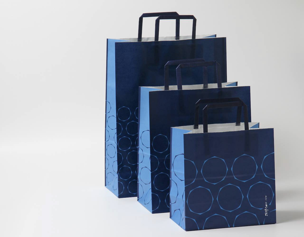
AYU KIMURA SHOPPING BAG
あゆの店きむらのショッピングバッグをデザインしました。マチ部分の柄とシームレスにつながるでざいんです。8角形の形は生け簀の形を図案化したものです。We designed a shopping bag for Ayu Kimura. The octagonal shape is based on the shape of a fish tank.
2019
VEHICLEN
室内用子供乗用玩具です。 中は収納で引出しになっていてお尻のほうから引き出せます。 オモチャなどを楽しく片付けながら遊べる乗り物です。 つののように張り出した部分は把手になっており、つかんで走ります。 子供の乗り物を考えるにあたって、子供の乗り物は暮らしの中で邪魔なものである。 あるいはいつか邪魔になる。と思っていました。 ですので、有用な引出し型の収納が走れば良いなと思っていたのです。 そして、子供は引出しが大好きなのです。 出来るだけコストを抑えるためにシンプルな板のみで作ろうと思いました。 でも、考えていくうち、少しずつ、箱が斜めになったのでした。 その方が、角がなく乗り心地も良いのです。
2007
KUROBUTA
段ボール箱のベロを差し込む部分を豚の鼻に見立てて、黒豚を立体的にパッケージ全体に描くデザインとしました。 既存のロゴに使われている豚の鼻、目、放射状の装飾をパッケージにあしらうことで、ロゴとパッケージがつながる統一的ブランディングとしています。お尻の側に社名と、尻尾を描いています。箱を開けるときに鼻を引き出すと「THNAK YOU」の文字が見えるようにしています。 お店にパッケージが並んでいる際も、豚がたくさん並んでいるように見え、可愛く、遠目にも目を引くデザインとなっています。 もらったあとも取っておきたいパッケージということで、極力商品名や社名は前面に出さないことを意図しており、段ボール製の収納用品として販売していそうなものを目指し、シンプルで抽象的なデザインとしています。それゆえ、ギフトボックス以外の、壁面デザインやのぼりなど、様々な媒体に展開しやすいものになっています。 段ボールのクラフトの地色を活かしたナチュラル感のあるデザインにしており、素材の良さを感じさせるものです。 The design depicts a black pig three-dimensionally on the entire package, using the part of the cardboard box where the tongue is inserted as a pig's nose. The pig's nose, eyes, and radial decorations used in the existing logo are used on the package to create a unified branding that connects the logo and the package. The company name and tail are drawn on the butt side. When the box is opened, the nose is pulled out to reveal the words "THNAK YOU. When the package is lined up in a store, it looks like a bunch of pigs, which is cute and eye-catching from a distance. The design is simple and abstract, aiming for something that would be sold as a cardboard storage product. Therefore, the design can be easily applied to a variety of media other than gift boxes, such as wall designs and banners. The design has a natural feel, taking advantage of the ground color of the corrugated kraft, and gives a sense of the quality of the material.
2023
Back to Top