商品開発・ブランディング・実装まで一貫して支援します。
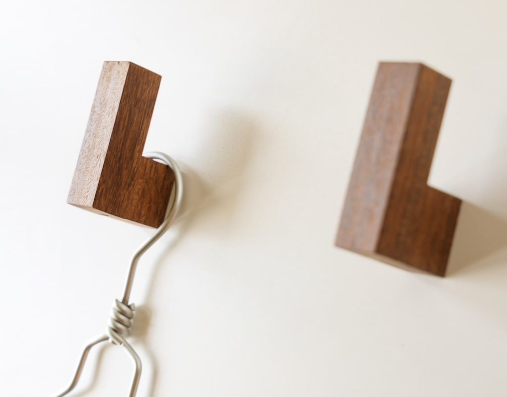
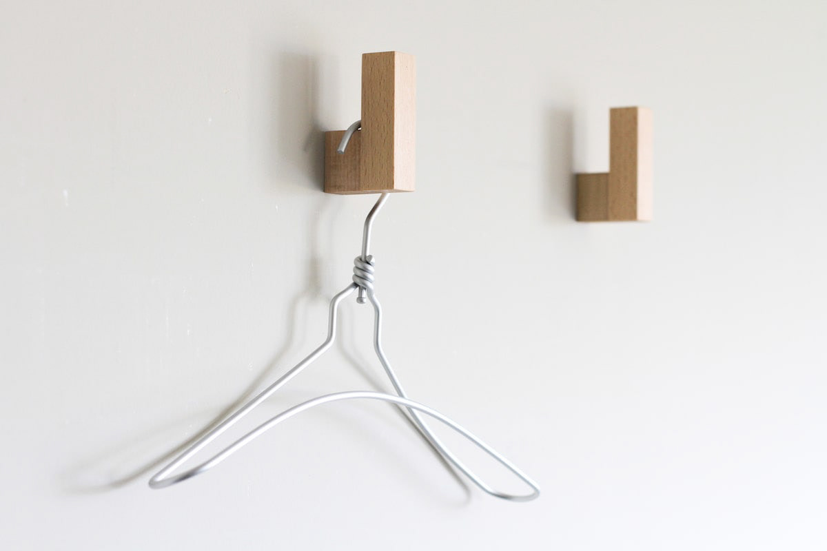
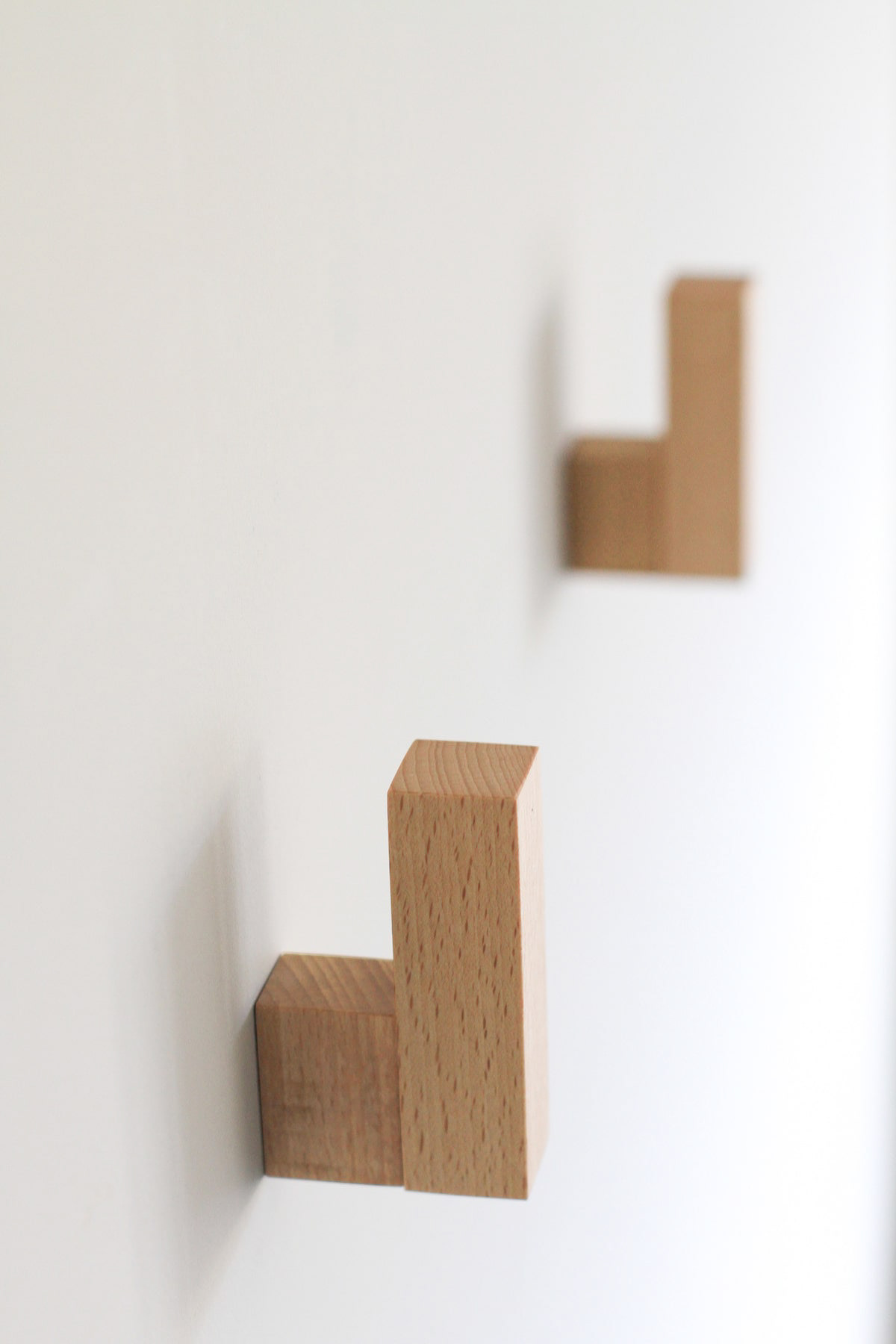
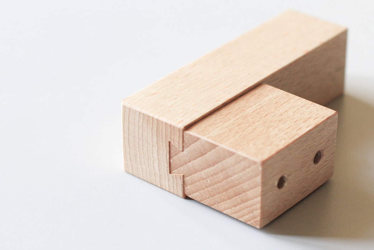
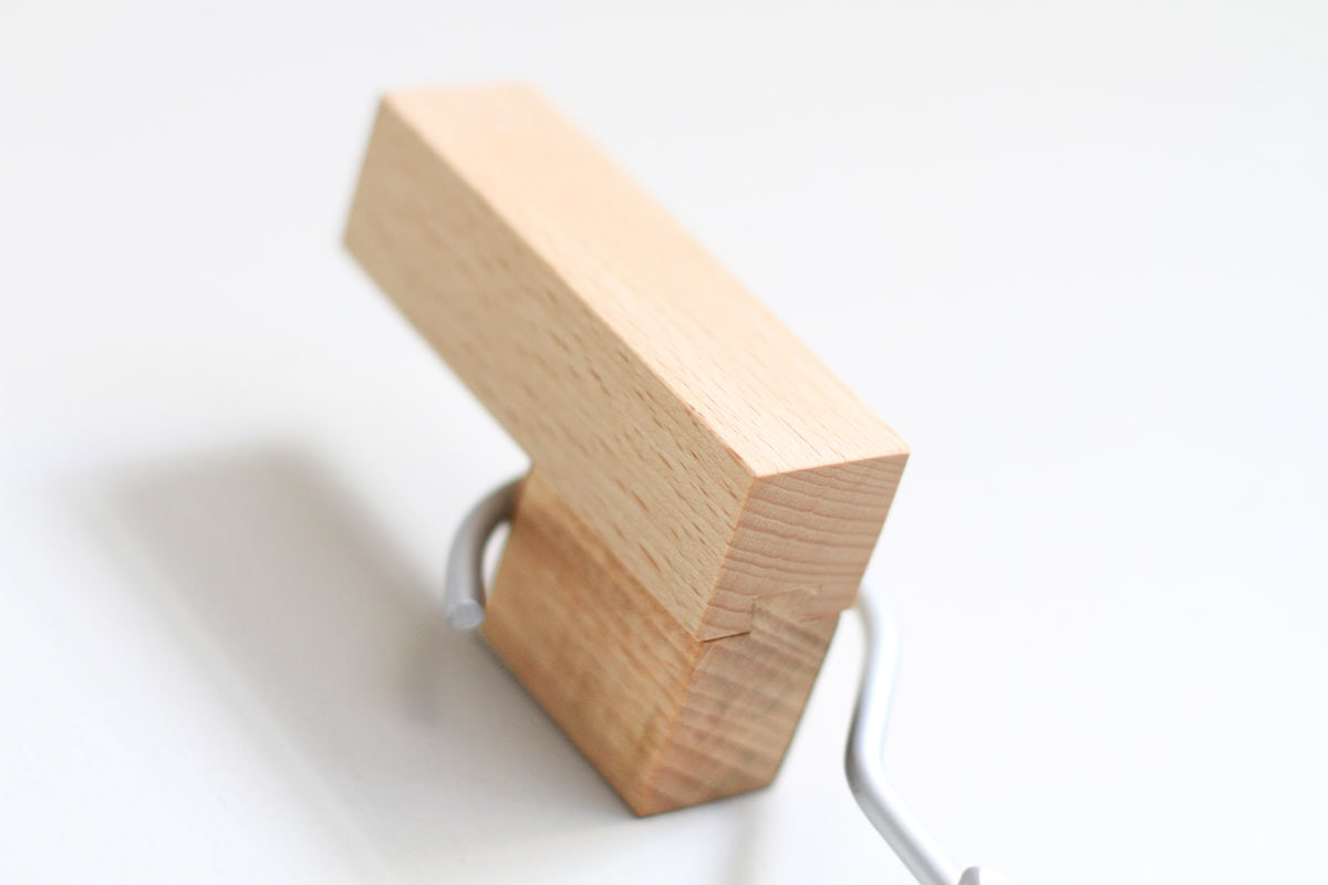
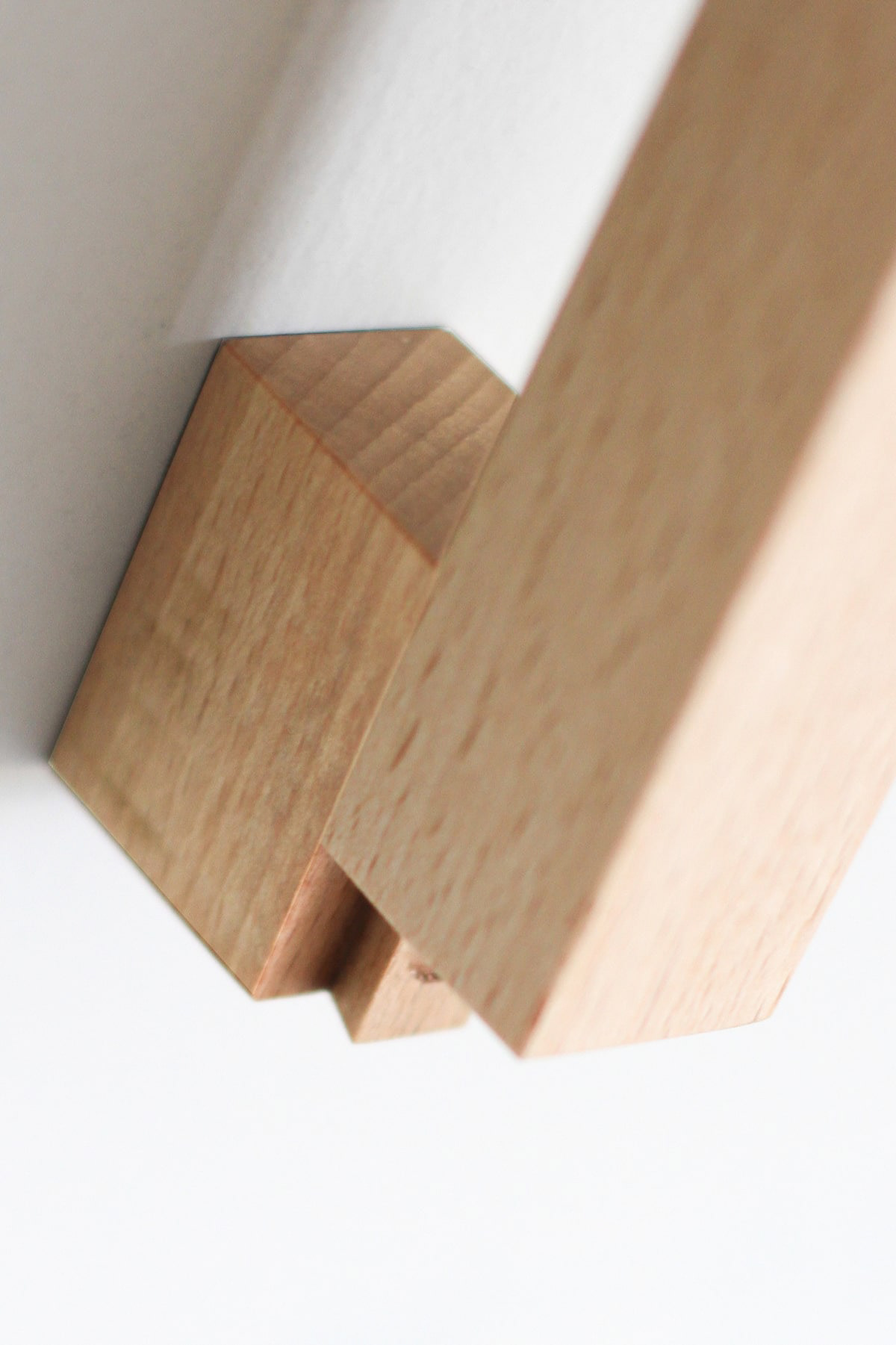
CUBRICはシンプルなデザインの木製の壁掛けフックです。 2つの立方体形状の組み合わせで構成されています。 どのような空間にもよく合う、なんでもないシンプルな形です。主張するわけでもなく、なんとなく壁にあり、玄関で向かえてくれる。 フックはあくまでも脇役。 主役は空間でありインテリアです。こんなシンプルな木製フックが意外と売っていませんでした。CUBRIC is a wooden wall hook with a simple design. It consists of a combination of two cube shapes. It is a simple, nondescript shape that fits well in any space. It does not make a statement, it is somehow on the wall, and it will greet you at the entrance. The hook is only a supporting role. The main role is the space and interior. Surprisingly, such a simple wooden hook was not sold.