HOP VISA
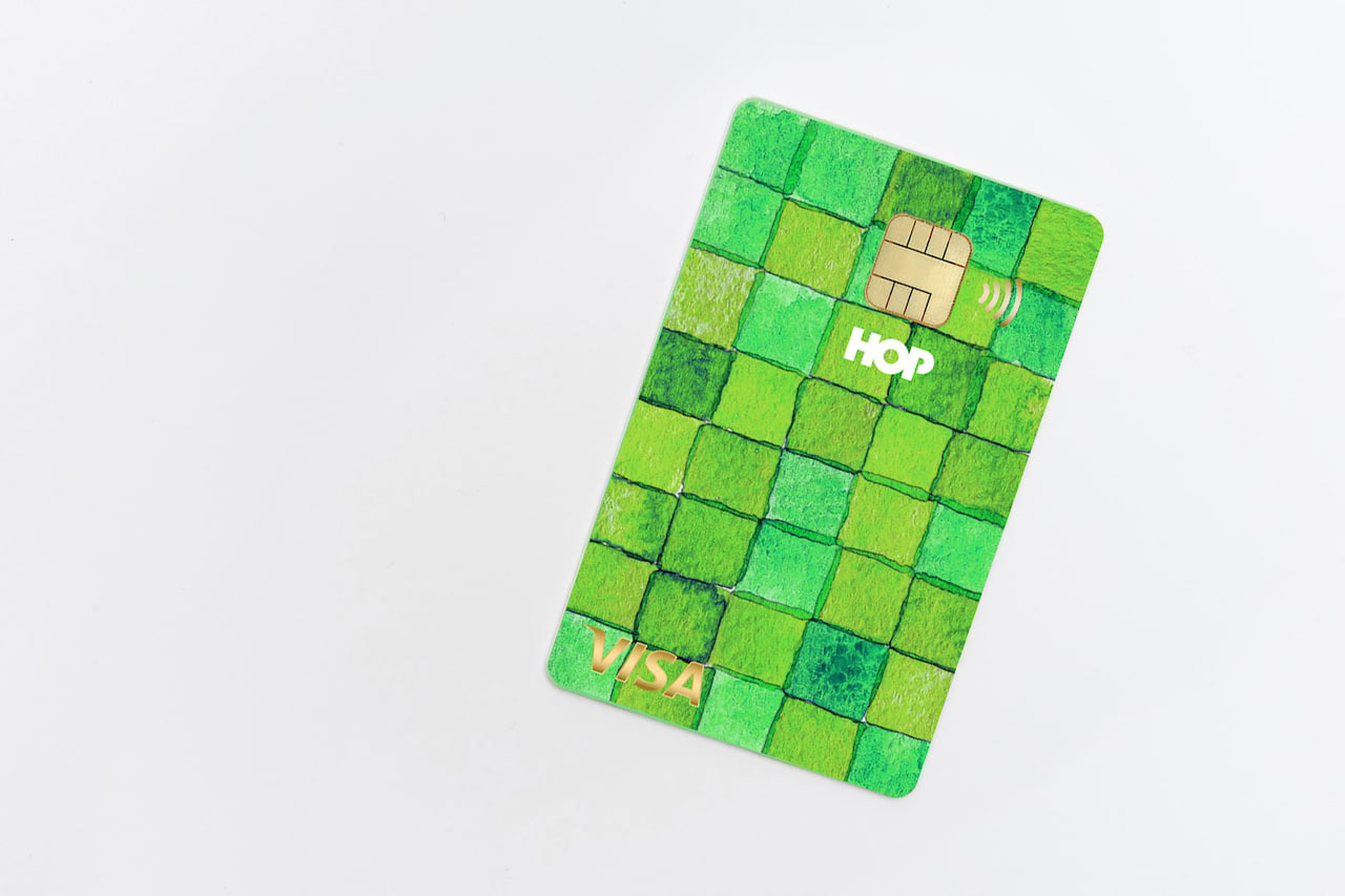
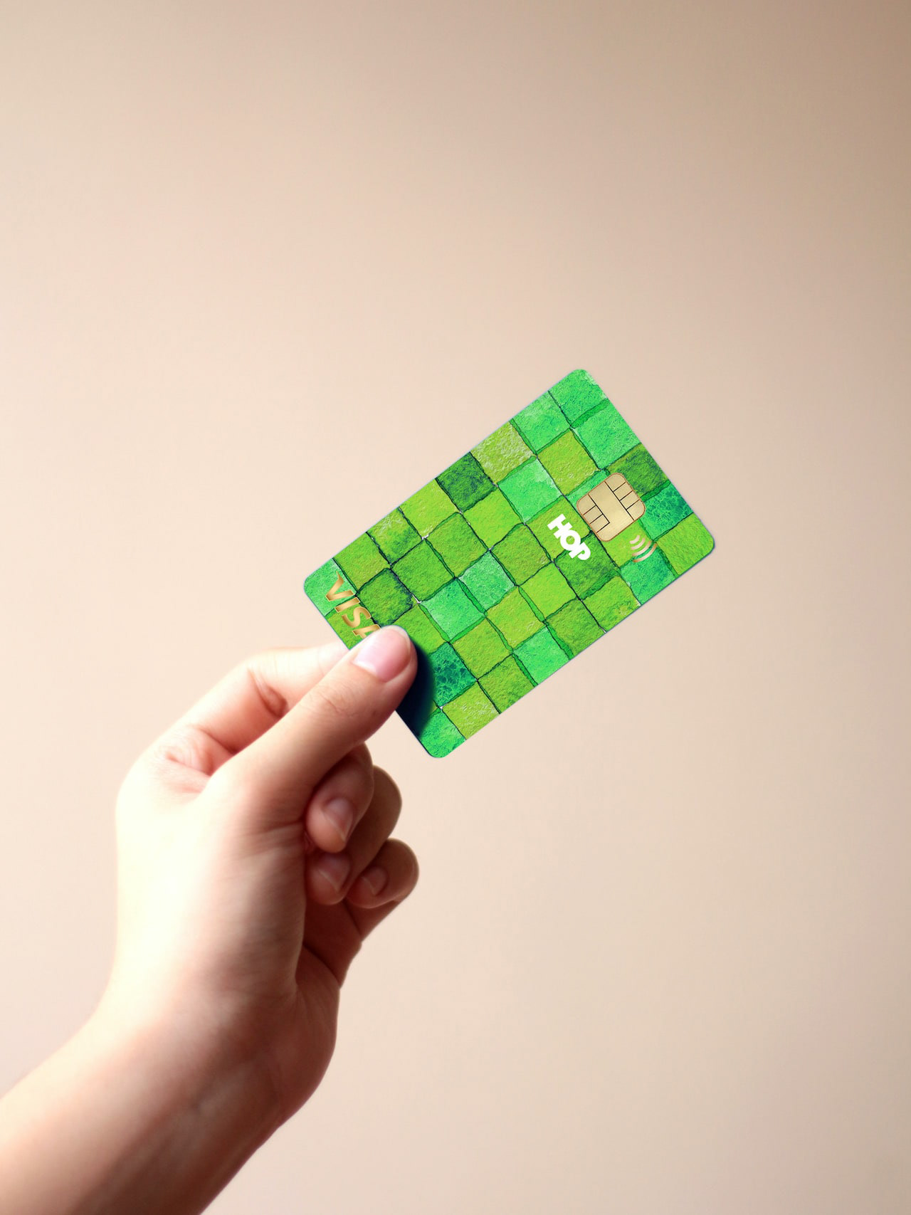
これはHOP VISAカードリニューアル指名コンペでの案です。滋賀の美しい緑、田園風景を水彩画を用いて表現したものです。手描きの四角い不均一なマス目が重なったりにじんだりして、一つの自然を形成しているようなイメージです。このようなおおらかさこそが滋賀のイメージであり、今までの緑のvisaカードのイメージも踏襲しながら、若々しく優しい、滋賀と、平和堂の空気感を表現できていると思います。This is a watercolor rendering of the beautiful green, rural landscape of Shiga. The image is of hand-painted squares of uneven squares overlapping and blurring to form a single natural feature. This kind of generosity is the image of Shiga, and I think it expresses the youthful and gentle atmosphere of Shiga and Heiwado, while also following the image of the existing green visa cards.
You may also like
minami design school
2025年6月〜2026年2月まで、大津北商工会にて、全10回のスクール形式で新商品開発、既存商品ブラッシュアップの講師を勤めることになりました。
事業者における新商品開発の際も、全てが決まってから「最後に外注するものが デザイン」ではなく、
リサーチから、今企業内にあるリソースを最大限に活かしながら、誰に向けて何を作るのか、サービスを考えることから、商品開発、売り場のデザインまで、その全てが「デザイン」であります。
ものづくりの事業者にとって、デザインは遠いものではなく、
それらの仕事の多くは実は「デザイン」です。
このスクールでは、事業者自身が自律的に考え、商品開発し、デザインができるように、私の力でどこまでできるかわかりませんがやることになりました。
I will be teaching a 10-session school-style course on new product development and product refining for existing products.
When developing a new product for a business, it is not a case of “the last thing to be outsourced is the design” after everything has been decided,
Design” is everything from research, to thinking about what to make and for whom, to product development, to designing the sales floor, all while making the most of the resources currently available within the company.
For manufacturing businesses, design is not something far away,
Many of those jobs are actually “design”.
In this school, I don't know how far I can go, but I will do it so that the businesses themselves can think, develop products, and design autonomously.
我将以 10 期学校的形式教授新产品开发和现有产品的更新。
在为企业开发新产品时,并不是在确定了一切之后 “最后外包的是设计”、
设计 "是指从研究、思考制造什么和为谁制造、服务、产品开发到销售空间设计的所有工作,同时还要充分利用公司内部现有的资源。
对于制造企业来说,设计并不遥远、
很多工作其实就是 “设计”。
在这所学校里,我不知道自己能走多远,但我会做到让企业自己能够自主思考、自主开发产品、自主设计。
2025
BRANCH
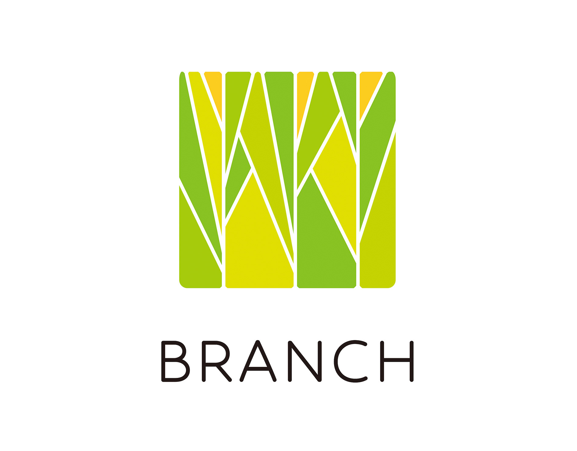
「枝」を意味する店名のロゴデザイン。花屋さんでありますので「枝、森、花」そのどれもを感じさせる明るいデザインとしました。
Logo design for a store name meaning “branch. As a florist, the logo is bright and evocative of “branches, forests, and flowers.
为一个意为 “枝条 ”的店名设计徽标。 作为一家花店,徽标色彩明亮,令人联想到 “树枝、森林和鲜花”。
2024
BIWAKO SHAMPOO & RINSE
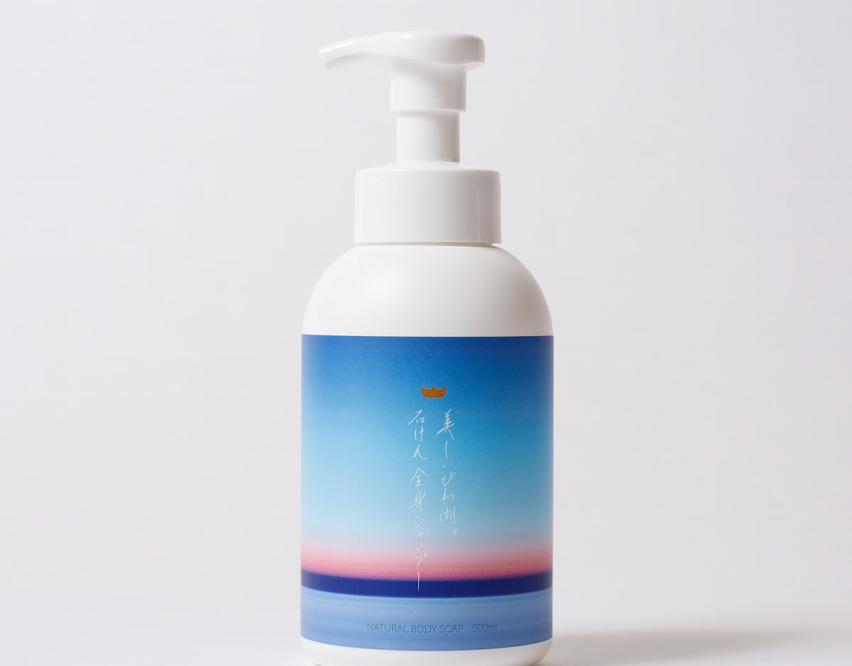
これはシャンプーとリンスのデザインです。琵琶湖にも優しい、人にも優しい原料でできており、100%自然に分解される厳選素材を使用しております。売り上げの一部を琵琶湖の環境保全にも役立てています。This is a shampoo and conditioner design. They are made of carefully selected ingredients that are both friendly to Lake Biwa and to people, and are 100% naturally degradable. A portion of the proceeds is also used to help preserve the environment of Lake Biwa.
2021
TAKASHIMA A MONO GP
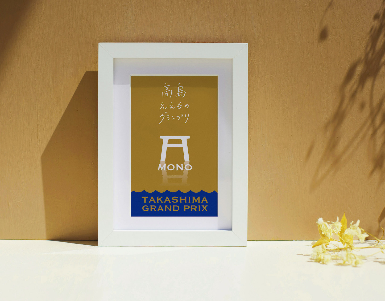
今年で8回目を迎える滋賀県高島市の「ええもの」を集めたコンテスト「高島ええものグランプリ」のリニューアルブランディングに関わりました。
受賞者は「センスがええ」ということで、トロフィー代わりに高島扇子が贈呈されました。
最高金賞に選ばれたのは、とも栄さんの「ふなずしxベイクド羊羹」の”ふなチー”です。
滋賀の人って、本当に鮒寿司を美味しくすることに執念を燃やしています!これが鮒寿司なの?っていうくらい美味しいもの沢山あります。これも、チーズ不使用なのに濃厚チーズケーキそのもので、審査員絶賛でした。
他にも金賞の発酵ドルチェ米シュワグルトも鮒寿司を作る際の飯から作られたヨーグルトです。
その他の金賞には、和ろうそくの大與さんは有名ですが、高島発アウトドアブランドの業界最小クラスの焚火台や、琵琶湖の宝石と呼ばれるビワマスひつまぶし、メタセコイアのブラウニーケーキなど、ユニークな商品が揃いました。
審査委員長も近年稀に見るハイレベルとおっしゃっていました。
We were involved in the renewal branding of the contest that featured "ehimono" (good things) from Takashima City, Shiga Prefecture, which is now in its 8th year.
In lieu of a trophy, a Takashima fan was presented to the winners for their "good taste.
The top gold medal went to Tomoei's "Funachie" (Funazushi x Baked Yokan).
The people of Shiga are really dedicated to making funa-zushi delicious! There are so many delicious funazushi that you may wonder, "Is this really funazushi? There are so many delicious funa-zushi that you may ask yourself, "Is this funa-zushi? The judges also praised the cheesecake, saying that it was just like a rich cheesecake, even though it did not contain cheese.
Another gold award winner, Fermented Dolce Rice Schwagurt, is a yogurt made from the rice used to make funa-zushi.
Other Gold Award winners included Ooyo, a well-known Japanese candle maker, the smallest fire pit in the industry from an outdoor brand from Takashima, Biwa trout hittomabushi, the jewel of Lake Biwa, metasequoia brownie cake, and many other unique products.
The long-time chairman of the judging committee, said that the level of the competition was of a high level rarely seen in recent years.
我们参与了 "高岛 A-mono 大奖赛 "的品牌更新工作,这是滋贺县高岛市的一项 "优秀产品 "竞赛,今年已是第八届。
获奖者获得的不是 "美味 "奖杯,而是一把高岛扇。
最高金奖由 Tomoei 的 Funa-zushi x Baked Yokan(Funachii)获得。
滋贺人真的很用心地把船寿司做得美味可口! 这是船卷寿司吗? 美味的寿司有很多。 这款寿司也得到了评委们的高度评价,虽然不含奶酪,但吃起来就像浓郁的芝士蛋糕。
评委会主席还说,这是近年来少见的高水平作品。
2024
TSUCHINOCO CARDBOARD MAZE
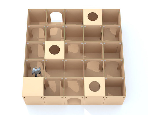
ブランディングを担当しました、つちのこブランドからまったく新しいダンボール迷路の登場です!
このダンボール迷路の最大の特徴は、宝探しをしながら遊べる迷路です。
入口で宝物カードを受け取り、その宝物を探しながら迷路を探検します。
宝物を見つけたら、カードに穴を空けてゆきます。
全部の宝物を発見するまで出る事はできません。
段ボール迷路をより面白く体験できる「宝探し迷路」です。
25,50,100など自由にマス目をカスタムできます。
納品事例多数です。
We are proud to introduce a brand-new cardboard maze from the Tsuchinoko brand, for which we were in charge of branding!
The main feature of this cardboard maze is that it is a maze where visitors can play while searching for treasure.
You receive a treasure card at the entrance and explore the maze looking for the treasure.
When you find the treasure, you make a hole in the card.
You cannot leave the maze until you have found all the treasures.
This is a "treasure hunting maze" that makes the cardboard maze experience more interesting.
You can customize the number of squares to 25, 50, 100, etc.
We have many delivery examples.
2014
Sustainable Architecture Book Design
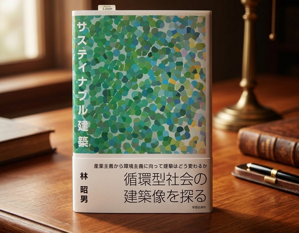
装丁デザインに際し、本書のタイトルはすでに「サステイナブル建築」と決まっており、クライアント(著者)の希望はグリーンの表紙のイメージというものでした。サステイナブル建築とはいかなるものだろうかというところを出発点とし思索をめぐらせました。私自身のサステイナブル建築のイメージとしては自然発生的に点在する集落のようなものでした。一つ一つの個はそれぞれ個性を持ち、それらは留まることなく動的に変化し更新されつづけるが、全体としての調和は決して崩れないような強さのあるつながり。そのようなイメージでした。そのような関係性はマクロな宇宙の組成から、ミクロの細胞、原子の配列まで通じるものではないでしょうか。圧縮力と張力のインタラクティブなバランスで全てのものは成立している。そのようなメッセージを込めた装丁デザインとしました。
When designing the book's cover, the title had already been decided as "Sustainable Architecture," and the client (author) requested a green cover image. I began by contemplating what sustainable architecture truly is. My own image of sustainable architecture was like a collection of settlements scattered spontaneously. Each individual has its own personality, and they are constantly changing and being renewed, but the overall harmony is strong enough to never break down. That was the image I had. I believe such relationships extend from the composition of the macroscopic universe to the arrangement of cells and atoms at the microscopic level. Everything is based on an interactive balance of compression and tension. I designed the cover to convey this message.
2004
TACHIBANA SHOKUDO
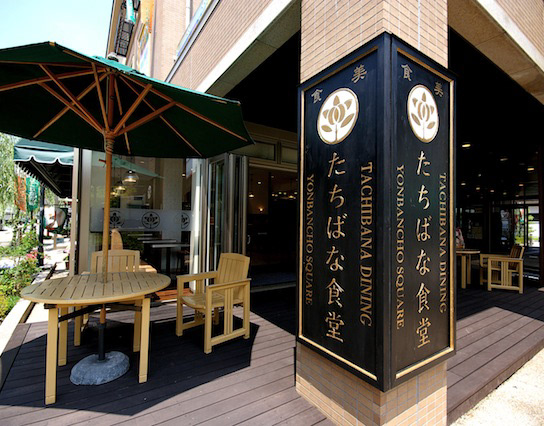
彦根四番町スクエアにある、「たちばな食堂」のCIおよび看板制作を担当しました。
大正ロマンをテーマに作られた街にふさわしいイメージで、ブランディングを行いました。
「たちばな」は伊井家の家紋であり、彦根市の市の木であります。
花紋はより現代的にすっきりとデザインしています。
「たちばな食堂」のインテリアデザインは、DEWKSさんによるものです。
2013
KUROBUTA
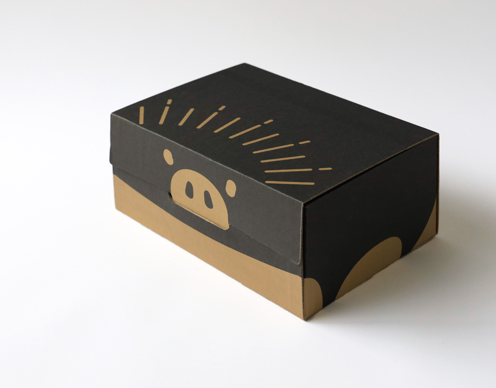
段ボール箱のベロを差し込む部分を豚の鼻に見立てて、黒豚を立体的にパッケージ全体に描くデザインとしました。
既存のロゴに使われている豚の鼻、目、放射状の装飾をパッケージにあしらうことで、ロゴとパッケージがつながる統一的ブランディングとしています。お尻の側に社名と、尻尾を描いています。箱を開けるときに鼻を引き出すと「THNAK YOU」の文字が見えるようにしています。
お店にパッケージが並んでいる際も、豚がたくさん並んでいるように見え、可愛く、遠目にも目を引くデザインとなっています。
もらったあとも取っておきたいパッケージということで、極力商品名や社名は前面に出さないことを意図しており、段ボール製の収納用品として販売していそうなものを目指し、シンプルで抽象的なデザインとしています。それゆえ、ギフトボックス以外の、壁面デザインやのぼりなど、様々な媒体に展開しやすいものになっています。
段ボールのクラフトの地色を活かしたナチュラル感のあるデザインにしており、素材の良さを感じさせるものです。
The design depicts a black pig three-dimensionally on the entire package, using the part of the cardboard box where the tongue is inserted as a pig's nose.
The pig's nose, eyes, and radial decorations used in the existing logo are used on the package to create a unified branding that connects the logo and the package. The company name and tail are drawn on the butt side. When the box is opened, the nose is pulled out to reveal the words "THNAK YOU.
When the package is lined up in a store, it looks like a bunch of pigs, which is cute and eye-catching from a distance.
The design is simple and abstract, aiming for something that would be sold as a cardboard storage product. Therefore, the design can be easily applied to a variety of media other than gift boxes, such as wall designs and banners.
The design has a natural feel, taking advantage of the ground color of the corrugated kraft, and gives a sense of the quality of the material.
2023
SAISIR
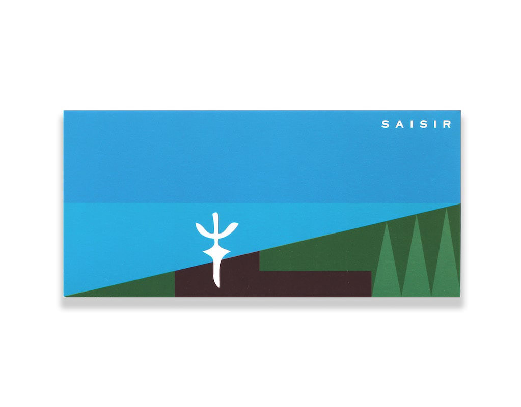
SAISIRはサカエヤに併設されたフレンチレストランです。SAISIRは掴むという意味であり、象形文字の牛の文字にヒントを得ながら、ナイフのようなロゴマークのデザインとしました。SAISIR is a French restaurant attached to Sakaeya, and the logo mark was designed to look like a knife, inspired by the hieroglyphic character for cow, SAISIR meaning "to grasp.
2019
FLOCK
FLOCKは群を意味します。信楽焼の陶器で作られた箸置きやブローチなどのブランディングデザインとネーミングです。商品数がとても多く、動物や植物など生物が多くを占めているので群と名付けました。FLOCK means flock. It is a branding design and naming of chopstick rests and brooches made of Shigaraki ware pottery. We named it "Flock" because there are so many products and many of them are creatures such as animals and plants.
2018